| Type |
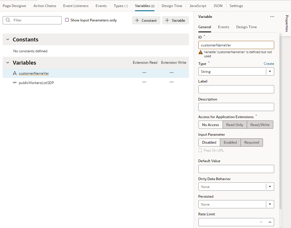
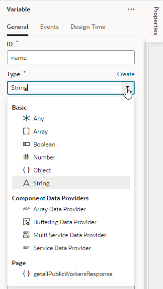
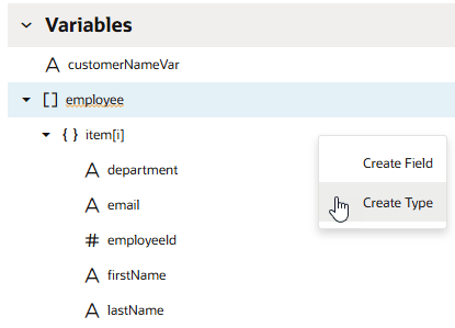
Identifies the variable type, which could be a specific primitive type (string, boolean, number, and so on); a structured type such as an array or object; a dynamic type (any); or a built-in type such as Service Data Provider or Array Data Provider.
|
| Access for Application Extensions |
Makes a variable or constant available to App UIs in another extension. See Make Variables and Types Available to Extensions.
|
| Input Parameter |
Marks a variable as input, indicating that the variable is part of the contract for navigation. Can be set to Disabled (default), Enabled, or Required. Choosing Required implies that the variable must be set to allow navigation to that page, flow, or App UI.
If you choose Enabled or Required, you can select Pass on URL to pass the input parameter on the URL of the page, flow, or App UI that you are invoking (by adding ?paramName=Value to the end of the URL). You can use this approach to bookmark pages that will show specific data based on the parameter.
You can also enter a Label and Description to show within a  icon; page users can then click the icon in the Page Input Parameters dialog to get some context on how best to set the parameter's value. icon; page users can then click the icon in the Page Input Parameters dialog to get some context on how best to set the parameter's value.
See Enable Variables as Input Parameters.
|
| Default Value |
Specifies the default value to initialize a variable. This property can be an expression or a static value.
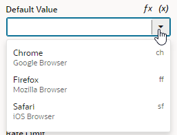
For string-type variables, you can use the Design Time tab in the Properties pane to display a custom component for setting the variable's Default Value in the General tab. For example, if you want to use a color picker component instead of the default text field to select a color, select Color as the Subtype in the Design Time tab. If you want to use an enumerated list, select Enum Values as the Subtype and add your enumerated list, which then appears as a drop-down menu for the Default Value:

Description of the illustration var-defaultvalue-enum1.png
The properties you see in the Design Time tab will depend upon the variable's type, and the Subtype property you select. For example, if Date is selected as the Subtype, you'll also see fields for setting Minimum and Maximum limits.
Selecting Color, Date, Date Time, Enum Values, or Time Zone as the subtype will display custom components for the Default Value. If you select any of the other subtypes, you'll see a text field for entering the Default Value.
|
| Dirty Data Behavior |
Tracks changes in a variable's state, marking it as "dirty" when its current value differs from its initial value. See Track Variables to Detect Unsaved Changes.
|
| Persisted |
Sets the lifespan of the variable to be longer than the page, for example, when you want to keep an authorization token for the duration of a session. This property ensures that even if the page is refreshed, the token will still be available throughout the session. Can be set to:
- Device: Stores the variable in the browser's local storage and persists it on the device where the App UI is running, even if the browser is closed. If you want to store a variable across sessions, use this setting.
- Session: Stores the variable but only during the current browser session.
- History: Stores the variable on the browser history. When navigating back to a page in the browser history using the browser back button, the value of the variable is restored to its value at the time the App UI navigated away from this page.
- None: Variable is not stored (default).
|
| Rate Limit |
Limits how often the onValueChanged event is triggered, which is whenever the variable's value changes. By default, the event listener that "listens" for this event waits for the value (specified here in milliseconds) to expire after all changes stop to fire the event.
You can trigger an action chain when a variable's value changes by adding a listener for the onValueChanged event and selecting the action chain that the change will initiate. For example, when a user clicks a row on a employee's table, you can set up an action chain to retrieve employee information whenever the employee's ID changes. To do this, switch to the Events tab in the variable's Properties pane, then specify the action chain that the variable's change will initiate. See Start an Action Chain When a Variable Changes.
|
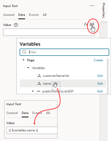
![]() to open the Variables picker, then select name under Page to populate the data value:
to open the Variables picker, then select name under Page to populate the data value: