Chart View: Burndown Chart to Analyze Reconciliation Performance
This example creates a burndown chart that analyzes reconciliation performance by tracking the end date, actual end date, and total reconciliation balances over time.
Burndown charts are a powerful tool in analyzing and then improving your reconciliation process. The chart shows if your reconciliations are being performed before schedule, on time, or late (after the scheduled date). You can analyze the performance of your reconciliations across multiple periods. Based on this analysis, you can make changes to your existing reconciliation process, if required. For example, if the chart indicates that your reconciliations are consistently being completed well before time, you can consider changing your reconciliation schedules to match the actual completion dates. You can do this by reducing the Duration set in your Profiles. However, if the chart indicates that are many late reconciliations, you can drill down into the late reconciliations and analyze the reasons they are late. You can leave the due dates as is, if you can make a process change to fix the problems causing late reconciliations. On the other hand, if there are legitimate reasons for not being able to complete the reconciliations before a certain date (for example, the Preparers cannot get all the required information on time), you can consider changing the due dates so that the reconciliations are not always late.
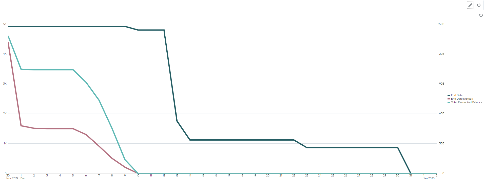
The chart created in this example is as follows:

The Green line shows the count of reconciliations with respect to their due dates. The Red line shows the count of reconciliations with respect to their actual completion. The Cyan line shows the total balances to be reconciled with respect to their actual completion. Notice that as time progresses, and balances are reconciled, the Cyan line representing the total balances to be reconciled goes to zero. Similarly, the count of open reconciliations, represented by the Red line, also goes to zero. Notice the progress of the Red and Cyan lines to compare the count of reconciliations with the total balances to be reconciled. Similarly, tracking the Red and Green lines helps you compare the actual completion dates and the planned completion dates.
Some observations based on this chart:
-
There is a considerable gap between the due date (represented by the Green line) and the actual end date (represented by the Red line). This indicates that the reconciliations are being worked on much earlier than the set due date. If this trend is observed consistently, across multiple periods, you can consider changing your process and bringing the end dates closer to the actual end dates.
-
Although both the Cyan and Red lines track the progress of reconciliations, there is a considerable distance between these two lines until 5th Dec. This indicates that the lower value reconciliations were being completed during this time. After 5th Dec, the distance between these two lines keeps reducing, indicating that the higher value reconciliations are worked on during the period between 5th Dec and 10th Dec.
The recommended best practice is to complete the high-value and high-risk reconciliations at the beginning of the reconciliation cycle.
Prerequisite: Creating an Attribute
If you don't already have an attribute that computes the absolute value of the Source System Balance (Functional), create an attribute named Source System Balance Functional Absolute. To create this attribute, from the Home page, click Configuration. In the Attributes tab, click Add to create an attribute. Specify the following for the new attribute:
- Properties tab: Enter Source System Balance Functional Absolute in Name, select Number in Type, select Calculation, and select Sum under Total.
- Format tab: Select 2 in Decimal Places and select Thousands Separator.
- Calculation tab: Select Scripted in Calculation Type, select Display to User, and enter ABS(TRANSLATE({Source System Balance (Functional)}, 'USD', 'REC')) in Calculation Definition.
To create the burndown chart:
- In the required view within the dashboard, click the View Selector and select Chart View.
- Click Settings.
- In the Properties tab:
- Set the Title to Burndown Chart to Analyze Reconciliation Performance.
- In Type, select Line.
- Select Dual-Y Axis.
- In the Layout tab:
- In Type, select Date.
- In the Legend (Series), add rows with the following properties:
- Row 1
In Value, select Reconciliation. In Aggregation, select Count. In Group By, select End Date. In Date Aggregation, select On or After.
- Row 2
In Value, select Reconciliation. In Aggregation, select Count. In Group By, select End Date (Actual). In Date Aggregation, select On or After.
- Row 3
In Value, select Source System Balance Functional Absolute. In Aggregation, select Sum. In Group By, select End Date (Actual). In Date Aggregation, select On or After.
- Row 1
- (Optional) In the Axis tab:
If you want to display data for a specific time period, click X Axis, and in Minimum and Maximum, select the required dates.
- In the Legend tab:
- For the Source System Balance Functional Absolute series, select Dual-Y.
- Customize the labels displayed in the chart:
- For the Series Count, set Label to End Date.
- For the second Series Count, set Label to End Date (Actual).
- For the Series Source System Balance Functional Absolute, set the Label to Total Reconciled Balance.
- Click OK to save the chart settings.