Chart Properties
The properties panel for the chart designer displays the options and navigation buttons.
General Properties
General properties affect the entire chart. Use general properties to edit the following:
-
Edit the chart name or data source
-
Edit the chart type, such as Bar or Scatter.
-
Select the grouping for the legend elements by Rows/Columns (each row is a different chart element, such as a bar or line) or Columns/Rows (each column is a different chart element).
-
Set chart type-specific properties, such as:
-
Orientation and Stack for Bar, Line, Area, and Combination chart types.
-
Subtype for Pie, Polar, and Radar chart types.
-
-
Toggle a dual-Y split. See Understanding the Dual Y Axis in Charts.
-
Set the background color for the chart. The background color applies to the entire chart area from border to border.
-
By default, the Plot Zero Values is set to True. From this setting, you can view zero data values are plotted in charts.
Plot Area
Plot Area properties affect the visual display of the chart. Use plot area properties to:
-
Show or hide the chart title and subtitle.
-
Edit the chart title and subtitle style, size, alignment (left, center, right), and font.
-
Adjust the background color.
-
Display grid lines (horizontal, vertical, or both).
-
Adjust the color of the grid lines.
Legend
Legend properties affect the visual display of the chart's legend. You can change the position of the legend, as well as displaying a title for the legend, changing the background and border colors, and editing the font and format of chart labels.
Chart Axes
Chart Axes properties affect the visual display of the chart's axis labels. You can create a title and label for the X-axis, and the primary and secondary Y-axes of the chart. You can also edit the text and number format of the Y-axes, and define a custom range for both Y-axes.
Note:
The custom scaling for the Y-axis is based on the displayed data values in the grid (with number formatting scaling applied) and not the unformatted and underlying data values.
About Custom Ranges
For chart types with a Y-axis, you can define a Fixed Custom Range to change the starting and ending numbers of your axis and the numeric intervals. For example, you can display values 40 through 60 at three-step intervals by entering 40, 60, and 3 as the values for Min, Max, and Step.
For chart types with a Y-axis, except radar and polar charts, you can specify a custom range to dynamically apply an Offset of either a Value or a Percent, applied to the minimum and maximum plotted data values. A step is not user entered for offset by value or percent, it is automatically calculated.
Offset by Value
For Offset by Value, the specified minimum is subtracted from the minimum data value plotted; the specified maximum is added to the maximum data value plotted. The axis step values, as well as the minimum and maximum, may be rounded up or down.
For example:
With Offset by Value set to the following:
Min: 10000
Max: 10000
Minimum plotted data value: 143,679
Maximum plotted data value: 475,774
Minimum: 143,679 - 10,000 = 133,679
Maximum: 475,774 + 10,000 = 485,774
Note:
The axis step values, as well as the minimum and maximum, may be rounded up or down.

Offset by Percent
-
The specified minimum percent is applied to the difference between the minimum and maximum plotted data values and then subtracted from the minimum data value plotted.
-
The specified maximum percent is applied to the difference between the minimum and maximum plotted data values and then added to the maximum data value plotted.
The axis step values, as well as the minimum and maximum, may be rounded up or down.
For example:
With Offset by Percent set to the following:
Min: 20%
Max: 20%
Minimum plotted data value: 143,679
Maximum plotted data value: 475,774
Difference between the minimum and maximum plotted data values:
475,774 – 143,679 = 332,095
Minimum: 143,679 - (332,095 x 20%) = 77,260
Maximum: 475,774 + (332,095 x 20%) = 542,193
Note:
The axis step values, as well as the minimum and maximum, may be rounded up or down.

Options
Chart Options enable you to set visual properties, such as fill style and color, for each data set in a chart. The properties are specific to the type of chart selected. For example, for bar charts you can set the bar width, labels, and borders.
Note:
If the Redwood Experience is set as the default theme in Cloud EPM, the Redwood theme colors will affect the default chart colors in existing reports. Enabling and defining a custom chart theme will override the Redwood color theme. For more information on setting a default custom chart theme, see Report Designer Toolbar.
Data Set Maximum
This property allows you to specify the maximum number of data sets for the chart, where each data set can have its own color and fill setting.
The default number of data sets is 12.
For example, if the Data Set Maximum property was set to
24, each data set in the chart can have its own color and
fill defined.
Note:
-
Previously, the maximum number of data sets, where you could set the data set-specific selections such as color and fill, was
12. -
For example, if you had a chart that resulted in
24data sets plotted, data set1and13would have the same color and fill, as well as2and14, and so on.
Label Location
This property defines how and where data labels are displayed in relation to the elements in a chart.
For example, in a Bar chart, the available label locations are: Auto, None, Center, Inside Bar Edge, and Outside Bar Edge.
For all chart types, you set the Label Location in the Options section, which applies to all data set elements in the chart.
For Bar, Line, and combination charts, you can set the Label Location for each data set in the Series section. Any selections other than Auto will apply to the selected Data Set element.
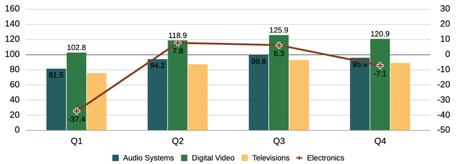
For example, this combination chart has the following Label Location settings at the Series level:
-
Audio Systems (Data Set 1): Auto (uses the Options Label Location setting of Auto)
-
Digital Video (Data Set 2): Outside Bar Edge
-
Televisions (Data Set 3): None
-
Electronics (Data Set 4): Below Line

Combine Y Axes
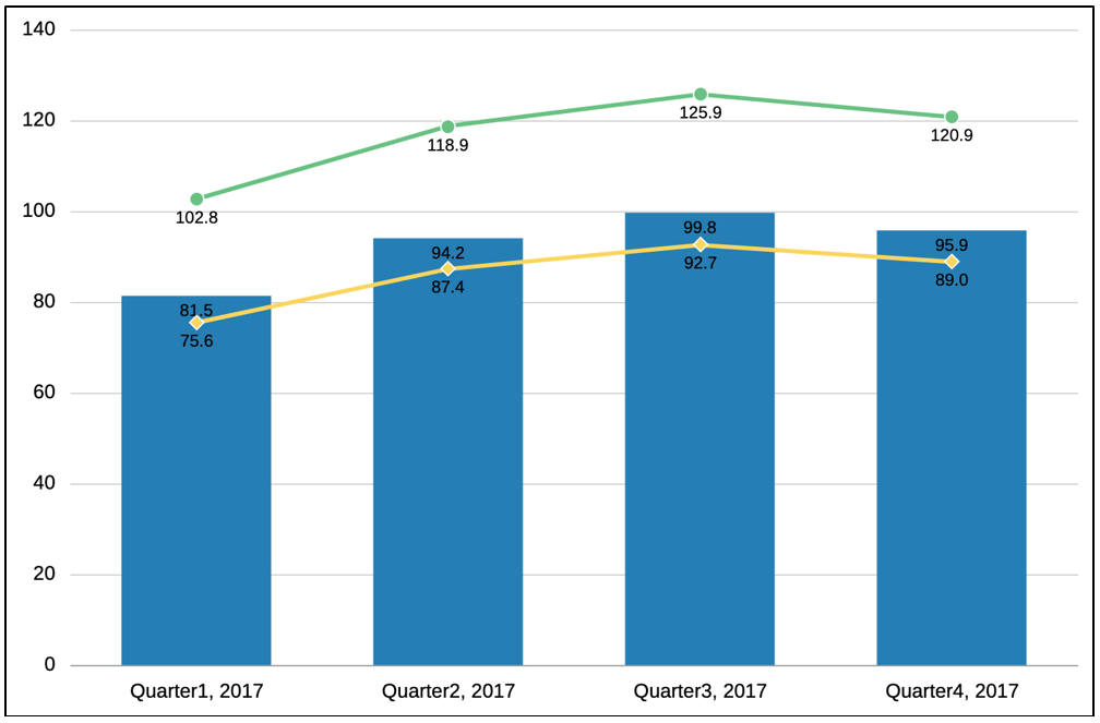
For some chart types, the property "Combine Y Axes", allows combining the plotting of the primary and secondary Y axes and data points to reflect plotting for both the bars and lines on only the primary Y-axis.
The property is most applicable when the bar and line data values have similar scaling and fall within the same numerical range. For example, in the following combination chart, where the "Combine Y Axes" property is enabled, note that both the bar and line data values correspond to the primary Y-axis and the secondary Y-axis is not displayed.
The property applies to the following chart types:
-
Bar
-
Line
-
Area
-
Combination
