View the Comparing Resources Productivity Report
The Comparing Resources by Productivity report displays the average number of completed work orders by work skill per resource/day. The report calculates data for all direct children of a chosen bucket/aggregator. The Comparing Resources by Productivity report shows the average number of activities completed for an activity type per resource per day for all the resources in a bucket/organization. Activities collaborated based on the teamwork and pre-work are not considered for generating this report.
Productivity is calculated as the total number of work orders completed by a resource during the month divided by the number of working days. This chart is often used along with the Comparing resources by number of activities report.
This report has the following characteristics:
You can run it for buckets/aggregators. If you select an individual resource in the Resource Tree, the report will be configured for the parent bucket/aggregator.
It refreshes automatically every hour
The report does not include teamwork, non-customer activities, or pre-work
To view the Comparing Resources Productivity report:
Results:
The Comparing Resources by Productivity report is represented with a column chart. The chart options allow you to choose a month to display the data for the corresponding period. You can filter the display data by activity type group or activity type represented in the list of activities in the selected bucket or organization. You can also define the number of resources and the number of activities to display on the chart. You can select from 20, 40, 50 or all resources.
This figure shows the dashboard window for Comparing Resources by Productivity column chart displaying average activities for each resource.
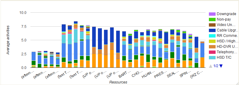
The horizontal axis lists individual resources by name; the vertical axis represents the number of work orders. Each column represents the number of work orders completed by one resource during the month. The colors correspond to the work types defined in the legend. Apart from differentiating the work types in colors, you can also view them as text in the chart hints.
This table displays the elements in the Comparing Resources by Productivity report and their description:
| Element | Description |
|---|---|
| Header | Displays the report name, the reported period and the number of resources in the header. |
| Columns | Each column represents the average number of activities for each activity type completed by a resource during the specified month. The chart columns contains several sections marked with different colors representing various types of activities. |
| Legend | Denotes the type of activities performed by the resources in the selected bucket/organization. If the resources in the selected bucket/organization perform only some of the activity types existing in the system, the columns and the legend displays only the activities performed. |
| Axes |
|
| Hint | Each activity displays a hint pop-up with Resource name, activity type and the number of activities for each activity type. |