View the Mean Time to Deliver Report
The Mean time to deliver report displays the average time it takes to assign a work order to a resource, or reassigned to another resource, and from the moment it is assigned until it is started by the resource. The report calculates data for all direct children of the chosen bucket/aggregator. If an individual resource is selected from the Resource Tree, the report will be configured for the parent bucket/aggregator of that resource. This report includes all the resources of a bucket/organization. Activities collaborated with teamwork and pre-work are not considered for generating this report.
This report has the following characteristics:
You can run it for buckets/aggregators. If you select an individual resource in the Resource Tree, the chart will be configured for the parent bucket/aggregator.
It refreshes automatically every hour
The report does not include teamwork, non-customer activities, non-ordered activities, or pre-work
To view the Mean Time to Deliver report:
Results:
The chart options lets you to choose a month and add a filter to display data for a particular activity type group. You can also setup the chart to show data for a particular capacity category assigned to the selected bucket or organization and define the number of resources whose activities is to be shown on the chart. you can select from 20, 40, 50 or all resources. The Mean time to deliver dashboard report is accessible only in the buckets/organizations. If an individual resource is selected in the resource tree, the report is configured for the entire parent bucket or organization. The Mean time to deliver report is represented with a column chart.
This figure displays the Mean Time to deliver report that calculates data for all direct children of a selected bucket.
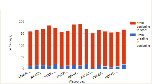
The horizontal axis lists resources by name; the vertical axis shows the time in days. Each column of the chart shows the time that passed from the creation of a work order until it is assigned (blue) and from assignment until it is started (red). Apart from differentiating the assignment status of work orders in colors, you can also view the status as text in the chart hints.
This table displays the elements in the Mean time to deliver report and their description:
| Element | Description |
|---|---|
| Header | Displays the report name, the reported period and the number of resources is displayed in the header. |
| Columns | Each column shows the time elapsed from the activity creation to its assigning, and from assigning to start. Each column consists of two colors representing time from activity creation to assignment (blue color) and time from activity assignment to start (red color) |
| Legend | From assigning to start, From creating to assigning |
| Axes | horizontal: Resources vertical: Time (in days) |
| Hint | Each activity displays a hint pop-up with resource name, description of time corresponding to the selected column part and the time in days, hours and minutes. |