View the Average Travel Time Per Resource Report
The Average travel time per resource report displays the average time spent by resources traveling to customers on any day that you select.
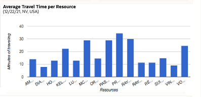
This image shows the Average Travel Time Per Resource column chart displaying the minutes of traveling per resource.
This report has the following characteristics:
-
You can run it for buckets/aggregators. If you select an individual resource in the Resource Tree, the chart is configured for the parent bucket/aggregator.
- You can configure the refresh rate in the Edit resource page of that resource. If the refresh rate is not available then the default value set in the database is used.
To view the Average travel time per resource report:
Results:
The Average Travel Time Per Resource report displays the
following information.
- Resource name – Displays the name of resource that belongs to the organization unit or bucket.
- Average Travel Time, minutes – Displays the average travel time for the resource.
This table displays the elements in the Average Travel Time Per Resource report and their description:
| Element | Description |
|---|---|
| Header | Displays the Report name, the reported period and the number of resources whose data is displayed on the chart. |
| Columns | Average travel time of each resource is shown as a column |
| Legend | The chart uses only one color to display data, therefore, the chart has no legend |
| Axes | horizontal: Resource vertical: Minutes of traveling |
| Hint | Resource name and their average travel time in minutes |