Flow Scheme Project User Interface
Intelligent Advisor Flows was only made available to select customers, and will not be made Generally Available.
When you open a flow scheme project from the Projects page, you will see the project details page. (Note that users with only the Viewer role will only be able to view the flow scheme project, not edit it.)
The project details page has a top toolbar, known as the project header. In the project header there is:
- an up arrow. This navigates back to the Projects page.
- the name of the flow scheme project. This can be edited.
- a button under the project name for the currently viewed version. This opens the Version history panel.
- a Run button (if the flow scheme project uses a scheme that has a Debug URL specified). This opens the flow in a new browser window for you to test it.
- an edit button (Edit, Edit latest version or Continue editing) when viewing an older version of the flow scheme project. This allows you to switch back to editing the draft version of the project (see Edit a Project).
- an Actions menu. This menu has the following options:
- Discard draft - This discards any unpublished changes in the draft version of the flow scheme project (see Edit a Project).
- Revert to this version - This allows you to make your draft version a copy of the currently opened older version of the flow scheme project (see Edit a Project).
- Version history - This opens the Version History panel allowing you to open any version of the flow scheme project (see View the Project History).
- Export - This downloads a JSON file of the flow scheme project (see Export a Project).
- Delete - This deletes all versions of the flow scheme project.
- a Commit button. This creates a new numbered version of the flow scheme project (see Commit a Version of a Project).
- an indication of the save status of the flow scheme project. This is shown as Saving, Saved or Save failed (see Save the Project).
Below the project header are one or two panes, depending on the tab selected:
- a left hand pane, with five tabs:
- Controls
- Data
- Formatters
- Language
- General
- a right hand pane, known as the properties panel, shown when the Controls tab and Formatters tab are selected
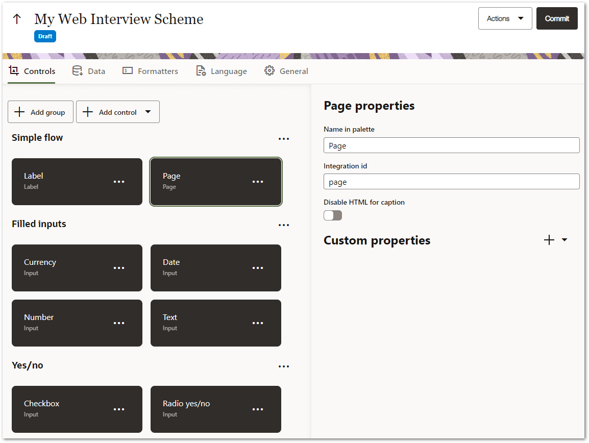
 Controls tab
The Controls tab contains the available controls and control groups that defines the control palette available to flows using this flow scheme.

Controls belong to groups and are alphabetically sorted within the group.
At the top of the Controls tab are buttons for Add group and Add control.
Controls can be moved between groups either by dragging or by using Shift-Control-Up arrow or Shift-Control-Down arrow. There are also menu items on the control that can be used to move the control to an adjacent group (Move to previous group and Move to next group).
Control groups can also be reordered in a similar way.
Clicking on an item selects it, and show its properties in the properties panel.
Data tab
The Data tab contains the input data fields and objects that the flow scheme makes available to flows that use the scheme.

There is an Add button for adding input data fields and objects to the flow scheme. There is also a pen button and a trash can button for editing and deleting input data fields and objects respectively.
Formatters tab
The Formatters tab contains the number and date formatters for the flow scheme.
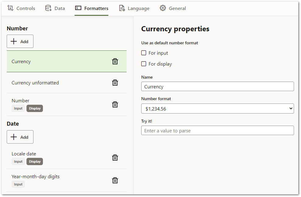
Clicking on an item selects it, and show its properties in the properties panel.
The default output format for a group (Number or Date) has the Display tag (only one formatter for each group can have this), and any formatter that is configured as a default input format has the Input tag.
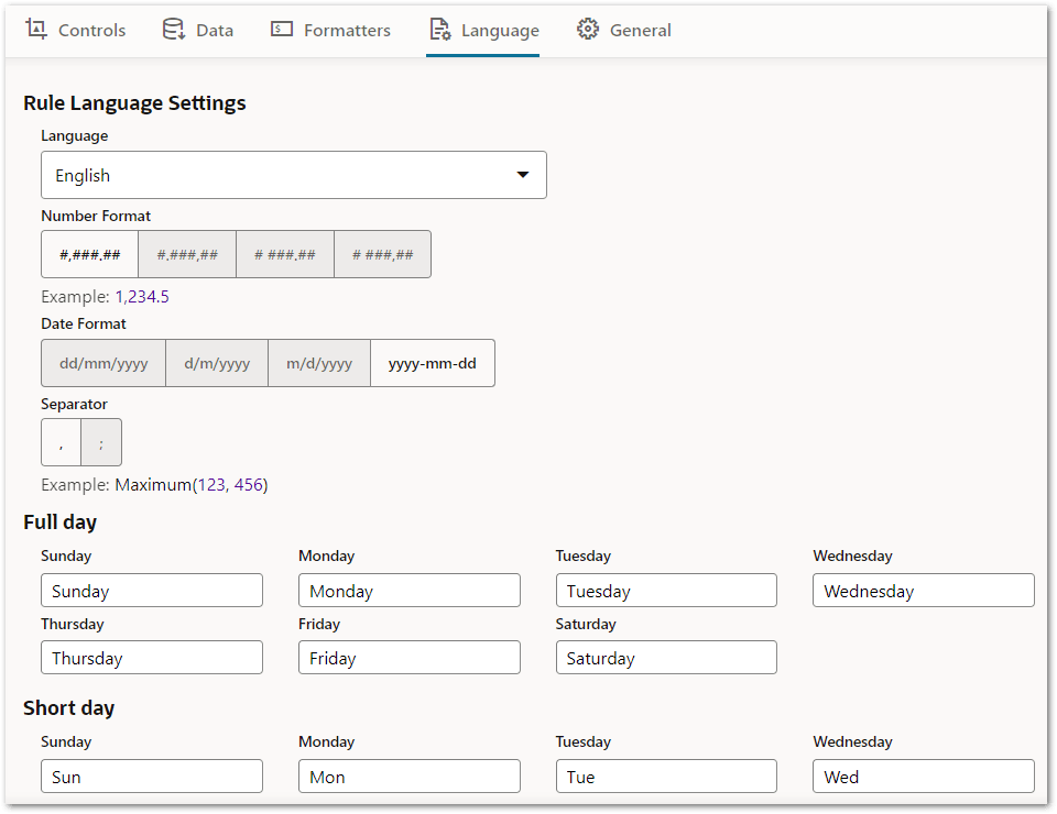
Language tab
The Language tab contains the rule language settings, as well as various strings pertaining to the text used for the flow scheme.
General tab
The General tab contains other settings for the flow scheme.
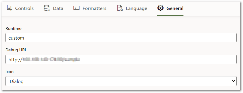
The Runtime setting specifies an identifier that can be used to identify the runtime engine that is expected to support this scheme.
The Debug URL is an optional URL used for enabling the Run button in the flow authoring experience. For more information, see Run a Flow.
The Icon setting specifies the icon that will be used for displaying projects that use this scheme on the Projects Page, and for deployments that use this scheme on the Deployments Page. The options are given in Table 1.
| Icon setting | Icon |
|---|---|
| Dialog |
|
| Chat |
|
| Workflow |
|
| Task |
|
| Request |
|
| Flow |
|
Properties panel
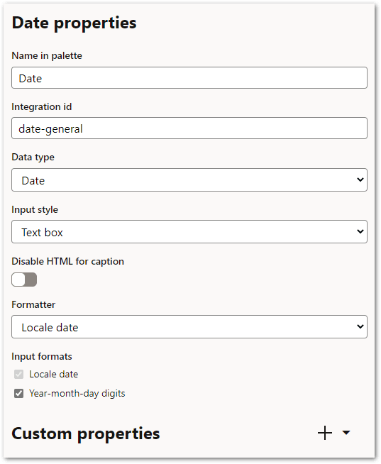
The properties panel displays the properties of the item selected on the Controls or Formatters tab. The set of properties available will differ depending on the type of item and the configuration of the item in the flow scheme.