Marketing Operations Center
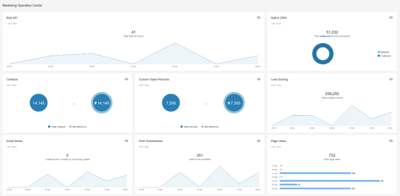
The Marketing Operations Center provides a holistic health view of your Eloqua system. All of the system activity and usage metrics are consolidated in one place, with more accurate, modern, and intuitive detail views.
In this topic, you'll learn about:
- Understanding the Marketing Operations Center
- Understanding the tiles
- Timezones in the Marketing Operations Center
Understanding the Marketing Operations Center
To open the Marketing Operations Center, navigate to Home , then click Operations Center. You must have interface access rights to view the Marketing Operations Center.
Using the dashboard tiles
Each tile on the Marketing Operations Center helps you monitor activity and performance of the specific area of your Oracle Eloqua instance.
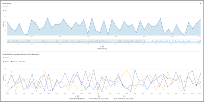
This section describes how to use the common features of the tiles, using the Email Sends tile as an example.
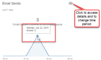
Tile: Each tile on the Marketing Operations Center shows a summary for each area.
- By default, the tiles show the last 7 days of activity.
- Move your mouse over the data points, and a tooltip will display more details of the specific point being viewed.
- Click the details view button
 to access the details view.
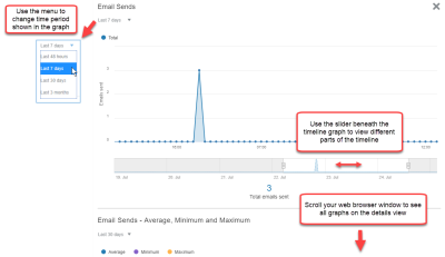
Details view: On the details view for each tile, you can view all graphs available for the area.
- Use the time filter menu to change the time period for a graph.
- For dashboard tiles showing the "Last 7 days" view, there is a slider at the bottom that you can use to change the time period shown. You can slide it to change the time period shown. You can also grab the handle at either end of the slider and pull it to increase or decrease the time period shown.
- Move your mouse cursor over the data points on the graphs, and a tooltip will display more details. For example, these details could be the total for that point in time, or it could show a summary for a full day, depending on the time filter you selected and the graph you are using.
- A details view may have more than one graph. Use the scroll bar on your web browser to view graphs that are lower in the details view panel.
Understanding the tiles
Tiles on the Marketing Operations Center focus on the following areas:
- Bulk API
- Native CRM
- Page Views
- Lead Scoring
- Email Sends
- Form Submissions
- Contacts
- Custom object records
Bulk API
This area helps to demonstrate stability and stability issues. The tile shows a graph of Bulk API activity over time, aggregating any activity together.
On the details view, you can see the total syncs and number of records processed during the time period selected (Last 7 days by default). Hovering over a data point in the graph shows the number of records processed for that point in time.
- Syncs: The number of Bulk API syncs over a given time.
- Throughput: The number of records processed over a given time. This data is available in the details view of the graph.
Native CRM
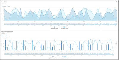
This tile shows the data being pushed into (and pulled out of) your integrated CRM. The data is broken up into inbound and outbound activity. For inbound, only throughput is available. For outbound, you can view throughput, oldest in queue, and waiting in queue. The total transfers, age in minutes, and contacts in the last hours are shown when you hover over a data point in the Waiting and Oldest Queue graph.
You can view the following metrics on the details view:
- Outbound records: The number of outbound records processed over a given time. Hovering over a data point in the Native CRM graph shows number of outbound records at that point in time.
- Inbound records: The number of inbound records processed over a given time. Hovering over a data point in the Native CRM graph shows the number of inbound records at that point in time.
- Oldest in Queue: The age in minutes of the oldest item waiting in the queue. This metric is shown in the details view of the tile on the Waiting and Oldest Queue graph. Hovering over a data point in the graph shows the time range for that data point, as well as the age in minutes that the oldest transfer has been in the queue.
- Waiting in Queue: The number of transfers waiting in queue. This metric is shown in the details view of the tile on the Waiting and Oldest Queue graph. Hovering over a data point in the graph shows a time range for that data point, as well as how many transfers are waiting in the queue. This metric can be used in combination with the age in queue to determine if there is a problem with batches not moving through the queue.
Page Views
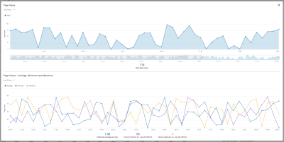
This tile shows page view data. Page view data helps you determine the value and quality of site content, and it shows how responsive recipients are to campaign and email content. You can view the patterns of total, average, minimum, and maximum views to identify patterns, such as when email and campaign recipients are more and less likely to view your pages.
You can view the following metrics:
- Page Views: This graph displays the total number of page views for the time period. Hover over a data point to view the total page views for that point in time.
- Page Views - Average, Minimum and Maximum: This graph is available on the details view. It shows the average, minimum, and maximum page views for either the last 30 days or the last 3 months. Hover over a data point to see the day's average and minimum and maximum per hour.
Lead Scoring
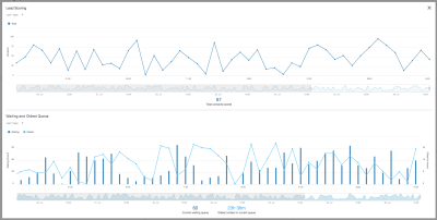
This area helps you monitor lead scoring in your Eloqua instance. The tile shows the number of contacts scored-per-time unit. The total batches, age in minutes, and number of contacts scored / unit time are shown to the left of the graph for quick reference.
You can view the following metrics:
- Contacts scored: This option displays the number of contacts scored over a given time. Hovering over a data point in the Lead Scoring graph shows the number of contacts processed for that point in a time.
- Oldest in Queue: The age in minutes of the oldest item waiting in the queue. This metric is shown in the details view of the tile on the Waiting and Oldest Queue graph. Hovering over a data point in the graph shows minute values for that point in time.
- Waiting in Queue: The number of transfers waiting in queue. This metric is shown in the details view of the tile on the Waiting and Oldest Queue graph. Hovering over a data point in the graph shows the number of contacts waiting in the queue for that point in time. This metric can be used in combination with the age in queue to determine if there is a problem with batches not moving through the queue.
Email Sends
This tile allows you to monitor the email sending performance. The Email send area shows campaign size, as well as system health as indicated by the processing rate.
You can view the following metrics:
- Emails Sent: This graph displays the total number of emails sent during the time period. Hover over a data point to view the total emails sent for that point in time.
- Emails Sent - Average, Minimum and Maximum: This graph is available on the details view. It shows the average, minimum, and maximum emails sent for either the last 30 days or the last 3 months. Hover over a data point to see the day's average and minimum and maximum per hour. The graph also shows the historical average per hour and the hourly maximum for the day selected.
Form Submissions
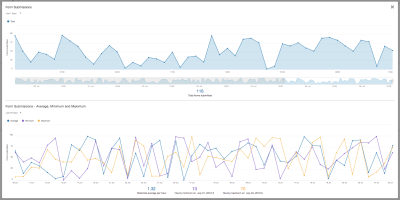
This tile shows form submissions data. Form submissions data helps you determine campaign performance, because it shows how responsive recipients are to campaign content. You can view the patterns of total, average, minimum, and maximum views to identify patterns, such as when campaign recipients are more and less likely to respond to the campaign, based on when they submit data through forms.
You can view the following metrics:
- Form Submissions: This graph displays the total number of form submissions for the time period. Hover over a data point to view the total form submissions for that point in time.
- Form Submissions - Average, Minimum and Maximum: This graph is available on the details view. It shows the average, minimum, and maximum form submissions for either the last 30 days or the last 3 months. Hover over a data point to see the day's average and minimum and maximum per hour.
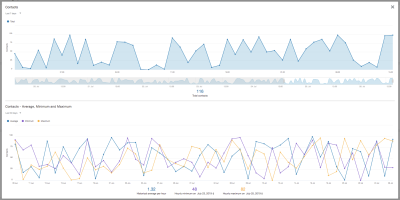
Contacts
This tile shows data about the number of contacts in your database. Contacts data identifies patterns of growth and decline in your contacts database, as well as providing you with a benchmark of historical data. This information provides a responsiveness index for your content and marketing activities.
You can view the following metrics:
- Contacts (summary view): This graph shows the new and total number of contacts over the time period shown (Last 7 days by default).
- Contacts (details view): This graph displays the total number of contacts for the time period. Hover over a data point to view the total number of contacts at that point in time.
- Contacts - Average, Minimum and Maximum: This graph is available on the details view. It shows the average, minimum, and maximum number of contacts for either the last 30 days or the last 3 months. Hover over a data point to see the day's average and minimum and maximum per hour. Below the graph, you can view the historical average per hour, as well as the hourly minimum or hourly maximum for the dates you select.
Custom object records
This tile shows data about the number of custom object records in your database. This will allow you to maintain and review current and historical information regarding the growth or decline of your custom objects records.
You can view the following metrics:
- Custom Object Records (summary view): This graph shows the net difference and total number of custom object records over the time period shown (Last 7 days by default).
- Custom Object Records (details view): This graph displays the total number of custom object records for the time period. Hover over a data point to view the total number of records at that point in time.
- Created Custom Object Records: This graph is available on the details view. It displays the amount of newly created custom object records for the time period. Hover over a data point to view the number of created records at that point in time.
Timezones in the Marketing Operations Center
Data in the new Marketing Operations Center is displayed in the timezone you specify in your user profile. However, if you specify one of the following timezones, data will be displayed slightly shifted:
| Actual timezone specified | Timezone to which data is adjusted |
|---|---|
| UTC-9.30 | UTC-10 |
| UTC-4.30 | UTC-5 |
| UTC-3.30 | UTC-4 |
| UTC+3.30 | UTC+3 |
| UTC+4.30 | UTC+4 |
| UTC+5.30 | UTC+5 |
| UTC+5.45 | UTC+5 |
| UTC+6.30 | UTC+6 |
| UTC+9.30 | UTC+9 |
| UTC+10.30 | UTC+10 |
