Configuring Mobile Page Elements
Mobile Configuration provides settings that you can configure to modify standard page elements. You can update the same settings through Mobile Customization, including additional ones available for custom mobile processes only.
The following table provides a list of settings available for each mobile page element:
|
Page Element |
Example |
Settings |
|---|---|---|
|
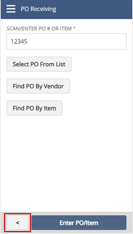
Action Button |
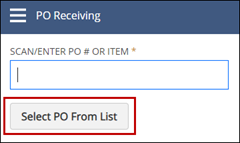
|
Label Layout Display Order Visibility Condition Disable Field Condition Autoclick Condition For standard mobile processes only:
For custom mobile processes only:
Action settings (print button for mobile printing):
|
|
Back Button |
|
Label Visibility Condition Display Order Content Area |
|
Capture Image Icon |
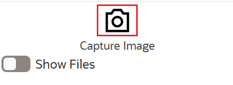
|
Disable Field Condition Display Order Field Name Image State Path Label Mandatory Condition Record Name Reference Transaction State Path Reference Transaction Type Sublist Name Visibility Condition |
|
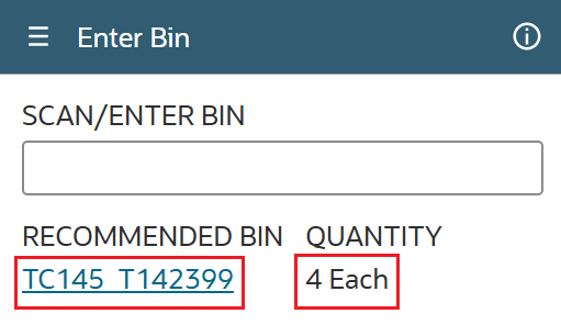
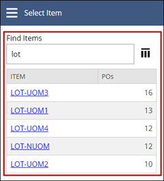
Data Table |
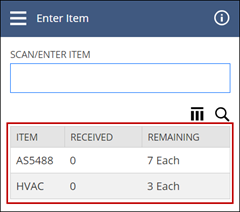
|
Apply Autosubmit To Cache Table Data On Back Navigation Display Order Visibility Condition Include Hidden Element in Load Events Is Mandantory Label Retain Column Filters Row Size Toggle State For standard mobile processes only:
For custom mobile processes only:
Row Colors:
|
|
Date field |
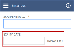
|
Default Value Disable Field Condition Display Order Earliest Date Include Hidden Element In Load Events Label Latest Date Visibility Condition For custom mobile processes only:
Time field settings:
|
|
Dropdown field |
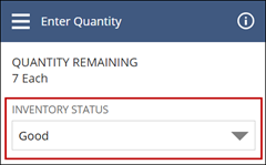
|
Disable Field Condition Disable For Single Value Display Order Include Hidden Element in Load Events Is Mandatory Label Translatable Default Value Visibility Condition For custom mobile processes only:
|
|
Dynamic Text |
|
Label Display Order Visibility Condition Layout Toggle State Toggle Label Text Style Include Hidden Element in Load Events For custom mobile processes only:
|
|
Icon |
|
Display Order Element Icon or Icon Path Label Layout Visibility Condition For icons on standard independent pages only:
For custom mobile processes only:
|
|
Search Grid |
|
Label Search Delay Search Character Count For custom mobile processes only:
|
|
Table Columns (for Data Table and Search Grid) |
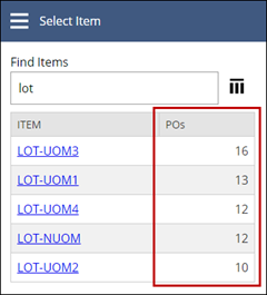
|
Is Visible By Default Label Visibility Condition For standard mobile processes only:
For custom mobile processes only:
For Data Table elements only: Custom Columns Configuration
For URL column data types only:
|
|
Table Configurations (for Data Table, Transfer Table, and Search Grid) |
|
Element settings:
For custom mobile processes only:
|
|
Table Row Color |
|
Color Color Description Column Condition Name Priority |
|
Text Area |
|
Disable Field Condition Display Order Disable Paste Is Mandatory Label Visibility Condition For custom mobile processes only:
|
|
Text Box |
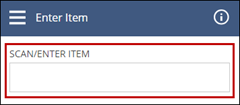
|
Automatically Submit Default Value Default Value Disable Field Condition Disable Paste Display Order Include Hidden Element in Load Events Is Mandatory Label On Scan Custom Action On Validate Custom Action Regular Expression Visibility Condition For custom mobile processes only:
|
|
Transfer Tables (Currently used in NetSuite Ship Central only) |
|
Closed List Group Icon Path Display Order Include Hidden Elements in Load Events Left Table Title Open List Group Icon Path Right Table Title Row Size Visibility Condition For custom mobile processes only:
|
|
Transfer Table Column (Currently used in NetSuite Ship Central only) |
|
Column settings:
For custom mobile processes only:
|
|
UOM (unit of measure) |
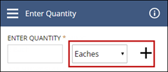
|
Default Value Disable Field Condition Disable Condition for Quantity Only Disable Condition for Unit Only Display Order Is Mandatory Label Visibility Condition Visibility Condition for Unit Only Include Hidden Element in Load Events For custom mobile processes only:
|
|
Upload File Icon |

|
Disable Field Condition Display Order Field Name Label Mandatory Condition Record Name Reference Transaction State Path Reference Transaction Type Sublist Name Visibility Condition |
The following table describes possible values for each setting available for one or more mobile page elements:
|
Settings |
Description |
Values |
|---|---|---|
|
Action Settings:
|
Print action settings that modify the behavior of mobile printing. See Setting Up Automatic or Required Printing. |
Possible values:
|
|
Apply Autosubmit To |
The key to the column to which you want to apply autosubmission. |
Possible values:
|
|
Autoclick Condition |
A condition that determines automatic clicking of an Action Button element. |
Possible values:
|
|
Button Size |
The size of an Action Button element located in the body of a mobile page. This setting does not apply to buttons at the footer of mobile pages, based on their Content Area setting. |
Possible values:
|
|
Cache Table Data On Back Navigation |
Check this box if you want to cache table data when you navigate back to a previous mobile page. |
Possible values:
|
|
Column Order |
Where the column appears, in relation to other columns in the table. For example, a value of 4 places the column after the third column in the table. |
<numeral> |
|
Content Area |
The location on the page where the element appears. |
Possible values:
|
|
Custom action settings:
|
The name of the custom mobile action you want to run for the page element. For example, you can create a custom mobile action for your own restlet and configure it in the On Scan Custom Action field of a text box element. When you scan a bar code using your mobile device, NetSuite calls your restlet from the associated custom mobile action. * The After On Click Action RESTlet is available to buttons only on pages on which data are submitted, usually located toward the end of a process flow. |
<text> |
|
Data Type |
The type of data displayed in the column of a table. |
Possible values:
|
|
Date Field settings: |
|
|
|
Earliest Date |
You can't enter a date in a date field that is earlier than this date. |
<date> |
|
Latest Date |
You cannot enter a date in a date field that is later than this date. |
<date> |
|
Default Value |
The default value that appears in a textbox element. |
<text> For a dynamic text, you can enter the state path for the state field from which you want to obtain the value. Example: state: |
|
Disable Field Condition |
The setting that always or conditionally keeps the page element disabled. |
Possible values:
|
|
Disable For Single Value |
If you check this box, NetSuite disables the associated dropdown element when it contains a single value only. You can't change the value of a disabled element or leave it blank. |
Possible values:
|
|
Disable Paste |
If you check this box, you can't paste text in the page element. |
Possible values:
|
|
Display Label |
For URL column data types, the label or readable text that appears in a column cell instead of the actual URL. For multiple URLs, this text appears as a clickable link that displays the list of URLs on a popup window. |
<text> Example: Image link |
|
Display Order |
Where the element appears on the page, in relation to other elements on the page. For example, a value of 4 places the element after the third position on the page. |
<numeral> |
|
Disable Row Click |
If you check this box, you can't tap text in the rows of this page element. |
Possible values:
|
|
Field Name |
The name of the field you want to add and use to store the page element value in a state. By default, the field name value is associated with the record. This value is stored in the state as follows: <record>:<field> If you provide a sublist name, the field name value becomes associated with the sublist. This value is stored in the state as follows: <record>:<sublist>:<field> |
<text> Example: firstname |
|
Image State Path |
Additional detail that appears before the timestamp of a captured image's filename |
state path Example: state: |
|
Include Hidden Element in Load Events |
Indicates whether, during a load event, you want to load the data of an element that is hidden by default. It follows a visibility condition setting that evaluates to false. |
Possible values:
|
|
Include In Group Filter |
Indicates whether you want to set up this column as a row filter. |
Possible values:
|
|
Is Mandatory |
If you check this box, you must enter a value for the element before you can proceed to the next page or step in the mobile process. |
Possible values:
|
|
Is Primary |
If you check this box, you assign the action associated with the on click event of the button as the primary action for the mobile page. |
Possible values:
|
|
Is Visible By Default |
If you check this box, the element appears on the mobile page. |
Possible values:
|
|
Label |
The text that appears on the mobile page and identifies the element. |
<text> |
|
Latest Date |
You can't enter a date in a date field that is later than this date. |
<date> |
|
Layout |
If you set this field to Block, the element appears below or above another element. If you set this field to Inline, the element appears next to another element within the same row or line. |
Possible values:
|
|
Mandatory Condition |
The setting that always or conditionally requires data in the page element. Mandatory conditions override the Is Mandatory setting. |
Possible values:
|
|
On Click |
The mobile action to execute when you tap a page element. |
<action name> |
|
On Load Action |
The mobile action you want to trigger to fetch data when loading this page element. |
<action name> |
|
On Row Click |
The action to execute when you tap a table element's row. |
<action name> |
|
Override Standard Element |
Indicates whether you want to override selections from the standard table to prevent conflicting mobile actions. This setting is available only if you clone a standard Data Table element. |
Possible values:
|
|
Record Name |
The name of the record you want to associate with the page element and store in a state. For page elements with the Field Name field, such as the dropdown list, enter the name of the record that contains the field you want to associate with the dropdown list and store in a state. For example, in the dropdown element, you want to display the first name from the employee records. You can enter the name of the employee record in this field and configure the first name in the Field Name field. |
<text> Example: employee |
|
Reference Transaction State Path |
The state path to the key that holds the internal ID of transaction associated with the mobile process. Set this field along with the Reference Transaction Type for the Image Capture Icon or Upload File Icon. |
state path Example: state: |
|
Reference Transaction Type |
The internal ID of the type of transaction associated with the mobile process. Set this field along with the Reference Transaction State Path for the Image Capture Icon or Upload File Icon. |
internal ID Example: purchaseorder |
|
Regular Expression |
The expected format for the entered text. To be a valid entry, the entered text must match this format. |
<numeral and expression symbols> For example, you can set up a numbers-only field by using the following expression: ^[0-9]*$ |
|
Remove Value On Back Navigation |
Indicates whether you want to persist or retain the value in the field when you navigate to a previous page of a mobile process. |
Possible values:
|
|
Response Key |
The key in the restlet's response from which the table element's response can be fetched. |
<data> |
|
Retain Column Filters |
Indicates whether you want to retain the filters that you select for a table on a mobile page, even when you navigate to another mobile page within the process. The behavior applies throughout an active session. |
Possible values:
|
|
Roles |
One or more roles that can access the icon on a standard independent page. |
<selected roles> |
|
Row Color settings: |
|
|
|
Color used to highlight data table rows |
Standard color values:
|
|
The setting that determines which rows to highlight using a color based on data specified through it |
Possible values:
|
|
Short text that describes when a color is used |
<text> Example: Urgent order |
|
A number greater than zero that indicates the priority of a color with regard to other colors that you set up for the same table |
<numeral> |
|
Row Size |
The number of rows you want to appear on a transfer table. |
<numeral> |
|
Search Character Count |
The minimum number of characters you can enter in a search field, after which results appear. By default, results appear after you enter at least three characters. |
<numeral> |
|
Search Delay |
The number of seconds after which results are shown when you enter text in a search field. By default, results appear only when you tap the search icon or, for some fields, as soon as you enter three characters. |
<numeral> |
|
Select Multiple Rows |
Indicates whether you want to enable multiple row selection by adding a checkbox column to a table. This setting overrides row and column click selection. |
Possible values:
|
|
Server-Side Pagination |
Indicates whether you want to implement server-side pagination, including searching and sorting, for a table element. |
Possible values:
|
|
Show Column Data As Buttons |
If you configure an On-Click action for the column, you can check this box to display data in each row of the column as a button. |
Possible values:
|
|
Show Selected |
Indicates whether the selected value from a table configuration field is displayed at the heading of a table element. For example, you can display the inventory status that you select from the table configuration. |
Possible values:
|
|
Standard Action |
A standard action that you can clone and set up on the associated page element |
<name of standard mobile action> |
|
Sublist Name |
The name of the sublist you want to associate with the field and store in a state. This configuration applies to page elements with the Field Name field, such as the dropdown element. For example, in the dropdown element, you want to display the first names from the list of emergency contacts. You can enter the name of the emergency contact sublist in this field and configure the first name in the Field Name field. |
<text> Example: emergencycontact |
|
Table Row Size |
The number of rows that appear in a table. |
<numeral> |
|
Table Title Placeholder |
The text you want to include in the title that describes the number of selected rows in the table. This title is displayed only if you check the Select Multiple Rows setting. |
<text> You can enter the record type, transaction type, or other descriptive text. For example, if you enter 'sales order' in this field, the following title is shown above the table when 2 rows are selected: '2 Sales Orders Selected'. |
|
Target URL |
A single website address or link to a page or a file in your file cabinet. You can set this up with the Display Label. |
<URL> |
|
Text Style |
The font weight or size of text in a dynamic message. |
Possible values:
|
|
Time Field settings: |
|
|
|
Show Time Field |
If you want to display a time field beside a date field, you can check this box for Date page elements only. For Mobile Configuration, this box appears only if the Is Preconfigured for Time box is checked. When this box is checked, these fields are displayed automatically: Earliest Possible Time, Latest Possible Time, and Default TIme. |
Possible values:
|
|
Default Time |
The default value that appears in the time field. |
Possible values:
|
|
Earliest Possible Time |
The earliest time value that can be entered in a time field |
Possible values:
|
|
Latest Possible Time |
The latest time value that can be entered in a time field. |
Possible values:
|
|
Transfer Table settings (currently used in NetSuite Ship Central only): |
|
|
|
The file cabinet path to the image that you want to appear for the open list group icon on a transfer table. In Ship Central, a list group of cartons or pallets appears in the panel next to the right table. |
file path Example: ~/icons/OpenCartonIcon.svg |
|
The location of the column in a transfer table. |
Possible values:
|
|
The title or heading for the left side of a transfer table. |
<text> |
|
The message you want to appear on the left table when it is empty or no data is shown. |
<text> |
|
The message you want to appear on the right table when it is empty or no data is shown. |
<text> |
|
The file cabinet path to the image that you want to appear for the closed list group icon on a transfer table. In Ship Central, a list group of cartons or pallets appears in the panel next to the right table. |
file path Example: ~/icons/PackedCartonIcon.svg |
|
The title or heading for the right side of a transfer table. |
<text> |
|
Toggle Label |
The toggle's label that you want to appear on a mobile page. |
<text> |
|
Toggle State |
The setting for the toggle button that controls the visibility of the element, usually a data table. |
Possible values:
|
|
UOM settings: |
|
|
|
The setting that determines the disable setting of the quantity subfield of a UOM element. |
Possible values:
|
|
The setting that determines disable setting of the unit subfield of a UOM element. |
Possible values:
|
|
The state path to the key that holds the internal ID of the item to which the unit is associate with. |
state path Example: state:dataRecord:poTable:item:itemId |
|
The state path to the key that holds the internal ID of the unit associated with the item. |
state path Example: state:dataRecord:poTable:item:unit |
|
The minimum positive value that you can enter in the associated quantity field. |
<numeral> |
|
The maximum positive value that you can enter in the associated quantity field. |
<numeral> |
|
Visibility Condition |
The setting that determines whether to always or dynamically show or hide the page element. |
Possible values:
|
To configure mobile page elements:
-
Using the Administrator role, go to Setup > Custom > Mobile - Applications.
-
In the Mobile - Applications List, click View next to the mobile app that contains the page element.
-
Access the mobile page element you want to configure by doing the following:
Tip:If you want to update the same settings for page elements in a custom mobile process, see Customizing Mobile Page Elements. You can also access and update settings available to custom mobile processes only.
-
In the Mobile - Process List, click Configure next to the standard mobile process.
-
On the Mobile Configuration page, in the Page field, select a mobile page.
In the Mobile Page section, the name and title of the page appear in their corresponding fields.
-
On the Page Element subtab, in the Mobile Page Element field, select the page element.
The list in this field contains the standard page elements that appear on the mobile page. It shows the name of the page element followed by the page element type.
-
-
In the Element Settings section, set values in fields for the basic settings that you want to modify or enable. Then, to save the updates that you have made on the Page Element subtab, click Save.
You can refer to the tables in this topic for the list of settings available for a page element.
The following Mobile Customization topics contain guidelines for basic fields that you can also set in standard mobile processes:
-
If you want to configure a table element or its subcomponents, you can do any of the following:
-
In the Element Settings section, you can update the basic table settings.
-
Depending on your table requirements, you can do any of the following:
-
To configure standard table columns, on the Table Columns subtab, in the Column field, select the column. In the Column Settings section, you can update the standard column settings.
-
To configure autosubmission, multiple row selection, or clone tables, see Configuring Mobile Table Elements
-
To add columns to standard table elements, click the Custom Columns Configuration subtab. Refer to the instructions in this section, Adding Columns to Table Elements.
-
To configure the table configuration popup window, on the Table Configurations subtab, from the dropdown list, select a configuration. In the Configuration Settings section, you can update the standard settings.
For more information about the Table Configuration popup window, see SCM Mobile Page Elements (Buttons, Fields, Tables).
-
To configure row colors, see Setting Up Table Row Colors.
-
-
After you update the settings on a subtab, click Save.
-
-
To add custom text boxes, dynamic fields, or dropdown fields to a mobile page, do the following:
-
Click the Additional Page Elements subtab, and then next to the Configuration Page field, click the open icon.
-
On the Mobile - Page page, click the Page Elements subtab, and then click New Mobile - Page Element.
-
On the Mobile - Page Element page, set values for the basic settings such as the name and label of the new page element. Then, in the Type field, select one of the supported page element types: Text Box, Dynamic Text, or Drop Down.
The Mobile - Page Element page contains the same settings for page elements that you can add to custom mobile processes. For more information about these settings, see Customizing Mobile Page Elements.
You can watch the video posted in this topic, SCM Mobile App Configuration.
-
To save the updates that you have made on this subtab, click Save.
-
-
To add an Action Button type of element, see Adding Action Buttons Through Mobile Configuration.
-
Based on your mobile app requirements, you can also do the following configurations:
-
If you use Mobile Printing, to configure automatic and required printing, or inactivate a print report, see Setting Up Automatic or Required Printing.
-
To update menu icon settings on standard independent pages, see Configuring Menu Icons on Independent Mobile Pages.
-
To add and set up image capturing or file upload, see Setting Up Image Capture or File Upload.
-
To copy a standard mobile action, see Cloning Standard Mobile Actions.
-
To add a custom loading text to a copy or custom mobile action, see Setting Up Custom Loading Text for Mobile Actions.
-
-
You can configure more page elements that belong to the same page or a different one. Make sure that you save all your updates before you switch to a different page or page element. After you complete all your configurations for a mobile process, click Save and Update App.
Wait for the update to complete before you try to access the mobile app. To view your updates on the app, see SCM Mobile App Access.
-
To apply configurations to the same app in another NetSuite account, see the following topics: