Working with Scatter Analysis Graphs
Scatter analysis graphs plot one value against another for the same member.
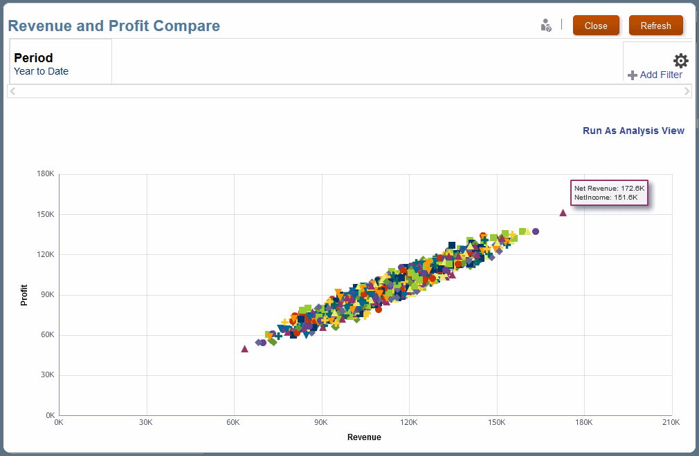
When plotted for a number of members, you can identify trends and also determine if some members deviate strongly from those trends (Figure 12-9). The following graph of Profit against Revenue shows a strong linear correlation of these variables throughout the range of values.
Figure 12-9 A Scatter Analysis Graph of Profit Against Revenue

For illustrations of a scatter analysis graph definition and results, see Scatter Analysis Graph Example.
Most users can generate scatter analysis graphs from existing definitions, but only administrators and others with sufficient security provisioning can define scatter analysis graphs.