Scatter Analysis Graph Example
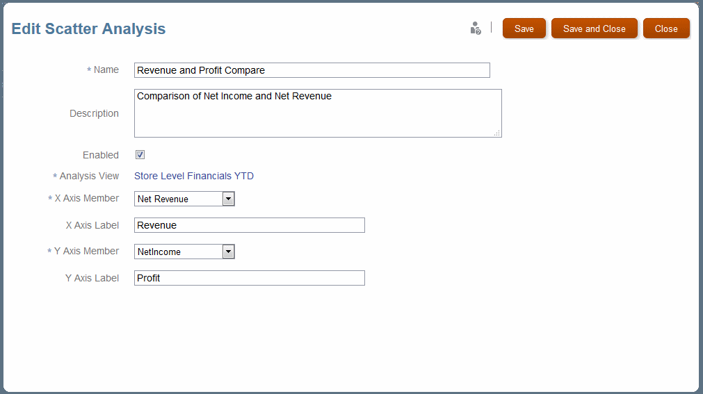
Figure 12-10 shows the definition for a scatter analysis graph.
Figure 12-10 Definition for a Scatter Analysis Graph

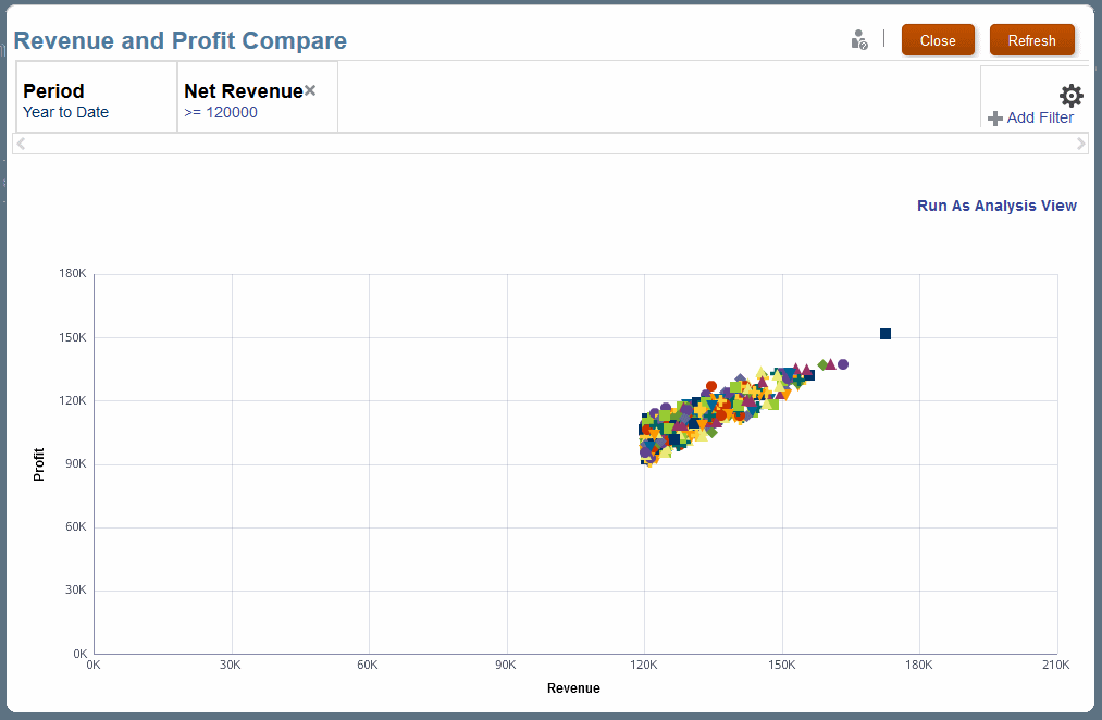
When you select and run this definition and apply a filter, the scatter analysis graph displays as shown in Figure 12-11. All data is included, but values are filtered to show only profit-revenue pairs with net revenue greater than $120,000. The graph is quite linear, which suggests a strong relationship between net profit and net revenue. You can click Run As Analysis View to display the graphed data in a table for further analysis.
Figure 12-11 A Filtered Scatter Analysis Graph of Profit Against Revenue
