Analyze planning results using a Supply Chain Network visualization
You can now use the Supply Chain Network visualization in supply plans and replenishment plans to explore upstream and downstream supply networks, from finished goods organizations through intermediate stocking points to supplier sites. You can search for items or categories by text entry, or use filters for item, category, and date. The category selection narrows the available item values, and date filtering defaults to the plan horizon while refreshing measure data for the selected date range. Use the Measures drop-down list and the hover tooltip for measures to review planning metrics directly from the visualization.
The display of echelons is determined by sourcing relationships defined in the plan. The network can show supplier sites, intermediate organization layers, and finished goods organizations. The visualization supports display for multi-tier suppliers, alternate suppliers, and the same item across multiple organizations. You can control the display of supplier sites in the echelon using the Show supplier level option in the Supply chain network properties drawer.
You get improved visibility into multiechelon supply networks so that you can investigate planning results with fewer context switches. Context-aware drill-down, saved searches, measures, and highlight controls help planning teams analyze supply, demand, exceptions, and supplier relationships more efficiently.
The Supply Chain Network visualization provides an end-to-end view of the supply chain, helping you understand how material flows across multiple echelons, from supplier sites through manufacturing and distribution organizations to the organizations that fulfill end demand.
The visualization represents the supply chain as an interactive network of organizations and supplier sites connected by sourcing relationships defined in the plan. The network is rendered from left to right with the rightmost echelon representing the finished goods organizations and each successive echelon representing organizations further upstream in the supply chain.
Refer to the Visualizations section in Analyze Supply Plans Using a Configurable Redwood Page on how to configure the Supply Chain Network visualization in your plan.
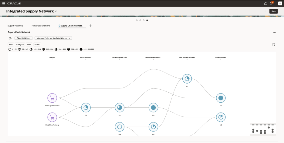
Supply Chain Network visualization
Key visualization elements include:
- Organization and Supplier Site nodes: Represent the locations participating in the supply chain.
- Arcs: Represent sourcing relationships between supplier sites and organizations, and between organizations.
- Measure-based node visualization: Node fill indicates the relative value of the selected Supply Planning measure, so that you can quickly identify areas requiring attention.
- Interactive highlighting: Trace upstream or downstream sourcing relationships from any selected node.
Echelon-based network structure
The Supply Chain Network is organized into multiple echelons (tiers), where each echelon represents a group of locations at the same level in the supply chain.
The leftmost echelon represents Supplier Sites when supplier visibility is enabled. Subsequent echelons contain downstream manufacturing, component, and distribution organizations, and the rightmost echelon contains the finished goods organizations associated with the selected items.
Each organization is assigned to an echelon by traversing the sourcing relationships defined in the plan. Shared organizations appear only once within an echelon, even when they participate in the supply chain for multiple items, providing a consolidated view of the network.
You can rename echelon headers using the Edit Properties action.
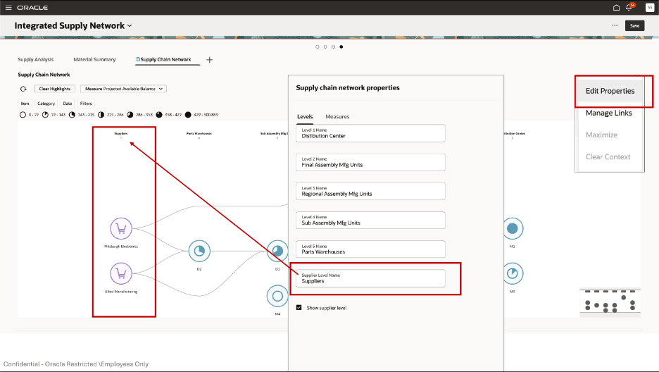
Editing name of an echelon
The user-defined echelon names are displayed as column headers in the network visualization such as:
- Suppliers
- Parts Warehouse
- Subassembly Manufacturing Units
- Regional Manufacturing Units
- Final Assembly Manufacturing Units
- Distribution Centers
Default tiered layout in the Supply Chain Network
- The network renders in a left-to-right, column-based hierarchy
- By default, all echelons of the network are shown
- Each echelon is displayed as a fixed vertical column
- Nodes are aligned consistently within their respective echelons for readability
Node and arcs representation in the Supply Chain Network
The Supply Chain Network visualization is constructed from the relationships defined in the sourcing rules in the assignment set for the plan.
By default, the visualization shows all the inventory organizations in the plan as nodes organized in different echelons. When you search for a specific segment or category, the nodes in the first level on the right will be limited based on the search filters. All upstream nodes to the left are then displayed based on the sourcing relationships for those end items. The arcs capture the full breadth of manufacturing, procurement, and transfer relationships across all components of an end item (for example, the keyboard, display, and battery for a laptop), with the nodes representing the organizations.
Example: Analyze upstream and downstream supply relationships
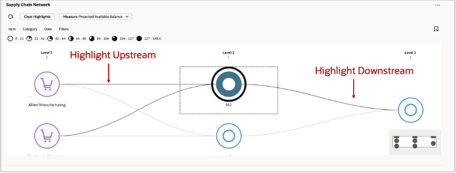
Illustration of upstream and downstream supply relationships for a selected organization
Consider that you search for a finished good using the Item filter. The Supply Chain Network first identifies the organizations associated with the searched item at the end of the supply chain and then uses the sourcing relationships defined in the plan to construct the network of organizations that contribute to supplying that item.
The network is rendered with the end-of-chain organization in Level 1 on the right. Moving from right to left, Level 2 contains the organizations that supply the Level 1 organization, and Level 3 contains organizations further upstream in the sourcing chain. If additional sourcing levels exist for the searched item and its components, they're displayed as additional echelons to the left.
The nodes represent organizations, not individual items. Therefore, an organization displayed in an upstream echelon can contain many items. It's included in the network because the sourcing relationships for the searched finished good and its components establish a supply relationship through that organization.
After the network is rendered, you can select an organization to investigate its supply relationships. In this example, M2 in Level 2 is selected.
Select Highlight Upstream to trace the organizations that directly or indirectly supply M2. The applicable sourcing arcs and organization nodes to the left of M2 are highlighted, so that you can identify the upstream organizations on which M2 depends.
Select Highlight Downstream to trace the organizations that M2 directly or indirectly supplies. The applicable sourcing arcs and organization nodes to the right of M2 are highlighted, so that you can follow the material flow from M2 toward the organization at the end of the supply chain.
Nodes and arcs that aren't part of the selected upstream or downstream path are faded into the background. You can start with the finished good specified in your search criteria and then progressively investigate the organizations and sourcing relationships that contribute to its supply across multiple echelons.
Network rendering
The rightmost column represents the end point of the supply chain, typically a distribution center from which finished goods are shipped to the customer. Each column to the left represents an upstream echelon in the sourcing chain, with the leftmost column containing the supplier sites of components in the end-item sourcing relationships.
Example: Electronics category
Consider a category called Electronics containing end products such as Laptops. When you search for a product such as Laptops, the network is built as follows:
- The end items (Laptop and other finished products in the segment) are identified first.
- The sourcing rules for each end item are traversed to determine which organizations are involved in manufacturing, procuring, and transferring the item and all its components across the supply chain.
- Nodes represent the organizations; arcs represent the sourcing relationships that exist across all components of the end item (keyboard, display, battery, and so on) capturing the interorganizational relationships.
- When you search by product (such as Laptops), all organizations and arcs that have an end item or component assembly manufacturing relationship for that product are rendered.
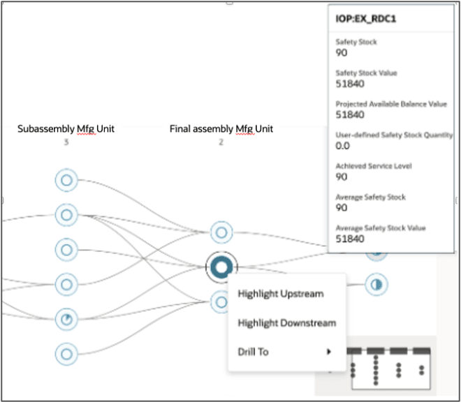
Nodes and arcs in a Supply Chain Network
Node fill behavior
The scale of the pie-chart style icon at the node represents the value of the selected measure for the items in each node.
Show or hide the supplier level
The Supply Chain Network visualization can optionally include a Supplier echelon, enabling you to extend the network beyond inventory organizations to include supplier sites and their sourcing relationships.
You can control the visibility of the Supplier echelon from the Edit Properties dialog box. Select Edit Properties from the visualization toolbar, and then select or deselect the Show supplier level option on the Levels tab.
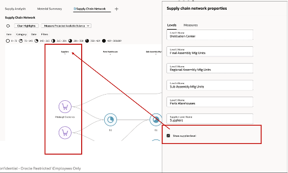
Show supplier level
When Show supplier level is selected, the visualization adds a new Supplier echelon as the leftmost column in the network. Supplier site nodes are rendered for all supplier sites that have sourcing relationships with the organizations currently displayed in the network. Directed arcs connect each supplier site to its downstream organization, extending the network to show the complete upstream supply chain.
Supplier site nodes support the same interactive capabilities as organization nodes. You can hover over a supplier node to view supplier-specific measures, highlight upstream or downstream sourcing paths, and drill to related planning information. Supplier nodes display supplier capacity measures, including Supplier Capacity Available, Supplier Capacity Required, and Supplier Capacity Utilization, allowing you to analyze supplier constraints together with the rest of the supply network.
When Show supplier level is deselected, the Supplier echelon and its associated sourcing relationships are removed from the visualization. The remaining organization echelons retain their layout and relationships, providing an organization-only view of the supply chain.
Interactive highlighting
When you select a node on the visualization, the selected node is highlighted with a bold outer ring, visually distinguishing it from all other nodes on the canvas. In the following illustration, D1 node from the Subassembly echelon is the selected node and is shown with a prominent, bold circular border.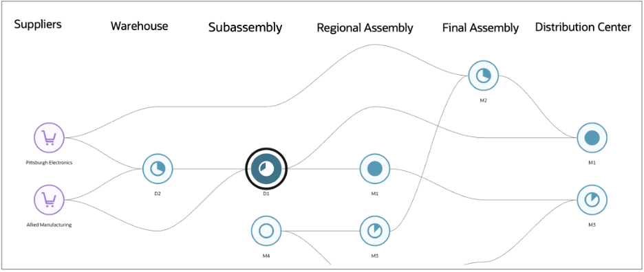
Selecting highlights the node
On hovering over nodes, a tooltip panel appears adjacent to the node, showing the measure values for that organization such as Projected Available Balance, Projected Available Balance Value, Planned Orders, Total Demand, and Demand At Risk Value.
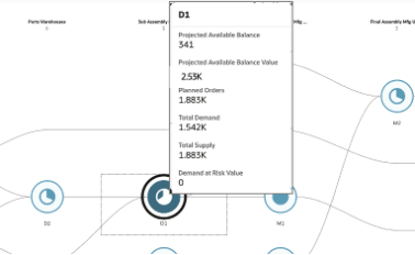
Tooltip when hovering on a node
When you right-click on a given node, a context menu appears with three options, Highlight Upstream, Highlight Downstream, and Drill To.
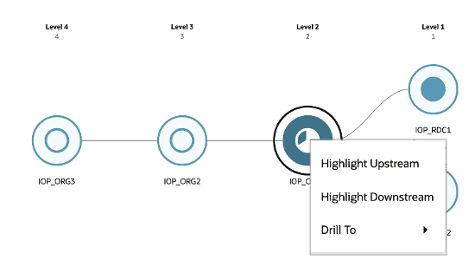
Context menu options
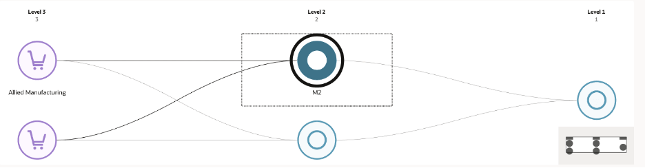
You can choose to highlight upstream or downstream. Selecting Highlight Upstream traces all sourcing relationships flowing left from the selected node, that is, all organizations that directly or indirectly supply the selected node.
Highlighting upstream
In the preceding image, highlighting upstream for the selected node (M2) would emphasize all connected nodes in the immediate left and any further echelons to the left, along with the arcs connecting them to the selected node. Only organizations that have a direct sourcing arc leading into M2 are highlighted, not every node in those echelons.
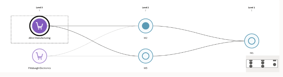
Selecting Highlight Downstream traces all sourcing relationships flowing right from the selected node, that is, all organizations that the selected node supplies to. For Allied Manufacturing in the following image, highlighting downstream emphasizes the connected nodes in the rightmost echelons and the arcs leading to them.
Highlighting downstream
Related arcs are emphasized, while unrelated nodes and arcs are visually faded. You need to refresh the network view to clear the highlights.
Clear highlights
After highlighting upstream or downstream sourcing relationships, you can restore the network to its default view by selecting Clear Highlights on the toolbar.

Clear highlights action
The Clear Highlights option removes all active node and arc highlights from the Supply Chain Network visualization, restoring the default appearance of the network. This action clears all highlighted upstream and downstream paths without affecting the current search filters, selected measure, date range, or network layout. It allows you to quickly begin a new analysis without resetting the visualization context.
Searching the Supply Chain Network
The Search capability enables you to quickly locate, filter, and analyze specific portions of the supply chain network. It supports multidimensional exploration across items, time, categories, and measures, dynamically updating the visualization to reflect the selected context.
You can search the network using either the search box or suggested filters.

Suggested filters chip for supply chain network
- Item: Selects one or more items using the search box or select from the filter’s list of values.
- Category: Filters by the category hierarchy configured for the plan.
- Date Range: Limits measure values to a specific planning horizon.
Applying search criteria dynamically refreshes the network. Organizations or supplier sites without measure values for the selected date range aren't displayed.
Zooming and mini-map guidance
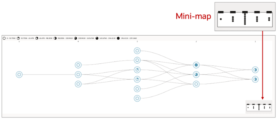
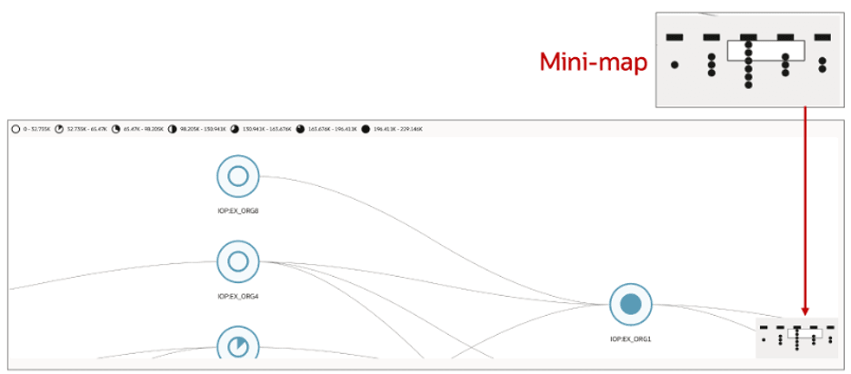
The Supply Chain Network visualization supports a continuous zoom range between a minimum (fit-to-screen) and a maximum zoom level. The following two screenshots represent the two extremes of this range. All intermediate zoom levels are available via scroll wheel, pinch gesture, or the zoom control panel.
Default view zoom(fit-to-screen)
Default zoom level view
At the default (minimum) zoom level, the entire network is scaled to fit within the available canvas. At this level:
- All nodes are visible simultaneously, rendered at their smallest size.
- Node labels are hidden to prevent overlap. The pie-chart fill within each node indicates the relative measure value.
- Arcs are visible as thin curved lines connecting nodes across supply chain tiers.
- Tier echelon column headers remain visible along the top of the visualization.
- The mini-map viewport indicator covers the entire mini-map because the full network and the canvas view are coextensive at this level.
Maximum zoom
Maximum zoom level view
At the maximum zoom level, a small subset of nodes fills the canvas. At this level:
- Nodes are rendered at full size with their labels fully visible beneath each node. For example, Suppliers echelon shows S1 as a supplier site node, or Manufacturing Assembly echelon shows M1 and a manufacturing org node.
- The pie-chart fill within each node icon is more prominent for measure value clearer for individual nodes.
- Only a small number of nodes are within the viewport and the rest of the network is off screen.
- The mini-map viewport indicator shrinks to a small rectangle, reflecting the narrow slice of the network currently in view. This rectangle moves in real time as you zoom in and out of the network visualization.
Intermediate zoom levels
At zoom levels between the default and maximum, nodes and labels progressively come into view as you zoom in, with the mini-map viewport indicator scaling continuously to reflect the proportion of the network visible on the canvas. The curvature and relative appearance of the arcs remain consistent across all zoom levels.
Measure selection in Supply Chain Network
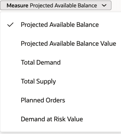
Measure drop-down list
The Supply Chain Network visualization is driven by a selected measure, which determines the color gradation used for rendering the nodes.
Use the Measure drop-down list on the toolbar to select the planning measure displayed on the Supply Chain Network visualization. The selected measure determines the values shown on each node and the corresponding node fill, and you can compare relative measure values across the network.
Changing the selected measure refreshes the visualization, updating the node values, color distribution, and hover tooltips while preserving the current network layout, search filters, and highlighting.
Configuring measures in the Supply Chain Network
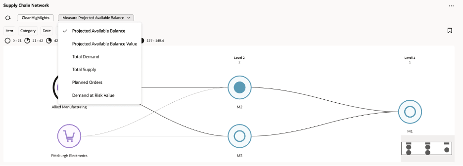
Measures list
You can select the measure to analyze from the Measure drop-down list on the visualization toolbar.
By default, the following measures are available for selection in a supply plan:
- Projected Available Balance
- Projected Available Balance Value
- Total Demand
- Total Supply
- Planned Orders
- Demand at Risk Value
By default, the following measures are available for selection in a replenishment plan:
- Projected Fill Rate
- Projected Available Balance Value
- Item Locations with Stockouts
- Stockout Cost
- Item Locations with Safety Stock Violations
- Total Demand Value
- Safety Stock Value
You can change the measures available in the Measure list using Edit Properties for the Supply Chain Network visualization.
Select the Edit Properties option from the visualization’s menu, and then select the Measures tab.
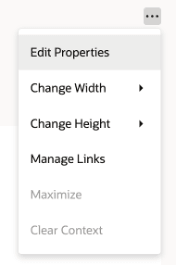
Edit Properties action
The Measures tab displays the Supply Chain Planning measures that are available for use with the visualization, organized by measure group. You can search for a measure or browse the available measure groups and select the measures that you want planners to use when analyzing the network.
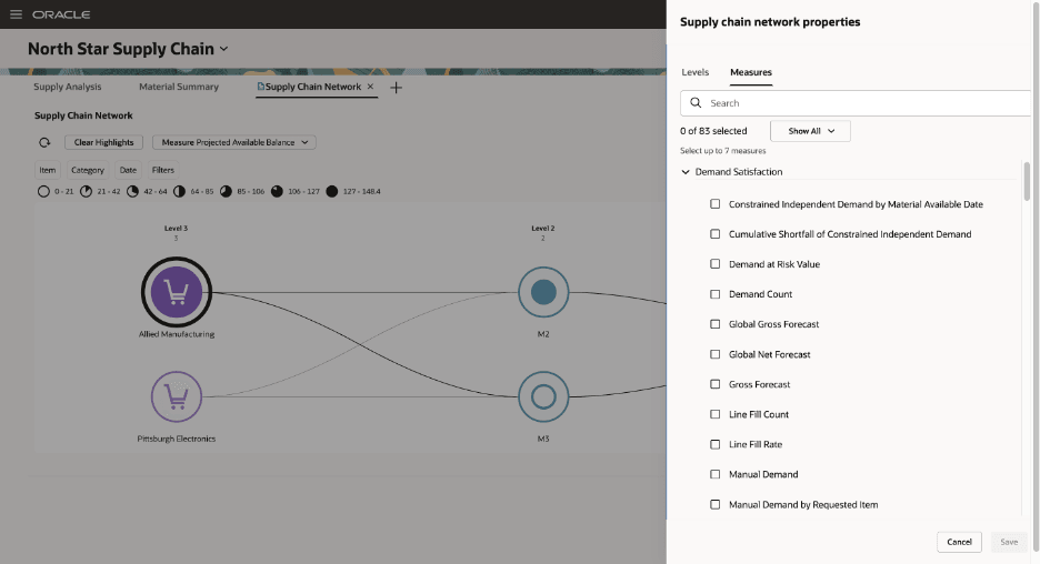
Measures tab in the Edit Properties drawer
You can select up to seven measures. Your selection isn't limited to the measures provided by default. You can select other applicable Supply Chain Planning measures, including measures that you've created, and make them available directly from the Measures list.
After you save the visualization properties, the measures you selected replace the default selection in the Measures list. You can then switch between these measures directly from the toolbar without returning to Edit Properties.
When you select a measure from the toolbar, the Supply Chain Network refreshes the measure information displayed for the network. The node fill and the value ranges in the legend are recalculated based on the selected measure, enabling you to visually compare the measure values across organizations in different echelons of the supply chain.
This measure configuration gives you the flexibility to tailor the Supply Chain Network to the planning metrics that are most relevant to your business and use the same network visualization to analyze both predefined measures and planning measures you’ve created.
Drill-To Navigation from the Supply Chain Network
The Supply Chain Network visualization supports context-sensitive Drill To actions. You can navigate directly from a selected organization or supplier site to related planning pages for further analysis.
To access the available drill targets, right-click a node and select Drill To from the context menu. The destination page opens with the appropriate planning context automatically applied, eliminating the need to manually recreate filters.
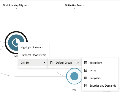
Drill to options in the Supply Chain Network visualization
The available drill targets include:
- Exceptions: Opens the Exceptions page filtered to the selected organization or supplier site. When applicable, the selected item and date range are also passed to the destination page.
- Items: Opens the Items page filtered to the selected organization. You can review item-level planning information for that location.
- Suppliers: Available only for Supplier Site nodes. Opens the Suppliers page filtered to the selected supplier and supplier site.
- Supplies and Demands: Opens the Supplies and Demands page filtered to the selected organization or supplier site. Where applicable, the selected item and date range are also passed to provide continuity between the network visualization and detailed planning analysis.
By preserving the planning context during navigation, with Drill To functionality you can move seamlessly from high-level supply network analysis to detailed operational investigation.
User-defined drill-to links
In addition to the predefined drill visualizations, you can configure your own drills to any table, graph, or page layout within Supply Chain Planning using the Manage Links option from the Actions menu of the Supply Chain Network visualization.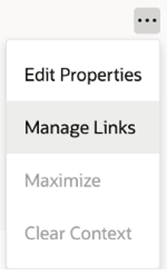
Manage links option
Once you’ve selected the Manage Links option, you can do the following:
- Create a link to another table, graph, page, or AI Agent
- Review the details of an existing link
- Edit the properties of an existing link
- Delete an existing link
Steps to enable and configure
You don't have to do anything to enable this feature.
Key resources
- For information on how to configure a visualization, refer to Analyze Supply Plans Using a Configurable Redwood Page in the Oracle Fusion Cloud Supply Planning 25B What's New.
Access requirements
Users who are assigned a configured job role that contains these privileges can access this feature:
| Privilege status | Privilege name and code |
|---|---|
| Existing |
Monitor Plan Inputs Work Area MSC_MONITOR_PLAN_INPUTS_WORK_AREA |
| Existing |
Monitor Demand and Supply Planning Work Area MSC_MONITOR_DEMAND_AND_SUPPLY_PLANNING_WORK_AREA |
| Existing |
Monitor Supply Planning Work Area MSC_MONITOR_SUPPLY_PLANNING_WORK_AREA |
| Existing |
View Planning Objects REST Service MSC_VIEW_PLANNING_OBJECTS_REST_SERVICE_PRIV |
| Existing |
Grant Search Framework Manager Permissions FND_SEARCH_FWK_MGR_PRIV |
| Existing |
FSCM REST Service Access Integration FUN_FSCM_REST_SERVICE_ACCESS_INTEGRATION_PRIV |
These privileges were available prior to this update.