Configure Metric Cards
The Sales Dashboard comes with the My ToDos and Pipeline metric cards and corresponding pages, but you can add more. This topic illustrates how to create a custom metric card and associated dashboard layout. You do this configuration in Oracle Visual Builder Studio.
Prerequisites
A metric card displays data from a saved search. Before you add a metric card to the Sales Dashboard and configure it, you must:
-
Create the saved search
-
Share the saved search with the appropriate job role
-
Capture the UUID of the saved search. For details see the topic How can I find the UUID for a saved search in Sales in the Redwood User Experience?
Overview of Setup
To add a metric card, you must:
-
Duplicate a metric card layout.
See Duplicate a Layout.
-
Add a new metric card and make note of the metric card ID.
-
Optionally add a set of badges to a metric card.
-
Associate a dashboard page layout to the new metric card by adding the metric card ID to the dashboard page layout's condition.
Duplicate a Layout
In this example, let's add a My Todos metric card to the sales representative's version of the Sales Dashboard.
To start, you must first duplicate an existing layout.
-
Navigate to the Sales Dashboard.
-
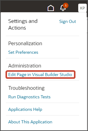
Under the Settings and Actions menu, select Edit Page in Visual Builder Studio.
-
Select the Redwood Sales project that's already set up for you. If only one project exists, then you will automatically land in that project.
-
If you're working in an active sandbox when you launch Visual Builder Studio from Digital Sales, then Visual Builder Studio looks for a workspace that's associated with your sandbox. If you're not working in a sandbox when you launch Visual Builder Studio, then Visual Builder Studio looks for a workspace without a sandbox. You might have to select a workspace if more than one workspace exists. If no workspace exists, then Visual Builder Studio automatically creates one for you.
-
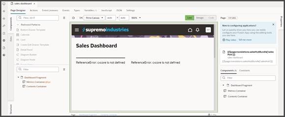
When you enter into your workspace in Visual Builder Studio, you land on the Page Designer. This is where you create your application extension.
The Sales Dashboard is displayed in the main design area called the canvas.
-
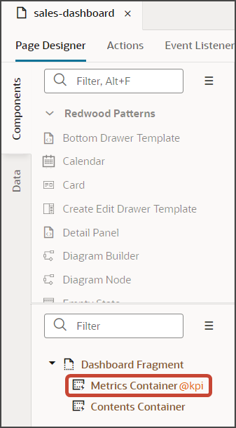
In this example, let's add a My Todos metric card to the sales representative's version of the Sales Dashboard.
On the Structure pane, click the Metrics Container node.
-
On the Properties pane, scroll down to the Sales Representative Metrics layout.
-
Click the Duplicate icon to make a copy of the layout.
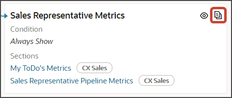
Visual Builder Studio makes a copy of the layout named Sales Representative Metrics (Copy).
You're now ready to make changes to the dashboard layout.
Add a New Metric Card
Let's add a metric card.
-
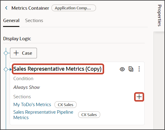
On the Properties pane for the Sales Representative Metrics (Copy) layout, click the + Add Section icon > + New Section.
-
In the Create Section dialog, in the Title field, enter
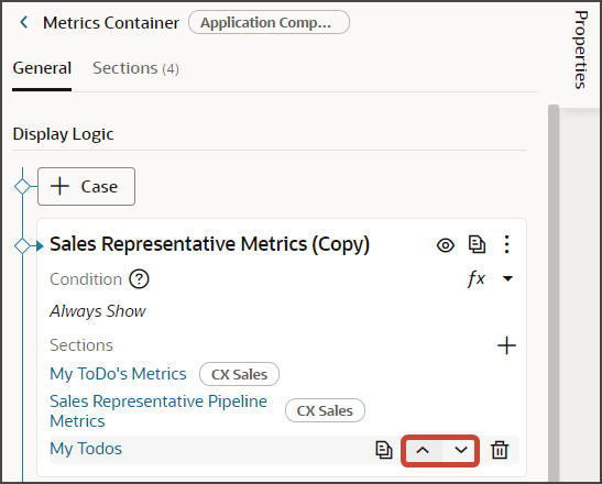
My
                            Todos
, and click OK.Note: The title is the name of the metric card, not how the metric card will appear at runtime on the dashboard. The runtime title comes from the cx-metric-card fragment that you add to the dashboard.The newly added metric card is added to the bottom of the layout. Use the Move Up arrow to move the new metric card to the desired location.
-
Click the My Todos link.
The template editor opens.
-
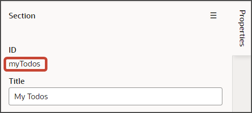
Make a note of the metric card's ID.
-
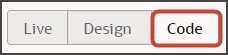
Click the Code button.
Your new My Todos section displays with empty placeholder
templatetags.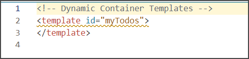
-
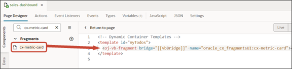
On the Components palette, in the Filter field, enter
cx-metric-card. -
Drag and drop the cx-metric-card fragment to the template editor, between the template tags.
-
Add the following parameters to the fragment code so that the code looks like the below sample:
<template id="myTodos">
  <oj-vb-fragment name="oracle_cx_fragmentsUI:cx-metric-card" bridge="[[ vbBridge ]]">
    <oj-vb-fragment-param name="resource" value="[[ {"name": "activities", "primaryKey": "ActivityId", "endpoint": "cx" } ]]"></oj-vb-fragment-param>
    <oj-vb-fragment-param name="query" value="[[ [{"type": "savedSearch", "params": [{"key": "queryUuid", "value": "b91c2d92-bb85-4a34-82b8-7091e604b697"}]}] ]]"></oj-vb-fragment-param>
    <oj-vb-fragment-param name="aggregate" value="[[ {"field": "PrimaryRevenue.RevnAmount","functionType": "sum" } ]]"></oj-vb-fragment-param>
    <oj-vb-fragment-param name="badgeItem" value="[[ [{status : "success", text : "On-Track", min : "0"}] ]]"></oj-vb-fragment-param>
    <oj-vb-fragment-param name="titleItem" value="[['My Todos']]"></oj-vb-fragment-param>
    <oj-vb-fragment-param name="footerItem" value="Appointments"></oj-vb-fragment-param>
</oj-vb-fragment>
</template>
In your fragment code, be sure to replace
activitiesandActivityIdwith the appropriate values for your object name and primary key.Also, replace the queryUuid value with the saved search's UUID value. Review the values for the other parameters, and adjust as necessary.
This table describes some of the parameters that you can provide for a metric card.
Parameters for Metric Card
Parameter Name
Description
resource
Specify resource details for the saved search, including object name, primary key, and endpoint.
For a list of resource details for common Sales objects, see "Resource Details for Sales Objects" in Add a List to the Redwood Sales Dashboard.
query
Include criteria for querying the data.
The metric card will display a count of records unless you include the "aggregate" parameter.
aggregate
Specify the function to aggregate the data for the metric card.
Use this format:
[[ [{"field": "DealAmount","function":
                                                "sum/min/max etc" }] ]]
Use this parameter only if you don't want the metric card to provide a count of records. Instead, you want to provide a numerical value derived from the underlying saved search.
Available functions to use in this parameter are:
sum,min,max, andavg.The
minandmaxfunctions display either the lowest or highest value of records returned from the saved search.badgeItem
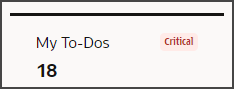
A metric card can include a badge. You can configure metric cards so that different badges display depending on certain conditions.
For example, if a metric card displays 10 open leads, then maybe you'd like the warning badge to display. But if there are only 2 open leads, then maybe you don't want a badge to display at all.
titleItem
Specify the title of the metric card. This title displays on the dashboard at runtime.
footerItem
Optionally specify a footer for the metric card. The footer displays as a description at the bottom of the metric card.
How to Add Metric Card Badges
This setup is optional. If you skip this setup for a metric card, then no badges or descriptions will ever display on the card.
To configure badges on a metric card, you first determine the display conditions. Each condition is a range of aggregate sum numbers that display on the metric card. For each range, you decide which type of badge to display. For example, you can configure this type of setup:
-
If fewer than 5 overdue tasks exist, then don't show a badge at all.
-
If 5-10 overdue tasks exist, then show a warning badge.
-
If more than 10 overdue tasks exist, then show a critical badge.
When you define the display conditions for a metric card, the order of those conditions is important. Each condition is evaluated in the order in which you define them, from top to bottom. Whichever condition is satisfied first is the condition that's applied.
You can also configure the metric card so that the card always displays the same badge regardless of the aggregate sum on the card.
The following table lists the badge properties that you can use to define a set of badges and display conditions:
| Badge Property | Description |
|---|---|
|
|
Each type of badge ( Here's an example of a "danger" badge with the text "Critical":
|
|
|
Lower limit of the display condition for a specific badge. |
|
|
Upper limit of the display condition for a specific badge. |
|
|
Text that displays on the badge. Each type of badge
( |
Here's a sample of the code that you can use to define a set of badges and display conditions:
[{status : "success", text : "All Good", min : "0",
                max : "10"}, {status : "warning", text : "Attention", min : "11", max :
"50"},{status : "danger", text : "Critical", min : "51"}]-
Specify the type of badge to display (
status). -
Define the conditions (
minandmax) under which each badge (and optionally a description) will display. -
Indicate the badge text (
text). For example, does the badge say Warning or Problem?
Tips:
-
You can specify only a lower limit without an upper limit (to indicate an aggregate sum that's greater than 10, for example).
-
You can add metaText without any range conditions. So, if none of the ranges apply, then show a description on the metric card.
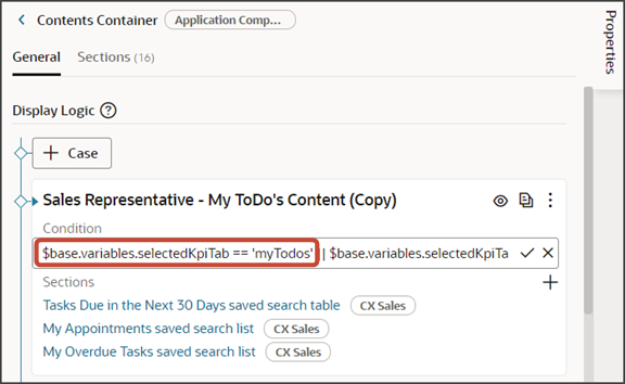
Associate a Dashboard Layout to Your New Metric Card
After you add a new metric card to a metric card layout, you must associate a dashboard layout to the card. Do this so that, when users click the metric card at runtime, the right dashboard page displays.
To associate a metric card with a dashboard layout:
-
Retrieve the metric card's ID that you earlier saved.
-
Navigate to the dashboard layout that you want to associate with the new metric card. For example:
-
Click the dashboard layout's condition to replace the existing metric card ID with the new ID.
Use this format for the layout condition:
$variable.selectedKpiTab == '<metric card id>'For example:
$base.variables.selectedKpiTab == 'myTodos'
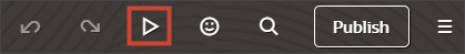
Test Your Changes
Test the new metric card to confirm the aggregate sum displays correctly. Also confirm that the right dashboard page displays when you click the card.
-
Test the modified dashboard layout by previewing your application extension.
Click the Preview button to see your changes in your runtime test environment.
-
The resulting preview link will be:
https://<servername>/fscmUI/redwood/cx-sales/dashboards/sales-dashboard Change the preview link as follows:
https://<servername>/fscmUI/redwood/cx-sales/application/container/dashboards/sales-dashboard
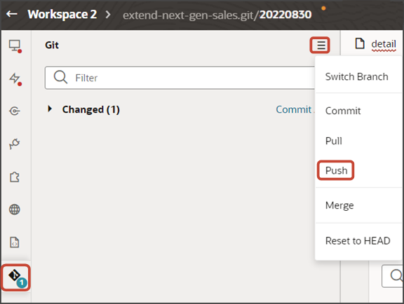
Save your work by using the Push Git command.
Navigate to the Git tab, review your changes, and do a Git push (which does both a commit and a push to the Git repository).