Three-Bar Neighbor Comparison
The Three-Bar Neighbor Comparison is designed to motivate customers to save energy based on how they see themselves in relation to their neighbors. It compares the customer (“You”) to two groups: “Efficient Homes” and “Similar Homes.” The results are displayed in a horizontal bar graph. A brief message indicates how the customer compares to efficient homes in the area. An informational section below the bar graph explains that "Efficient Homes" represent the 20% of similar homes in the customer's comparison group that used the last amount of energy in the billing period and provides information about how the graph works. An insight statement located below the Three-Bar Neighbor Comparison indicates whether the customer falls in one of three states: good, great, or using more than average.
The neighbor comparison in Digital Self Service - Energy Management mirrors the customer's report experience. For example, a customer that receives the Efficiency Zone in their report will also see an Efficiency Zone in Digital Self Service - Energy Management. For more information about the web version of the neighbor comparison, see Digital Self Service Energy Management Neighbor Comparison.
Appears in: Progress Report, Welcome Report, Limited Income Report, Annual Report, Time of Use Report, Solar Report, Electric Vehicle Report
On this page:
Requirements
Utility Requirements
|
Category |
Description |
|---|---|
|
Required Cloud Service |
Energy Efficiency Cloud Service |
|
Scale |
Maximum of 300,000 a week. |
Customer Requirements
|
Category |
Description |
|---|---|
|
Billing Frequency |
Monthly, bi-monthly, quarterly. |
|
Data Delivery Frequency |
Monthly and bi-monthly. |
|
Data Requirements |
Billing data and third-party data. |
|
Data History |
A minimum of one historical bill. |
|
Data Coverage |
Not applicable. |
|
Supported Fuels |
Electric, gas, and dual fuel. |
User Experience
This section describes the user experience for the Three-bar Neighbor Comparison Module. The module varies by report type, service type, and other factors. See the User Experience Variations for additional information about the variations.
Progress Three-Bar Neighbor Comparison Graph
This image is an example of the Three-bar Neighbor Comparison module, which is a part of most standard report types.
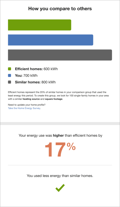
Heading: The heading notifies the customer that the Three-Bar Neighbor Comparison gives them a comparison of their energy use to similar homes.
Bar Chart: The bar chart displays how much energy each group in the comparison used. Typically, the bar with the smallest value is on top and the bar with the largest value is on the bottom.
- You: This bar indicates how the customer is doing. This is often a color that corresponds to the utility brand color.
- Similar Homes: This bar indicates how all the customer's neighbors are doing. It is usually a gray or neutral color. The energy use data that is shown is the mean energy use value.
- Efficient Homes: This bar displays a usage value for the most efficient 20% of the customer's similar homes. It is usually colored green because green is commonly associated with energy efficiency. Note that the efficient homes value that appears in the module is not an average of the top 20% of similar homes. A threshold value—the 20th percentile of similar homes—is used to determine the efficient homes value. Efficient homes are not chosen in advance.
Legend: A legend included below the graph indicates what portions of the graph indicate the customer's home energy use , efficient homes, and similar homes.
Explainer Text: The explainer text indicates what data goes into the comparison graph and provides the customer with a way to improve or correct these details in the Home Energy Analysis.
- Great: Less than or equal to Efficient Homes.
- Great: Close to Efficient Homes.
- Good: About the same as Similar Homes.
- Good: Lower than Similar Homes.
- Fair: More than Similar Homes.
Top Insight: The top insight displays a percentage for either how much more or less the customer used compared to their "efficient homes. For example, "29% more electricity than efficient homes." The percentage color changes depending on where the customer's usage falls on the Benchmark Module gauge. If the customer's usage is "great" or "good" the percentage is green. If the customer's usage falls in the "fair" range, the percentage is orange. By default the percentage threshold for the top insight is >100%. When the threshold is exceeded, alternative insight statements are used to ensure that the insights have a material impact on the user. See the User Experience Variations for more information.
Bottom Insight: The bottom insight tells the customer how their usage compared to compared to "neighbors" (that is, all neighbors, including efficient neighbors). The insight states are related to the Benchmark Module states of Great, Good, and Fair.
Note: Occasionally, the customer's previous bills do not coincide exactly in time with the previous bills of the customer’s efficient homes. In order to arrive at the similar homes averages, it is necessary to align the similar homes energy use amounts with the customer's energy use amounts. In these scenarios, the application pro-rates, or "time-shifts," the similar homes bills to align with the customer bills by determining and adjusting for the amount of overlap. The time-shifted neighbor bills are then used to determine the neighbor averages.
Solar Three-bar Neighbor Comparison
The Three-bar Neighbor Comparison for Solar Reports. accommodates net zero and excess generation (negative) reads. The graph varies based on the benchmark state, fuel type, neighbors and similar homes language, and whether the customer has positive, negative, or net zero energy use. The module in the Solar Report differs from the Progress Report in the following ways:
This image is an example of the Three-bar Neighbor Comparison module included in the Solar Report.

Bar Chart: The bar chart shows a customer's net energy compared to other homes with solar. The comparison groups are informed by the same logic as the standard experience but only include other homes with solar. To help orient the customer, three increment indicators and one net zero indicator appear on the graph. A single increment indicator appears before the net zero indicator.
Bar Graph Categories:
- Efficient Homes with Solar: This bar displays a usage value for the most efficient 20% of the customer's similar homes.
- Similar Homes with Solar: This bar indicates how all the customer's neighbors with solar are doing.
- You: This bar indicates the customers energy use.
- Graph Comparison State: The graph comparison states are determined by whether the customer has positive, negative, or net zero energy use.
- Positive Comparison State: In a positive comparison state, all graph bars show positive readings, meaning that the customers used more energy than their panels produced.
- Straddle Comparison State: In the straddle comparison state, the graph shows a mix of positive and negative reads. The module varies based on fuel type, language type, and whether the customer's "You" bar is positive or negative.
- Negative Comparison State: If the customers used less energy than their panels produced, all graph bars show negative readings. The module varies depending on the customer's benchmark state and fuel type.
- Legend: A legend included below the graph indicates what portions of the graph indicate the customer's home energy use , efficient homes with solar, and similar homes with solar.
- Explainer Text: The explainer text section of the solar Three-bar Neighbor Comparison module includes definitions of net energy, comparison groups, and fuel used in the insights.
- Top Insight: The top insight is the large colored numeric percentage which displays the customer's status relative to Similar Homes. By default the percentage threshold for the top insight is >100%. When the threshold is exceeded, alternative insight statements are used to ensure that the insights have a material impact on the user. See the User Experience Variations for more information.
- Bottom Insight: If the solar customer uses more energy than their solar panels produced, the secondary insight will display a gray exclamation point.
Electric Vehicle Three-Bar Neighbor Comparison
The Three-bar Neighbor Comparison for Electric Vehicle Reports is adapted to show the impact of electric vehicle charging on home energy use. The graph varies based on the benchmark state, fuel type, and whether the customer has similar homes or neighbors language.
This image is an example of the Three-Bar Neighbor Comparison module included in the Electric Vehicle Report.

Heading: The heading indicates that the customer will be compared to other homes.
Billing period: The billing period dates applicable to the report.
Bar chart: The bar chart shows a customer's energy use compared to other single family homes that may or may not have electric vehicles. The comparison groups are informed by the same logic as the standard experience but includes the customer's electric vehicle charging. Bar graph categories include:
- Efficient Homes: This bar displays a usage value for the most efficient 20% of the customer's similar homes.
- Similar Homes: This bar indicates how all the customer's neighbors are doing.
- You: This bar highlights the home energy use in relation to Efficient and Similar homes. It includes the customer’s home energy use, electrical vehicle charging, and total energy use, but excludes electric vehicle charging.
The appearance of the bar graph varies depending on the customer's comparison state. Possible comparison states include:
- Fair: Home energy use, excluding electric vehicle charging, was more than efficient homes or average neighbors.
- Good: Home energy use, excluding electric vehicle charging, was more than efficient than similar homes or average neighbors.
- Great: Total energy use, excluding electric vehicle charging, was less than efficient homes or average neighbors.
- Near: Within more or less than five percent of the average efficient homes or average neighbor value.
Legend: A legend included below the graph indicates what portions of the graph indicate home energy use excluding EV charging, and energy use for EV charging at home.
Explainer Text: The explainer text defines the comparison group and efficient homes. The explainer state and text is determined by the available customer data. For example, square footage, heating source, home type, and fuel type data.
Top Insight: The first insight displays a percentage for either how much more or less the customer used compared to their "efficient homes. The percentage color changes depending on whether the customer's usage is Great, Good, and Fair. By default the percentage threshold for the top insight is >100%. When the threshold is exceeded, alternative insight statements are used to ensure that the insights have a material impact on the user. See the User Experience Variations for more information.
Bottom Insight: The second insight tells the customer how their usage compared to compared to all neighbors, including efficient neighbors.
Usage Lookback Three-Bar Neighbor Comparison
The Usage Lookback Report educates gas-only customers about their energy use during the heating season of the previous calendar year. This image is an example of the Three-bar Neighbor Comparison module included in the Usage Lookback Report:

The Three-bar Normative Comparison module in the Usage Lookback Report type varies from Progress Report the in the following ways:
- Heading: The heading specifies the duration of time the chart covers or the start month of the duration.
- Bar Chart: The bar chart displays a longer period of time than the usual monthly or bi-monthly period shown in a Progress Report.
User Experience Variations
The user experience of the feature may vary for customers and utilities depending on their service types (gas, electricity, dual fuel, and so on), available data, costs, locale, and other factors.
Gas-Only and Dual Fuel
Gas-only and dual fuel customers see a variation in the units of energy displayed in the Three-Bar Neighbor Comparison module. The electricity unit “kWh” is replaced by “therms” for gas-only customers and “units” for dual fuel customers.
Seasonal Report
The Seasonal Report includes the Seasonal Normative Comparison module by default, instead of the three-bar Neighbor Comparison or Efficiency Zone. The Three-bar Neighbor Comparison may be used in place of the default Seasonal Normative Comparison module. See the Seasonal Normative Comparison for more information.
Annual Report
The annual version of the module differs from the Progress Three-bar Neighbor Comparison in the following ways:
- Heading: The heading specifies the months for which the chart covers.
- Bar Chart: The bar chart displays how much energy each group in the comparison used during the months included in the Annual Report.
Seasonal Lookback Report
The seasonal lookback version of the module differs from the Progress Three-bar Neighbor Comparison in the following ways:
- Heading: The heading copy includes the count of months for the date range that is configured, or the start month for the date range that is configured.
- Bar Chart: The bar chart displays how much energy each group in the comparison used during the months included in the report. Therms are used as the unit of measurement for gas customers.
Insight Statements
The insight statements provide the customer with a summary of their energy use compared to efficient homes or average neighbors. The insight statements can vary depending on the report type, benchmark state, fuel type, and percentage insight threshold. By default, the percentage insight threshold for the top insight is >100%. When the threshold is exceeded, alternative insight statements are used to ensure that the insights have a material impact on the user.
The following table provides an example of how the insight statement can vary for an electric-only or dual-fuel customer in a "Good" benchmark state.
| Comparison Language | Insight Type | Example Insight |
|---|---|---|
| Similar Homes | Standard |
Top Insight Your energy use was higher than efficient homes by 48% Bottom Insight You used less energy than similar homes |
| Similar Homes | Alternative |
Top Insight Your energy use was higher than efficient homes Bottom Insight You used less energy than similar homes |
| Neighbors | Standard |
Top Insight Your energy use was higher than efficient neighbors by 48% Bottom Insight You used less energy than average neighbors |
| Neighbors | Alternative |
Top Insight Your energy use was higher than efficient neighbors Bottom Insight You used less energy than average neighbors |