Understanding the Flex Operations Workspace
The Flex Operations workspace is displayed after successfully logging on.
The workspace is comprised of a banner and a panel for displaying tools (for example, Events and Crews and Event Details).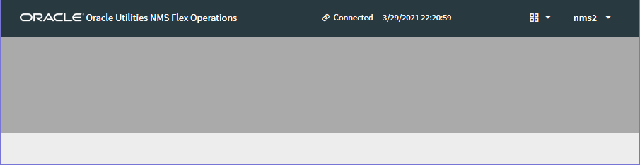
Understanding the Workspace Banner
The Flex Workspace banner displays connection information and access to the tools you need to manage outages:
The banner contains the following information and interaction buttons.
1. Application Name
2. Connection Indicator
3. Tools Selection Menu
4. User Menu
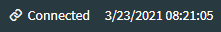
Understanding the Connection Indicator
The Connection Indicator shows the client's connection status and a system time based on that status.
• Connected clients display a link symbol, the word Connected, and the current system (server's) date and time.
• Disconnected clients display a broken link symbol, the word Disconnected, and the date and time when the disconnect occurred.
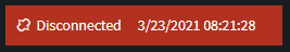
Note: You cannot view or edit any information while disconnected.
Understanding the Tool Selector
The Tool Selector ( ) provides a drop‑down list of tools that you may open or switch between. The options are:
) provides a drop‑down list of tools that you may open or switch between. The options are:• Events and Crews: Displays the Events List and the Crews List; see “Working with the Events and Crews Tool”.
• DMS Status Summary: Displays the DMS Status Summary; see .
• Authority: Opens the Authority dialog box, which allows you to subscribe or unsubscribe from control zones; see “Using the Authority Dialog Box”.
• Switching Sheet List: Opens the Switching Sheet List; see “Understanding Switching in Flex Operations”.
Note: To close a tool, click the Close button ( ) on the tool's tab or in the tool's title bar.
) on the tool's tab or in the tool's title bar. Understanding the User Menu
The User menu provides the following options.
• About: Displays version and other application information.
• Settings: Launches a Settings dialog box that allows you to configure the appearance or behavior of certain user interface elements.
• Dark Theme: Switches the user interface to a dark theme, which is suitable for low light conditions. This setting is saved with your User Preferences.
• Alternate Row Coloring: When selected, data table rows will have alternating colors.
• Allow Clicking Table Headings to Sort: When selected, you can click the column heading to sort the table on that column. If it is not selected then you must use the Sort button on the Sort/Quick Filter toolbar that is displayed beneath column headings when they are hovered with the mouse or touched on a touch enabled device. See “Understanding Table Sorting” and “Understanding Table Filtering” for more information on sorting and filtering tables.
• Show Shortcut Text on Checkboxes/Radio Buttons: When selected, check boxes and radio buttons will show an associated shortcut key in their label, if one exists. This setting allows you to disable the label shortcut text if you feel you are familiar enough with them. For example, in the illustration below, the Map Hide/Display Landbase option is not showing a shortcut when the check box (from this Settings option) is deselected [1] and showing the shortcut (B) when the check box is selected [2]; any configured shortcuts for check boxes and radio buttons will always be shown in the tooltip if hovered with the mouse [3]. 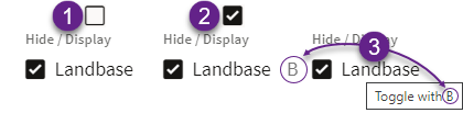
• Thicker Scroll Bars: When selected, makes vertical and horizontal scroll bars wider than their default. This setting is saved with your User Preferences.
Note: If you are using a mouse with a scroll wheel, it is generally faster to scroll through the table. See “Scrolling Using a Mouse Scroll Wheel”.
• Logout: Logs you out of Flex Operations.
Understanding the Tabbed User Interface
You can toggle between tools by using the tabs at the bottom of the Workspace. Most tools open a tab at the bottom of the Flex Operations client workspace.
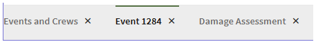
You may switch between tools by clicking the tool's tab. For some tools, when you open a different instance (such as an event or switching sheet), the tab updates with the identification of the current instance; for example, if you have Event 1284 open in Event Details, and then open Event 1285, the tab will update to Event 1285 and load that event's data.
Understanding Common User Interactions
Using Keyboard Shortcuts
Many buttons and tabs have keyboard shortcuts. Hover over the component to display the shortcut.
Many single-action dialogs that allow text entries also provide a Ctrl+Enter shortcut to save the text and confirm the dialog.
Setting Font Size
The font size in Flex Operations is tied to the browser magnification. Change the font size by holding down the Ctrl key and rolling the mouse wheel toward or away from you.
Scrolling Using a Mouse Scroll Wheel
Vertical Scrolling
Use the scroll wheel to scroll vertically (up and down) through a list.
Horizontal Scrolling
Press and hold the Shift key while turning the scroll wheel to scroll horizontally (side to side).
Understanding Common Table Features
Understanding Table Components
The following image shows an illustrated screen capture of a table showing call outs for the components.

2. Filter and Selection History ( ) shows a list of recent filters, which may include Column Quick Filter additions, and selected rows. See “Understanding Quick Filters” for more information on column filters.
) shows a list of recent filters, which may include Column Quick Filter additions, and selected rows. See “Understanding Quick Filters” for more information on column filters.3. Disable Filtering button ( ) temporarily disables (removes) currently applied filters; clicking the button again restores the filters.
) temporarily disables (removes) currently applied filters; clicking the button again restores the filters.4. The applied filter name (for example, To Do & In Progress).
5. Column Filter results shows the column being filtered and the number of rows that meet the column filter criteria; see “Understanding Quick Filters”.
6. Reset All Column Filters button ( ) removes any quick filtering selections; see “Understanding Quick Filters” for more information.
) removes any quick filtering selections; see “Understanding Quick Filters” for more information. 7. Save the Current Filters button ( ) allows you to save the combination of the filter and column quick filter criteria.
) allows you to save the combination of the filter and column quick filter criteria.8. Filter results; see “Understanding Table Filtering” for details.
9. The table Search button. See “Understanding Searching in Tables” for details on using the Search feature.
10. The header row check box allows you to select all of the table rows.
11. The column sort arrow icon shows the current sort direction for that column; clicking it will sort the table by that column. See “Understanding Table Sorting” for details.
12. The column filter button ( ) appears on any column being used in a quick filtering. When you click the button, the values available to filter on are listed allowing you to modify the quick filter; see “Understanding Quick Filters”.
) appears on any column being used in a quick filtering. When you click the button, the values available to filter on are listed allowing you to modify the quick filter; see “Understanding Quick Filters”. Changing Column Order and Display
There are a number of options to reorder (move) and hide columns.
• Select a column heading and drag the column to its desired new position.
• Right click a column header and select Hide Column to hide the column.
• Right click a column header and choose Organize Columns... to open the Columns dialog box that allows you to reorder and hide columns.
• Hide or show columns by deselecting or selecting them, respectively.
• Reorder columns by dragging the column row up or down the list.
• Use the positioning buttons to move the column to the top of the list (first column in table), up one position (left in table), down one position (right in the table), or to the end (last column in the table).
Example
The Events List table showing the Status column [1] selected and displayed, [2] deselected and hidden, and [3] displayed and moved to the left in the table.

Changing Column Widths
Move the mouse pointer over a column heading vertical separator until it changes shape, then click and drag the column to its desired width. You can also right click on any column header and choose Auto Size Column or Auto Size All Columns to let the system auto-correct column widths.
Restoring List Defaults
Right click any header and choose Restore Default Settings to revert all display changes that you have made to that list.
Using Right-Click Context Menus
In lists like Events and Crews, commonly accessed functions are available from the right‑click context menu. Switching steps can also be progressed through right-click context menus.
Revealing Additional Row Information
In many lists, double-clicking a row will display more information about the row. For example, double‑click an Events row to open its Event Details.
Understanding Table Sorting
Sorting by a Single Column
Tables may be sorted by a column by clicking the column heading or by clicking a Sort button ( ) that is displayed in a toolbar that drops down when your mouse hovers over the column heading.
) that is displayed in a toolbar that drops down when your mouse hovers over the column heading. 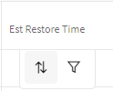
Note: In addition to the Sort button, a Quick Filter button ( ) is displayed. See “Understanding Quick Filters” for information.
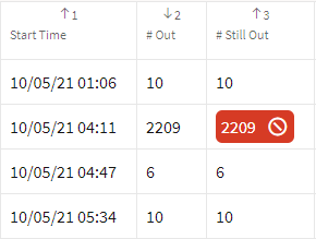
) is displayed. See “Understanding Quick Filters” for information.The Sort double arrow button () is available when the table is not being sorted by that column; once a column is included in a sort, the button will display the current sort direction and clicking it will reverse the sort. Sorting a column will also update the column heading cell to show the sort direction; the sort direction icon is enabled as a button when you hover over it.
) is available when the table is not being sorted by that column; once a column is included in a sort, the button will display the current sort direction and clicking it will reverse the sort. Sorting a column will also update the column heading cell to show the sort direction; the sort direction icon is enabled as a button when you hover over it.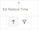
Note: Once you sort on a different column, the previous sort column heading updates to remove the sort direction icon.
Sorting by Multiple Columns By Column Selection
If you press the Shift key while selecting columns, each column will be included in a sort. The sort hierarchy is based on the selection order, which is indicated by a number next to the sort direction in the column heading cell.
You can change the sort direction for any of the selected columns by pressing Shift and either clicking the sort direction button in the column header or in the drop down toolbar.

Note: If you do not press Shift, you multiple column selection will be lost.
Sorting by Multiple Columns Using the Advanced Sorting Options
To display the Columns dialog box with sorting options, right click a column heading, select Sort and then Show Advanced Sort Options... from the context menu.
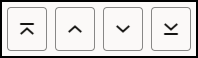
The Columns dialog box displays a list of all columns in the table and will be expanded to show a sort configuration pane. Select the column name and then click the Add to sorting list button ( ). Once columns have been added, you may arrange the sort order using the controls below the list or by dragging the column name to the desired spot in the list; see “Changing Column Order and Display” for information on the Columns dialog box controls. Set the sort type by clicking the button on the left to get the proper sort direction.
). Once columns have been added, you may arrange the sort order using the controls below the list or by dragging the column name to the desired spot in the list; see “Changing Column Order and Display” for information on the Columns dialog box controls. Set the sort type by clicking the button on the left to get the proper sort direction.Understanding Table Filtering
Creating and Using Global and Personal Filter
Tools with table data may be filtered using filter panes that allow you to access Global (system-wide) filters and create and rearrange your own (Personal) filters. You may also create shortcuts to your favorite filters. Filtering in Flex Operations is very similar to filtering in the Web Workspace (see “Filtering Data Tables”).
To use an existing filter, click the Filter icon ( ) in the upper left corner of the table title area; the Filter pane will open.
) in the upper left corner of the table title area; the Filter pane will open.
The Filters pane has collapsible sections (folder icons that expand) that list filters that you have set as Favorites, Global filters saved by your organization, and Personal filters that you have created.
The filter pane will close once you click away from it; to keep it visible, click the pin icon ( ).
).
).Create a New Personal Filter Folder Structure
To create a personal filter folder, right-click the Personal folder icon and select New Folder....
Create a New Personal Filter
To create a personal filter, do the following:
1. Select the Personal folder that you want to add the filter to, right‑click, and select New Filter....
2. In the New Filter dialog box, enter the criteria for your filter.
• Name: Your new filter's name.
• Value: Becomes active when you select an operator that requires a value to match.
Note: See “Filtering Data Tables” for the operator.
3. Click Add to List to add the filter criteria to list below.
4. You can build more criteria and select whether they all should match or if any can match. Click And to have the filter only show data that matches all of the added filter criteria; click the Or to match a criterion.
Editing and Removing Filters
To edit a filter statement, select it from the list, make your changes, and click Replace.
Removing Filters
You can remove any of the added filter statements by selecting it in the list and clicking Remove. To remove all of the statements in the list, click Clear.
Temporarily Disabling a Filter
Filters may be temporarily disabled by clicking the Disable Filter button () next to the filter name. The Filter Name will be updated with strikethrough text to indicate that it is not active. For example, if you’ve selected In Progress to be your filter, but then decide to disable it, the filter bar will indicate so. Click the No Filter button again to restore the filter.
) next to the filter name. The Filter Name will be updated with strikethrough text to indicate that it is not active. For example, if you’ve selected In Progress to be your filter, but then decide to disable it, the filter bar will indicate so. Click the No Filter button again to restore the filter.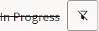
Understanding Quick Filters
Quick Filters allow you to filter based on values in a column. To perform a quick filter, hover your mouse over a column heading and then click the filter button ( ) in the drop down toolbar. In the filter panel that opens, select an item to filter or enter the criteria in the Search box. Once you have filtered on a column, the filter icon (
 ) will be displayed in the column header and a quick filter breadcrumb will display the filter results and criteria.
) in the drop down toolbar. In the filter panel that opens, select an item to filter or enter the criteria in the Search box. Once you have filtered on a column, the filter icon () will be displayed in the column header and a quick filter breadcrumb will display the filter results and criteria. To remove the quick filter, click the Reset All Column Filters button (). The current quick filters can be saved along with the current search folder filters as a new filter in the personal section, by clicking the Save the Current Filters button (), then providing a name for the new filter. If a folder in the Personal filters section is selected, the new filter will be saved there, otherwise it will be saved in the root of the Personal section. The new filter will have a different icon ( ) indicating that there are quick filters associated with it, and when that filter is selected in the tree, the table filtering will be changed to match that saved with the filter.
). The current quick filters can be saved along with the current search folder filters as a new filter in the personal section, by clicking the Save the Current Filters button (), then providing a name for the new filter. If a folder in the Personal filters section is selected, the new filter will be saved there, otherwise it will be saved in the root of the Personal section. The new filter will have a different icon () indicating that there are quick filters associated with it, and when that filter is selected in the tree, the table filtering will be changed to match that saved with the filter.Example:
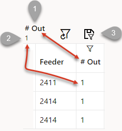
Filtering on the #Out column [1] for a value of 1 [2] with the Save the Current Filters button [3].
Note: Quick filtering is applied to all filtered views, but it is removed when you close the tool or log off.
Understanding Searching in Tables
You can search for data and the table will only show rows matching the search criteria. Any rows containing data that matches the criteria will dynamically highlight the matching text. The searching sequence is as follows: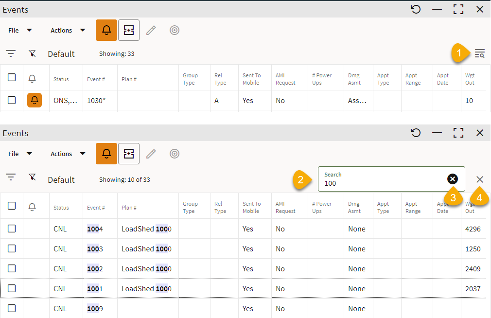
1. Find and highlight text in any list by clicking the Search icon ( ) in the column heading. The Search field will be displayed.
) in the column heading. The Search field will be displayed.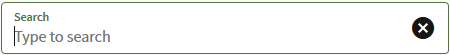
2. Enter your search criteria. As you type, the table will begin to highlight matches and hide any rows that do not contain the criteria.
3. To clear the text entered in the Search field, click the Clear button ( ).
).
).4. To close the Search field, click the Close button ( ).
).
).Selection and Filter History
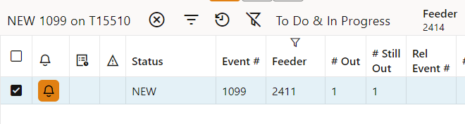
The selection and filter history allows you to quickly return to previous filter states or row selections. The Recent Selections and Recent Filters are listed side‑by‑side with the most recent selections and filters added to the beginning of the lists.
Example
1. Recent Selection
2. Recent Filter of To Do & In Progress.
3. Newer Recent Filter that added Feeder 2414 to the To Do & In Progress filter.

When returning to previous row selections, the table will move to a view that shows just those rows, regardless of filtering. The previous view can be restored by clicking the Return to Normal View button ( ) on the toolbar.
) on the toolbar.Example
Recent selection from the example above selected.
Exporting Table Information
You can export the information displayed in tables in a variety of formats. To display the export options, right click on a table heading and select Export, then choose one of the following options:
Option | Meaning |
|---|---|
Selection to Clipboard | Copies the selected items to the Clipboard. |
Rows to Clipboard | Copies all rows in the table to the Clipboard. |
Selection to Clipboard (With Headings) | Copies the selected rows and the column headings to the Clipboard. |
Rows to Clipboard (With Headings) | Copies all table rows, including column headings, to the Clipboard. |
Selection as Comma Separated Values | Exports the selected rows, including column headings, as comma separated values in a CSV file. The CSV file is downloaded and displayed in your browser's download area. |
Rows as Comma Separated Values | Exports all table rows, including column headings, as comma separated values in a CSV file. The CSV file is downloaded and displayed in your browser's download area. |
Note: CSV files can be opened in a spreadsheet application, such as Microsoft Office Excel.
Understanding Other Table Actions
Many tables provide right-click context menus for actions you may perform on the data (for example, viewing an event's information or location in the Map).
In addition, double-clicking a table row may bring up a different tool with related data.
Understanding Printing in Flex Operations
Print menu options are available for lists and detail forms in Flex Operations. Selecting the Print... option from a window's File menu, opens a print preview dialog box that allows you to print the contents of the page.
Selecting the Print option for a details page (for example, from Event Details or Switching Sheet Details) invokes a Print Options dialog box that allows you to select what to print.
• Print the current tab
• Print selected tabs
You can select the tabs to print from the list of tabs in the dialog box.
Selecting the Print Options dialog box's OK button opens a print preview dialog box displaying the content that will be output.
The print preview dialog allows you to print to a printer or save to PDF.