Understanding Chart
Introduction
Chart in Communication Cloud Service is designed to turn complex data into clear and engaging visual representations by combining text, data, and colors. It highlights the key relationships and insights, specific to your customer’s data, making information easy to understand. These visual elements can include various chart types such as Column, Line, and Combo charts, which highlight trends, comparisons, and relationships in the data. Chart configuration ensures that each chart is organized and styled appropriately to communicate the desired message effectively.
Chart configuration creates the chart in SVG format. Once the chart is generated, it can be embedded into a communication asset and distributed in PDF or HTML formats, based on your customer’s needs.
For better management and ease of future updates, Chart Groups are used to organize and associate charts with specific Marketing Companies. This feature is particularly useful when multiple companies share the same tenancy, as it helps keep charts organized and easy to access, ensuring that configurations are readily available when needed.
- User Defined Data configuration- User Define Data allows you to map customer specific data to the Chart and create charts with different values from single configuration. See Understanding Data for more details.
- Brand Color Series configuration- Brand Color Series decides the color palette to be used in the Chart. See Understanding Brand for more details.
- Style configuration- Style decides attributes, background, border, grid, margin, and so on, of the Chart. See Creating a Style for more details.
Functionality
- Dedicated configuration interface for defining User Defined Data, Title, Brand Color Series, Style, and Chart configuration.
- Flexible Chart configuration allows your company to create personalized and dynamic charts that cater to individual recipients' needs.
Example
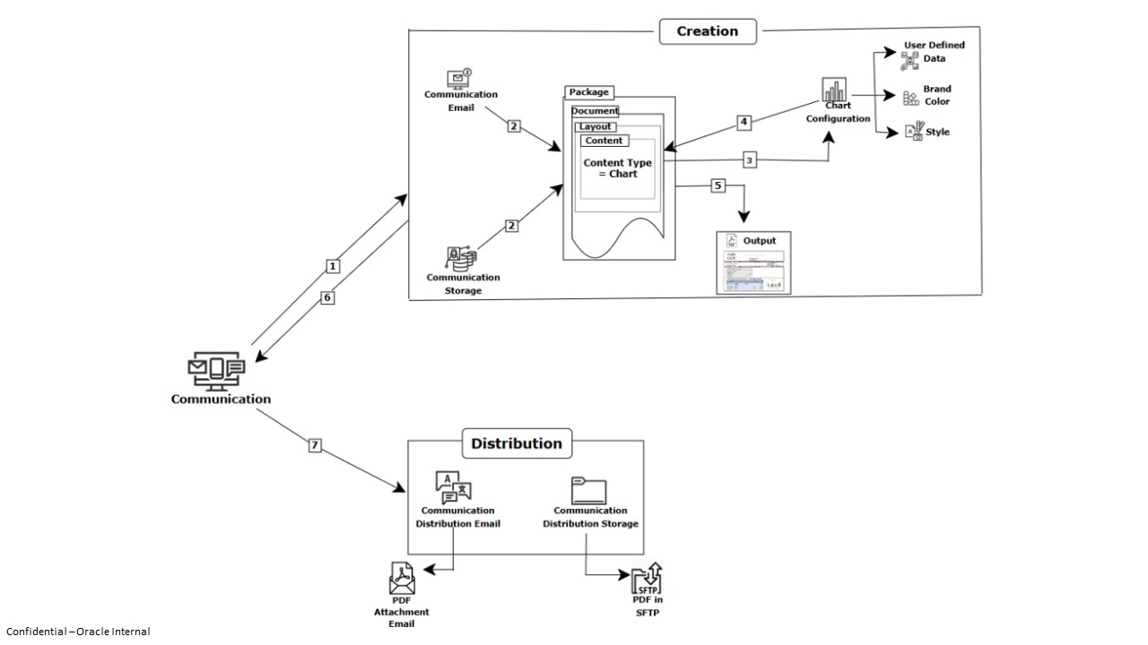
Your organization wants to send an email to the customers with their statement containing the account details like balance amount, the amount withdrawn, and the amount deposited. These values are different for each one of the customers. For better representation, you want to show these values in a form of a chart along with data. Chart configuration helps you to create the customer specific charts that you can include as a content in the document and distribute, which display the distinct customer specific values so that each of the customers gets the clear sight of their account details. The following image illustrates the Chart disposition in a communication asset:
Execution Flow
- Part 1: Composing Chart
To start, configure the Chart Category followed by Chart according to your business requirements. Define the necessary elements, such as plots,series and category axis, marker, annotation data labels, title, legend, and styling to ensure that the chart displays the correct customer-specific values.
- Part 2: Processing Chart
Next, to process and produce the chart within a Communication, associate the Chart Configuration under Content Configuration and select Chart as Content Type. This content is then incorporated into a Layout, which is included in a Document. The document is finally added to the Package configuration. During the Assembly Processing under the Package, the system processes customer-specific data and shares the data required to process and generate the chart image and then embeds it into the final communication.
The following image illustrates the Chart configuration and its flow:

Configuration Movement
The Chart configuration follows the configuration movement process; that is, if you configure any one of them in one tenancy (non-production), you can move the configuration to different tenancies (pre-production and production) sequentially.
For more information see, Understanding Configuration Movement topic.