Main Dashboard charts
The Main Dashboard contains time series charts that help you understand participant engagement and symptoms.

Any filters that you select apply to all dashboard pages.
The charts have built-in reports containing detailed participant information for each metric. To view a report, point to a horizontal or vertical bar line until your mouse changes to a hand icon, and then click. You can also export this information to a CSV for further analysis or action.
| Chart | Description |
|---|---|
|
Overview metrics |
|
|
Enrollment |
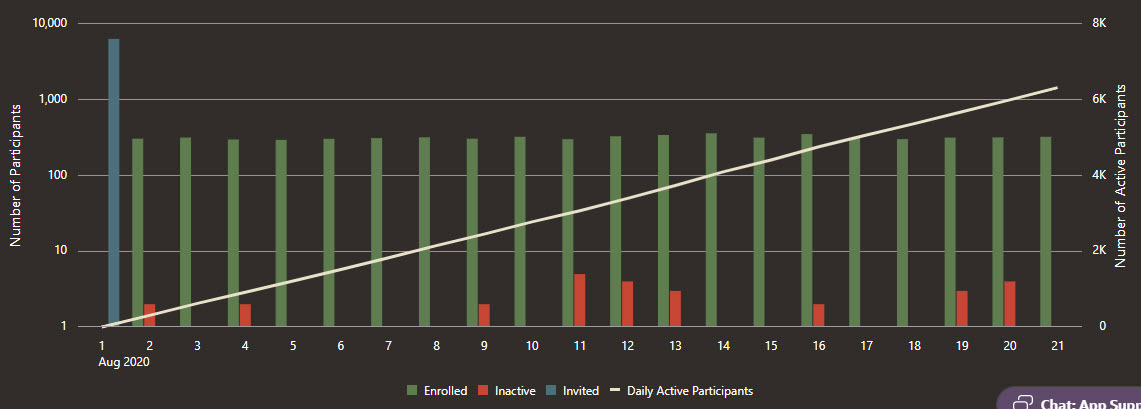
The Enrollment chart helps you understand your participants' current statuses as well as their engagement with Oracle COVID-19 Patient Monitoring System. You see only the data that meets the requirements that you specified in the filters. Vertical bar lines, which correspond with the left Y-axis, appear for each day or week (you decide the time period using the filters) in which participants' statuses have changed. The bar lines are color coded for each status. For information about participant statuses, see Participant statuses. The white line, which corresponds with the right Y-axis, shows the number of active participants at a given time. To show or hide the data for a status, click the status in the key that is below the chart.
|
|
Uptake % |
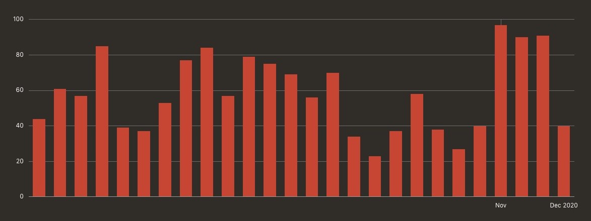
The Uptake Percent chart helps you understand the percent of invited participants who decided to participate. You see only the data that meets the requirements that you specified in the filters. A vertical bar line appears for each day or week (you decide the time period using the filters) in which participants were added to the system and invited to participate. The bar line shows the percentage of participants who decided to participate. Use this chart along with the Timeframe filter on the left to understand the time frame in which participants accept their invitations. This chart is useful not only for identifying the people who participate but also for identifying the people who haven't responded. For example, you can click a vertical bar line for a date, filter the view so that you see only the Pending participants, and create a plan for reaching out to them.
|
|
Validation |
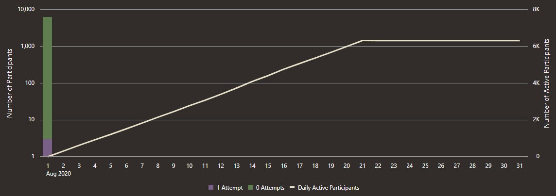
The Validation chart helps you determine whether participants reached their maximum validation attempts while entering their personal information. If any participants encountered this issue, you can determine whether an operational error is to blame. For instance, if many participants enter information that doesn't match your records in Oracle COVID-19 Patient Monitoring System, their personal information might have been incorrect in the upload file. You see only the data that meets the requirements that you specified in the filters. A participant has 3 tries to enter their personal information so that Oracle COVID-19 Patient Monitoring System can validate their identity. After a third failure, they are locked out and cannot take any further action until a help desk agent, coordinator, or other user resets their validation attempts. On this chart, the white line, which corresponds with the right Y-axis, shows the number of active participants at a given time. The vertical bar lines, which correspond with the left Y-axis, are color-coded for participants who have made 0, 1, 2, or 3 attempts to validate their identity on that day or week (you decide the time period using the filters). Note: This chart is useful for tracking trends, but the Participants tab offers a more straightforward method for identifying the participants who have been locked out.
|
|
Engagement |
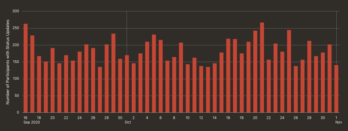
The Engagement chart helps you understand the number of participants who completed daily updates during a given day or week (you decide the time period using the filters). You see only the data that meets the requirements that you specified in the filters. If you are continually adding new participants to the system, these values should track upwards.
|
|
Activation |
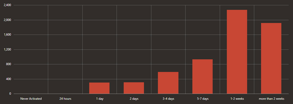
The Activation chart helps you understand the time that passed between participants receiving their invitations and entering their personal information so that Oracle COVID-19 Patient Monitoring System can validate their identity. You see only the data that meets the requirements that you specified in the filters. This chart also includes participants who haven't entered their personal information yet. You can check this chart periodically to identify any participants who haven't entered their personal information yet and take the appropriate action, such as resending an invitation.
|
|
Lateness |
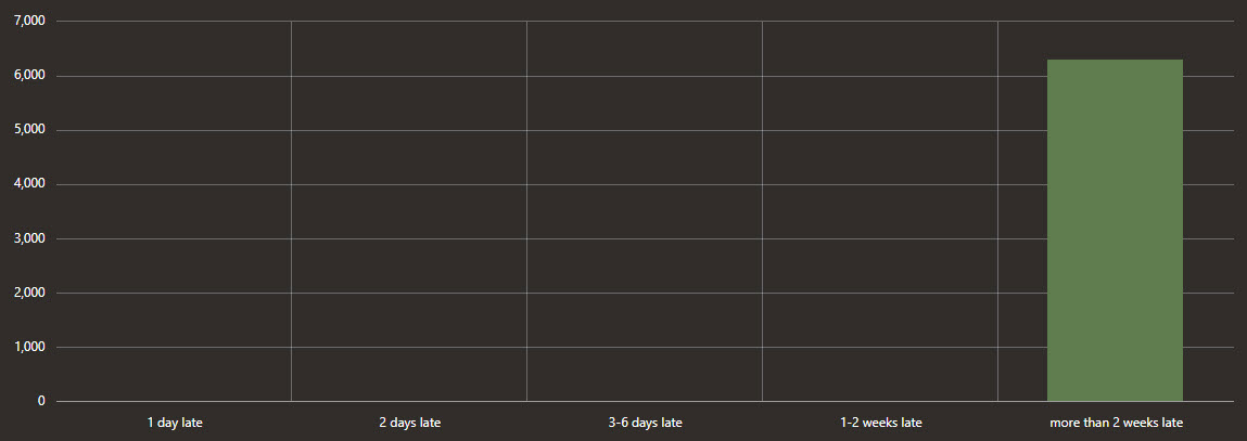
The Lateness chart helps you understand the time that has passed since your participants' most recent daily updates. You see only the data that meets the requirements that you specified in the filters. Participants who are counted in the 1 day late bar line completed their last daily update yesterday. They might not actually be late with today's update yet; they simply might not have completed it yet. You should check this chart periodically to identify any participants who haven't completed a daily update in a while and take an appropriate action.
|
|
Welcome Emails |
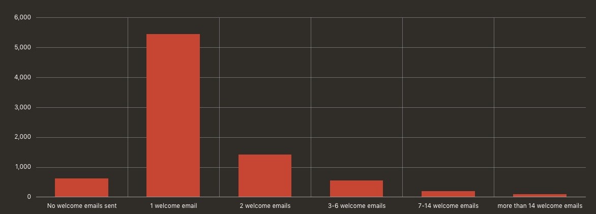
The Welcome Emails chart helps you understand the number of invitations that invited participants have received. This chart includes only invited participants, so after a participant validates their identity, they no longer are included in this chart. You see only the data that meets the requirements that you specified in the filters. This chart is useful for monitoring your recruitment. You should check this chart periodically to identify the participants to re-invite.
|
|
Any Symptom |
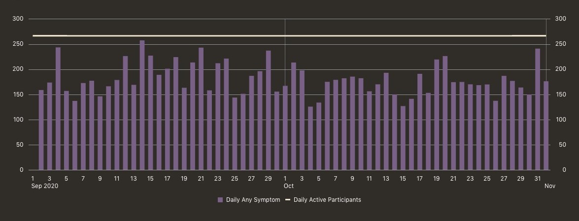
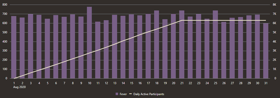
The Any Symptom chart helps you understand the participants who reported at least one COVID-19 symptom on a day or week (you decide the time period using the filters). You see only the data that meets the requirements that you specified in the filters. Vertical bar lines, which correspond with the left Y-axis, appear for each day or week (you decide the time period using the filters) in which participants' reported a single symptom. The white line, which corresponds with the right Y-axis, shows the number of active participants at a given time. A map-based form of this chart is available on the Map Dashboard page.
|
|
Any Symptom from List |
The Any Symptom from List chart helps you understand the participants who reported at least one symptom on a day or week (you decide the time period using the filters). You select the symptoms from a list below the chart. You see only the data that meets the requirements that you specified in the filters. The white line, which corresponds with the right Y-axis, shows the number of active participants at a given time. A map-based form of this chart is available on the Map Dashboard page.
|
|
All Symptoms from List |
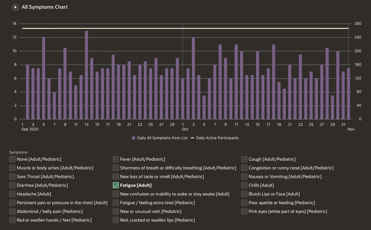
The All Symptoms from List chart helps you understand the participants who reported a specific combination of symptoms on a day or week (you decide the time period using the filters). You select the combination of symptoms below the chart. You see only the data that meets the requirements that you specified in the filters. The white line, which corresponds with the right Y-axis, shows the number of active participants at a given time. Note: Only participants who experienced every single symptom that you select appear in the chart. To see participants who experienced any single symptom from a list, review the Any Symptom from List chart.A map-based form of this chart is available on the Map Dashboard page.
|
Parent topic: Dashboard charts
