Foldout
This floor plan template is used to view a business object
Use Cases
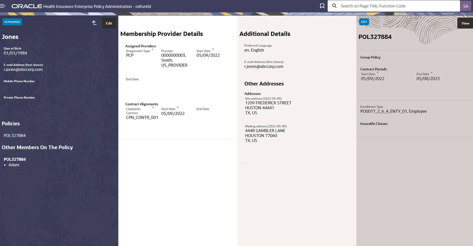
This template is commonly used for large objects to show information categorized over various panels
Few examples of pages that use this template:
-
Membership view
Page Layout and Components
Foldout
Presentation Configuration
A customer can change certain aspects of a page by changing or updating the floor plans and their properties. This is done by customizing the components within the floor plan’s JSON payload.
For more details refer ui-presentation-configuration/presentation-configuration/floor-plan-configuration.adoc page.
- JSON Template (Payload Structure)
-
The following JSON outlines the structure of the foldout template
{
  "floorplan_foldout":{
     "folds":[{
       "title":{
       },
       "labels":[{
       }],
      "sections":[{
       "resource":{
          "properties":[{}],
          "resourceName": ""
        },
       "region":{}
      }]
    }]
  }
}
Components
This template can have the following components
Title
-
Optional Component
-
Shown as the main title for the fold
-
"label" specifies boilerplate key and its value shows up as title
Labels
-
Optional Component
-
Labels are right aligned and appears below the title
-
They display property values in form of a label and can take in exactly one property per label
-
A fold can have multiple labels
-
Section 2 in the above image shows the placeholder for labels.
-
For more details refer ui-presentation-configuration/components/label-component.adoc
Section
-
The section is used to display an array of properties together
-
The sections are placed below the labels
-
Section may specify resource property of type list, this is needed when attributes of its subresources (list properties) are to be shown.
-
Whenever a resource is specified, the set configuration is repeated for each record in the list.
-
The attributes of the "resource" ( list property defined in the above step) can be set up in "set-tiles" (region) for display purposes.
-
resourceName specifies the generic api resource linked to the list property
-