Properties
A property represents the most granular level in a user interface. A component’s properties specify its behavior. Some properties apply to many components like for example name and sequence, others are more specific. Vice versa, each component only supports a restricted list of properties.
The usage of a property is within the context of the component, for example, the result component defines which properties are displayed in set 1 or as a title. Similarly, for a quick search component a property forms a search criterion.
Properties have the following settings:
| Setting | Mandatory | Description |
|---|---|---|
name |
yes |
Name of the property. This should correspond with the name of the field in Rest API on the resource |
sequence |
yes |
The order in which the property is applied in the component. Properties are applied in ascending order of the sequence |
display |
no |
specifies if the property is displayed in UI or not |
label |
no |
key to boilerplate key, used to override the default boilerplate text |
mandatory |
no |
When set to true indicates the property is mandatory in UI. For multivalue fields setting at feild level only triggers when some data is added to the row. If the setting is specified at the multivalue property level the system expects user to add atleast one row. |
readonly |
no |
When set to true indicates the property is read only even in create mode. |
nonupdatable |
no |
When set to true indicates the property cannot be updated once saved |
default |
no |
Applicable for boolean, enum, string, numeric, and referenced property properties. NOTE: Defaults can be set for a multivalue property in the region component only through conditional display triggered by setting some other field within the row or if the addNewRow is set to never. |
filter |
no |
Applicable for referenced property, enums and multivalue list |
refType |
no |
The LOV page to be used for-Selecting or changing values in Create and Edit mode -Displaying reference properties as descriptors in the View mode. |
displayType |
no |
Indicates display settings for a property * String
textarea
* this setting is applies only within region component
* String/Object [1]
xml
json
composite
file
* Multivalue
combobox
multivalue
* Enums
radiobutton
checkbox
dropdown
* Object
region |
evaluateConditions |
no |
list of conditions that must be evaluated when the property value changes. |
setToNull |
no |
used along with conditional display. If the display is set to never, the system considers setToNull setting to determine the value of the property - null or not when the property is hidden in the UI. |
link |
no |
To connect to any external system |
properties |
no |
To display additional descriptive columns, a property can refer to nested properties , for example, multivalue list, reference properties. These reference properties are displayed as separate fields in the page, separate from properties used by in the LOV |
"properties":[
  {
    "name": "name of the property",
    "sequence":"",
    "display":"",
    "label": "",
    "mandatory":""
    "readonly":
    "nonupdatable":
    "default":
    "properties":[] // Property can have nested properties, for example, multi value list, reference properties
  }
]
| Nested properties must be defined as array of the top level property. That is a new array element from top level must not be created per nested property. |
Sequence
If more than one property is used, the sequence determines the order in which the properties are displayed by the component.
"properties":[
  {
  {
    "name":"benefitsInputDate",
    "sequence":1,
    ..
  },
  {
    "name":"benefitInputAmount",
    "sequence":2,
    ..
  }
]
The sequence attribute together with the type of the property (in relation to the resource) single value resource property, reference property, object, array determines the display of the property in the UI. Every property should specify a sequence attribute. Properties without a sequence number are given the lowest priority. The display order of the property can influence the label that is used in the UI. Refer to the section 'Boilerplate' for more details.
Display
For every property, the setting display is available to indicate whether the property is displayed in the UI or not.
This setting supports three options:
-
Always ("display":"always") - considered as default setting when this property is not specified
-
Never ("display":"never")
When a column property is set to display never though conditional display, at the (row) cell level property is not displayed in the UI. -
Only with value ("display":"notNull")
In the below example, field benefitsInputDate is displayed only if the object has a value populated:
"properties":{
  "benefitsInputDate":{
    "display":"notNull"
     ...
  }
}
Mandatory, Readonly, and Non-Updatable
These attributes facilitate customization of the property in a form (region component) or table (table component).
The readonly and non-updatable setting can only be made more restrictive at floor plan level. For example, a non-restricted field can be set to be readonly or non-updatable true. These settings do not override metadata information, that is, a readonly field (as per metadata) cannot be made editable by setting readonly as false.
The setting mandatory is used to override behaviour of a field at the UI level. A mandatory field can be made non-mandatory from the UI or vice versa. However, setting a mandatory field to be non-mandatory does not surpass any mandatory data check when data is stored in the database.
Default
A default value can be specified for string, number, boolean, enums, and referenced properties.
| Property Type | Sample configuration |
|---|---|
String |
"default":"mystringdata" |
Numeric |
"default":123.12 |
Enum |
"default":"code of the enumeration", so if an enum is defined as A-Active, I-Inactive; to set default as Active, the property must be configured as "default":"A" |
Boolean |
"default":true or false |
Referenced Property |
"default": "properties":[{ "name":"property for example, code" "value":"Samplecode" }, … ] |
Links
Link requires the following details to be specified
{
    "links": [{
        "label": "reference to boilerplate key",
        "URL" : "reference to system property",
        "parameters":[{
         "name" : "name of the substitution parameter",
          "properties":[{
             "The property on the current resource that contains the value to be substituted into the parameter."
          }]
        }],
       "sequence":""
    }]
}| Attribute | Description |
|---|---|
label |
Refers to boilerplate key. Link is displayed using the boilerplate value given by the key. |
sequence |
Only applicable when more than one external link is defined. |
URL |
Refers to a system property ohi.ui.httplink.{custom identifier}. The URL can have fixed and dynamic parts, supported by substitution parameters. A URL is parameterized using substitution parameter within \{\{}}, an example of parameterized URL is Here, param0 can be substituted with the value from the object. |
parameters |
The substitution parameters referenced in the URL. The parameters are configured as To substitute the parameter param0 in the above (URL) example with the code of the object the parameter should be setup as: For list resource the parameter properties should be specified relative to it. For example, adding an external link to (persons) policyholders in the Tab - Policyholder or within the region (as multivalue) on Policy Page are set up as: |
Type of Property
The rendering and behavior of a property in the UI is based on the field type in the REST API and the consuming component. For details on the property types refer to the Metadata (OpenAPI Specification).
Every property supports view and edit. Depending on the state of the object and the consuming component, the property is rendered in the UI. Object state is driven by the user actions, for example, action 'Create' opens the object in the create mode and all the object properties are thereby displayed in the edit mode.
However, there is an exception to this rule. Some object properties cannot be created by a user, such properties are rendered non-editable within the component (example Region Component, Table Component) when the object is the 'Create' mode. Likewise, some object properties are restricted for updates (example claim form on claim), and therefore cannot be updated by a user, such properties are displayed as read only when object is in 'Edit' mode. Object metadata specifies which properties are editable and which are not for a given state of the object. This exception does not apply to components that are used to filter and search object list. These components always display the properties in the edit mode.
Sort component, always displays the label of the property.
Single-Value Properties
The single value fields are displayed with the attribute name and value within a component. Every record is displayed on a separate line.
| REST API Field Type | Read mode | Edit mode | Note |
|---|---|---|---|
Enum |
Text |
Radio buttons, checkbox or dropdown list based on display type |
Domain values are displayed. In the region and filter component based on display type when specified (radiobutton, checkbox or dropdown):
In the region and filter component, if the display type is not specified then the enum is displayed based on its nature (mandatory or optional).
When an enum is used in advanced search component it is displayed as a dropdown list with additional value null (no value), by default null (no value) is selected. When an enum is used in the table component, it is always displayed as a dropdown list. If the enum is optional then an additional value null (no value) is available and is selected by default null (no value) if no default is specified in the floor plan. When an enum is used in the region, it is not possible to set display type as checkbox. For create form (create object mode) in region and table component, if a default is specified for the property in the floor plan then that is set. Domain code is set as default value and domain value is displayed in the UI. |
String |
Text |
To display a textarea, input text box, or an editor. The editor can be for XML, JSON, or Groovy code.
The |
If the size exceeds a hundred characters, we recommended using |
Number |
Text |
Input number |
The value is formated based on user locale. The displayLanguageCode setting from the user’s preferences drives the locale setting. The decimal part is driven by API metatdata specification. |
Date |
Text |
Input date picker |
The default country determines the primary |
Datetime |
Text |
Date time picker |
The default country determines the primary System converts all datetime value to user’s broswer time zone for display purpose. |
Boolean |
Checkbox |
Checkbox or Dropdown |
In advanced search, booleans are displayed as dropdown with values - Null (no value), Yes and No. By default, Null (no value) is selected. For create form (create object mode) in region and table component, if a default is specified for the property in the floor plan then that is set. |
Oracle Health Insurance Money |
Money |
Money |
The value is formated based on user locale. The displayLanguageCode setting from the user’s preferences drives the locale setting. Read-only mode: The value gets displayed only up to two decimal places (only if it a big decimal). The complete value with precision gets displayed when the user hovers over the field. Edit mode: The value is display with full precision as returned by the API response. Zero Padding: Default zero padding of 2 for all amount field get applied. For example, if the value is 20.1, then 20.10 is shown in UI. |
Flex code definition based properties |
Text |
as Reference Property |
|
Single value dynamic fields |
Text |
Based on the type either textbox or textarea or inputnumber or date |
|
Single value non time valid dynamic record |
multivalue |
Single value dynamic record is considered as multi value property. Refer to the section on multi value properties for details. |
|
Ref |
RefType |
RefType |
See the section of reference properties. |
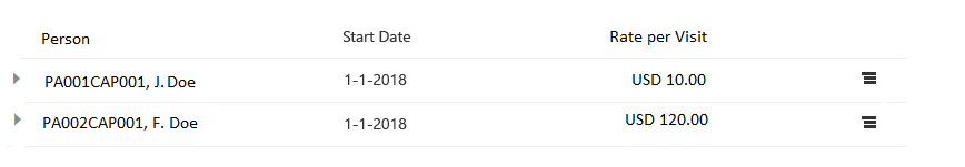
Money Properties
View Mode
A money object is displayed with its currency code and value displayed on the same line.
The amount is always right aligned.
The currency is displayed on the left side of the amount.
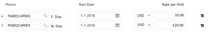
Edit Mode
The Currency field is non-editable if only one currency is configured, the amount field itself can be changed. If multiple currencies do exist, a dropdown list is presented with the default currency pre-selected.

XML, JSON, Groovy Editor
By setting appropriate display type, an XML, JSON or Text editor is used to view or edit a string property or an object property that hold XML, JSON, so formatted string data, for example, CSV.
When a display type is set to file or composite or json or xml, next to the string text area, a notepad icon is displayed. Click the icon to open the appropriate editor in a pop-up window.'Apply' and 'Close' buttons are displayed in the edit mode. The 'Close' button is displayed in the view mode.
For more complex types, setting display type as composite makes it possible for a user to select appropriate editor (dropdown - Text, XML, JSON) in the pop-up at the time of display. By default, the data is displayed as Text.
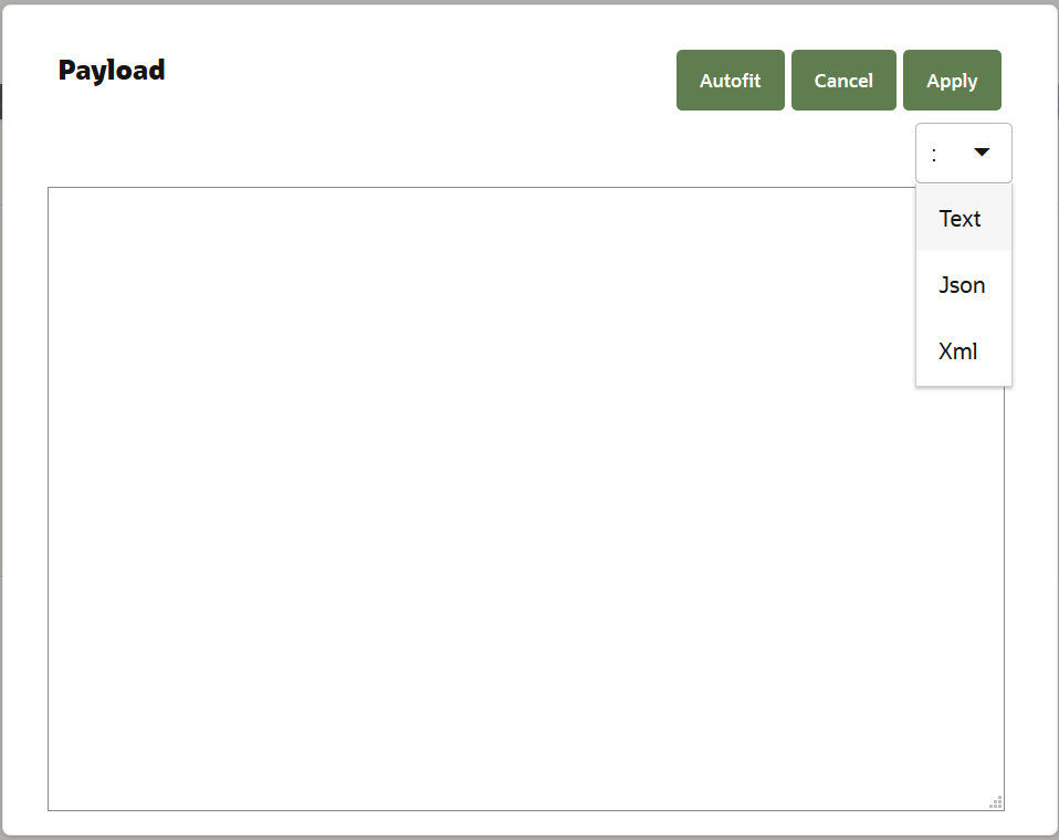
Selecting action 'Apply' triggers data format validation for XML and JSON editors. If the data format is correct the pop-up closes and the property value is updated.
Reference Properties
Some properties are not a literal value, but are a reference to another resource. These properties are called Reference properties.
In the floor plan a reference property requires additional information on how it is to be displayed. This information is provided by means of a reference type (refType). Within the Reference type user can provide the search properties, title properties and pop-up tail properties that the reference type provides.
The structure of a reference property is given below:
"properties": [
  {
    "name":"name of the reference property",
    "sequence":1,
    "display":"",
    "default": {
      "properties":[{
        "name":"code",
        "value":"Samplecode"
     },
     ...
     ]},
    "deeplink": "true|false",
    "deeplinkMode" : "all|view"
    "links": "external links"
    "properties":[
     ...
     ]
    "refType":{
      "criteriaMandatory":true|false
      "type": "standard reference types for example, person, provider, procedure etc.","filter":"",
      "filter":"filter condition"
    }
]
Specifying "criteriaMandatory" as true restricts a user from performing a blank search (including searching using only widecard). If blank search is attempted then client validation error message is shown "Searching without criteria is not allowed" Note: LOV template also supports this setting. See below for details.
When not specified system considers it to be false.
Structure of LOV floor plan template:
{
     "referencedResourceLink":{
       "properties""[
         ...
       ]
     }
    "propertySelection":"true|false"
     "search":{
        "criteriaMandatory":true|false,
        "properties":[
        ...
        queryOperator":"bet|gte|lt|eq|like|likeic"
        toUpperCase:"true|false"
        ]
      },
      "title":{
        "properties":[
         ...
        ]
      },
      "popupTail":{
        "properties":[
         ...
        ]
      }
}
-
criteriaMandatory - When set to true, blank search (including searching using only widecard) is not allowed. When a blank search is attempted then client validation error message is shown "Searching without criteria is not allowed"
-
Default value is false
-
At a page floorplan level user can override the setting by specifying it along with the reftype setting.
-
-
search - List of all the properties that can be searched on in the LOV.
-
System allows all numberic and string properties as search properties.
-
Date/Datetime/enums/amounts/referened properties can only be added to search when propertySelection is set to true and cannot be properties with sequence 1
-
bet|gte|lt for dates/numbers are only supported with property selection set to true
-
-
With queryOperator it is possible to specify query operator for string or number properties. Dafault is likeic for strings and numbers. For Dates/Datetime/enums/amounts/inline reference properties queryOperator is always eq.
-
With toUpperCase set to true the system converts the entered character value to uppercase for the criterion.
-
-
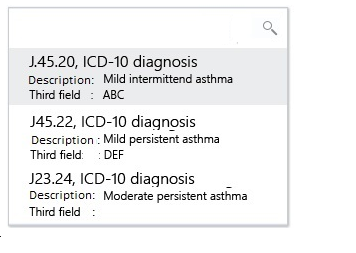
title - The fields that are displayed in view mode, and in create or edit mode when a value has been selected. The first property is displayed inside the LOV box, the subsequent values are displayed after the LOV box concatenated by commas. NOTE: Nested/Multivalue properties can be searched on when configued in the search, and are shown in the LOV and lookup dialogs when configured under title however, they are not displayed on the page when a selection is made.
-
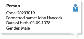
popupTail - Additional properties that are required to be displayed for the selected record. Refer below image for an artist impression.
-
NOTE: When deeplink feature is enabled, then popup tail is not be displayed in the UI page.
-
-
propertySelection - This setting allows for more complex searches. When enabled, system allows users to enter value for each creterion. User may select more than one criterion and a search request is executed with AND statements and the input value is inserted in the query with a Equals, Like or Like Ignore Case depending on the operator setting for string and integer type of attributes. The default setting for operator is likeic - like ignore case. The default setting is false.
-
For search properies based on inline referenced property (that is not not any string fields) toUpperCase and operator settings do not apply. System always uses eq in this case.
-
-
referencedResourceLink - This is applicable when list of values should be based on a intersection entity. This configuration specifies the property of the intersection on which the list of value results gets based on.
-
For example, in Claims while entering a claim, A user may prefer to see speciality in context of the selected provider. In order to do this, the system requires the LOV to be based on providerspecialties resource and not on specialties resource. The lov floorplans requires this metadata setting "referencedResourceLink" which points to specialty, so that LOV shows only thoes specialties linked to the provider. The list of value search gets based on list resource (providerspecialties), and the results show "specilaties".
-
There is a possibiliy that a record may showup twice in the list. OHI therefore recommends to use appropiate filter conditions to handle uniqueness. In the provider specialties example, specifying a condition to show specilities of the selected provider will eliminate duplicates and show only the specialities related to the provider on the claim.
-
The property nesting level is bounded by abilities of query api (usually query api allows for 2 level of nesting)
-
Results
The search results display all the distinct Title and Search properties. The title property with sequence 1 and 2 are displayed separated by a comma. Any search property that is not part of the title is also displayed as Label - Value (after all the title properties). If there are more properties with higher sequence, then they are displayed in the subsequent row as Label - Value.
Nested Properties
In addition, a reference property can define nested properties, these nested properties are displayed below the reference property as read only. The sequence attribute is used to determine the order of the property placement.
It is also possible to define a reference property with only nested properties. Consider the following example:
"properties": [
  { "name":"" paymentReceiverProvider",
    "sequence":1,
    "display":"notNull",
    "properties":[
      {
        "name":"code",
        "sequence":1
       }
     ]
  }
]
Default
Default value can be set in region and table component for referenced fields. The system selects the record given by the record id as default value.
Deeplink and Deeplink Mode
It is possible to create deeplink to reference property detail page by setting the property "deeplink" to true.
When deeplink is configured for view, the property value is displayed as a clickable link when the property is in view mode. Click to open the object page ('View and Edit-Recursive' page or 'View and edit list') in a drawer when deeplinked from object detail page. Deeplink in a widget takes the user to the detail object page.
Similarly, in create or edit mode, an additional option 'Add New?' and View ( when the value is selected in the LOV) are displayed below the property if the property is in creatable or editable state. Add New? opens the create object page for the referenced resource and View opens the View and edit page for the selected value.
| The floor plan conditional loading is applied in the selection of the most appropriate floor plan. Function access checks with associated page also applies. Deeplink to relation or provider property displays the page based on the type of the referenced object. Also, only view or edit mode are supported. For example, deeplink to service provider in claims displays either individual provider page or organization provider page depending on the type of provider. This sub-type resolution is done only for relations and providers. |
| If the referenced page uses deeplink or links, these links are not enabled in the pop-up. |
| This feature brings up a page that is already defined within the system. Enabling deeplink for a referenced property for which there is no page definition, may result into "Page Not Found" error. |
Filter for Referenced Property
The setting 'Filter' takes in criteria that is executed for all the searches as 'and' condition. This limits the result set on which the search is performed. The filter conditions are set using HTTP Query API grammar.
Filters are set on fixed values, for example on function dynamic logic filter out only the signatures that have subtype 'COND' can be set up as filter out only the signatures that have subtype 'COND' can be set up as signature.subtype.eq("COND"). Similarly, specifying filter as 'signature.name.eq("Classification Scheme (Claim)").and.signature.subtype.eq("COND")' limits the LOV’s result set to the dynamic logic of type condition and name 'Classification Scheme (Claim)'.
Filters also refer to information from the page’s parent (topmost level) resource. The page’s top level resource is referenced using the keyword 'context'. While using context, a special construct
`$\{context.propertyName}`
is used. This construct replaces the value of the property in the actual query. For Example, restricting the list of group accounts in an LOV on the group client bill allocation page so that the LOV displays only the group accounts are already attached to the group client can be specified as
'groupClient.code.eq($\{context.code}),
in this case the context is groupclient.
For example: Suppose the property servicedMember on the resource Claim is declared as :
{
  "properties": [
    {
      "name":"servicedMember",
      "sequence": 1,
      "refType": {
        "type":"person"
      }
      "properties": [
        { "name":"dateOfBirth",
          "sequence": 1
        },
        { "name":"gender",
          "sequence": 2
        }
      ]
    }
  ]
}
In this case, the system displays LOV for serviced member as defined by reference type - person, system also displays additional attributes - date of birth and gender - for the serviced member.
Reference to a Reference Property
It is possible to search or display attributes of another ‘reference property’ from a reference property, for example: displaying ‘Bank Account Number’ for a Payment receiver (Provider) in details for object Claims requires LOV template to be set up as:
  {
        "search": {
          "properties": [
            { "name":"code",
              "sequence": 1
            },
            {
              "name":"flexCodeDefinitionCode",
              "sequence": 2
            }
          ]
        },
        "title": {
          "properties": [
            { "name":"code",
              "sequence": 1
            },
            { "name":"name",
              "sequence": 2
            }
          ]
        },
        "popupTail": {
          "properties": [
            { "name":"flexCodeDefinitionCode",
              "sequence": 1
            },
            { "name":"bankAccountNumber",
              "sequence": 2,
              "properties": [
                { "name":"bankAccountNumber",
                  "sequence": 1
                }
              ]
            }
          ]
        }  }
| Above JSON is also an example when a reference implementation of 'provider' is not used. |
Along with the bank account number, if the bank name should be displayed then the bankAccountNumber property should be declared as:
"popupTail": {
  "properties": [
    { "name":"flexCodeDefinitionCode",
      "sequence": 1
    },
    { "name":"bankAccountNumber",
      "sequence": 2,
      "properties": [
        { "name":bankAccountNumber,
          "sequence": 1
        },
        { "name":bank",
          "sequence": 2,
          "properties": [
            { "name":"name",
              "sequence:: 1
            }
          ]
        }
      ]
    }
  ]
}
A reference property may also refer to a multi value property. It is possible to display the details of a multi value property. A multi value property is displayed in the details as described in the section multi value property having display type as multi value.
Reference Property as One-to-One Child
In some cases one to one child mapping appears in the api or ip definition as referenced property. However, they are not the referenced property but have one to one relationship with the parent. For example, user to userPreference, or claimLine to claimLineOverride or FinancialTransaction(Detail) to FinancialTransaction(Detail)ProcessData
Such a property can be configured as:
{
  "properties": [
    {
      "name":"claimLineOverride",
      "sequence": 1,
      "properties": [
        { "name":"coverageRegime",
          "sequence": 1,
          "refType":"coverageregimes",
        }
      ]
    }
  ]
}
In this case the property coverageRegime is only displayed in the UI with a LOV. All the properties of claimLineOverrides, should be configured together. It is not possible to split the configuration over various elements of the form (like sets or tiles).
Reference Property and Quick Search Component
It is necessary to specify the exact attribute of the reference property (nested property) on which the search must be performed. Quick search component therefore takes in only the nested property structure of the reference property
Reference Property and Advanced Search Component
In advanced search, if a reference property included reftype, then it is always displayed in the edit mode (LOV). It is also possible to add additional attributes of the reference property. Each attribute (nested properties) that is specified form separate search criterion and are displayed based on their type. Refer single value property section for details.
For the LOV, the additional title properties are not displayed next to the text area once the object is selected.
Reference Property in Table Component
The following applies to a reference property in the table:
-
The nested properties are displayed under separate columns next to the LOV.
Consider the below JSON to clarify: resource tagTypeMessageList
{
  "columns": {
    "properties": [
      { "name":"message",
        "sequence": 1,
        "refType": {
           "type":"messages"
        },
        "properties": [
          { "name": "message",
            "sequence": 1
          }
        ]
      }
    ]
  }
}
The message property is displayed as displayed in the image below:

Enable List of Value on any String or Number
Picklist on self
For string fields it is possible to create a lookup listing existing values. The lookup is enabled when the attribute "group" is set true.
Consider the below JSON to clarify:
{
  "columns": {
    "properties": [
      { "name":"tag",
        "sequence": 1,
         "group": true
      }
    ]
  }
}
Picklist on referenced data
The refType setting enables List of Value (LOV) on any string or number property.
The system selects the list of value floor plan based on refType type settings.
The value of the title property with sequence: 1 becomes the value of the field.
In the view mode, LOV gets the values by using query API on the resource as specified in the floor plan table. Additional properties and the pop-up tail are only possible if the title property with sequence 1 is also the unique key for the collection. That is, if only one record is returned is for the specified value then in the view mode (when configured) additional properties and the pop-up the tail are displayed.
For example: To enable LOV on a dynamic field "field1" to display a list of persons, see JSON below.
{
    "properties": [
      { "name":"field1",
        "sequence": 1,
        "refType": {
           "type":"mypersonLOV"
        }
      }
    ]
}
The system selects the LOV floor plan based on refType type settings. Here the type "mypersonLOV" refers to the pagename in the floor plan table.
When "mypersonLOV" template gets configured as below, then the system persist the code of the person that is selected(from the list of value).
 {
        "search": {
          "properties": [
            { "name":"code",
              "sequence": 1
            }
          ]
        },
        "title": {
          "properties": [
            { "name":"code",
              "sequence": 1
            },
            { "name":"name",
              "sequence": 2
            }
          ]
        }
  }
|
To show additional properties of flexcodes (other that key and descriptor), an extra configuration "flexcodeSystemCode" is required to be specified. For example: To enable LOV on a dynamic field "field1" to display a LOV on flexcode having additional usages, see JSON below. {
"properties": [
{ "name":"field1",
"sequence": 1,
"refType": {
"type":"flexcodeLOVWithAdditionalUsage"
"flexcodeSystemCode":"flexcodWithAdditionalUsage"
}
}
]
}
|
Multi-Value Properties
Multivalue properties are an array or object type of properties.
Display Type
A multi value property has an additional attribute, that specifies how a multi value list property will be rendered in the UI within a component. The following values are possible :
| Type | Description | Remarks |
|---|---|---|
combobox |
If a multi value list contains a single property of type referenced, it can be displayed in a combo box. |
|
multivalue |
To display list record with multiple attributes |
Oracle Health Insurancedefault implementation for all multi value list fields within a component |
For combobox and multivalue display type, the list is sorted on the row id ascending.
Combo Box
If a multi value list contains only a single value of type referenced, it can be displayed in a combo box. Lists with a single attribute can also be displayed on separate lines (as multi value).
View Mode
Label and comma separated list of values.
Edit Mode
A multi select box is displayed which allows the user to add multiple values. Every value that is added can be removed from the list using the delete button placed on the value.
In the edit mode a list of value is displayed for multiple values to be selected. The property with the sequence 1 as defined in the refType search is used by the multi select box. This property is searched upon and is also displayed.
For Example: consider the below json snippet to clarify:
"properties": [
  { "name": "claimLineModifierList",
     "sequence": 1,
     "displayType": "combobox",
     "properties": [
       {  "name":"modifier",
          "sequence": 1,
          "refType":{
          "type":"codeDescr"
       }
     ]
  }
]
This displays a combo box on to add modifiers as displayed in the below image.
| It is not possible for a user to add values that are not part of the list. |
In the view mode only the title property with sequence 1 is displayed for each of the selected values.
Multi-Value
View Mode
Individual attributes adhere to the single value or reference property design. These attributes are displayed horizontally on the same line. The labels are displayed as the first row in italics.
If the display width of the record attributes exceeds the width of the page real estate, the header displaying the labels is hidden (for example, Amount Check Number Date Ban…'). Upon hovering over the value, the full list is displayed. The overflowing attributes are displayed on a new line thereby avoiding a horizontal scroll bar.
For a reference property, if there are any nested properties[2], then they are not displayed.
Multivalue field is displayed on the page (view mode) if there is at least one record available.

Edit Mode
The list is displayed on separate lines. An empty row is displayed by default in the edit mode. Subsequently, if a value is populated on the last row for at least one of the displayed attributes, an empty row is automatically added to the list and a delete button is placed next to the row that has just been populated. The delete button is never placed on the last (empty) list entry. If it is desired that the new row should not be added automatically attribute addNewRow can be set to never. This prevents addition of a new row.
For a reference property, the title is not displayed next to the selected value. Also, if there are any nested properties[2], then they are not displayed.
For Example: Claim diagnoses is a list record with multiple attributes. Therefore, it can only be displayed on separate lines.
Example: Modifier as multivalue
Single value non-time valid dynamic record is considered as multi value property. The following exception applies: new empty (additional) row is not available in edit mode.
The following example displays property representation for claim pend reasons for the object claim:
| It is possible to create up to three columns when used with a record. Any additional columns are not displayed in the UI. |
"properties": [
  {
    "name":"claimPendReasonList",
    "sequence": 1,
    "properties": [
      {
        "name":"resolved",
        "sequence": 1
      },
      { "name":"pendReason",
        "sequence": 2,
        "refType:{
          "type":"pendreasons"
        }
      }
    ]
  }
]
View representation of this property displays the following:
Label for the property claim line pend reasons is followed by:
-
Label for the property resolve, followed by a checkbox (non-edible), checked if the value is true.
-
Label for the property pend reasons, followed by the value of pend reason code and a popup tail on code, which displays the description.
Filter for Multivalue Property
Filter can also be used filter out values within the List when used in the region. Filter condition can be set using the operators as mentioned in the table below. Conditions can be evaluated using the direct property of the list, for example to see only address of type SITE, condition can be set as addressType.code=="SITE". In case multiple values evaluations, the operators AND/OR can be specified
=== or == |
Equal comparison operator, checks if left operand is equal to right operand |
|---|---|
!== or != |
Not equal comparison operator, checks if left operand is not equal to right operand |
>= |
Greater than equal to operator, checks if left side operand is greater than equal to left side |
> |
Greater than operator, checks if left side operand is grater than left side |
⇐ |
Less than equal to operator, checks if left side operand is less than equal to left side |
< |
Less than operator, checks if left side operand is less than left side |
&& |
And operator, Performs logical and operation between left and right side operand. |
|| |
Or operator, Performs logical or operation between left and right side operand. |
Multi-Value Property and Quick Search Component
It is necessary to specify the exact attribute of the property (nested property) on which the search must be performed. Attribute "display type" is ignored by the quick search component.
Multi-Value Property and Advanced Search Component
In advanced search, if multiple properties of a multi value property are included, then each property forms a search criterion and are displayed based on their type. Refer single value property or reference property section for details.
Example:
{  "name":"claimPendReasonList",
   "sequence": 5,
    "properties": [
      {  "name":"pendReason"
          "sequence": 1,
          "refType": "codeDescr"
      },
      {  "name":""resolved",
          "sequence": 2,
          "label": "GEN_RESOLVED"
       }
     ]
}
This configuration results in an advanced search with two search criteria displayed as:
Label for pend reason in ClaimPendReason entity |
LOV on pend reason |
|---|---|
Label for Indicator resolve on pend reason |
Yes or No dropdown |
Properties and Validation
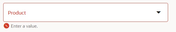
Field level validations are applicable in the edit mode when a property is a form field, for example when used in the Region Component. Field validations (client side) are triggered when a user action is performed, for example, action save. Messages resulting from field validation routines are displayed directly on the associated form field. A validation can be placed on the attribute field giving immediate feedback to the user with a focus on the related attribute field. The message disappears when the user takes an action on the field - for example, adds a value to a mandatory field - or if the user executes an action in his current workflow (for example, cancel, save).
Example:
Field validation is displayed when the user tries to save an object with one or more mandatory field values not being populated. Each of the mandatory attribute fields that do not have a value populated raises an error.
For multivalue fields, the mandatory check behaves as follows
-
if the list is marked as mandatory i.e. mandatory is set to true at the list property level then a client-side validation should happen which would as for at least one row (a record) to be present.
-
if the mandatory flag is set to true at the field level, the validation gets triggered as the user starts entered data for a record.