17 Contributing and Publishing Content

WebCenter Portal provides a quick and easy way to contribute and publish simple content, such as images, formatted text, and embedded videos, to the pages in your portal.

See Also:

For an overview of the different options available in WebCenter Portal for working with portal content and adding content to a portal, see Introduction to Adding Content to a Portal.

Permissions:

To perform the tasks in this chapter, you need to be a member of a role that has been granted the portal-level permission Contribute Page Content or has been granted the Contribute permission on an individual page.

Topics:

About Contributing and Publishing Content

You can add text, images, and embedded videos to pages in your portal.

If you have the appropriate permissions, you can enter contribution mode to add the following types of content to your portal:

  • If the page includes an Image component, you can place a picture on the page, for example, a logo, banner, photograph, or diagram. For more information, see Contributing and Publishing an Image.

  • If the page includes a Styled Text component, you can place a small piece of text on the page, for example, a title, heading, byline, or caption. The style used for the text is determined by the designer of the page and you cannot change it. For more information, see Contributing and Publishing Text with Predefined Formatting.

  • If the page includes a Text component, you can place a larger piece of text on the page, for example, the body of a news article; press release; or review, the description of an event, or a list of instructions. You can apply your own formatting and add hyperlinks to the text. For more information, see Contributing and Publishing Rich Text.

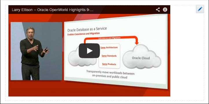
    You can also use Text components to place embedded video on a page. For more information, see Contributing and Publishing a Video.

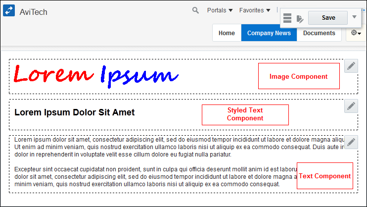
For example, a page could contain an Image component for the page banner, followed by a Styled Text component for a headline, and then another Text component for the main content of the page. Figure 17-1 shows an example of a page created using content publishing.

Figure 17-1 Example Page for Content Publishing
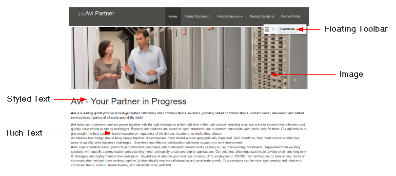
Description of Figure 17-1 follows
Description of "Figure 17-1 Example Page for Content Publishing"

When you edit a Text or Image component, you access the appropriate editing tools for that component. A Text component provides text formatting tools and a text entry area, a Styled Text component provides just a text entry area, and an Image component provides a dialog where you can specify the properties of the image that you want to publish.

When page drafts are enabled in the portal administration settings, you can refine your page contributions before making them available to others who view the portal. When users with Edit Page or Contribute Page Content permission view the page, they can toggle between viewing the latest updates in the page draft (to preview the changes), or the most recently published page (without the changes). Users without either of these permissions will only ever see the most recently published page. When you are satisfied with the page updates and they are approved, you or another user with the correct permissions can publish the page, thereby making the changes visible to all users. For more information, see Publishing a Portal Page in Building Portals with Oracle WebCenter Portal.

For information about publishing content in wikis and blogs, see Working with Wikis and Working with Blogs.

Users with additional permissions can publish more complex content. For more information, see Publishing Content Using Content Presenter in Building Portals with Oracle WebCenter Portal.

Entering Contribution Mode

If your role enables you to contribute content, you can enter contribution mode while viewing a page to add images, text, and video to a page.

To enter contribution mode:

  1. Go to the page where you will add content.
  2. In the floating toolbar, click Contribute.

    Figure 17-2 The Contribute Button in the Floating Toolbar

    The Contribute button in the floating toolbar

    Tips:

    • By default, the floating toolbar appears in the top right of the page, just below the toolbar, but you can move it around on the page by using the handle on the left of the toolbar to drag it to the preferred location.

    • If you cannot see the floating toolbar or the Contribute option, you do not have permission to contribute content.

    • The keyboard shortcut to enter and exit contribution mode is Ctrl+Shift+C.

  3. The components on the page in which you can contribute content are highlighted with a dashed border.

    Figure 17-3 Page with Content Publishing Components in Contribution Mode

    Description of Figure 17-3 follows
    Description of "Figure 17-3 Page with Content Publishing Components in Contribution Mode"

    Tip:

    If you do not see any components with dashed borders, this means that the current page does not contain any content publishing components. Navigate to a page that does contain content publishing components, or contact the portal manager if you think you should be able to publish content on the current page.

  4. Provide your content, as described in one of the following sections:
  5. When you have finished creating your content, click Save in the floating toolbar.

    If you change your mind and want to discard your changes, in the floating toolbar, click Actions and then choose Discard Changes. You can then click Save to return to view mode.

    The Discard Changes option in the Actions menu

    You are returned to view mode.

    • If page drafts are enabled, view mode includes two different views of the page and the floating toolbar provides a toggle to switch between them:

      • Page draft view—a blue icon in the floating toolbar indicates that you are viewing the page draft and this is what the page will look like when the draft is published. Click the icon to view the currently published page.

      • Published page view—a dark gray icon in the floating toolbar indicates that you are viewing the currently published page, which does not includes any of the changes you made in contribution mode. Click the icon to view the page draft.

        No page draft—a light gray icon in the floating toolbar indicates that there is currently no page draft for the page.

      The changes that you made in contribution are not visible to page viewers until the page draft is published by a portal manager or a user with Publish permissions on the page.

      See Publishing a Portal Page in Building Portals with Oracle WebCenter Portal.

    • If page drafts are disabled, your changes are immediately visible in view mode to all users.

Contributing and Publishing an Image

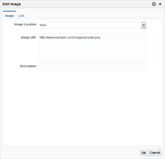
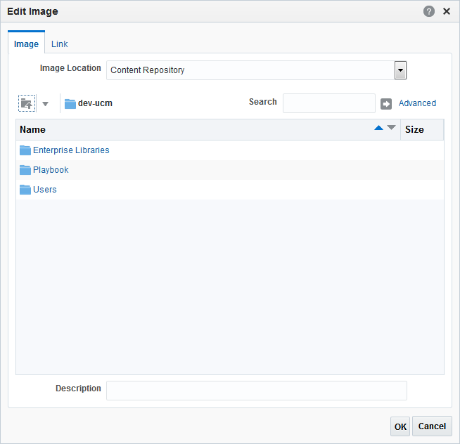
If a page includes an Image component, you can add an image to the page by specifying its URL or selecting an image from the Content Server repository.

Note:

If you want to use an image from the content repository, that image must already exist in the repository. You cannot upload an image to the repository from the Edit Image dialog.

To contribute and publish an image:

  1. Go to the page that contains the Image component in which you want to add the image.
  2. Enter contribution mode.

    For more information, see Entering Contribution Mode.

  3. Click anywhere in the Image component, or click the Contribute icon.

    Figure 17-4 The Contribute Icon

    Contribute icon
  4. In the Image tab of the Edit Image dialog, from the Image Location dropdown list, select:

    Note:

    Select your image carefully. If a specific size has been defined for images in this component, the image will be stretched or shrunk as appropriate to fit. If the size is not specified, the component will use whitespace for padding if the image is too small, or scrollbars if it is too large.

  5. In the Description field, enter a brief description of the image.

    This description is used as the alternate text for the image and is displayed when a user hovers the mouse cursor over the image. The description is also read by screen readers.

  6. Click OK to preview the image.

Contributing and Publishing Rich Text

If a page includes a Text component, you can add text to the page and apply your own formatting. For example, you can use a Text component to publish a list of items, an article, or a press release.

To contribute and publish rich text:

  1. Go to the page that contains the Text component in which you want to add the text.
  2. Enter contribution mode.

    For more information, see Entering Contribution Mode.

  3. Click anywhere in the Text component or click the Contribute icon (Figure 17-7).

    Figure 17-7 The Contribute Icon

    Contribute icon
  4. In the Text component, enter the text that you want to publish on the page.

    Tips:

    • Text components are for detailed pieces of content; if you want to add a brief piece of content, such as a heading, use a Styled Text component.

    • You can paste existing text into the Text component. Any HTML formatting will be retained.

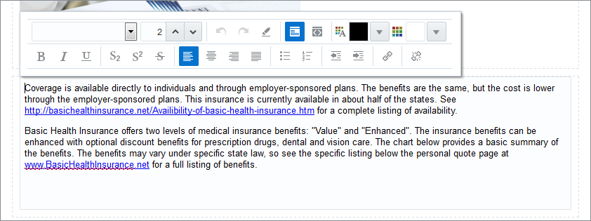
  5. Use the formatting tools, shown in Figure 17-8, to change the appearance of the text.

    Figure 17-8 A Text Component with Formatting Tools

    Description of Figure 17-8 follows
    Description of "Figure 17-8 A Text Component with Formatting Tools"

    For example, you can:

    • Change the font, size, or color of the text

    • Apply text effects, such as bold, italic, or strikethrough

    • Align or indent text within the component

    • Create bulleted or numbered lists

    • Add hyperlinks (for more information, see Adding a Hyperlink to Rich Text)

    Note:

    By default the text is formatted as defined by the page's skin. If you change the font of your text, for example the font face, size, style, or color, this overrides the settings from the skin.

  6. To preview your text, click anywhere outside the Text component.

Contributing and Publishing Text with Predefined Formatting

If a page includes a Styled Text component, you can add a heading, title, or caption. The text in a Styled Text component is formatted according to predetermined settings.

To contribute and publish text with predefined formatting:

  1. Go to the page that contains the Styled Text component in which you want to add the text.
  2. Enter contribution mode.

    For more information, see Entering Contribution Mode.

  3. Click anywhere in the Styled Text component, or click the Contribute icon (Figure 17-9).

    Figure 17-9 The Contribute Icon

    Contribute icon
  4. In the Styled Text component, enter the text that you want to publish on the page.

    Tip:

    Styled Text components are intended for brief items of content, such as headings and captions; if you want to provide more detailed text, use a Text component.

  5. To preview your text, click anywhere outside the Styled Text component.
    The text uses the formatting defined for the component.

Contributing and Publishing a Video

To add video to a page, you can use a Text component to enter the code to embed the video.

To contribute and publish a video:

  1. Copy the code to embed the video.

    For example:

    <iframe width="560" height="315" src="https://www.youtube.com/embed/3zdv65Kzw54" frameborder="0" allowfullscreen></iframe>

    Tip:

    The steps for obtaining this piece of code will depend on the source of your video.

  2. Go to the page that includes the Text component in which you want to add the video.
  3. Enter contribution mode.

    For more information, see Entering Contribution Mode.

  4. Click anywhere in the Text component where you want to add your video, or click the Contribute icon (Figure 17-10).

    Figure 17-10 The Contribute Icon

    Contribute icon
  5. In the rich text editor, click the Source Code Editing Mode icon (Figure 17-11).

    Figure 17-11 The Source Code Editing Mode Icon

    Source Code Editing Mode icon
  6. In the text area, paste the code for embedding the video, which you copied earlier (Figure 17-12).

    Figure 17-12 Code in Text Component for Embedding Video

    Description of Figure 17-12 follows
    Description of "Figure 17-12 Code in Text Component for Embedding Video"
  7. To preview the video, click anywhere outside the Text component (Figure 17-13).

Adding a Hyperlink to an Image

You can add hyperlinks to images to make them clickable.

To add a hyperlink to an image:

  1. Go to the page that contains the image to which you want to add the hyperlink and enter contribution mode.

    For more information, see Entering Contribution Mode.

  2. Click anywhere in the Image component where you want to add the hyperlink, or click the Contribute icon (Figure 17-14).

    Figure 17-14 The Contribute Icon

    Contribute icon
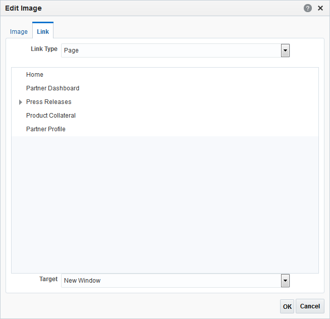
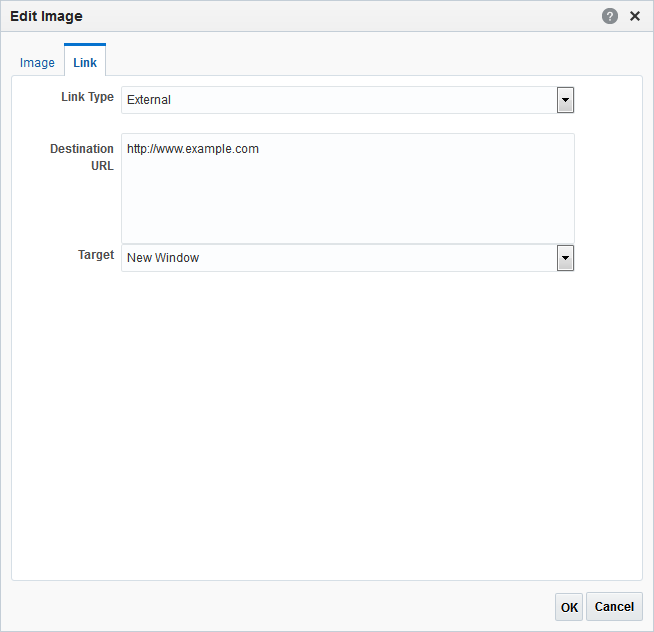
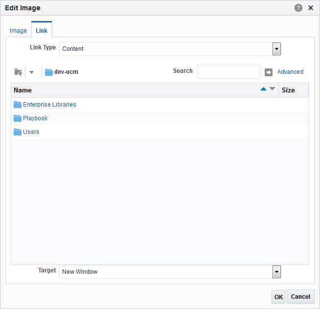
  3. In the Link tab of the Edit Image dialog, from the Link Type list, select:
  4. From the Target dropdown list, select:
    • Same Window to display the link destination in the current browser window, navigating away from the current page.

    • New Window to display the link destination in a new browser window.

    If you do not specify a target, the browser default behavior is observed, which is usually to open the link in the current browser window.

  5. Click OK to preview the image.

Adding a Hyperlink to Rich Text

To add a hyperlink to rich text:

  1. Go to the page that contains the text to which you want to add the hyperlink and enter contribution mode.

    For more information, see Entering Contribution Mode.

  2. Click anywhere in the Text component where you want to add your hyperlink, or click the Contribute icon (Figure 17-18).

    Figure 17-18 The Contribute Icon

    Contribute icon
  3. In the Text component, place the cursor where you want to add the link and click the Add Link icon (Figure 17-19).

    Tip:

    If the Text component already includes the text that you want to turn into a hyperlink, select the text before clicking Add Link.

    Figure 17-19 The Add Link Icon

    Add Link icon
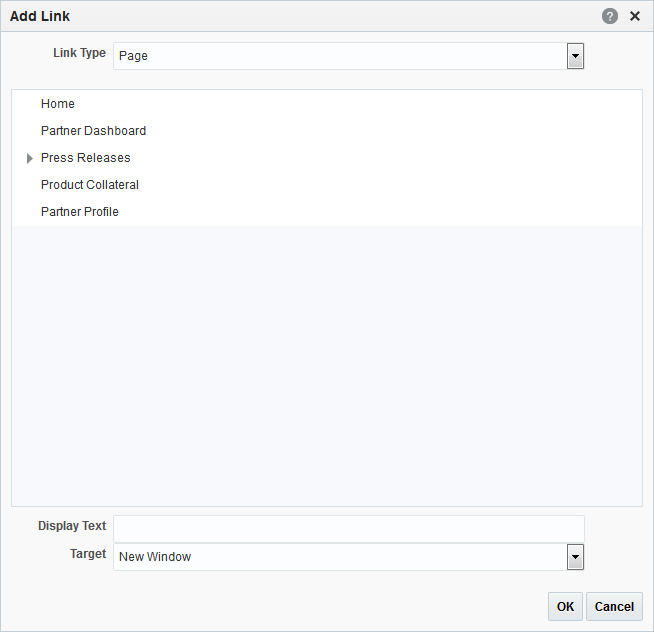
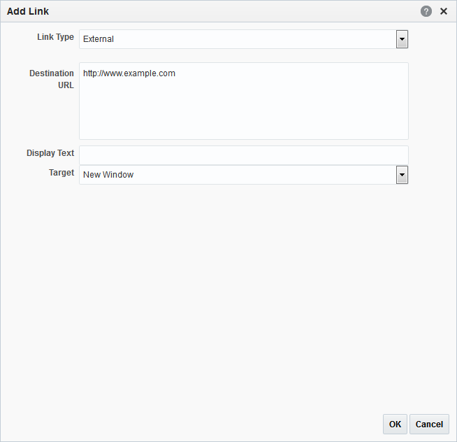
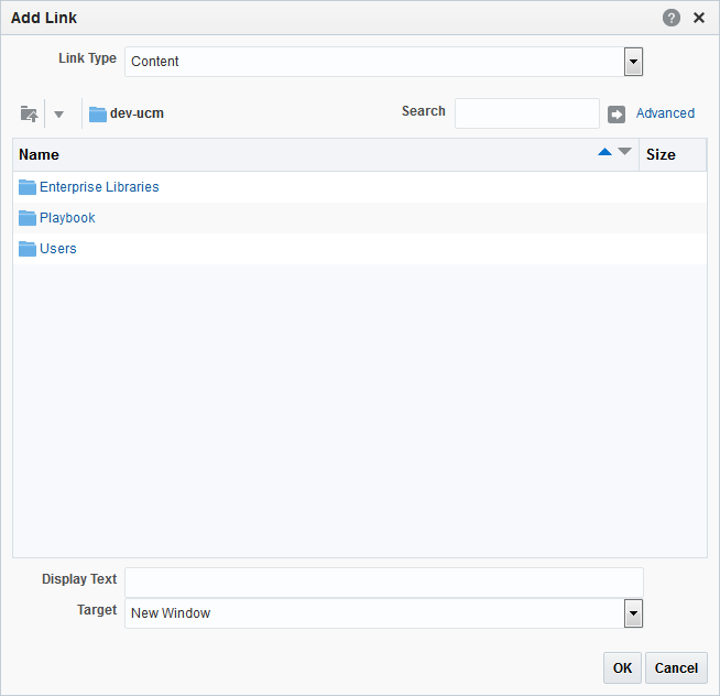
  4. In the Add Link dialog, from the Link Type dropdown list, select:
  5. In the Display Text field, enter the text to use for the hyperlink. If you do not enter a value here, the value is determined from the link destination.

    Note:

    If you selected text in the Text component, the Display Text field is prepopulated with the selected text.

  6. From the Target dropdown list, select:
    • Same Window to display the link destination in the current browser window, navigating away from the current page.

    • New Window to display the link destination in a new browser window.

    If you do not specify a target, the browser default behavior is observed, which is usually to open the link in the current browser window.

  7. Click OK.
  8. To remove a link, select the hyperlinked text and click the Remove Link icon.

    Figure 17-23 The Remove Link Icon

    Remove Link icon
  9. To preview your text, click anywhere outside the text component.

Contributing and Publishing Content in Different Languages

After first adding content in the portal’s default language, you (or other content contributors) can subsequently publish that content in different languages to provide localized content.

Note:

WebCenter Portal does not automatically translate published content; content contributors must provide the translated content, which is then displayed to other users when they view the portal in that language.

To contribute and publish content in different languages:

  1. Make sure that your preferred language is set to the one for which you want to add a localized version.

    For more information, see Choosing Your Preferred Display Language.

  2. Go to the page that contains the content that you want to localize and enter contribution mode.

    For more information, see Entering Contribution Mode.

  3. Overwrite the existing content with the equivalent content in the appropriate language.

    You can provide localized content for the following:

    • Text of a Text or Styled Text component

    • Image location

    • Image description

    • Link destination for images or text

    For more information about the different content contribution and publishing components, see Contributing and Publishing an Image, Contributing and Publishing Rich Text, and Contributing and Publishing Text with Predefined Formatting.

    When the content is published, users whose language matches the one which was used to contribute the localized content will see the localized content; users whose language is set to a different language will see the content which was published for that language. If no localized content was provided for a language, users will see the content provided for the portal's default language.