Working with Page Templates
A page template ensures that all pages in the portal look and behave consistently. WebCenter Portal provides several built-in page templates, and you can create new custom page templates to meet specific requirements.
Permissions: To perform the tasks in this chapter on shared page templates, you must have the application-level
Create, Edit and Delete Page Templatespermission. Users with theApplication Specialistrole have this permission by default. For more information about application-level permissions, see About Application Roles and Permissions in Administering Oracle WebCenter Portal.
To perform the tasks in this chapter, you need one of the following portal-level permissions:
-
Assets: Create, Edit, and Delete AssetsorCreate AssetsandEdit Assets(standard permissions) -
Page Templates: Create, Edit, and Delete Page TemplatesorCreate Page TemplatesandEdit Page Templates(advanced permissions)
See About Roles and Permissions for a Portal.
Note:
Beginning with Release 12c (12.2.1.4.0), Oracle WebCenter Portal has deprecated the support for the built-in page templates Mosaic and Unicorn. However, if you have upgraded from a prior release, these page templates remain available in your upgraded instance.
Topics
About Page Templates
On the Assets and Shared Assets pages, WebCenter Portal provides several built-in page templates. Alternatively, portal designers can create custom page templates to offer more ways to display pages on the screen. If a page template is a shared asset (available to all portals), it is shown on the Assets page of all portals along with portal-specific page templates. Within a portal, you can copy or customize an existing page template.
Note:
Creating and editing a page template is a fairly complex task. While you can develop page templates in WebCenter Portal, the editing capabilities are limited. Oracle recommends that developers use JDeveloper to develop page templates for portals. When fully developed, the developer can publish page templates directly to WebCenter Portal (the portal server) or to a specific portal for immediate use or for testing. Alternatively, the developer can export the page template to a file and upload the page template to WebCenter Portal later.
For more information, see Developing Page Templates in Developing for Oracle WebCenter Portal.
Every page in a portal has an associated page template that defines the structure and layout of the entire page. To ensure that all pages in a portal look and behave consistently, they all use the same page template, set as the default by the portal manager. In contrast, the page style defines the initial layout of the main content area and may be unique for every page.
Typical elements of a page template include:
-
Header, content area (different in each page), and footer. The header and footer commonly include brand-specific elements. For example, a header usually includes a logo and possibly a slogan, and a footer usually includes contact and copyright information. The layout of the content area is defined by the page style.
-
Portal navigation. For example, you might have global navigation in the header and additional navigation on the left side of the page.
-
Additional links and actions. Portal-specific links and actions may include log in/log out, pop-up menus, global links (such as to send an email to the web administrator or to display a privacy statement).
-
Conditional elements. For example, some elements on the page might differ depending on whether the user is public or authenticated or depending on the user's role and privileges.
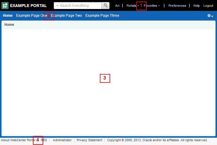
The following figure shows a typical page template, which includes the following elements:
-
Header at the top of the page.
-
Navigation structure below the header, or in a sidebar, to link to important resources.
-
Page content area, which can have its own style and layout as defined by the page style.
-
Footer at the bottom of the page. Figure: Page Template - Basic Structure
Description of the illustration wcsug_paget.gif
A page template exposes the navigation for a portal along the top of the page, or down the side of the page:
-
A top navigation page template exposes the portal navigation in header area. Top navigation makes effective use of the horizontal space on the page, and is recommended when there are 7 or fewer top level pages in the portal navigation. This page template design generally has a header, page and footer sections that use panelGroupLayout components, and is an ideal starting point for sites that require a flowing layout (described below).
-
A side navigation page template exposes the portal navigation in a sidebar on the left side of the page. The vertical nature of side navigation allows for a more lengthy list of navigation items, and is recommended when there are more than 7 top level pages in the portal navigation. Choose a side navigation template for more complex navigations.
Both top navigation and side navigation page templates can have a flowing layout or a stretching layout:
-
A flowing layout is the most typical layout. Components are arranged side by side or one below the other, displayed using their natural size. When the content of the page extends beyond the size of the browser window, the browser displays scroll bars on the page.
-
A stretching layout may be a suitable choice when your page content fills a large area, or you want the page content to grow and shrink depending on the size of the browser window. For example, a stretching layout may be suitable when a page contains a table or graph that you want to fill up the whole content area, no matter what size it is. Another example is a page that contains an editing area, where you want the editor to be exactly as tall and wide as the space given to the content area. This layout has a region for the page content, and adds vertical and horizontal scroll bars to the region on the page when the content cannot be contained within the size of the browser window. When scroll bars are added to the page, the navigation area, page header, and page footer remain in view while the content area scrolls.
Each page template works together with a skin to determine the overall look and feel of the pages in your portal. While the page template controls the location and behavior of components on the page, the skin controls the visual appearance of those components, such as the colors, fonts, and various other aspects.
Each page template can define a preferred skin to identify the skin that works best with that page template. When the page template is selected as the default page template for a portal or as the system default, the default skin automatically updates to the page template’s preferred skin.
By default, a portal inherits the page template defined for the portal template that you select when you create the portal.
Note:
If the portal template does not specify a page template, the portal uses the default page template specified by the system administrator.
You can optionally select a different page template for an individual portal, overriding the default page template settings.
About the Built-In Page Templates
WebCenter Portal provides several built-in page templates suited to common page design requirements, described in Table 15-1.
At the application level, you cannot directly edit or customize any of the built-in page templates. If you want to alter one of these templates to make it match your requirements, you must create a new page template, selecting the built-in page template from the Copy From list, and then make the required adjustments in the new page template.
Note:
The built-in page templates are designed to show one or two levels of navigation. If your navigation includes more than two levels, then only the first one or two levels are displayed when using the built-in page templates. To display further levels of the navigation, you must create your own page template or make a copy of the built-in page template and edit the copy to meet your requirements. .
There are several functions built into the WebCenter Portal page templates:
-
Login and logout
-
User profile and user preferences
-
Edit, create, and manage pages
-
Home portal
-
Portals menu
-
Contact administrator
-
Copyright message and branding
-
Search
Table 15-1 organizes the built-in page templates chronologically, by release, from newest to oldest. Some of the older page templates are provided for backward compatibility with prior releases, as noted in their descriptions. For new pages, use the latest page templates.
The newer page templates provide the following advantages over the older page templates:
-
Simplified customization through improved structured use of ADF components.
-
Fewer task flows, replacing unnecessary task flows with URLs.
-
Efficient XML with fewer nested layout components and easy-to-understand layout creation.
-
Inline navigation, rather than embedded in a JAR-based task flow, allowing for easier customization of portal navigation.
-
Faster performance.
Table 15-1 Built-in Page Templates
| Name | Release | Preferred Skin | Description |
|---|---|---|---|
|
Alta Side Navigation |
12.2.1 |
Alta |
A flowing page layout with side navigation that offers simplified customization and fewer task flows for faster performance over the earlier Side Navigation template. Page and portal actions are available under an Actions icon at the top right of the page header. When the browser window shows scroll bars, the side navigation area, page header, and page footer scroll out of view as you scroll the contents of the page.  |
|
Alta Top Navigation |
12.2.1 |
Alta |
A default page template for flowing layout and top navigation that offers simplified customization and fewer task flows for faster performance over the earlier Top Navigation templates. Page and portal actions are available under an Actions icon at the top right of the page header. When the browser window shows scroll bars, the page header and footer scroll out of view as you scroll the contents of the page.  |
|
Skyros Top Navigation |
11.1.1.8.0 |
Skyros |
A flowing page layout with top navigation. Page and portal actions are available under an Actions icon at the top right of the page header. When the browser window shows scroll bars, the page header and footer remain in view as you scroll the contents of the page. This page template is very similar to WebCenter Portal Top Navigation, with a different skin.  This page template is used for backward compatibility with prior releases where it may have been used to create a custom page template. For new pages, use the newer template Alta Top Navigation. |
|
WebCenter Portal Top Navigation |
11.1.1.8.0 |
WebCenter Portal Skin |
A page template with flowing layout and top navigation. Page and portal actions are available under an Actions icon at the top right of the page header. When the browser window shows scroll bars, the page header and footer remain in view as you scroll the contents of the page. This page template is very similar to Skyros Top Navigation, with a different skin.  This page template is used for backward compatibility with prior releases where it may have been used to create a custom page template. For new pages, use the newer template Alta Top Navigation. |
Setting the Default Page Template
When a user creates a new page in a portal, the portal’s default page template is used to determine the structure and layout of the page. This helps to ensure that all pages in a portal have a consistent look and feel. This consistency within pages makes a portal easy to use.
Tip: To determine which page template to use as the default page template, you can preview page templates.
Page templates work in combination with skins to determine the look and feel of the pages in a portal. When you set the default page template, the default skin is automatically set to the preferred skin for that page template, if it has one.
Note:
If you change the default skin to something other than the page template’s preferred skin, the pages in your portal may not look as expected.
Setting the Default Page Template for a Portal
Permissions: To perform this task, you must be a portal manager or member with
Administration: Manage Security and ConfigurationorAdministration: Manage Configurationpermission in the portal.
Every portal has a set of default assets, including a default page template. By default, a portal inherits the page template defined for the portal template that you select when you create the portal. If the portal template does not define a default page template, the system default page template is used instead.
Setting the Default Page Template for All Portals
Permissions: To perform this task, you must be a system administrator (have the
Administratorrole, or thePortal Server: Manage AllorPortal Server: Manage Configurationpermission).
System administrators can select a page template to use as the WebCenter Portal application-level default page template. This page template is used for pages in the Home portal and for pages in portals where the portal template used to create the portal did not define a default page template.
For information about how to specify the system default page template, see Choosing a Default Page Templates in Administering Oracle WebCenter Portal.
Setting the Default Page Template for a Portal
Permissions: To perform this task, you must be a portal manager or member with
Administration: Manage Security and ConfigurationorAdministration: Manage Configurationpermission in the portal.
For more information about permissions, see About Roles and Permissions for a Portal.
Every portal has a set of default assets, including a default page template. By default, a portal inherits the page template defined for the portal template that you select when you create the portal. If the portal template does not define a default page template, the system default page template is used instead.
To set a different default page template for the pages in your portal, see Changing the Page Template for a Portal.
Setting the Default Page Template for All Portals
Permissions: To perform this task, you must be a system administrator (have the
Administratorrole, or thePortal Server: Manage AllorPortal Server: Manage Configurationpermission).
System administrators can select a page template to use as the WebCenter Portal application-level default page template. This page template is used for pages in the Home portal and for pages in portals where the portal template used to create the portal did not define a default page template.
For information about how to specify the system default page template, see Choosing a Default Page Templates in Administering Oracle WebCenter Portal.
Creating a Page Template
If none of the available page templates meet your requirements, you can create your own. When you create a page template, you use an existing page template as the starting point for the new page template.
Note:
Creating and editing a page template is a fairly complex task. While you can develop page templates in WebCenter Portal as described here, the editing capabilities are limited. Oracle recommends that developers use JDeveloper to develop page templates for portals. When fully developed, the developer can publish page templates directly to WebCenter Portal (the portal server) or to a specific portal for immediate use or for testing. Alternatively, the developer can export the page template to a file and upload the page template to WebCenter Portal later.
For more information, see Developing Page Templates in Developing for Oracle WebCenter Portal.
If you choose to create a page template in WebCenter Portal, giving you the option to later refine it in JDeveloper, you can do so at the application level or at the portal level. Application-level page templates are available for use in all portals, unless the portal has been specifically excluded. Portal-level page templates are available for use only in the portal in which they are created.
To create a page template:
Editing a Page Template
In a portal, you can edit a page template using Structure view of the page editor to fine-tune the layout and content as desired. Note that you can not edit built-in page templates; you can copy a built-in page template to create a new custom page template for a portal, then edit that copy.
Note:
Creating and editing a page template is a complex task. While you can develop page templates in WebCenter Portal as described here, the editing capabilities are limited. Oracle recommends that developers use JDeveloper to develop page templates for portals. New page templates can also be developed from scratch using JDeveloper. When fully developed, the developer can upload page templates directly to WebCenter Portal (the portal server) for immediate use or for testing. Alternatively, the developer can export the page template to a file and upload the page template to WebCenter Portal later.
For more information, see Developing Page Templates in Developing for Oracle WebCenter Portal.
To edit a page template:
Setting the Preferred Skin for a Page Template
Page templates and skins are designed to work in combination to define the look and feel of the pages in your portal. When you create a page template to define the structure and layout of your pages, you should also create a corresponding skin to define the colors, fonts, and so on, used by that page template. As they are so closely related, you may want to identify the skin that is intended to be used with the page template as the page template’s preferred skin.
Note:
When a user identifies a page template as the default for a portal or as the system default, the default skin is automatically set to the preferred skin for that page template, if it has one. If a different default skin is selected, the pages in the portal may not look as expected.
To set a page template’s preferred skin:
Adding Navigation to a Page Template
One of the key parts of a page template is the navigation visualization. This determines how the navigation looks and behaves in your portal.
Best Practice: You can add navigation visualization to a page, but typically you add it to a page template so that it can be defined in one place and propagated consistently across the whole portal.
This section includes the following topics:
-
Header, content area (different in each page), and footer. The header and footer commonly include brand-specific elements. For example, a header usually includes a logo and possibly a slogan, and a footer usually includes contact and copyright information. The layout of the content area is defined by the page style.
-
Portal navigation. For example, you might have global navigation in the header and additional navigation on the left side of the page.
-
Additional links and actions. Portal-specific links and actions may include log in/log out, pop-up menus, global links (such as to send an email to the web administrator or to display a privacy statement).
-
Conditional elements. For example, some elements on the page might differ depending on whether the user is public or authenticated or depending on the user's role and privileges.0
Adding a Built-in Navigation Task Flow to a Page Template
WebCenter Portal provides three built-in navigation task flows that you can add to page templates:
-
Header, content area (different in each page), and footer. The header and footer commonly include brand-specific elements. For example, a header usually includes a logo and possibly a slogan, and a footer usually includes contact and copyright information. The layout of the content area is defined by the page style.
-
Portal navigation. For example, you might have global navigation in the header and additional navigation on the left side of the page.
-
Additional links and actions. Portal-specific links and actions may include log in/log out, pop-up menus, global links (such as to send an email to the web administrator or to display a privacy statement).
-
Conditional elements. For example, some elements on the page might differ depending on whether the user is public or authenticated or depending on the user's role and privileges.1
To add a built-in navigation task flow to a page template:
-
Header, content area (different in each page), and footer. The header and footer commonly include brand-specific elements. For example, a header usually includes a logo and possibly a slogan, and a footer usually includes contact and copyright information. The layout of the content area is defined by the page style.
-
Portal navigation. For example, you might have global navigation in the header and additional navigation on the left side of the page.
-
Additional links and actions. Portal-specific links and actions may include log in/log out, pop-up menus, global links (such as to send an email to the web administrator or to display a privacy statement).
-
Conditional elements. For example, some elements on the page might differ depending on whether the user is public or authenticated or depending on the user's role and privileges.2
Working with Navigation Task Flow Properties
The navigation task flows have associated properties, which users with sufficient properties can access from the Component Properties dialog in Structure View in the page editor (Figure 15-13).
Figure: Navigation Tree Task Flow - Component Properties
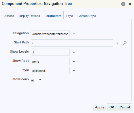
Description of the illustration wcpaa_pgtemp_navtreeprp.gif
See Also: Setting Component Properties in Structure View
This section provides an overview of the navigation task flow properties and steps you through examples of configuring a task flow instance using property values. It includes the following topics:
-
Header, content area (different in each page), and footer. The header and footer commonly include brand-specific elements. For example, a header usually includes a logo and possibly a slogan, and a footer usually includes contact and copyright information. The layout of the content area is defined by the page style.
-
Portal navigation. For example, you might have global navigation in the header and additional navigation on the left side of the page.
-
Additional links and actions. Portal-specific links and actions may include log in/log out, pop-up menus, global links (such as to send an email to the web administrator or to display a privacy statement).
-
Conditional elements. For example, some elements on the page might differ depending on whether the user is public or authenticated or depending on the user's role and privileges.3
Setting Navigation Task Flow Properties
To set properties on a navigation task flow (Navigation Breadcrumb, Navigation Menu, and Navigation Tree), see Setting Component Properties in Structure View.
Navigation Task Flow Properties
This section describes the parameters that are unique to each of the built-in navigation task flows.
Table 15-2 describes the parameters for the Navigation Breadcrumb task flow. For steps to set parameter values, see Rendering Navigation as Breadcrumbs.
Table 15-2 Navigation Breadcrumb Task Flow Parameters
| Parameter | Description |
|---|---|
|
|
Displays the name of the navigation model. |
|
|
The level in the navigation model at which to start the navigation. You can enter a path or an EL expression or click the Select Path icon to select the start node. Valid values are:
For more information, see Selecting the Navigation Start Path. |
|
|
Specifies whether to show the start node in the breadcrumbs. |
|
|
Enter |
Table 15-3 describes the parameters for the Navigation Menu task flow.
Table 15-3 Navigation Menu Task Flow Parameters
| Parameter | Description |
|---|---|
|
|
Displays the name of the navigation model. |
|
|
The style for rendering the second level of navigation items. Valid values are: Notes:
|
|
|
The level in the navigation model at which to start the navigation. You can enter a path or an EL expression or click the Select Path icon to select the start node. Valid values are:
For more information, see Selecting the Navigation Start Path. Note: The Navigation Menu task flow is limited to showing a maximum of two levels of navigation items. |
|
|
The style for rendering the first level of navigation items. Valid values are Notes:
|
|
|
Specifies whether to render icons for each resource. |
Table 15-4 describes the parameters for the Navigation Tree task flow.
Table 15-4 Navigation Tree Task Flow Parameters
| Parameter | Description |
|---|---|
|
|
Displays the name of the navigation model. |
|
|
The level in the navigation model at which to start the navigation. You can enter a path or an EL expression or click the Select Path icon to select the start node. Valid values are:
For more information, see Selecting the Navigation Start Path. |
|
|
The number of levels shown when the tree is initially rendered. Valid values are:
Note: This option applies only if the tree is rendered as a |
|
|
Specifies whether to render the start node in the tree. |
|
|
The style of the navigation. Valid values are:
Note: Specifying the |
|
|
Specifies whether to render icons for each resource. |
Configuring Navigation Task Flows
The following sections use examples based on the sample navigation shown in Figure 15-14:
Figure: Sample Navigation
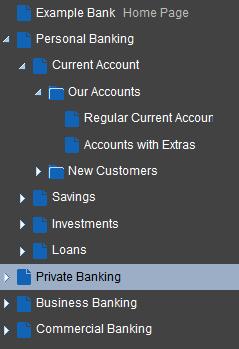
Description of the illustration wcsug_nav_samplemodel.gif
-
Header, content area (different in each page), and footer. The header and footer commonly include brand-specific elements. For example, a header usually includes a logo and possibly a slogan, and a footer usually includes contact and copyright information. The layout of the content area is defined by the page style.
-
Portal navigation. For example, you might have global navigation in the header and additional navigation on the left side of the page.
-
Additional links and actions. Portal-specific links and actions may include log in/log out, pop-up menus, global links (such as to send an email to the web administrator or to display a privacy statement).
-
Conditional elements. For example, some elements on the page might differ depending on whether the user is public or authenticated or depending on the user's role and privileges.4
#{: #GUID-FDFBEA46-B895-454B-9D6B-47FC987BB148}
Selecting the Navigation Start Path
To select the start path for your navigation:
-
Header, content area (different in each page), and footer. The header and footer commonly include brand-specific elements. For example, a header usually includes a logo and possibly a slogan, and a footer usually includes contact and copyright information. The layout of the content area is defined by the page style.
-
Portal navigation. For example, you might have global navigation in the header and additional navigation on the left side of the page.
-
Additional links and actions. Portal-specific links and actions may include log in/log out, pop-up menus, global links (such as to send an email to the web administrator or to display a privacy statement).
-
Conditional elements. For example, some elements on the page might differ depending on whether the user is public or authenticated or depending on the user's role and privileges.5
#{: #GUID-E5C82D20-D4BD-4CF0-98A0-3E4741E3F29C}
Rendering Navigation as a Tree
To render your navigation as a tree:
-
Header, content area (different in each page), and footer. The header and footer commonly include brand-specific elements. For example, a header usually includes a logo and possibly a slogan, and a footer usually includes contact and copyright information. The layout of the content area is defined by the page style.
-
Portal navigation. For example, you might have global navigation in the header and additional navigation on the left side of the page.
-
Additional links and actions. Portal-specific links and actions may include log in/log out, pop-up menus, global links (such as to send an email to the web administrator or to display a privacy statement).
-
Conditional elements. For example, some elements on the page might differ depending on whether the user is public or authenticated or depending on the user's role and privileges.7
#{: #GUID-ADB4472A-436B-4846-9FBF-D09B33AF3EF9}
Rendering Navigation as a Menu
To render your navigation as a menu:
-
Header at the top of the page.
-
Navigation structure below the header, or in a sidebar, to link to important resources.
-
Page content area, which can have its own style and layout as defined by the page style.
-
Footer at the bottom of the page.0
#{: #GUID-596B810C-48CD-434C-A210-1CED7B94A1BC}
Rendering Navigation as Breadcrumbs
To render your navigation as breadcrumbs:
-
Header at the top of the page.
-
Navigation structure below the header, or in a sidebar, to link to important resources.
-
Page content area, which can have its own style and layout as defined by the page style.
-
Footer at the bottom of the page.2
#{: #GUID-114CC4AF-9E3F-4B65-AD33-FF65DFCBE502}
Linking Navigation Task Flows
You may want to include more than one area of navigation in your portal. For example, you might want to include tabs along the top of the page, displaying the top level of your navigation, and a second tree structure down the side of the page. You can link the navigation task flows together so that the tree navigation reflects the selected navigation item in the tabbed menu.
The following procedure shows how to do this using the sample navigation shown in Figure 15-14.
To link navigation task flows:
-
Header at the top of the page.
-
Navigation structure below the header, or in a sidebar, to link to important resources.
-
Page content area, which can have its own style and layout as defined by the page style.
-
Footer at the bottom of the page.3
Downloading Additional Navigation Task Flows
Additional navigation task flows are available for download from Oracle Technology Network at:
http://www.oracle.com/technetwork/middleware/webcenter/samples-196325.zip
The ZIP file contains the following navigation task flows:
-
Header at the top of the page.
-
Navigation structure below the header, or in a sidebar, to link to important resources.
-
Page content area, which can have its own style and layout as defined by the page style.
-
Footer at the bottom of the page.4
Download the ZIP file and extract its contents locally. You can then upload one or more of the archive files to your application, as described in Uploading an Asset. The task flows are then available in the resource catalog under Integration, Task Flows.
Designing Advanced Navigation Visualization
The navigation task flows provided by WebCenter Portal enable you to quickly visualize your navigation in your application. However, you may find that these task flows do not quite match your navigation requirements. If you find this is the case, you can use JDeveloper to edit the page templates you create in WebCenter Portal and add the navigation UI directly to the templates using the navigation EL APIs provided by WebCenter Portal. You can then upload these edited page templates back into WebCenter Portal. You can also create your page templates entirely in JDeveloper before uploading them to WebCenter Portal. The WebCenter Portal built-in page templates were created in this way.
Note:
Designing advanced navigation visualization in a page template is a complex task. Therefore, the implementation of advanced navigation visualization should be completed by an experienced Web Developer.
The steps to download and upload page templates from WebCenter Portal are described in Working with Portal Assets in JDeveloper.
For information about specific considerations for creating page templates in JDeveloper for use in WebCenter Portal, see Developing Page Templates in Developing for Oracle WebCenter Portal.
Managing a Page Template
The following options are available on the Assets or Shared Assets page to enable you to manage page templates.
See Also: Accessing Portal Assets and Accessing Shared Assets
-
Header at the top of the page.
-
Navigation structure below the header, or in a sidebar, to link to important resources.
-
Page content area, which can have its own style and layout as defined by the page style.
-
Footer at the bottom of the page.5