27 Creating Content Presenter Display Templates
This chapter describes the out-of-the-box Content Presenter display templates, how to create new display templates, and how to make display templates available to users.
Note:
Content Presenter can only be used with Content Server-based content. No other content repository connection types are supported.This chapter includes the following topics:
-
Section 27.3, "Creating Content Presenter Display Templates"
-
Section 27.4, "Adding the Content Presenter Task Flow to a Page"
-
Section 27.5, "Making Content Presenter Display Templates Available"
-
Section 27.7, "Configuring Coherence as the Caching Mechanism"
-
Section 27.8, "Optimizing Performance for Content Presenter Display Templates"
-
Section 27.9, "Content Presenter Tips, Tutorials and Examples"
27.1 About Content Presenter Display Templates
A Content Presenter display template is a JSFF file (JSF page fragment) that defines how Content Presenter renders content items (including images and text) on a portal or Framework application page. WebCenter Portal provides several out-of-the-box display templates to get you started, but you can also create your own templates to solve specific display requirements.
Some typical situations where Content Presenter display templates provide value are:
-
Providing different layouts for different parts of a page. For example, you may have articles from different sources on the same page, each requiring its own layout (for more information, see Section 27.3.3, "Defining Multiple-Item Display Templates").
-
Presenting content based on the capabilities of the viewing device. You can provide display templates that respond to whether the viewing device is a standard monitor, tablet or smart phone (for more information, see Section 27.3.4, "Using Responsive Templates").
Making content available through Content Presenter display templates lets you solve complex display issues through a standardized template rather than doing each individual layouts by hand. By making display templates available to users you enable them to solve layout requirements based on predefined department or company standards without developer involvement.
Tip:
You can find sample display templates in$ORACLE_HOME/jdeveloper/webcenter/samples/contentpresenter. These sample files were installed as part of WebCenter Portal's extension for Oracle JDeveloper.Display templates can use the full set of Rich ADF components, so you can quickly and easily create robust and attractive templates to display your content. Note, however, that you are not required to use these components in your template.
A Content Presenter display template can handle either single-content items, multiple-content items, or combinations of the two. For example, a multiple content item template might render tabs for each item and then call a single item template to render the details of a selected item.
Each content item is associated with a specific content type defined in the WebCenter Content repository. A content type defines the properties of the content item. Content types can map to WebCenter Content profile definitions and Site Studio region definitions.
Tip:
Oracle recommends that you use Content Presenter ADF templates to integrate Site Studio and WebCenter Portal instead of Site Studio region templates. The recommended flow is:-
Develop region definitions in Site Studio
-
Develop ADF templates referencing region definitions using JDeveloper
-
Publish the templates and import them into Portal Server
-
Use Content Presenter to render the content and to enable users to contribute content
Content types are created on the content repository (WebCenter Portal Content Server). As a Content Presenter display template developer, you need to know the names of the properties defined for the associated content type so that you can define how to display the selected content item(s) on the page.
Tip:
One way to determine the properties for the existing content types defined in WebCenter Content is to use the Content Presenter Configuration dialog in a portal. For a detailed description of this technique, see Section 27.3.8, "Discovering Content Type Property Names."At runtime, an authorized end user can choose a display template in the Content Presenter Configuration dialog. For more information about best practices and determining when and how to use Content Presenter templates, see the blog entry at:
http://www.ateam-oracle.com/portal-and-content-content-integration-best-practices
27.2 Using the Out-of-the-Box Display Templates
WebCenter Portal provides several out-of-the-box Content Presenter display templates. These pre-built templates provide options for displaying single content items and multiple content items.
For example, the Default Document Details View template displays detailed information about any single content item including creation date, modification date, created by username, modified by username, and path. Figure 27-7 shows a content item displayed at runtime with this template.
Figure 27-1 Default Document Details View Display Template
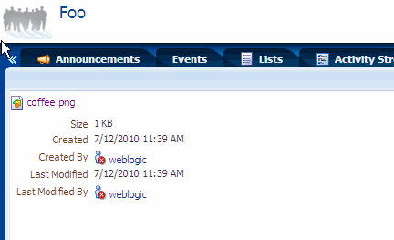
Description of ''Figure 27-1 Default Document Details View Display Template''
Several options are provided for displaying multiple content items, such as the Accordion View, which displays multiple content items in an accordion format. In this format, each item can be expanded to display its details, as shown in Figure 27-2. (Note that one item will always be open in an accordion view. That is, you cannot close all of the items, you can only change which single item is open at any time.)
Figure 27-2 Accordion View Display Template
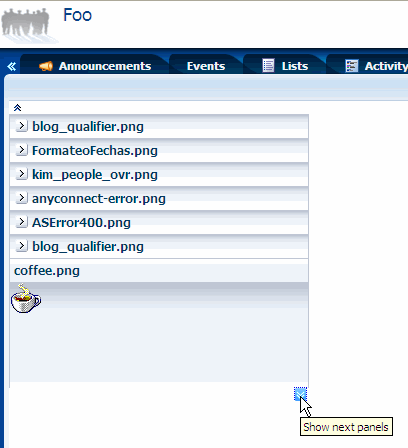
Description of ''Figure 27-2 Accordion View Display Template''
For a complete list of out-of-the-box display templates, see Section 29.7.1, "Content Presenter Task Flow Parameters and Out-of-the-Box Display Templates."
27.3 Creating Content Presenter Display Templates
If the out-of-the-box display templates (see Section 27.2, "Using the Out-of-the-Box Display Templates") do not meet your needs, you can define custom Content Presenter templates.
Tip:
As well as creating new Content Presenter display templates, you can also copy one of the out-of-the-box templates and modify it.This section discusses these topics:
-
Section 27.3.6, "Using Image Renditions in Content Presenter Display Templates"
-
Section 27.3.7, "Using EL Expressions to Retrieve Content Item Information"
-
Section 27.3.9, "Referencing External Files in Display Templates"
-
Section 27.3.10, "Referencing Site Studio Region Elements in a Custom View"
-
Section 27.3.11, "Using a Content Presenter Display Template"
27.3.1 About Content Presenter Display Templates
Depending on your needs, the approach you take to defining Content Presenter display templates will vary. Typically, you define display templates for specific single items of content, then define a multiple content item display template that includes calls to the single item display templates.
Template definitions can include calls to other display templates in any of the following ways:
-
A single content item display template can call another single content item display template.
-
A multiple content item display template can call a single content item display template (as shown in the examples below).
-
A multiple content item display template can call another multiple content item display template.
The basic tasks for creating Content Presenter display templates include:
-
Deciding whether to create a single or multiple item display template. See Section 27.3.2, "Creating Single-Item Display Templates" and Section 27.3.3, "Defining Multiple-Item Display Templates."
-
Deciding what kind of information you want to display with content items. Consider also, for example, using WebCenter Portal's EL expressions in your template to retrieve and display this information. See Section 27.3.7, "Using EL Expressions to Retrieve Content Item Information," and Appendix G, "Expression Language Expressions" for more information about using EL expressions.
-
Designing the look and feel of the template. In addition to standard JSFF constructs, display templates can use ADF components. See Web User Interface Developer's Guide for Oracle Application Development Framework.
-
Exporting the template as a portal resource. See Section 27.5.1, "Export a Content Presenter Display Template as a Portal Resource."
-
Configuring Content Presenter to use Coherence as the caching mechanism for production (optional, but recommended) and HA environments (required) as described in Section 27.7, "Configuring Coherence as the Caching Mechanism."
27.3.2 Creating Single-Item Display Templates
Examples of single content items for which you may want to create Content Presenter display templates are:
-
Individual items to display with a specific look and feel on a page.
-
Different views of a specific type of item (such as short and detailed views of an article).
-
Different versions of a similar item (such as Press Releases that may be formatted differently for different groups and using a different set of properties).
The definition of a single content item display template uses the JSP tags listed in Table 27-1.
Table 27-1 Content Display Template Tags for Single Content Items
| JSP Tag | Description | Example |
|---|---|---|
|
|
Required. Defines a single content item template. Attributes:
|
<dt:contentTemplateDef var="node"> <af:outputText value="#{node.name}" /> </dt:contentTemplateDef> |
|
|
Optional. Retrieves and renders the string value(s) of the specified node property inline. Attributes:
|
<!--
  Handling of text-based primary
  properties (HTML, text, etc.).
-->
<dt:contentTemplateDef var="node">
    <cmf:renderProperty id="rp1"
     name="#{node.primaryProperty.name}"
     node="#{node}"/>
</dt:contentTemplateDef>
|
|
|
Optional. Nested under Calls another single item template. Attributes:
|
<dt:contentTemplateDef var="node">
  <af:outputText value="#{node.name}" >
  <dt:contentTemplate node="#{node}"
     view="templates.pressrelease.item"
     />
  </af:outputText>
</dt:contentTemplateDef>
|
To create a display template for a single content item:
-
In JDeveloper, create a JSFF file:
-
From the File menu, choose New.
-
In the New Gallery dialog, expand Web Tier, select JSF, then JSF Page Fragment.
-
Click OK.
-
In the Create New JSF Page Fragment dialog, enter a name for the display template file.
-
Set the Directory field to point to the
oracle/webcenter/portalapp/pagesfolder of your portal Web project. This directory must be set from the correct root path. In JDeveloper, the root path is PROJECT_NAME > Web Content. On the file system, the root path is PROJECT_ROOT/public_html. For example: PROJECT_ROOT/public_html/oracle/webcenter/portalapp/pages. A good practice is to first create a subfolder inpagesand store the JSFF in the subfolder.
-
-
Select View, then Component Palette to open the Component Palette.
-
From the dropdown list at the top of the Component Palette (Figure 27-3):
-
Select WebCenter Content Display Templates for a list of display template tags.
-
Select WebCenter Content Management Faces for the
renderPropertytag.
Figure 27-3 Content Display Template Tags in Component Palette
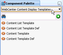
Description of ''Figure 27-3 Content Display Template Tags in Component Palette''
-
-
In Source view, drag and drop the required display template tags from the Component Palette onto the page to define your template. Refer to Table 27-1 for information about each tag and required parameter values.
Example 27-1 and Example 27-2 show sample single content item display template definitions. These examples illustrate a use case where a certain kind of document (a press release) is produced by two different departments inside a company, and each department has defined its own content type and properties. These sample Content Presenter display templates allow these two different content types to be displayed in a consistent manner.
The template shown in Example 27-1 handles a press release that uses a property named xHeading to describe the heading of the press release document, and xDestinationUrl to describe the location of the document. To learn how you can retrieve these property names for a given content type, see Section 27.3.8, "Discovering Content Type Property Names."
Example 27-1 Sample Content Presenter Display Template for a Press Release Document
<?xml version = '1.0'?>
<jsp:root xmlns:jsp="http://java.sun.com/JSP/Page"
          version="2.1"
          xmlns:af="http://xmlns.oracle.com/adf/faces/rich"
          xmlns:dt="http://xmlns.oracle.com/webcenter/content/templates">
   <dt:contentTemplateDef var="node">
      <af:goImageLink text="#{node.propertyMap['xHeading'].value}"
                      id="gil1"
                      icon="#{node.icon.smallIcon}"
                      destination="#{node.propertyMap['xDestinationUrl'].value}"
                      targetFrame="_blank">
      </af:goImageLink>
   </dt:contentTemplateDef>
</jsp:root>
The template shown in Example 27-2 handles a press release that uses a property named dDocTitle to describe the heading of the press release document, and xLinkUrl to describe the location of the document.
Example 27-2 Sample Content Presenter Template for Another Press Release Document
<?xml version = '1.0'?>
<jsp:root xmlns:jsp="http://java.sun.com/JSP/Page"
          version="2.1"
          xmlns:af="http://xmlns.oracle.com/adf/faces/rich"
          xmlns:dt="http://xmlns.oracle.com/webcenter/content/templates">
   <dt:contentTemplateDef var="node">
      <af:goImageLink text="#{node.propertyMap['dDocTitle'].value}"
                      id="gil1"
                      icon="#{node.icon.smallIcon}"
                      destination="#{node.propertyMap['xLinkUrl'].value}"
                      targetFrame="_blank">
      </af:goImageLink>
   </dt:contentTemplateDef>
</jsp:root>
27.3.3 Defining Multiple-Item Display Templates
Examples of multiple content items for which you may want to create Content Presenter display templates are:
-
A group of similar items that you want to display on a page, such as a list of books or an employee directory of pictures.
-
Query results, such as all documents modified in the last week.
-
A list of all documents in a WebCenter Content folder.
A Content Presenter display template can also combine both single and multiple items. For example, a multiple content item template might render tabs for each item and then call a single item template to render the details of a selected item. For an example of how to do this, see the A-Team blog entry "Enable Content Editing of Iterative Components."
The definition of a multiple content item display template uses the JSP tags listed in Table 27-2.
Table 27-2 Content Display Template Tags for Multiple Content Items
| JSP Tag | Description | Example |
|---|---|---|
|
|
Required. Defines the multiple content item template. Attributes:
|
<dt:contentListTemplateDef var="nodes"> <af:iterator value="#{nodes}" var="node"> <af:outputText value="#{node.name}" /> </af:iterator> </dt:contentListTemplateDef> |
|
|
Optional. Nested under Calls another multiple item template. Attributes:
|
<dt:contentListTemplateDef var="nodes">
<!--
  Reuse the default bulleted list view, but
  indent it with a <blockquote>
-->
  <f:verbatim>
    <blockquote>
  </f:verbatim>
  <dt:contentListTemplate nodes="#{nodes}"
     category="oracle.webcenter.content.
         templates.default.category"
     view="oracle.webcenter.content.
         templates.default.list.bulleted"/>
  <f:verbatim>
    </blockquote>
  </f:verbatim>
</dt:contentListTemplateDef>
|
|
|
Optional. Nested under Calls a single item template. Attributes:
|
<dt:contentListTemplateDef var="nodes">
  <af:iterator rows="0" var="node"
     varStatus="iterator" value="#{nodes}">
  <dt:contentTemplate node="#{node}"
     view="templates.pressrelease.listitem"
     nodesHint="#{nodes}"/>
  </af:iterator>
</dt:contentListTemplateDef>
|
To define a display template for multiple content items:
-
In JDeveloper, create a JSFF file and open the Component Palette, as described in Step 1 through Step 3 in Section 27.3.2, "Creating Single-Item Display Templates."
-
In Source view, drag and drop the required display template tags from the Component Palette onto the page. Refer to Table 27-2 for information about each tag and required parameter values.
Example 27-3 shows a sample multiple content item display template definition.
Example 27-3 Sample display template definition for the display of multiple press releases (press-release-list-view.jsff)
This template definition iterates over the data items selected for display, and processes them according to the referenced view (view="mycorp.content.templates.pressrelease.listitem").
<?xml version = '1.0'?>
<jsp:root xmlns:jsp="http://java.sun.com/JSP/Page" version="2.1"
          xmlns:af="http://xmlns.oracle.com/adf/faces/rich"
          xmlns:dt="http://xmlns.oracle.com/webcenter/content/templates">
   <dt:contentListTemplateDef var="nodes">
      <af:panelGroupLayout layout="scroll" id="nodeListPanel" valign="middle">
        <af:iterator rows="0" var="node" varStatus="iterator" value="#{nodes}">
           <dt:contentTemplate node="#{node}"
               view="mycorp.content.templates.pressrelease.listitem"
               nodesHint="#{nodes}"/>
        </af:iterator>
      </af:panelGroupLayout>
   </dt:contentListTemplateDef>
</jsp:root>
27.3.4 Using Responsive Templates
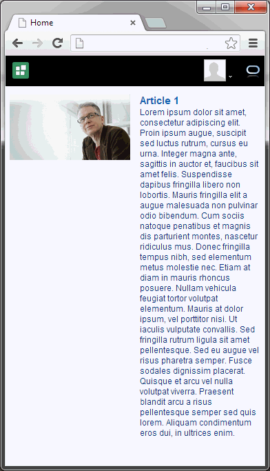
Using CSS3 media queries, you can render content to adapt to conditions such as screen resolution. The out-of-the-box Content Presenter templates "Articles View" and "Full Articles View" are examples of how CSS3 media queries can be used in a Content Presenter template for a responsive layout. For information about how these responsive templates can be extended, see Section 27.3.5, "Extending Responsive Templates." For information about Content Presenter's out-of-the-box display template parameters, see Section 29.7.1, "Content Presenter Task Flow Parameters and Out-of-the-Box Display Templates." For information about optimizing viewport settings for mobile devices such as smart phones and tablets, see the "Optimizing Portals for Mobile Devices" section in Building Portals with Oracle WebCenter Portal.
27.3.4.1 Prerequisites
The Articles View and Full Article View templates described in Section 27.3.4.2, "Displaying Multiple Articles," rely on the Site Studio RD_ARTICLE region definition. Consequently, Site Studio must be enabled in WebCenter Content to allow the Articles View and Full Article View Content Presenter templates to be used.
Follow the steps below to enable Site Studio and seed Content Server with the RD_ARTICLE region definition:
-
Enable Site Studio (see the "Understanding Site Studio Integration" section in Building Portals with Oracle WebCenter Portal).
-
Start (or restart) WebCenter Portal after Site Studio has been enabled (this will seed the
RD_ARTICLEregion definition).
27.3.4.2 Displaying Multiple Articles
The template definition in Example 27-4 iterates over the data items selected for display, and uses three style classes:
-
article- applied to each content item -
article-3- applied to each content item that will be in the first column if the page is split into rows of three columns -
article-2- applied to each content item that will be in the first column if the page is split into rows of two columns
The style classes are defined in the articles.css style sheet.
Example 27-4 Sample display template definition for displaying multiple articles (articles.jsff)
<?xml version = '1.0'?>
<jsp:root xmlns:jsp="http://java.sun.com/JSP/Page" version="2.1"
          xmlns:af="http://xmlns.oracle.com/adf/faces/rich"
          xmlns:dt="http://xmlns.oracle.com/webcenter/content/templates"
          xmlns:f="http://java.sun.com/jsf/core"
          xmlns:h="http://java.sun.com/jsf/html"
          xmlns:rah="http://xmlns.oracle.com/webcenter/resourcehandler"
          xmlns:tr="http://myfaces.apache.org/trinidad">
   <dt:contentListTemplateDef var="nodes">
      <af:resource type="css" source="/oracle/webcenter/content/templates/seeded/articles.css"/>
      <af:iterator rows="0" var="node" varStatus="iterator" value="#{nodes}"
                   id="it0">
         <h:panelGroup styleClass="#{(iterator.index % 3 == 0) ? 'article-3 ' : ''}#{(iterator.index % 2 == 0) ? 'article-2 ' : ''}article"
                       id="pg1">
            <af:commandLink immediate="true" partialSubmit="true" id="cl2">
               <rah:resourceActionBehavior id="rah1"
                                           serviceId="oracle.webcenter.content.presenter"
                                           resourceId="#{node.id}"
                                           resourceTitle="#{node.propertyMap['RD_ARTICLE:TITLE'].asTextHtml}"
                                           useResourcePopup="never"/>
               <f:attribute name="taskFlowInstId"
                            value="a5fafea8-90e6-4972-997d-314401b6c98b"/>
               <f:attribute name="datasourceType" value="dsTypeSingleNode"/>
               <f:attribute name="datasource"
                            value="#{node.id.repositoryName}#dDocName:#{node.propertyMap['dDocName'].value}"/>
               <f:attribute name="templateView"
                            value="oracle.webcenter.content.templates.sitestudio.fullarticle"/>
               <f:attribute name="regionTemplate" value="#{false}"/>
               <af:outputText value="#{node.propertyMap['RD_ARTICLE:IMAGE'].asTextHtml}"
                              escape="false" id="ot4"/>
               <tr:panelHeader text="#{node.propertyMap['RD_ARTICLE:TITLE'].asTextHtml}"
                               id="ph1">
                  <af:outputText value="#{node.propertyMap['RD_ARTICLE:SUMMARY'].asTextHtml}"
                                 escape="false" id="ot3"/>
               </tr:panelHeader>
            </af:commandLink>
         </h:panelGroup>
      </af:iterator>
   </dt:contentListTemplateDef>
</jsp:root>
27.3.4.3 Using CSS3 Media Queries
The style sheet in Example 27-5 uses media queries to render the content in different ways depending on the width of the browser.
Example 27-5 Style sheet using CSS3 Media Queries (articles.css)
/* Default styles */
.article {
  display: block;
  float: left;
  width: 31.623931623931625%;
  margin-left: 2.564102564102564%;
  margin-bottom: 1em;
}
.article-3 {
  margin-left: 0;
  clear: both;
}
.article img {
  width: 100%;
  margin: 0 0 .25em;
  float: none;
  padding-top: 0;
  display: block;
  border: 0;
}
.article h1 {
  font-size: 1.5em;
}

@media only screen and (max-width : 480px) {
  /* up to width of iPhone (excluding iPhone 5 in landscape) */
  .article {
    margin-top: .5em;
    float: left;
    display: inline;
    width: 100%;
    margin-left: 0;
  }
  .article-3 {
    width: 100%;
    clear: none;
  }
  .article img {
    margin-right: 4%;
    width: 48%;
    float: left;
  }
  .article {
    font-size: 1em;
  }
  .article h1 {
    font-size: 1.25em;
  }
}

@media only screen and (min-width : 481px) and (max-width : 780px) {
  /* up to the width of iPad in portrait and iPhone 5 in landscape */
  .article {
    display: block;
    float: left;
    width: 48.71794871794871%;
    margin-left: 2.564102564102564%;
    clear: none;
  }
  .article-3 {
    margin-left: 2.564102564102564%;
    clear: none;
  }
  .article-2 {
    margin-left: 0;
    clear: both;
  }
  .article h1 {
    font-size: 1.25em;
  }
}

@media only screen and (min-width : 769px) and (max-width : 1024px) {
  /* up to the width of iPad in landscape */
}

@media only screen and (min-width : 1025px) {
  /* desktop */
}
27.3.5 Extending Responsive Templates
These section describes the steps required to modify the out-of-the-box templates if they don't meet your local requirements. For information about optimizing viewport settings for mobile devices such as smart phones and tablets, see the "Optimizing Portals for Mobile Devices" section in Building Portals with Oracle WebCenter Portal.
This section includes the following subsections:
27.3.5.1 Extending the Articles View Template
To extend the Articles View template follow the steps below:
-
Create an empty template for displaying multiple items (see Section 27.3.3, "Defining Multiple-Item Display Templates") and copy the contents of
articles.jsff (located in theJDEVELOPER/webcenter/samples/contentpresenter/directory) into the empty template. -
Embed the CSS used by
artices.jsffinto the new template by changing:<af:resource type="css" source="/oracle/webcenter/content/templates/seeded/articles.css"/>
To:
<af:resource type="css"> /* Default styles */ .article { display: block; float: left; width: 31.623931623931625%; margin-left: 2.564102564102564%; margin-bottom: 1em; } .article-3 { margin-left: 0; clear: both; } .article img { width: 100%; margin: 0 0 .25em; float: none; padding-top: 0; display: block; border: 0; } .article h1 { font-size: 1.5em; } @media only screen and (max-width : 480px) { /* up to width of iPhone */ .article { margin-top: .5em; float: left; display: inline; width: 100%; margin-left: 0; } .article-3 { width: 100%; clear: none; } .article img { margin-right: 4%; width: 48%; float: left; } .article { font-size: 1em; } .article h1 { font-size: 1.25em; } } @media only screen and (min-width : 481px) and (max-width : 780px) { /* up to the width of iPad in portrait */ .article { display: block; float: left; width: 48.71794871794871%; margin-left: 2.564102564102564%; clear: none; } .article-3 { margin-left: 2.564102564102564%; clear: none; } .article-2 { margin-left: 0; clear: both; } .article h1 { font-size: 1.25em; } } @media only screen and (min-width : 769px) and (max-width : 1024px) { /* up to the width of iPad in landscape */ } @media only screen and (min-width : 1025px) { /* desktop */ } </af:resource> -
Edit the new template to adapt it to your requirements (see Section 27.3.5.3, "Adapting the Out-of-the-Box Templates").
-
Export the new template as a Portal Resource (see Section 27.5.1, "Export a Content Presenter Display Template as a Portal Resource").
-
Upload the new template to your WebCenter Portal or Framework application (see Section 27.5.2, "Upload the New Content Presenter Display Template").
27.3.5.2 Extending the Full Article View Template
Follow the steps below to extend the Full Article View template:
-
Create an empty template for displaying a single content item (see Section 27.3.2, "Creating Single-Item Display Templates") and copy the contents of
full-article.jsff(located in theJDEVELOPER/webcenter/samples/contentpresenter/directory) into the empty template. -
Embed the CSS used by
full-artice.jsffinto the new template by changing:<af:resource type="css" source="/oracle/webcenter/content/templates/seeded/articles.css"/>
To:
<af:resource type="css"> /* Default styles */ .full-article h1 { font-size: 1.5em; } .full-article-image img { margin-left: 4%; width: 48%; float: right; } @media only screen and (max-width : 480px) { /* up to width of iPhone */ .full-article-image img { margin-left: 0; width: 100%; float: none; } } @media only screen and (min-width : 481px) and (max-width : 780px) { /* up to the width of iPad in portrait */ } @media only screen and (min-width : 769px) and (max-width : 1024px) { /* up to the width of iPad in landscape */ } @media only screen and (min-width : 1025px) { /* desktop */ } </af:resource> -
Edit the new template to adapt it your requirements (see Section 27.3.5.3, "Adapting the Out-of-the-Box Templates").
-
Export the new template as a Portal Resource (see Section 27.5.1, "Export a Content Presenter Display Template as a Portal Resource").
-
Upload the new template (see Section 27.5.2, "Upload the New Content Presenter Display Template").
27.3.5.3 Adapting the Out-of-the-Box Templates
This section describes changes you may want to make to the Articles View and Full Article View templates, and outlines how you could go about making those changes. For example:
-
You may want to update the templates to support a responsive layout on older browsers like Internet Explorer 8.
-
You may want to update the templates to work with a different region definition.
These extensions are described in the following sections:
27.3.5.3.1 Supporting Responsive Layouts for Older Browsers
The current responsive templates rely on CSS3 media queries, which are not supported by older browsers, so you may want to use a third-party JavaScript library that can take the media queries and use JavaScript to enable a responsive design.
To do this:
-
Create and deploy a custom Shared Library for WebCenter Portal containing the third-party JavaScript library (see Section 55.2, "Developing Task Flows, Data Controls, and Managed Beans for WebCenter Portal").
-
Add a reference to a third-party JavaScript library to the template (where
path/to/3rd/party/library.jsis the path to the JavaScript file within the Custom Shared Library):<af:resource type="javascript" source="path/to/3rd/party/library.js"/>
27.3.5.3.2 Using Different Region Definitions
This section shows you how you can modify the region definitions in your responsive template, For example, you might have a region definition called RD_NEWS with four elements: TITLE, LEAD, IMAGE, and BODY (see Section 27.3.10, "Referencing Site Studio Region Elements in a Custom View"). You could then update the templates to reference this new region definition by changing references of RD_ARTICLES to RD_NEWS and changing the references of SUMMARY to LEAD.
This template displays a list of news items (of type RD_NEWS) based on the Articles View template:
<?xml version = '1.0'?>
<jsp:root xmlns:jsp="http://java.sun.com/JSP/Page" version="2.1"
          xmlns:af="http://xmlns.oracle.com/adf/faces/rich"
          xmlns:dt="http://xmlns.oracle.com/webcenter/content/templates"
          xmlns:f="http://java.sun.com/jsf/core"
          xmlns:h="http://java.sun.com/jsf/html"
          xmlns:rah="http://xmlns.oracle.com/webcenter/resourcehandler"
          xmlns:tr="http://myfaces.apache.org/trinidad">
   <dt:contentListTemplateDef var="nodes">
      <af:resource type="css" source="/oracle/webcenter/content/templates/seeded/articles.css"/>
      <af:iterator rows="0" var="node" varStatus="iterator" value="#{nodes}"
                   id="it0">
         <h:panelGroup styleClass="#{(iterator.index % 3 == 0) ? 'article-3 ' : ''}#{(iterator.index % 2 == 0) ? 'article-2 ' : ''}article"
                       id="pg1">
            <af:commandLink immediate="true" partialSubmit="true" id="cl2">
               <rah:resourceActionBehavior id="rah1"
                                           serviceId="oracle.webcenter.content.presenter"
                                           resourceId="#{node.id}"
                                           resourceTitle="#{node.propertyMap['RD_NEWS:TITLE'].asTextHtml}"
                                           useResourcePopup="never"/>
               <f:attribute name="taskFlowInstId"
                            value="a5fafea8-90e6-4972-997d-314401b6c98b"/>
               <f:attribute name="datasourceType" value="dsTypeSingleNode"/>
               <f:attribute name="datasource"
                            value="#{node.id.repositoryName}#dDocName:#{node.propertyMap['dDocName'].value}"/>
               <f:attribute name="templateView"
                            value="oracle.webcenter.content.templates.newsitem"/>
               <f:attribute name="regionTemplate" value="#{false}"/>
               <af:outputText value="#{node.propertyMap['RD_NEWS:IMAGE'].asTextHtml}"
                              escape="false" id="ot4"/>
               <tr:panelHeader text="#{node.propertyMap['RD_NEWS:TITLE'].asTextHtml}"
                               id="ph1">
                  <af:outputText value="#{node.propertyMap['RD_NEWS:LEAD'].asTextHtml}"
                                 escape="false" id="ot3"/>
               </tr:panelHeader>
            </af:commandLink>
         </h:panelGroup>
      </af:iterator>
   </dt:contentListTemplateDef>
</jsp:root>
This template displays a full news item (View ID: oracle.webcenter.content.templates.newsitem) based on the Full Articles View template:
<?xml version = '1.0'?>
<jsp:root xmlns:jsp="http://java.sun.com/JSP/Page" version="2.1"
          xmlns:af="http://xmlns.oracle.com/adf/faces/rich"
          xmlns:dt="http://xmlns.oracle.com/webcenter/content/templates"
          xmlns:f="http://java.sun.com/jsf/core"
          xmlns:h="http://java.sun.com/jsf/html"
          xmlns:tr="http://myfaces.apache.org/trinidad">
     <dt:contentTemplateDef var="node">
        <af:resource type="css" source="/oracle/webcenter/content/templates/seeded/articles.css"/>
        <af:panelGroupLayout id="psl1" layout="vertical">
            <tr:panelHeader text="#{node.propertyMap['RD_NEWS:TITLE'].asTextHtml}"
                            styleClass="full-article" id="ph1">
                <tr:panelGroupLayout id="pgl1" styleClass="full-article-image">
                    <af:outputText value="#{node.propertyMap['RD_NEWS:IMAGE'].asTextHtml}"
                                   escape="false" id="ot4"/>
                </tr:panelGroupLayout>
                <af:outputText value="#{node.propertyMap['RD_NEWS:BODY'].asTextHtml}"
                               escape="false" id="ot3"/>
            </tr:panelHeader>
        </af:panelGroupLayout>
    </dt:contentTemplateDef>
</jsp:root>
27.3.5.3.3 Updating the Layout in a Template
You might want to change the layout of the templates to better suit your content. For example, in the single column layout the Articles View template will flow the text of an article summary under the image if the text is sufficiently long:
You could change this so that the text doesn't flow under the image:
To do this, you could create a new template based on the Articles View template, add a style class to the block of text (article-text), and set the display CSS property for this style class to table-cell for the narrow layout:
<?xml version = '1.0'?>
<jsp:root xmlns:jsp="http://java.sun.com/JSP/Page" version="2.1"
          xmlns:af="http://xmlns.oracle.com/adf/faces/rich"
          xmlns:dt="http://xmlns.oracle.com/webcenter/content/templates"
          xmlns:f="http://java.sun.com/jsf/core"
          xmlns:h="http://java.sun.com/jsf/html"
          xmlns:rah="http://xmlns.oracle.com/webcenter/resourcehandler"
          xmlns:tr="http://myfaces.apache.org/trinidad">
   <dt:contentListTemplateDef var="nodes">
      <af:resource type="css">
      /* Default styles */
      .article {
        display: block;
        float: left;
        width: 31.623931623931625%;
        margin-left: 2.564102564102564%;
        margin-bottom: 1em;
      }
      .article-3 {
        margin-left: 0;
        clear: both;
      }
      .article img {
        width: 100%;
        margin: 0 0 .25em;
        float: none;
        padding-top: 0;
        display: block;
        border: 0;
      }
      .article h1 {
        font-size: 1.5em;
      }

      @media only screen and (max-width : 480px) {
        /* up to width of iPhone */
        .article {
          margin-top: .5em;
          float: left;
          display: inline;
          width: 100%;
          margin-left: 0;
        }
        .article-3 {
          width: 100%;
          clear: none;
        }
        .article img {
          margin-right: 4%;
          width: 48%;
          float: left;
        }
        .article {
          font-size: 1em;
        }
        .article h1 {
          font-size: 1.25em;
        }
        /* Set the display CSS property to table-cell for the article-text style class in the narrow layout */
        .article-text {
          display: table-cell;
        }
      }

      @media only screen and (min-width : 481px) and (max-width : 780px) {
        /* up to the width of iPad in portrait */
        .article {
          display: block;
          float: left;
          width: 48.71794871794871%;
          margin-left: 2.564102564102564%;
          clear: none;
        }
        .article-3 {
          margin-left: 2.564102564102564%;
          clear: none;
        }
        .article-2 {
          margin-left: 0;
          clear: both;
        }
        .article h1 {
          font-size: 1.25em;
        }
      }

      @media only screen and (min-width : 769px) and (max-width : 1024px) {
        /* up to the width of iPad in landscape */
      }

      @media only screen and (min-width : 1025px) {
        /* desktop */
      }
      </af:resource>
      <af:iterator rows="0" var="node" varStatus="iterator" value="#{nodes}"
                   id="it0">
         <h:panelGroup styleClass="#{(iterator.index % 3 == 0) ? 'article-3 ' : ''}#{(iterator.index % 2 == 0) ? 'article-2 ' : ''}article"
                       id="pg1">
            <af:commandLink immediate="true" partialSubmit="true" id="cl2">
               <rah:resourceActionBehavior id="rah1"
                                           serviceId="oracle.webcenter.content.presenter"
                                           resourceId="#{node.id}"
                                           resourceTitle="#{node.propertyMap['RD_ARTICLE:TITLE'].asTextHtml}"
                                           useResourcePopup="never"/>
               <f:attribute name="taskFlowInstId"
                            value="a5fafea8-90e6-4972-997d-314401b6c98b"/>
               <f:attribute name="datasourceType" value="dsTypeSingleNode"/>
               <f:attribute name="datasource"
                            value="#{node.id.repositoryName}#dDocName:#{node.propertyMap['dDocName'].value}"/>
               <f:attribute name="templateView"
                            value="oracle.webcenter.content.templates.sitestudio.fullarticle"/>
               <f:attribute name="regionTemplate" value="#{false}"/>
               <af:outputText value="#{node.propertyMap['RD_ARTICLE:IMAGE'].asTextHtml}"
                              escape="false" id="ot4"/>
               <tr:panelHeader text="#{node.propertyMap['RD_ARTICLE:TITLE'].asTextHtml}"
                               id="ph1" styleClass="article-text">
                  <af:outputText value="#{node.propertyMap['RD_ARTICLE:SUMMARY'].asTextHtml}"
                                 escape="false" id="ot3"/>
               </tr:panelHeader>
            </af:commandLink>
         </h:panelGroup>
      </af:iterator>
   </dt:contentListTemplateDef>
</jsp:root>
27.3.6 Using Image Renditions in Content Presenter Display Templates
In some cases you may want to use different renditions of an image in different circumstances. For example, you might want to use a large, high resolution image when the page containing the image is displayed using a desktop browser. However, if the same page is displayed on a mobile device, a large, high resolution image might not be appropriate given the smaller screen size and possible slower download speed. For mobile devices it would be better to display a smaller, lower resolution version, or rendition, of the image. Content Presenter display templates provide the capability of specifying which rendition of an image to display under which circumstances.
To enable the use of different image renditions, you can use EL expressions in your Content Presenter display templates to determine which image renditions to use when.
Note:
Image renditions are not supported through CMIS.This section includes the following topics:
-
Section 27.3.6.2, "Retrieving Image Rendition Information for Image Documents"
-
Section 27.3.6.3, "Retrieving Image Renditions for Site Studio Region Elements"
27.3.6.1 Prerequisites
For full image rendition support, the WebCenter Content where your images are checked in must have Digital Asset Management (DAM) enabled. If DAM is not enabled, there is limited support for separate web and thumbnail renditions only. For information about enabling DAM, see the "Enabling Digital Asset Manager" section in Administering Oracle WebCenter Portal.
When DAM is enabled, different renditions are automatically created when an image is checked in, determined by the rendition set specified during check in. DAM provides some built-in rendition sets but the WebCenter Content administrator can also create new rendition sets. The individual renditions can then be referenced by name in Content Presenter display templates by using the appropriate EL expression.
For more information about DAM and rendition sets, see the "Working with Image and Video Conversions" chapter of Managing Oracle WebCenter Content.
Note:
WebCenter Portal supports multiple renditions for images only, not video.In addition, the following other prerequisites must also be met:
-
You must be using WebCenter Content Release 11gR1 (11.1.1.9.0) or later.
-
WebCenter Portal and WebCenter Content must be using the same OHS front-end.
-
The
webContextRootparameter must be set in line with the common OHS front-end so that WebCenter Portal can find WebCenter Content objects, for example,/cs. -
Single sign-on must be enabled across WebCenter Portal and WebCenter Content.
27.3.6.2 Retrieving Image Rendition Information for Image Documents
To retrieve image rendition information for image documents in your Content Presenter display template, use the following EL expression:
node.renditionsMap['renditionName:renditionProperty']
Where:
-
renditionNameis:-
for DAM implementations, the name of the rendition from the appropriate rendition set. For example,
web,thumbnail,preview, orlowres. -
for non-DAM implementations, either
weborthumbnail.Note:
TherenditionNameis not case sensitive, thereforepreviewrefers to the same rendition asPreview.
-
-
renditionPropertyis the required rendition information.In most cases, you will want to retrieve the URL of the image rendition so that the rendition can be displayed on a page. To do this use the
urlproperty.You can also retrieve other information about the rendition, such as
name,type,width,height,resolution,size, orcontentType.Note:
Forwebandthumbnailrenditions, onlysize,contentType, andurlare applicable;namereturns the name of the native file, not of the web or thumbnail rendition.
For example to display the preview rendition of an image, add the following to your template:
<af:image source="#{node.renditionsMap['preview:url']}" shortDesc="Preview rendition" id="imageContent3"/>
Note:
Wherever possible,url points to a static rendition URL for the image rendition on the WebCenter Content. If the static URL cannot be determined, the url uses the WebCenter Portal showProperty servlet.Example 27-6 shows a Content Presenter display template that displays a carousel of images. If the carousel is displayed on a desktop device (rendered="#{DeviceAgent.desktop}), then the a200 rendition is used for the images (node.renditionsMap['a200:url']). If the carousel is displayed on a mobile device (rendered="#{DeviceAgent.mobile}), then the smaller thumbnail rendition is used (node.renditionsMap['thumbnail:url']).
Example 27-6 Content Presenter Template Using Image Renditions
<?xml version='1.0' encoding='utf-8'?>
<!-- Copyright (c) 2014 Oracle and/or its affiliates.
All rights reserved. -->

<jsp:root xmlns:jsp="http://java.sun.com/JSP/Page" version="2.1"
          xmlns:af="http://xmlns.oracle.com/adf/faces/rich"
          xmlns:dt="http://xmlns.oracle.com/webcenter/content/templates"
          xmlns:f="http://java.sun.com/jsf/core">
  <dt:contentListTemplateDef var="nodes">
    <af:carousel id="c1"
                 value="#{nodes}"
                 var="node"
                 emptyText="#{templateBundle.EMPTY_NODES}"
                 inlineStyle="#{DeviceAgent.desktop ? '' : 'height:200px;'}">
      <f:facet name="nodeStamp">
        <af:carouselItem id="ci1"
                         text="#{node.isFolder ? node.name : (empty node.propertyMap['dDocTitle'] ?
                               node.name : node.propertyMap['dDocTitle'].value.stringValue)}"
                         shortDesc="#{not empty node.propertyMap['xComments'].value.stringValue ?
                                    node.propertyMap['xComments'].value.stringValue :
                                    node.primaryProperty.value.binaryValue.name}">
          <af:image id="cimg1"
                    source="#{node.primaryProperty.isImage ? node.renditionsMap['a200:url'] :
                            node.icon.largeIcon}"
                    shortDesc="#{node.primaryProperty.value.binaryValue.name}"
                    rendered="#{DeviceAgent.desktop}"/>
          <af:image id="cimg2"
                    source="#{node.primaryProperty.isImage ? node.renditionsMap['thumbnail:url'] : node.icon.largeIcon}"
                    shortDesc="#{node.primaryProperty.value.binaryValue.name}"
                    rendered="#{DeviceAgent.mobile}"/>

                </af:carouselItem>
            </f:facet>
        </af:carousel>
    </dt:contentListTemplateDef>
</jsp:root>
27.3.6.3 Retrieving Image Renditions for Site Studio Region Elements
The handling of image renditions for images in Site Studio region definitions is determined by way the region definitions are defined in Site Studio. You can either have a region definition that includes a single region element that defines the original image or a region definition that includes separate region elements for each image rendition. Your Content Presenter display template must use the appropriate EL expression according to how the region definition is set up.
For example, your region definition could have a single region element (myimage) for the original image, therefore to display a particular image rendition, you must use an EL expression where you can specify which rendition to retrieve from the WebCenter Content, for example, highres or lowres. Alternatively, if your region definition has separate region elements for the different image renditions, say one element (desktop) for a rendition suitable for desktop browsers and one (mobile) for a rendition more suited to mobile devices, you can use an EL expression that refers directly to the region element that defines the rendition that you want to use.
Tip:
If you anticipate adding further image renditions in the future, for example for new devices, it makes sense to create region definitions with single image region elements so that as new renditions are added, they can be included in your Content Presenter display templates without having to create new region elements.-
If the region definition includes a single region element that defines the original image, you can also specify which rendition of the image you want to use:
node.propertyMap['regionDefinitionName:elementName/Rendition:renditionName'].asTextHtml
-
To reference a region element within a region definition that defines a specific image rendition, use the following EL expression:
node.propertyMap['regionDefinitionName:elementName'].asTextHtml
Where:
-
regionDefinitionNameis the name of the region definition. -
elementNameis the name of the region element. -
renditionNameis:-
for DAM implementations, the name of the rendition from the appropriate rendition set. For example,
web,thumbnail,highresorlowres. -
for non-DAM implementations, either
weborthumbnail.Note:
TherenditionNameis not case sensitive, thereforepreviewrefers to the same rendition asPreview.
-
The EL expressions return an HTML img tag with a src element that points to the URL of the appropriate image rendition.
Note:
Wherever possible, thesrc URL points to a static rendition URL for the image rendition on the WebCenter Content. If the static URL cannot be determined, the url uses the WebCenter Portal showProperty servlet.Figure 27-6 shows a Site Studio region definition (RD_REUSEIMG) for an article. The definition includes region elements for the title, summary, body and image of the article. The single image region element defines the original image (Image).
Figure 27-6 Region Definition with Single Image Region Element
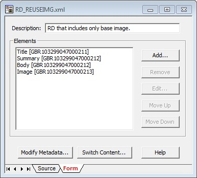
Description of ''Figure 27-6 Region Definition with Single Image Region Element''
To use a lower resolution rendition (lowres) of the image on a mobile device, use the following code:
<af:outputText value="#{node.propertyMap['RD_REUSEIMG:Image/Rendition:lowres'].asTextHtml}" escape="false" id="olmaget" rendered="#{DeviceAgent.mobile}"/>
Note:
If the specifiedrenditionName does not exist for the image, the image's primary rendition is used instead.Figure 27-7 shows a different region definition (RD_NAMEDREND) for a different article that includes separate region elements for the different possible renditions of the article image: BaseImage, ThumbnailImage, A100Image, and A200Image.
Figure 27-7 Region Definition with Region Elements for Named Renditions
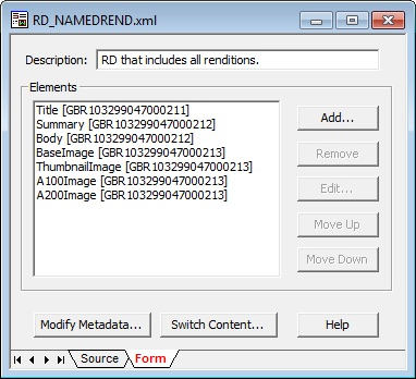
Description of ''Figure 27-7 Region Definition with Region Elements for Named Renditions''
To use the ThumbnailImage region element to render the image on a mobile device, use the following code:
<af:outputText value="#{node.propertyMap['RD_NAMEDREND:ThumbnailImage'].asTextHtml}" escape="false" id="olmaget" rendered="#{DeviceAgent.mobile}"/>
Note:
If you use an EL expression with a specifiedrenditionName for an region element that explicitly references a particular image rendition (rather than the original image), the rendition defined by the region element is returned (not the rendition specified by renditionName).Within a WYSIWYG or static list region element you can reference a specific rendition of an image using the node.propertyMap['regionDefinitionName:elementName'] EL expression. Alternatively, you can reference original images in the WYSIWG or static list region elements and then use the node.propertyMap['regionDefinitionName:elementName/Rendition:renditionName'] EL expression to use a specific rendition for all images within the element.
Example 27-7 shows how a particular rendition (Preview) is used for images within a static list region element (paragraph).
Example 27-7 Using Image Renditions within a Static List Region Element
<af:iterator value="#{node.propertyMap['RD_MYREGION:paragraph/Rendition:Preview'].values}"
             var="row"
             id="i1"
             rendered="#{DeviceAgent.desktop}">
  <af:showDetailItem text="#{row.nestedValue[0].value}" id="sdi1" stretchChildren="first">
    <af:panelGroupLayout layout="horizontal" id="tt" inlineStyle="padding:5px;">
      <af:outputText escape="false" value="#{row.nestedValue[1].value}" id="ld1"/>
      <af:outputText escape="false" value="#{row.nestedValue[2].value}" id="ld2"/>
    </af:panelGroupLayout>
  </af:showDetailItem>
</af:iterator>
In Example 27-8 RD_MYREGION:body corresponds to a WYSIWYG region element. All images within that WYSIWYG element will be rendered using the A100 rendition.
Example 27-8 Using Image Renditions within a WYSIWYG Region Element
<af:outputText value="#{node.propertyMap['RD_MYREGION:body/Rendition:A100'].asTextHtml}"
               escape="false" id="ot5"/>
Note:
If the WYSIWYG or static list element references an element that defines a particular image rendition, that rendition supersedes any rendition specified using theRendition:renditionName syntax.27.3.7 Using EL Expressions to Retrieve Content Item Information
This section describes the EL expressions that you can use in your Content Presenter display template definitions to retrieve and display specific information about content items.
Use the EL expressions described in the following tables as you define your Content Presenter display templates as explained in Section 27.3.2, "Creating Single-Item Display Templates" and Section 27.3.3, "Defining Multiple-Item Display Templates." These expressions are used with the JSP tags described in Table 27-1 and Table 27-2.
This section contains the following subsections:
-
Section 27.3.7.1, "Retrieving Basic Information About a Content Item"
-
Section 27.3.7.2, "Working with Content Item Properties and Values"
-
Section 27.3.7.3, "Working with Content Item Icons and URLs"
27.3.7.1 Retrieving Basic Information About a Content Item
The EL expressions listed in Table 27-3 let you display basic information about a content item in a display template.
Table 27-3 EL Expressions for Retrieving Basic Content Information
| EL Expression | Description |
|---|---|
|
|
Returns the user name of the node's creator. |
|
|
Returns the node's creation date. |
|
|
Returns |
|
|
Returns the icon service defined in the current web application. |
|
|
Returns the node's identifier. |
|
|
Returns |
|
|
Returns |
|
|
Returns the user name of the node's last modifier. |
|
|
Returns the node's last modification date. |
|
|
Returns the node's name. |
|
|
Returns the parent node's identifier. |
|
|
Returns the node's path. |
|
|
Returns the node's primary property, if available. |
|
|
Creates and returns a map of wrapped property objects, keyed by property name. Properties can be accessed as |
|
|
Returns an instance of the node property URL service for the primary property of this node (if any). By default, it resolves to |
27.3.7.2 Working with Content Item Properties and Values
Use the EL expression described in Table 27-4 and Table 27-5 to perform actions on content item node properties and property values.
Tip:
To determine the names of the properties defined for a given content type, see Section 27.3.8, "Discovering Content Type Property Names."Table 27-4 EL Expressions for Content Item Node Properties
| EL Expression | Description |
|---|---|
|
|
Returns this property as text or HTML if the type is text or HTML. If |
|
|
Returns |
|
|
Returns the icon service defined in the current web application. |
|
|
Returns the indexed name of a multi-valued property. For example, if a multi-valued node property named |
|
|
Returns |
|
|
Returns |
|
|
Returns |
|
|
Returns |
|
|
Returns |
|
|
Returns |
|
|
Returns |
|
|
Returns |
|
|
Returns |
|
|
Returns |
|
|
Returns |
|
|
Returns |
|
|
Returns |
|
|
Returns |
|
|
Returns |
|
|
Returns |
|
|
Returns |
|
|
Returns |
|
|
Returns |
|
|
Returns |
|
|
Returns |
|
|
Returns |
|
|
Returns |
|
|
Returns |
|
|
Returns |
|
|
Returns |
|
|
Returns |
|
|
Returns |
|
|
Returns the Example: |
|
|
Returns the property's name. |
|
|
Retrieves nested properties for this single-valued property, and returns a list of properties. |
|
|
Returns the data type of this property value. For example: |
|
|
Returns a URL service for this property. |
|
|
Returns the value service for this property. |
|
|
Returns elements from a static list. For example:
 <af:iterator var="listItem"
  value="#{node.propertyMap['ARTICLE_RGD:Paragraphs'].nestedProperties}"
  varStatus="vs">
  <af:outputText id="ot1" value='#{listItem[0].value}'/>
  <af:outputText id="ot3" value="#{listItem[1].value}"/>
  </af:iterator>
|
|
|
Returns Site Studio data as HTML text. For example:
The element name ( |
Table 27-5 EL Expressions for Content Item Node Property Values
| EL Expression | Description |
|---|---|
|
|
Returns custom attributes for a binary property type or attachment. Attributes available on
|
|
|
Returns the value of this property as |
|
|
Returns the value of this property as |
|
|
Returns the value of this property as |
|
|
Returns the value of this property as |
|
|
Returns the "index" of the property when the property is multi-valued. Example: |
|
|
Returns the value of this property as Example: |
27.3.7.3 Working with Content Item Icons and URLs
Table 27-6 and Table 27-7 describe EL expressions for working with icons and URLs associated with content items and properties.
Table 27-6 EL Expressions for Content Item Node or Property Icons
| EL Expression | Description |
|---|---|
|
|
Returns a URL to an image resource for a large icon. Example: |
|
|
Returns a URL to an image resource for a small icon. Example: |
Table 27-7 EL Expressions for Content Item Node URLs
| EL Expression | Description |
|---|---|
|
|
Creates a URL to the binary content. Forces a download, and the underlying operating system renders the content based on the content type. Example: |
|
|
Creates a URL to the binary content. Allows the browser to render the content based on the content type. By default, Example: |
27.3.7.4 Working with Image Renditions
Table 27-8 lists the EL expressions available to retrieve information about a particular rendition of an image, including the URL to render the image using that rendition.
Table 27-9 lists the EL expressions available to retrieve different image renditions for Site Studio region elements.
For more information about image renditions, see Section 27.3.6, "Using Image Renditions in Content Presenter Display Templates."
Table 27-8 EL Expressions for Image Renditions of Image Documents
| EL Expression | Description |
|---|---|
|
|
Returns the URL of the image rendition. For example: http://mymachine.example.com:8888/cs/groups/ personalspaces/@pewebcenter/ @799c4d7d-255c-46c8-80f5-0d06c848dd65/documents/ document/awrf/mdax/~edisp/~extract/ ID_001642~3~staticrendition/preview.gif Wherever possible, |
|
|
Returns the name of the rendition, for example For |
|
|
Returns the file type of the image rendition, for example, The |
|
|
Returns the width of the image rendition in pixels, for example The |
|
|
Returns the height of the image rendition in pixels, for example The |
|
|
Returns the resolution (DPI) of the image rendition, for example The |
|
|
Returns the file size of the image rendition, for example, |
|
|
Returns the MIME type of the image rendition, for example. |
Table 27-9 EL Expressions for Image Renditions of Site Studio Region Elements
| EL Expression | Description |
|---|---|
|
|
Returns an HTML <img src="http://mymachine.example.com:9400 /cs/idcplg?IdcService=GET_FILE&dDocName= id_038497&RevisionSelectionMethod=LatestReleased" alt="S3-1" class=""> Use this EL to reference a Site Studio region element that defines a specific rendition of an image. Wherever possible, the URL points to a static rendition URL for the image rendition on the WebCenter Content. If the static URL cannot be determined, the |
|
|
Returns an HTML <img src="/cs/groups/wc081512c/ @sb5cdcaa4610341a8bb8387effdf21790/documents/document/ awrf/mdm4/~edisp/~extract/ ID_038497~1~staticrendition/preview.gif" alt="S3-1" class=""> If the specified image rendition does not exist for the image, then the URL of the original image is returned. Use this EL to reference a Site Studio region element that defines the original image for which you want to display the specified Wherever possible, the URL points to a static rendition URL for the image rendition on the WebCenter Content. If the static URL cannot be determined, the |
27.3.7.5 Working with Group Portal Information
Table 27-10 and Table 27-11 provide EL expressions you can use to work with group portal information in your content presenter template.
Table 27-10 EL Expressions for Basic Group Portal Information
| EL Expression | Description |
|---|---|
|
|
Returns the user who created the current or specified group portal. |
|
|
Returns a |
|
|
Returns the value of a specific custom attribute of the name |
|
|
Returns the default language for the current or specified portal. |
|
|
Returns the description associated with the current portal with the display name in the language in which the portal was created. If the portal name has been translated, the translated name is not shown. Example: Evaluates to conglomeration of all teams involved in financial activities. |
|
|
Returns the display name associated with the current or specified portal in the language in which the portal was created. If the portal name has been translated, the name in which the portal was created will be shown. Example: If a group portal called "Web20Portal" has the display name "Web 2.0 Portal", then:
will evaluate to "Web 2.0 Portal". |
|
|
Returns the unique ID associated with the current or specified portal. |
|
|
Returns a URL to the icon associated with the current or specified portal. |
|
|
Returns a comma-separated list of searchable keywords associated with the current or specified portal. |
|
|
Returns the |
|
|
Returns the path to the image associated with the logo of the current or specified portal. |
|
|
Returns the name of the current or specified portal used generally at the back end of the portal and is used with the pretty URL. |
|
|
Returns the pretty URL of the current or specified portal. |
|
|
Returns Boolean value indicating whether the portal has been kept closed. |
|
|
Returns Boolean value indicating whether users will be able to discover the existence of the portal by searching for it or getting it listed in My Portals. |
|
|
Returns Boolean value indicating whether the portal has been taken offline. |
|
|
Returns Boolean value, indicating whether the portal publishes RSS feeds. |
|
|
Returns a Boolean value indicating whether users are allowed to subscribe themselves to the portal. |
|
|
Returns a Boolean value representing whether approval is required to unsubscribe from the current or specified portal. |
Table 27-11 EL Expressions for Portal UI Information
| EL Expression | Description |
|---|---|
|
|
Returns the ID of the page template associated with the current or specified portal. |
|
|
Returns the ID of the resource catalog associated with the current or specified portal. |
|
|
Returns the ID of the resource catalog associated with the page template of the current portal. |
|
|
Returns the ID of the navigation model associated with the current portal. |
|
|
Returns the ADF Faces skin family associated with the current portal. |
|
|
Returns the Boolean value representing whether the footer of the portal is hidden. |
|
|
Returns the copyright message used by the portal. |
|
|
Returns the URL to the privacy policy document followed. |
27.3.8 Discovering Content Type Property Names
As a Content Presenter display template developer, you will need to know the names of the properties defined for the associated content type so that you can define how to display the selected content item(s) on the page.
Each content item is associated with a specific content type defined in the WebCenter Content repository. Content types can map to WebCenter Content profile definitions and Site Studio region definitions. Types are created on the WebCenter Content and define the properties of the content item. The property names of a content item's content type, however, are different than the display names, and need to be obtained from the Content Server. For more information, see "Defining Content Types" in Managing Oracle WebCenter Content.
Note:
You can also use REST services to obtain content type property names. For more information see Chapter 31, "Content Management REST API.".27.3.9 Referencing External Files in Display Templates
In some cases, a display template needs to reference an external file, like a CSS file. All such references must be either an absolute path or a path that is relative to the root of the web application. For example:
-
absolute path –
http://host:port/mypath/file.css -
relative path –
/webcenter/mypath/file.css
Do not use local references to external files. Local references to external files do not work because they are not included when you upload a Content Presenter display template to a WebCenter Portal application, as explained in Section 27.5, "Making Content Presenter Display Templates Available."
27.3.10 Referencing Site Studio Region Elements in a Custom View
You can use custom display templates to display Site Studio Region Definition elements. For example, you might have a Site Studio Region Definition called RD_NEWS with four elements: TITLE, LEAD, IMAGE, and BODY. A Content Presenter display template can reference these elements using the node property EL expression like this:
#node.propertyMap['RD_NEWS:LEAD'].asTextHtml}
Example 27-9 illustrates how these Site Studio Region elements can be included in a contentTemplateDef definition:
Example 27-9 Referencing Site Studio Region Elements in a Template
<dt:contentTemplateDef var="node">
   <af:panelGroupLayout layout="vertical" id="pgl3">
     <af:panelGroupLayout layout="horizontal" valign="top" inlineStyle="background-color:#FFF; padding:10px;" id="pgl4">
         <af:panelGroupLayout layout="vertical" id="pgl2" valign="top">
            <af:outputText value="#{node.propertyMap['dInDate'].value.calendarValue}" id="ot3" styleClass="bodytext" converter="javax.faces.DateTime"/>
          </af:panelGroupLayout>
          <af:spacer width="10px;" id="s1" inlineStyle="background-color:#DDD; color:white;"/>
          <af:panelGroupLayout layout="vertical" id="pgl1" valign="top">
             <af:outputText value="#{node.propertyMap['xTargetGroup'].value}" id="ot12" inlineStyle="background-color:#0A9FC0; color:white; text-align:left; padding:5px;"/>
            <af:goLink text="#{node.propertyMap['RD_NEWS:TITLE'].asTextHtml}" id="gil1"
                destination="#{'/faces/home/news-viewer?news_id='}#{node.propertyMap['dDocName'].value}" styleClass="newstitle"/>
           <af:outputText value="#{node.propertyMap['RD_NEWS:LEAD'].asTextHtml}" id="ot2" styleClass="bodytext"/>
         </af:panelGroupLayout>
       <af:panelGroupLayout layout="vertical" id="pgl32" valign="top" styleClass="newsimage">
         <af:outputText value="#{node.propertyMap['RD_NEWS:IMAGE'].asTextHtml}" escape="false" id="ot1"  inlineStyle="max-width:100px;"/>
       </af:panelGroupLayout>
     </af:panelGroupLayout>
     <af:panelGroupLayout layout="horizontal" id="aaaa">
     </af:panelGroupLayout>
   </af:panelGroupLayout>
</dt:contentTemplateDef>
For a complete, end-to-end example illustrating how to reference Site Studio Region elements in multiple templates, see the WebCenter Architecture Team blog entry at: http://www.ateam-oracle.com/content-presenter-cmis-complete
27.3.11 Using a Content Presenter Display Template
For information on using a display template in a Content task flow, see Section 29.5, "Adding a Content Task Flow to a Page." See also Section 29.7.1, "Content Presenter Task Flow Parameters and Out-of-the-Box Display Templates." For information on integrating a display template into a Portal Framework application, see the following section Section 27.5, "Making Content Presenter Display Templates Available."
Note:
If you display a wiki page in a Portal Framework application using a Content Presenter display template, by default any links within that wiki page are displayed in the Document Viewer. If you want to display wiki page links using Content Presenter, you must edit theadf-config.xml file. For more information, see Section 30.3.5, "Displaying Wiki Page Links Within Content Presenter."27.4 Adding the Content Presenter Task Flow to a Page
You can add a Content Presenter task flow at design time or runtime. For information about how to add Content Presenter at design time (using JDeveloper), see Chapter 29, "Adding Content Task Flows and Document Components to a Portal Page." For information about how to add Content Presenter at runtime, see the "Publishing Content Using Content Presenter" chapter in Building Portals with Oracle WebCenter Portal.
27.5 Making Content Presenter Display Templates Available
This section explains how to make a Content Presenter display template available to Content Presenter in a portal or Framework application.
-
Section 27.5.1, "Export a Content Presenter Display Template as a Portal Resource"
-
Section 27.5.2, "Upload the New Content Presenter Display Template"
-
Section 27.5.3, "Test the New Content Presenter Display Template"
Note:
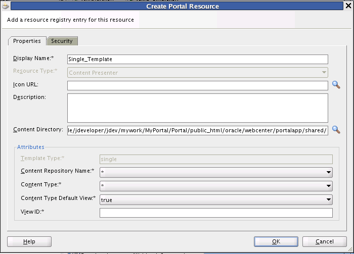
If you are using a locally configured JDev environment to develop a Portal Framework application, all you need to do to use a Content Presenter display template in your application is to export it as a portal resource, as explained in Section 27.5.1, "Export a Content Presenter Display Template as a Portal Resource." You do not need to perform the upload task as explained in Section 27.5.2, "Upload the New Content Presenter Display Template."27.5.1 Export a Content Presenter Display Template as a Portal Resource
This section explains how to export a Content Presenter display template as a portal resource. This procedure is a prerequisite to adding a Content Presenter display template to a portal and to Content Presenter at runtime.
-
Create a Content Presenter display template, as explained previously in Section 27.3, "Creating Content Presenter Display Templates."
-
In the Application Navigator, right-click the Content Presenter display template file (a JSFF file) and select Create Portal Resource.
-
Fill in the Create Portal Resource dialog. This dialog differs depending on whether you are creating a single or multiple-item template. The dialog for a single-item template is shown in Figure 27-8. The dialog for a multiple-item template is shown in Figure 27-9.
Figure 27-8 Create Portal Resource Dialog for a Single-Item Template
Description of ''Figure 27-8 Create Portal Resource Dialog for a Single-Item Template''
Figure 27-9 Create Portal Resource Dialog for a Multiple-Item Template
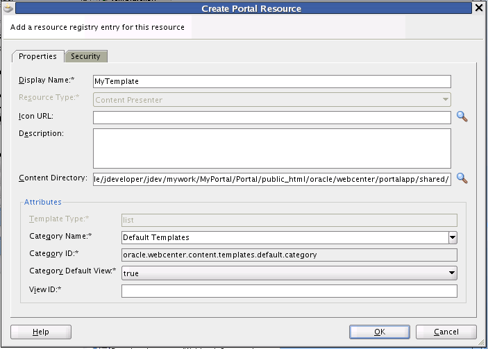
Description of ''Figure 27-9 Create Portal Resource Dialog for a Multiple-Item Template''
The default settings in the Create Portal Resource dialog are generally sufficient; however, you must enter a unique value in the View ID field. The Display Name is the name that appears in the display template drop down menu at runtime.
The View ID parameter is intended to be human-readable; therefore, it is not automatically generated for you. For example, you can use the View ID to programmatically refer to one template from another. For example, a multiple content item template could render tabs for each item and also call on a single item template to be used below the selected tab to render the details of that item. As another example, you can include one template in another by passing the View ID as a parameter to the Content Presenter task flow. For a detailed example illustrating this, see the WebCenter Architecture Team blog entry at:
http://www.ateam-oracle.com/content-presenter-cmis-complete. See also Section 27.3.10, "Referencing Site Studio Region Elements in a Custom View."Additional Attributes in the Create Portal Resource dialog for a single item template include:
-
Template Type – Reflects whether the template is single or multi-item template.
-
Content Repository Name – By default, the portal resource uses the repository associated with the application's default content connection. If you intend to export the portal resource for use in a portal, you must pick the repository that matches the one used by the portal connection name(s).
-
Content Type – Lets you pick a content type for which the template will be valid. The list of content types displayed in the menu depends on the selected content repository.
-
Content Type Default View – If set to true, specifies that the display template is the default template to use for the given combination of repository and content type.
-
View ID – A unique value that is used to refer to the template programmatically, as discussed previously in this section.
Additional Attributes in the Create Portal Resource dialog for a multiple item template include:
-
Template Type – Reflects whether the template is single or multi-item template.
-
Category Name – A name given to a category of display templates. Can be any name that describes the category or you can use the Default Templates category name.
-
Category ID – An ID for the category. If you select Default Templates as the category name, this field will become read-only and populate with oracle.webcenter.content.templates.default.category. If you are creating a new category, this value can be any unique string. For example: oracle.webcenter.content.templates.pressrelease.category. If two resources have the same ID, they will be grouped together in the user interface.
-
View ID – A unique value that is used to refer to the template programmatically, as discussed previously in this section.
Note:
For more information on other fields in the Create Portal Resource dialog, see Section 9.6.3, "How to Export a Portal Resource from JDeveloper."
-
-
Click OK in the dialog when you are finished.
-
Right-click the Content Presenter display template (JSFF) file again, and this time select Export Portal Resource.
-
In the Export Portal Resource dialog, enter or browse to a directory in which to place the exported portal resource (JSPX) file. You can place this file anywhere on your file system.
-
Click OK in the Export Portal Resource dialog.
Now that your Content Presenter display template is exported as a portal resource, the next step is to upload it to your portal. After uploading the display template portal resource, it will be available in the list of display templates when you add a Content Presenter to your portal page.
27.5.2 Upload the New Content Presenter Display Template
You can upload a new display template to any deployed portal or Framework application that includes the Resource Manager. To upload a Content Presenter display template to a portal or Framework application, an application administrator performs the following steps:
Note:
The content repository connection names and details must be the same between the design time portal or Framework application in which you developed the Content Presenter display template and the destination application. Also, any references to external files in the display template must either be absolute or relative path references. See Section 27.3.9, "Referencing External Files in Display Templates."Note:
Uploading from the scope of a specific portal within WebCenter Portal instance is different than uploading from the application scope of the portal's administration tools. For more information, see the section on application-level versus portal-level resources in Section 55.1.5, "Editing WebCenter Portal Assets in JDeveloper."-
Open your portal or Framework application.
-
Click Administration.
Note that you must have administrator privileges.
-
Select Shared Assets.
-
Under Look and Layout, click Content Presenter.
-
Select Upload, as shown in Figure 27-10.
Figure 27-10 Uploading the Display Template Portal Resource
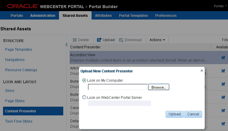
Description of ''Figure 27-10 Uploading the Display Template Portal Resource''
-
In the Upload New Content Presenter dialog, navigate to the portal resource file you saved on your file system.
-
After you've selected the template file, click OK. If the operation is successful, an Information dialog appears with the message "Resource uploaded successfully."
-
Locate your Content Presenter display template in the list of Content Presenter templates and select it as shown in Figure 27-11.
Figure 27-11 Toggling the Show/Hide State of a Template
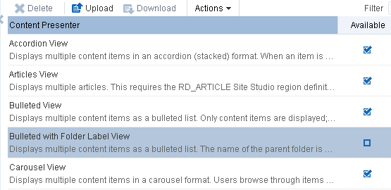
Description of ''Figure 27-11 Toggling the Show/Hide State of a Template''
-
To make the template visible to users and available for use in Content Presenter, check the Available check box.
The new Content Presenter display template is now ready to be used with Content Presenter in a portal or Framework application.
27.5.3 Test the New Content Presenter Display Template
This section explains how to test your Content Presenter display template with Content Presenter.
-
If it is not currently running, start the portal or Framework application to which you added a Content Presenter display template. This application must have a WebCenter Content connection that Content Presenter can use. For portals, if you just completed the setup procedures described in the previous sections, click Back to return to the Portal link in the upper right corner of the Administration page.
-
Navigate to the portal or Framework application in which you want to use the new Content Presenter display template. Note that you'll need to be able to edit it.
-
Optionally, create a new page to test the display template. Select Create a New Page from the Page Actions menu. Then select Save and Close.
-
In the new or existing page, select Edit Page from the Page Actions menu.
-
Select an Add Content button in the part of the page where you want to add Content Presenter.
-
In the Add Content dialog, open the Content Management folder, as shown in Figure 27-12.
Figure 27-12 Opening the Content Management Folder
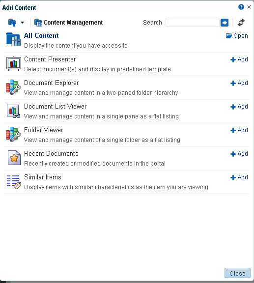
Description of ''Figure 27-12 Opening the Content Management Folder''
-
In the Add Content dialog, click the Add button next to Content Presenter.
-
Close the Add Content dialog.
-
Select the task flow Edit icon in the Content Presenter tool bar (see Figure 27-13).
-
If this is a new page, select one or more Content items on the Content tab.
-
In the Content Presenter Configuration window, select the Template tab.
-
From the Template menu, select your Content Presenter display template, as shown in Figure 27-14.
Figure 27-14 Selecting the Content Presenter Display Template
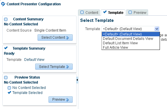
Description of ''Figure 27-14 Selecting the Content Presenter Display Template''
The Content Presenter template will be applied to the Content Presenter instance. For more information on using Content Presenter and display templates, see Section 29.2, "Understanding the Documents Task Flows" and Section 27.2, "Using the Out-of-the-Box Display Templates."
27.6 What Happens at Runtime?
This section includes these topics:
27.6.1 Runtime Overview
After you have defined a Content Presenter display template, you can add a Content Presenter task flow to a page in your application, specifying the content and display template in the Content Presenter task flow parameters (see Section 29.6, "Modifying Content Task Flow Parameters" and Section 27.2, "Using the Out-of-the-Box Display Templates").
If you integrate the Documents Service in your application (see Chapter 28, "Integrating Documents"), end users of your application can select content and your Content Presenter display templates in the Content Presenter Configuration dialog to include content on editable pages of the application, as described in the "Publishing Content Using Content Presenter" chapter in Building Portals with Oracle WebCenter Portal. To understand how Content Presenter identifies which display templates to expose in the Content Presenter Configuration dialog, see Section 27.6.2, "Identifying Display Templates for Selected Content Items."
27.6.2 Identifying Display Templates for Selected Content Items
At runtime, after a user selects content in the Content Presenter Configuration dialog, Content Presenter checks the Resource Manager to identify the display templates that are suitable for the selected content item(s), then exposes the list of valid templates on the Template page in the Content Presenter Configuration dialog for the user to select. See also Chapter 9, "Introduction to Portal Resource Management." Note that uploaded templates must also be "available" in the list of resources for them to be selectable. See Section 27.5.2, "Upload the New Content Presenter Display Template" for more information.
For single content item templates, Content Presenter generates a list of valid templates using the following precedence order:
-
Check the Resource Manager for template definitions matching the content item's content repository and content type.
-
Add template definitions matching the default content repository (
*) and specified content type. -
Add template definitions matching inherited content types.
-
Add template definitions matching the default content repository (
*) and default content type (*).
For multiple content item templates, Content Presenter generates a list of valid templates using the following precedence order:
-
Check the Resource Manager for template definitions associated with the selected template category.
-
Add template definitions associated with the default category (
*).
For example, if the user selects multiple content items (such as the children of a folder, or the results of a search), the Content Presenter Configuration dialog shows a list of categories and the list of templates associated with that category and the default category, based on the repository of the content items.
Note:
When a user selects a template in the Content Presenter Configuration dialog, that template is used to display the selected content item(s) in the running application. If that template is later deleted from the Resource Manager for any reason, Content Presenter will automatically select a "closest match" template to display the content item(s) using the precedence order above.27.7 Configuring Coherence as the Caching Mechanism
Content Presenter, by default, is configured to use a local (in-memory) cache. However, using Coherence for any type of production environment is strongly recommended, and is a requirement for High Availability (HA) environments. This section describes how to enable Coherence as the caching mechanism for Framework applications.
Note:
Your Coherence license may or may not support multi-node environments depending on the license option you have purchased. To check what your license agreement provides, see the "Oracle Coherence" section in Licensing Information.You can enable content caching with Coherence for both WebCenter Portal and Framework applications by modifying the Coherence configuration file. For WebCenter Portal, only the steps described in the "Modifying Cache Settings for Content Presenter" section in Administering Oracle WebCenter Portal are required. For Framework applications, however, an additional step is required to add the configuration file to the application (EAR) classpath or server's system classpath.
This section contains the following subsections:
27.7.1 Adding the Coherence Configuration File to the EAR Classpath
The following steps show how to add the XML file in the EAR classpath.
-
Complete the steps described in the "Modifying Cache Settings for Content Presenter" section in Administering Oracle WebCenter Portal.
-
Under the application's
srcdirectory (for example,WebCenterPortalCoherence/src), create a directory namedAPP-INF/classesand place thecontent-coherence-cache-config.xml)in it. -
Open the application's Application Properties and select Deployment.
-
Edit the profile contained in the EAR file (see Figure 27-15).
Figure 27-15 Adding the XML File to the EAR Classpath
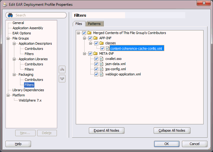
Description of ''Figure 27-15 Adding the XML File to the EAR Classpath''
-
Add a new File Group named
Packaging. Leave the Type asPackaging. -
Make sure
classesandcontent-coherence-cache-config.xmlfile are selected in the Filters pane. -
Deploy the application and restart the managed server on which it was deployed. After deploying your application, Coherence should be enabled.
27.7.2 Verifying the Coherence Configuration
After restarting the managed server where your application is deployed, connect to it by entering jconsole from the command line and choosing the process corresponding to WC_Spaces to open JConsole. In JConsole, check for Coherence in the MBeans tab. You should also see something like the following output in the WC_Spaces-diagnostic.log file:
2013-06-26 14:45:47.321/1278.178 Oracle Coherence GE 3.6.0.4 <Info>
(thread=[ACTIVE] ExecuteThread: '1' for queue: 'weblogic.kernel.Default
(self-tuning)', member=n/a): Loaded cache configuration from
"zip:/oracle/app/admin/domains/webcenter/servers/WC_CustomPortal/tmp/_WL_
user/WebCenterPortalCoherence_application1_
V2.0/i092wg/APP-INF/lib/portal-coherence.jar!/content-coherence-cache-config.xml"
27.8 Optimizing Performance for Content Presenter Display Templates
When content nodes are retrieved for display in a Content Presenter display template, most content item node property values are retrieved immediately along with the node, but some are loaded later only if needed. Other than the performance difference, the selective loading of node property values is transparent to the user or developer.
As a Content Presenter display template developer, you can optimize performance of your template if you are aware when different property values are loaded. For example, a typical list display template will render faster if you refer only to properties that are immediately loaded when the node is first retrieved and avoid properties that are loaded later when needed.
A secondary consideration is dependent on how the node is retrieved: through search versus fetched by parent ID. A property that may be loaded immediately on node retrieval for searches (such as "Results of a Query") may be loaded later for other retrieval methods (such as "Contents Under a Folder"). Table 27-12 shows whether or not node properties are loaded immediately upon node retrieval, by retrieval mechanism.
For information about the node properties listed in Table 27-12, see Configuration Reference for Oracle WebCenter Content.
Table 27-12 Loading of Node Properties By Node Retrieval Mechanism
| OCS Global Profile Properties | Loaded When Node Is First Retrieved? | ||
|---|---|---|---|
| GET BY PARENT ID ("Contents Under a Folder") | SEARCH ("Results of a Query") | GET BY UUID ("Single Content Item" and "List of Items") | |
|
|
N |
Y |
Y |
|
|
Y |
N |
Y |
|
|
Y |
Y |
Y |
|
|
Y |
Y |
Y |
|
|
Y |
Y |
Y |
|
|
Y |
Y |
Y |
|
|
Y |
Y |
Y |
|
|
Y |
Y |
Y |
|
|
Y |
Y |
Y |
|
|
Y |
Y |
Y |
|
|
Y |
Y |
Y |
|
|
Y |
N |
Y |
|
|
Y |
Y |
Y |
|
|
Y |
N |
Y |
|
|
Y |
N |
Y |
|
|
Y |
N |
Y |
|
|
Y |
Y |
Y |
|
|
Y |
N |
Y |
|
|
Y |
Y |
Y |
|
|
Y |
Y |
Y |
|
|
Y |
N |
Y |
|
|
Y |
Y |
Y |
|
|
N |
N |
Y |
|
|
Y |
Y |
Y |
|
|
N |
N |
Y |
|
|
Y |
Y |
Y |
|
|
Y |
Y |
Y |
|
|
Y |
Y |
Y |
|
|
Y |
Y |
Y |
|
|
Y |
Y |
Y |
|
|
Y |
Y |
Y |
27.9 Content Presenter Tips, Tutorials and Examples
The following supplementary tutorials and examples further illustrate how Content Presenter can be used:
-
Using Content Presenter Templates - describes how to build a region definition in Site Builder, and then use that region definition as the basis for a Content Presenter template (rather than a Site Studio region template), and finally, add the template to a Portal Framework application page.
http://yonaweb.be/webcenter_tutorial/using_content_presenter_templates -
UCM, Site Studio and Templates - describes the components (Content Server, Site Studio, and Content Presenter) that drive content interactions in WebCenter Portal.
-
Content Presenter-CMIS-Complete - steps you through using Content Presenter-based pages and complex CMIS and custom templates to create a filterable content list viewer.
-
Portal and Content - Content Integration - Best Practices - highlights some of the best practices to consider when integrating content into your portal.
http://www.ateam-oracle.com/portal-and-content-content-integration-best-practices/