35 Creating Databound Chart and Gauge Components
This chapter describes how to create charts or gauges from data modeled with ADF Business Components, using ADF data controls and ADF Faces components in a Fusion web application. Specifically, it describes how you can use ADF Data Visualization Tools (DVT) area, bar, bubble, horizontal bar, line, pie, scatter, and spark charts and dial, LED, rating, and status meter gauges that visually represent business data. It describes how to use ADF data controls to create these components with data-first development.
If you are designing your page using simple UI-first development, then you can add the chart or gauge to your page and configure the data bindings later. For information about the data requirements, tag structure, and options for customizing the look and behavior of the chart and gauge components, see "Using Chart Components" and "Using Gauge Components" in Developing Web User Interfaces with Oracle ADF Faces.
This chapter also describes how to use ADF DVT funnelGraph, paretoGraph, radarGraph, and stockGraph legacy components to display data in graphs. However, the use of these components is discouraged in favor of the client-side charts.
This chapter includes the following sections:
35.1 About ADF Data Visualization Chart and Gauge Components
ADF Data Visualization components provide extensive graphical and tabular capabilities for visually displaying and analyzing business data. Each component must be bound to data before it can be rendered since the appearance of the components is dictated by the data that is displayed.
Both chart and gauge components render graphical representations of data. However, charts allow you to evaluate multiple data points on multiple axes in a variety of ways. Many chart types assist in the comparison of results from one group with the results from another group. In contrast, gauges focus on a single data point and examine that point relative to minimum, maximum, and threshold indicators to identify problems.
The prefix dvt: occurs at the beginning of each data visualization component name indicating that the component belongs to the ADF Data Visualization Tools (DVT) tag library.
35.1.1 Data Visualization Components Use Cases and Examples
For detailed descriptions of data visualization use cases and examples, see the following:
-
Chart components: "Chart Component Use Cases and Examples" section in Developing Web User Interfaces with Oracle ADF Faces.
-
Gauge components: "Gauge Component Use Cases and Examples" section in Developing Web User Interfaces with Oracle ADF Faces.
35.1.2 End User and Presentation Features
Visually compelling data visualization components enable end users to understand and analyze complex business data. The components are rich in features that provide out-of-the-box interactivity support. For detailed descriptions of the end user and presentation features for each component, see the following:
-
Chart components: "End User and Presentation Features of Charts" section in Developing Web User Interfaces with Oracle ADF Faces.
-
Gauge components: "End User and Presentation Features of Gauge Components" section in Developing Web User Interfaces with Oracle ADF Faces.
35.1.3 Additional Functionality for Data Visualization Components
You may find it helpful to understand other Oracle ADF features before you data bind your data visualization components. Additionally, once you have added a data visualization component to your page, you may find that you need to add functionality such as validation and accessibility. Following are links to other functionality that data visualization components use:
-
Partial page rendering: You may want a data visualization component to refresh to show new data based on an action taken on another component on the page. For more information, see the "Rerendering Partial Page Content" chapter in Developing Web User Interfaces with Oracle ADF Faces.
-
Personalization: Users can change the way the data visualization components display at runtime, those values will not be retained once the user leaves the page unless you configure your application to allow user customization. For more information, see the "Allowing User Customization on JSF Pages" chapter in Developing Web User Interfaces with Oracle ADF Faces.
-
Accessibility: You can make your data visualization components accessible. For more information, see the "Developing Accessible ADF Faces Pages" chapter in Developing Web User Interfaces with Oracle ADF Faces.
-
Skins and styles: You can customize the appearance of data visualization components using an ADF skin that you apply to the application or by applying CSS style properties directly using a style-related property (
styleClassorinlineStyle). For more information, see the "Customizing the Appearance Using Styles and Skins" chapter in Developing Web User Interfaces with Oracle ADF Faces. -
Placeholder data controls: If you know the data visualization components on your page will eventually use ADF data binding, but you need to develop the pages before the data controls are ready, then you should consider using placeholder data controls, rather than manually binding the components. Using placeholder data controls will provide the same declarative development experience as using developed data controls. For more information, see Chapter 19, "Designing a Page Using Placeholder Data Controls."
35.2 Creating Databound Charts
Charts are based on data collections. To create a databound chart, you drag and drop a collection from the Data Controls panel onto the JSF page and use a dialog to bind the data collection attributes in the chart.
Charts display series and groups of data. Series and groups are analogous to the rows and columns of a grid of data. Typically, the rows in the grid appear as a series in a chart, and the columns in the grid appear as groups.
For most charts, a series appears as a set of markers that are the same color. Typically, the chart legend shows the identification and associated color of each series. For example, in a bar chart, the yellow bars might represent the sales of shoes and the green bars might represent the sales of boots.
Groups appear differently in different chart types. For example, in a stacked bar chart, each stack is a group. A group might represent time periods, such as years. A group might also represent geographical locations such as regions.
Depending on the data requirements for a chart type, a single group might require multiple data values. For example, a scatter chart requires two values for each data marker. The first value determines where the marker appears along the x-axis while the second value determines where the marker appears along the y-axis. For details about chart data requirements, see "Chart Component Data Requirements" in Developing Web User Interfaces with Oracle ADF Faces.
The attributes in a data collection can be data values or categories of data values. Data values are numbers represented by markers, like bar height or points in a scatter chart. Categories of data values are members represented as axis labels or appear as additional properties in a tooltip. The role that an attribute plays in the bindings (either data values or identifiers) is determined by both its data type and where it gets mapped (for example, bars vs. x-axis).
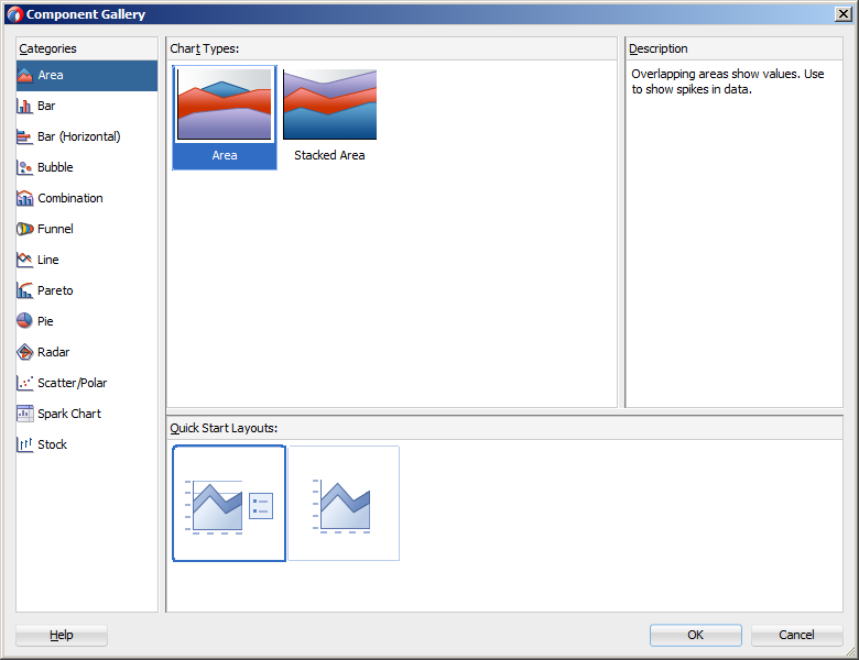
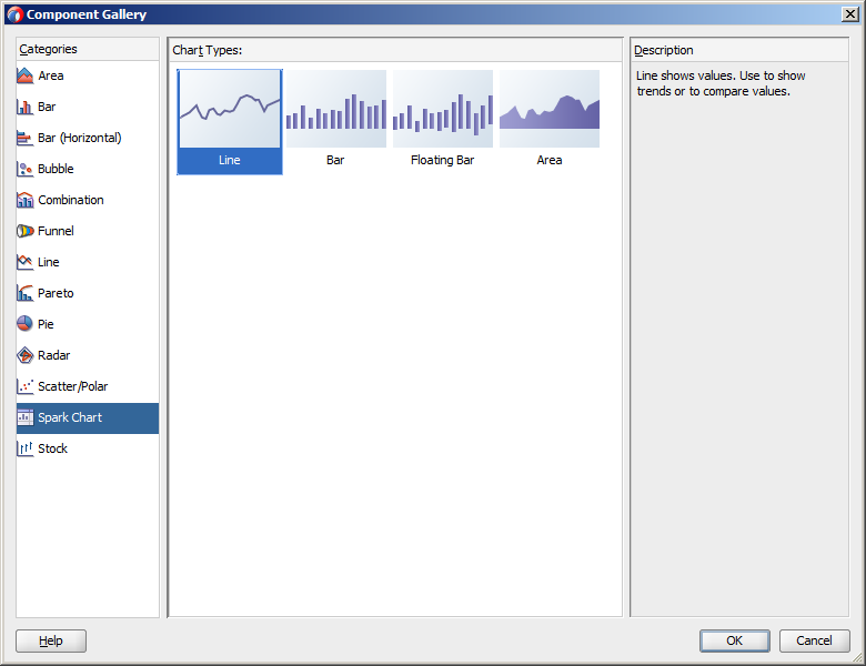
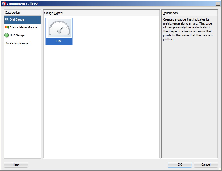
When you create a chart using a data collection inserted from the Data Controls panel, a Component Gallery allows you to choose from a wide number of chart categories, chart types, and layout options. Chart categories group together one or more types of chart. For example, the Area category includes the following types of charts:
-
Area
-
Stacked Area
Explore the Component Gallery that appears when you create a chart to view available chart categories, types, and descriptions for each one. Figure 35-1 shows the Component Gallery that appears for ADF charts when you use the Data Controls panel.
Note:
Thefunnel, pareto, radar, and stock components are legacy server-side graphs whose use is discouraged in favor of the client-side chart components. For information about creating databound legacy graphs, see Section 35.3, "Creating Databound Graphs."Table 35-2 lists the categories that appear in the Component Gallery for charts. Each category has one or more chart types associated with it.
Table 35-1 ADF Chart Categories in the Component Gallery
| Image | Category | Description |
|---|---|---|
 |
Area |
Creates a chart in which data is represented as a filled-in area. Use area charts to show trends over time, such as sales for the last 12 months. Area charts require at least two groups of data along an axis. The axis is often labeled with time periods such as months. |
 |
Bar |
Creates a chart in which data is represented as a series of vertical bars. Use to compare values across products or categories, or to view aggregated data broken out by a time period. |
 |
Bar (Horizontal) |
Creates a chart that displays bars horizontally along the y-axis. Use to provide an orientation that allows you to show trends or compare values. |
 |
Bubble |
Creates a chart in which data is represented by the location and size of round data markers (bubbles). Use to show correlations among three types of values, especially when you have a number of data items and you want to see the general relationships. For example, use a bubble chart to plot salaries (x-axis), years of experience (y-axis), and productivity (size of bubble) for your work force. Such a chart allows you to examine productivity relative to salary and experience. |
 |
Combination |
Creates a chart that uses different types of data markers (bars, lines, or areas) to display different kinds of data items. Use to compare bars and lines, bars and areas, lines and areas, or all three. |
 |
Line |
Creates a chart in which data is represented as a line, as a series of data points, or as data points that are connected by a line. Line charts require data for at least two points for each member in a group. For example, a line chart over months requires at least two months. Typically a line of a specific color is associated with each series of data such as the Americas, Europe, or Asia. Use to compare items over the same time. |
 |
Pie |
Creates a chart that represents a set of data items as proportions of a total. The data items are displayed as sections of a circle causing the circle to look like a sliced pie. Use to show relationship of parts to a whole such as how much revenue comes from each product line. |
 |
Scatter |
Creates a chart in which data is represented by the location of data markers. Use to show correlation between two different kinds of data values such as sales and costs for top products. Scatter charts are especially useful when you want to see general relationships among a number of items. |
 |
Spark |
Creates a simple, condensed chart that displays trends or variations, often in the column of a table, or inline with text. |
You can also create a chart by dragging a chart component from the Components window. This approach allows you the option of designing the chart's user interface before binding the component to data. A Create Chart dialog appears to view chart types, descriptions, and quick layout options. For more information about creating charts using UI-first development, see "Using Chart Components" in Developing Web User Interfaces with Oracle ADF Faces.
35.2.1 How to Create an Area, Bar, Combination, Horizontal Bar, or Line Chart Using Data Controls
Area, bar, horizontal bar, and line charts require at least two groups of data, with one or more series. The groups are displayed along the chart's X Axis for area, bar, and line charts and on the chart's Y Axis for horizontal bar charts. Series are displayed as the areas, bars, or lines on the chart.
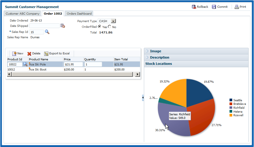
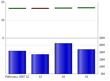
Figure 35-2 shows two bar charts in the Summit ADF sample application. The bar chart on the left is configured to show the customer's order history and order average, and the bar chart on the right shows the ship time for each order. In these examples, the bar charts are configured with groups that represent order and ship dates, and the series are the order totals and ship time averages. The order average is displayed as a red reference line on the Order History chart.
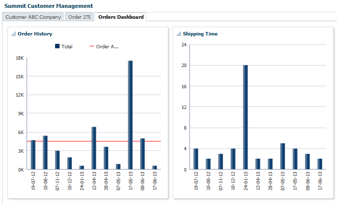
For information about adding reference lines to charts after the chart is created, see "Adding Reference Objects to a Chart" in Developing Web User Interfaces with Oracle ADF Faces.
It may be helpful to have an understanding of databound data visualization charts. For more information, see Section 35.2, "Creating Databound Charts."
You may also find it helpful to understand functionality that can be added using other Oracle ADF features. For more information, see Section 35.1.3, "Additional Functionality for Data Visualization Components."
You will need to complete these tasks:
-
Create an application module that contains instances of the view objects that you want in your data model, as described in Section 13.2, "Creating and Modifying an Application Module."
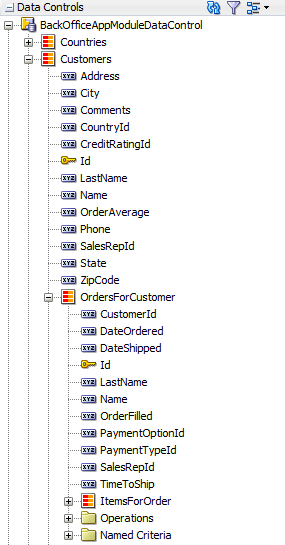
For example, the Summit ADF Shipping Time bar chart is based on the
OrdersForCustomerdata collection. Figure 35-3 shows theOrdersForCustomercollection in the Data Controls panel.The
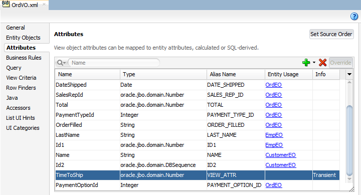
OrdersForCustomerdata control is based on theOrdVOview object. Figure 35-4 shows theOrdVOview object which contains attributes from theOrdEO,EmpEO, andCustomerEOentity objects. TheOrdEO,EmpEO, andCustomerEOentity objects are derived from theSOrd,SEmp, andSCustomertables in the Summit schema.The
OrdVOobject also contains theTimeToShiptransient attribute which is represented by the bars on the Summit ADF Shipping Time bar chart. TheTimeToShipattribute's value is obtained by a call to thecalculateTimeToShip()method:adf.object.calculateTimeToShip(DateOrdered, DateShipped). ThecalculateTimeToShip()method determines the number of days that the order took to ship and is added toOrdVORowImpl.java.OrdVORowImpl.javacontains the implementation methods for theOrdVOview object.Example 35-1 shows the
calculateTimeToShip()method in the Summit ADF sample application. The method returns the number of days as anoracle.jbo.domain.Number, which is the type expected by the chart'svalueattribute.Example 35-1 calculateTimeToShip() Method in Summit ADF Sample Application
public oracle.jbo.domain.Number calculateTimeToShip(Date ordered, Date shipped) {
  if (null != shipped) {
    long days = (shipped.getTime() - ordered.getTime()) / (1000 * 60 * 60 * 24);
    return new Number(days);
  } else
    return new Number(0);
}
For additional information about adding transient attributes to a view object, see Section 5.5, "Adding Calculated and Transient Attributes to a View Object."
-
Create a JSF page as described in the "How to Create JSF Pages" section of Developing Web User Interfaces with Oracle ADF Faces.
To create a databound area, bar, combination, horizontal bar, or line chart:
-
From the Data Controls panel, select a collection.
For example, to create the bar chart that displays the shipping times for each order on the Orders Dashboard page of the Summit ADF sample application, select the
OrdersForCustomercollection. -
Drag the collection onto a JSF page and, from the context menu, choose Charts.
-
In the Component Gallery, select a chart category and a chart type and click OK.
For information about the chart categories and chart types that appear in the Component Gallery, see Table 35-2.
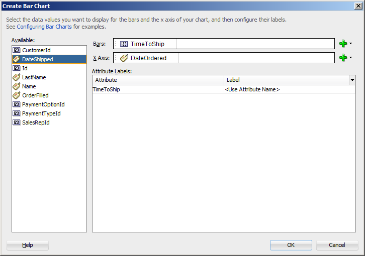
The name of the dialog and the input field labels that appear depend on the category, type of chart, and data collection that you select. For example, if you select Bar as the chart category and Bar as the chart type, then the name of the dialog that appears is Create Bar Chart and the input fields are labeled Bars and X Axis.
-
Do the following in the dialog to configure the chart to display data:
-
Drag attributes from the Available list to the input fields, depending on where you want the values for the attributes to appear at runtime.
For example, to configure the bar chart in the Summit ADF sample application to display the order dates along the X Axis, drag the
DateOrderedattribute from the Available list to the X Axis field in the Create Bar Chart dialog. To configure the chart to display the time to ship as bars, drag theTimeToShipattribute from the Available list to the Bars field in the Create Bar Chart dialog.If you selected a chart type that includes a dual y-axis, the second area, bar, or line that you add will be rendered on the second y-axis. In addition, a
chartSeriesStylecomponent will be added to the chart for the series represented on the second y-axis, and theassignedToY2attribute of thechartSeriesStylecomponent will be set to true.If you selected a combination chart, each attribute that you add to the Data Points input field will be rendered as an area, bar, or line chart. By default, the first attribute will be rendered as a bar chart, the second attribute will be rendered as a line chart, and the third attribute will be rendered as an area chart. To change the chart type, you can add a
chartSeriesStylecomponent to the combination chart'sseriesStampfacet. For additional information, see "How to Customize a Chart Series" in Developing Web User Interfaces with Oracle ADF Faces. -
In the Attribute Labels table, accept the default value or select a value from the dropdown list in the Label field to specify the label that appears at runtime.
The underlying data type determines the choices available in the Label field. The choice you make determines how that attribute's label is rendered in the chart. For more information, see Section 35.2.6, "What You May Need to Know About Using Attribute Labels."
Figure 35-5 shows the Create Bar Chart dialog that generates the Summit ADF sample application Shipping Time bar chart using data from the
DateOrderedandTimeToShipattributes in theOrdersForCustomerdata collection. -
-
Click OK.
After completing the data binding dialog, you can use the Properties window to specify settings for the chart attributes and you can also use the child tags associated with the chart tag to customize the chart further. For example, the legend display is turned off for the Shipping Time chart in the Summit ADF sample application. For more information about configuring chart components, see "Using Chart Components" in Developing Web User Interfaces with Oracle ADF Faces.
35.2.2 What Happens When You Use the Data Controls Panel to Create a Chart
Dropping a chart from the Data Controls panel has the following effect:
-
Creates the bindings for the chart and adds the bindings to the page definition file
-
Adds the necessary code for the UI components to the JSF page
The data binding XML that JDeveloper generates represents the physical model of the specific chart type you create. Example 35-2 shows the bindings that JDeveloper generated in the page definition file where a vertical bar chart was created using data from the DateOrdered and TimeToShip attributes in the OrdersForCustomer data collection.
Example 35-2 Binding XML for an ADF Bar Chart
<tree IterBinding="OrdersForCustomerIterator" id="OrdersForCustomer5"
      ChangeEventPolicy="ppr">
  <nodeDefinition DefName="oracle.summit.model.views.OrdVO"
                  Name="OrdersForCustomer5">
    <AttrNames>
      <Item Value="TimeToShip"/>
      <Item Value="DateOrdered"/>
    </AttrNames>
  </nodeDefinition>
</tree>
Charts use a standard tree binding as shown in the example. The node definition shows the name and instance of the data control (OrdersForCustomer5), and the view object (OrdVO) on which the data control is based. Each displayed attribute is listed in the AttrNames definition. For a chart configured for a dual y-axis, the AttrNames definition would include an additional item for the series displayed on the second y-axis.
Example 35-3 shows the code generated for a vertical bar chart when you drag the OrdersForCustomer data collection onto a JSF page and specify DateOrdered for the x-axis and TimeToShip for the bars.
Example 35-3 JSF Code for an ADF Bar Chart
<dvt:barChart id="barChart2" var="row"
              value="#{bindings.OrdersForCustomer5.collectionModel}">  <dvt:chartLegend id="cl2"/>
  <f:facet name="dataStamp">
    <dvt:chartDataItem id="di2" value="#{row.TimeToShip}"
                 group="#{row.DateOrdered}"
                 series="#{bindings.OrdersForCustomer5.hints.TimeToShip.label}"/>
  </f:facet>
</dvt:barChart>
35.2.3 How to Create Databound Pie Charts
A pie chart displays one group of data, each slice representing a different series. This chart type requires one column, with multiple rows, one for each slice.
Figure 35-6 shows a pie chart in the Summit ADF sample application that displays the inventory available for the ordered item at each stock location as a percentage of the total available inventory for the item. As the user moves the mouse over each slice, a tooltip shows the actual quantity at the location. The column of data in this example represents the total inventory for the ordered item, and the slices represent the inventory levels at each stocking location.
It may be helpful to have an understanding of databound data visualization charts. For more information, see Section 35.2, "Creating Databound Charts."
You may also find it helpful to understand functionality that can be added using other Oracle ADF features. For more information, see Section 35.1.3, "Additional Functionality for Data Visualization Components."
You will need to complete these tasks:
-
Create an application module that contains instances of the view objects that you want in your data model, as described in Section 13.2, "Creating and Modifying an Application Module."
-
Create a JSF page as described in the "How to Create JSF Pages" section of Developing Web User Interfaces with Oracle ADF Faces.
To create a databound pie chart:
-
From the Data Controls panel, select a collection.
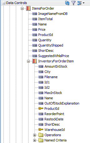
For example, to create the pie chart that displays the inventory levels at each stock location in the Summit Customer Management page of the Summit ADF sample application, select the BackOfficeAppModuleDataControl > Customers > OrdersForCustomer > ItemsForOrder > InventoryForOrderItem collection. Figure 35-7 shows the
InventoryForOrderItemcollection in the Data Controls panel. -
Drag the collection onto a JSF page and, from the context menu, choose Charts.
-
In the Component Gallery, select the Pie chart category and a chart type and click OK.
For example, select the Pie chart category and the Pie chart type to create the pie chart in Figure 35-6.
-
Do the following in the Create Pie Chart dialog to configure the pie chart to display data:
-
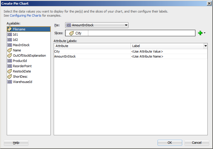
From the Pie field's dropdown menu, select an attribute to represent the column of data.
For example, to configure the pie chart in the Summit ADF sample application to display inventory levels, select the
AmountInStockattribute from the Pie field's dropdown menu. -
Drag attributes from the Available list to the Slices field, depending on where you want the values for the attributes to appear at runtime.
For example, to configure the pie chart in the Summit ADF sample application to display the ordered item's inventory levels at each stock location, drag the
Cityattribute from the Available list to the Slices field in the Create Pie Chart dialog. -
In the Attribute Labels table, accept the default value or select a value from the dropdown list in the Label field to specify the label that appears at runtime.
The underlying data type determines the choices available in the Label field. The choice you make determines how that attribute's label is rendered in the chart. For more information, see Section 35.2.6, "What You May Need to Know About Using Attribute Labels."
Figure 35-8 shows the Create Pie Chart dialog that generates a pie chart using the
AmountInStockandCityattributes in theInventoryForOrderItemcollection. -
-
Click OK.
Example 35-4 shows the code generated for the pie chart when you drag the
InventoryForOrderItemdata collection onto a JSF page and specifyAmountInStockfor the Pie value andCityfor the Slices.
After completing the data binding dialog, you can use the Properties window to specify settings for the chart attributes and you can also use the child tags associated with the chart tag to customize the chart further. For example, you can configure an exploding pie slice which causes one slice of the pie to appear separated from the other slices. For more information, see "Using Chart Components" in Developing Web User Interfaces with Oracle ADF Faces.
35.2.4 Creating a Databound Spark Chart Using Data Controls
Spark charts are simple, condensed charts that display trends or variations, often in the column of a table, or inline with text.
You can create a sparkchart by inserting a data control from the Data Controls Panel. Figure 35-9 shows the Component Gallery that displays when you drag a spark chart onto your page from the Data Controls panel.
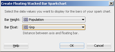
A binding dialog prompts you to specify the value you wish to display for the selected spark chart type. Line, bar, and area spark charts require a single series of data values, for example the changing value of a stock. Floating bar spark charts require two series of data values, one for the float offset, and one for the bar value. For example, in the Create Floating Stacked Bar Sparkchart dialog you specify:
-
Bar Height: Use to select the data value to use for the bar value.
-
Bar Float: Use to select the data value to use for the float offset, the distance between the axis and the floating bar.
Figure 35-10 shows a completed Create Floating Stacked Bar Sparkchart dialog.
In a simple UI-first development scenario you can insert a sparkchart using the Components window and bind it to data afterwards. For additional information about providing data to spark charts, see "How to Add Data to Spark Charts" in Developing Web User Interfaces with Oracle ADF Faces.
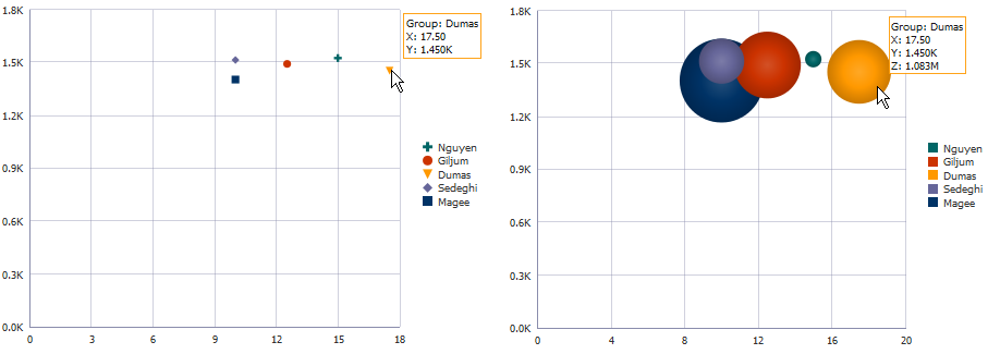
35.2.5 How to Create Databound Bubble and Scatter Charts
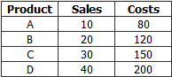
Bubble and scatter charts represent data by the location of the data marker. Bubble charts also use the size of the markers to represent an additional aspect of the data.
Scatter charts require at least two data values for each marker. Bubble charts require an additional data value for the marker size. Each data marker represents the following:
-
The x value that determines the marker's location along the x-axis.
-
The y value that determines the marker's location along the y-axis.
-
The z value that determines the size of the marker on bubble charts
For more than one group of data, the data must be in multiples of two for scatter charts and three for bubble charts.
Figure 35-11 shows a scatter and a bubble chart displaying salary and commission for salesmen in the Summit organization. In this example, the x value is determined by the commission, and the y value is determined by the salary. The bubble chart is configured to use the salesmen's total sales for the z value. In this example, Magee has the lowest salary and commission but is the salesman with the highest sales total.
It may be helpful to have an understanding of databound data visualization charts. For more information, see Section 35.2, "Creating Databound Charts."
You may also find it helpful to understand functionality that can be added using other Oracle ADF features. For more information, see Section 35.1.3, "Additional Functionality for Data Visualization Components."
You will need to complete these tasks:
-
Create an application module that contains instances of the view objects that you want in your data model, as described in Section 13.2, "Creating and Modifying an Application Module."
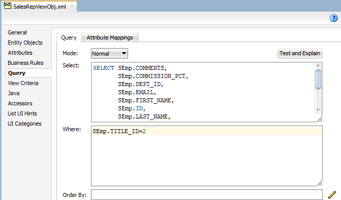
For example, the bubble and scatter charts in Figure 35-11 in uses a top level view object based on the
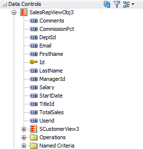
SEmpentity in the Summit ADF DVT sample application. In this example, the view object retrieves all sales representatives in the Summit ADF employee database by retrieving all employee records with aTITLE_IDof2. Figure 35-12 shows theSalesRepViewObjview object.Figure 35-17 shows the
SalesRepViewObj3data control.The
TotalSalesattribute is a transient attribute that calculates the salesman's total sales from theTotalattribute in theSOrdViewview object:SOrdView.sum ('Total'). For information about adding transient attributes to view objects, see Section 5.5, "Adding Calculated and Transient Attributes to a View Object." -
Create a JSF page as described in the "How to Create JSF Pages" section of Developing Web User Interfaces with Oracle ADF Faces.
To create a databound bubble or scatter chart:
-
From the Data Controls panel, select a collection.
For example, to create the bubble or scatter chart shown in Figure 35-11, select the
SalesRepViewObj3collection. -
Drag the collection onto a JSF page and, from the context menu, choose Charts.
-
In the Component Gallery, select the bubble or scatter chart category and a chart type and click OK.
-
In the Create Bubble Chart or Create Scatter Chart dialog, do the following in the dialog to configure the bubble or scatter chart axis values:
-
In the X Axis Data Point field, use the dropdown list to specify the attribute in the data collection to use for the x-axis data point.
For example, to configure the bubble or scatter chart to display the commission percent along the X Axis, select CommissionPct from the dropdown list.
-
In the Y Axis Data Point field, use the dropdown list to specify the attribute in the data collection to use for the y-axis data point.
-
For bubble charts, in the Z Axis Data Point field, use the dropdown list to specify the attribute in the data collection to use for the z-axis data point.
-
-
If you are configuring a scatter chart, in the Markers section, do the following in the dialog to configure the scatter chart's color, shape, and tooltip:
-
Select Automatically to use system-generated values for color/shape combinations. Select Manually to use distinct attributes to determine color and shape.
If you select Manually, select the attributes in the dropdown list for Marker Color and Marker Shape.
For example, you could select
LastNameandFirstNameto be used for Marker Color and Marker Shape for the scatter chart displayed in Figure 35-11. When the scatter chart is rendered, the legend will contain entries for both the color and shape as shown in Figure 35-14. The scatter chart's tooltip displays the value associated with both the marker and shape attributes. -
From the Marker Type field's dropdown list, specify one or more attributes in the data collection that determine the values that appear in the legend of the scatter chart. Each attribute will be represented by its own color/shape combination in the scatter chart's legend. You can drag and drop attributes from the Available list, or select from the Add dropdown list.
After specifying attributes for the input field, you can right click on any attribute to display a context menu for actions such as Move Right, Move Left, Delete, or Treat as Text.
-
From the Marker Tooltip field's dropdown list, select the attribute to use for the scatter chart's tooltip.
-
-
If you are configuring a bubble chart, in the Markers section, do the following in the dialog to configure the bubble colors and tooltip:
-
Select Automatically to use system-generated values for color. Select Manually to use distinct attributes to determine color and shape.
If you select Manually, select the attribute in the dropdown list for Marker Color and Marker Shape.
-
If you selected Automatically, from the Bubble Color field's dropdown list, specify one or more attributes in the data collection that determine the values that appear in the legend of the bubble chart. Each attribute will be represented by its own color in the bubble chart's legend. You can drag and drop attributes from the Available list, or select from the Add dropdown list.
After specifying attributes for the input field, you can right click on any attribute to display a context menu for actions such as Move Right, Move Left, Delete, or Treat as Text.
-
From the Bubble Tooltip field's dropdown list, select the attribute to use for the bubble chart's tooltip.
By default, the bubble chart's tooltip will display the attribute or attributes associated with the bubble chart's legend. For example, the bubble chart's tooltip in Figure 35-11 shows the last name of the salesman for the Group. You can select a different attribute in the collection to be used for the Group item in the tooltip.
-
-
In the Attribute Labels table, accept the default value or select a value from the dropdown list in the Label field to specify the label that appears at runtime.
The underlying data type determines the choices available in the Label field. The choice you make determines how that attribute's label is rendered in the chart. For more information, see Section 35.2.6, "What You May Need to Know About Using Attribute Labels."
-
Click OK.
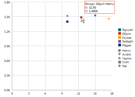
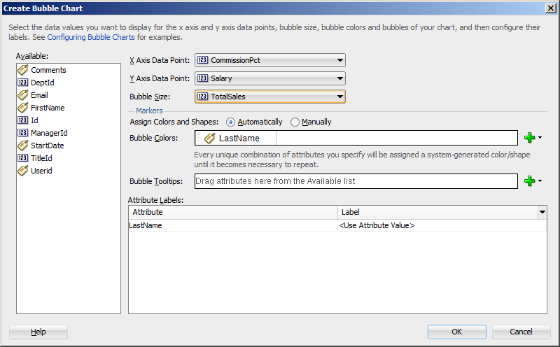
Figure 35-15 shows the Create Bubble Chart dialog that generates a bubble chart using data from the CommissionPct, Salary, and Total Sales attributes in the SalesRepViewObj3 data collection.
The entries for the Create Scatter Chart dialog are similar, but you would not need to select a bubble size. Figure 35-16 shows the Create Scatter Chart dialog that generates a scatter chart using data from the CommissionPct and Salary attributes in the SalesRepViewObj3 data collection.
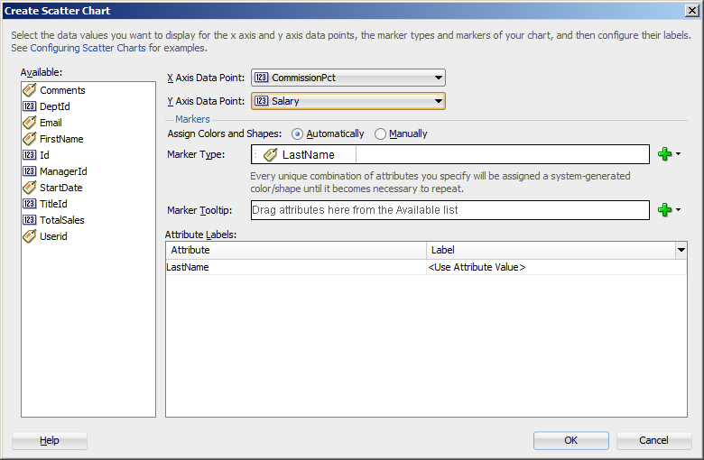
Example 35-5 shows the code generated for the bubble and scatter charts when you drag the SalesRepViewObj3 data collection onto a JSF page and specify CommissionPct for the X Axis Data Point, Salary for the Y Axis Data Point, and TotalSales for the bubble chart's Z Axis Data Point.
Example 35-5 JSF Code for an ADF Scatter and Bubble Chart
<dvt:scatterChart id="scatterChart1" var="row"
                  value="#{bindings.SalesRepViewObj3.collectionModel}">
  <dvt:chartLegend rendered="true" id="cl1">
    <dvt:legendSection source="ag1" id="ls1"/>
  </dvt:chartLegend>
  <f:facet name="dataStamp">
    <dvt:chartDataItem id="di1" group="#{row.LastName}" x="#{row.CommissionPct}"
                       y="#{row.Salary}">
      <dvt:attributeGroups id="ag1" value="#{row.LastName}" type="color shape"/>
    </dvt:chartDataItem>
  </f:facet>
</dvt:scatterChart>
...
<dvt:bubbleChart id="bubbleChart1" var="row"
                 value="#{bindings.SalesRepViewObj3.collectionModel}">
  <dvt:chartLegend rendered="true" id="cl1">
    <dvt:legendSection source="ag1" id="ls1"/>
  </dvt:chartLegend>
  <f:facet name="dataStamp">
    <dvt:chartDataItem id="di1" group="#{row.LastName}" x="#{row.CommissionPct}"
                       y="#{row.Salary}" z="#{row.TotalSales}">
      <dvt:attributeGroups id="ag1" value="#{row.LastName}" type="color"/>
    </dvt:chartDataItem>
  </f:facet>
</dvt:bubbleChart>
If you chose to configure the scatter chart manually using attributes from the data collection for marker and shape, JDeveloper adds an additional dvt:legendSection and dvt:attributeGroups tag to the JSF page. Example 35-6 shows the revised code, with the modified entries highlighted in bold.
Example 35-6 Code on JSF Page for Scatter Chart Manually Configured for Marker Color and Shape
<dvt:scatterChart id="scatterChart1" var="row"
                  value="#{bindings.SalesRepViewObj3.collectionModel}">
  <dvt:chartLegend rendered="true" id="cl1">
    <dvt:legendSection source="ag1" id="ls1"/>
    <dvt:legendSection source="ag2" id="ls2"/>
  </dvt:chartLegend>
  <f:facet name="dataStamp">
    <dvt:chartDataItem id="di1" group="#{row.LastName} #{row.FirstName}"
                       x="#{row.CommissionPct}"
                       y="#{row.Salary}">
      <dvt:attributeGroups id="ag1" value="#{row.LastName}" type="color"/>
      <dvt:attributeGroups id="ag2" value="#{row.FirstName}" type="shape"/>
    </dvt:chartDataItem>
  </f:facet>
</dvt:scatterChart>
After completing the data binding dialog, you can use the Properties window to specify settings for the chart attributes, and you can also use the child tags associated with the chart tag to customize the chart further. For example, you can specify where you want the chart's legend to appear. For more information, see "Using Chart Components" in Developing Web User Interfaces with Oracle ADF Faces.
35.2.6 What You May Need to Know About Using Attribute Labels
When you configure attribute labels in the Create Chart dialog, the underlying data type determines the choices available in the Label field. The choice you make determines how that attribute's label is rendered in the chart.
If an attribute represents data values, then the choices in the Label field are:
-
Use Attribute Name: Select to render the value as a string using the label from the
UIHintsfor that attribute in the underlyingViewObject. This is the default selection. -
No Label: Select to render no label. This choice is useful if there is a single metric and you want to provide your own descriptive text on the page to describe the resulting chart.
-
Select Text Resource: Select to open a Select Text Resource dialog to select or add a text resource to use for the label. The text resource is a translatable string from an application resource bundle. If you need help, press F1 or click Help.
-
Expression Builder: Select to open the Expression Builder dialog to create an expression to be executed at runtime for the label. If you need help, press F1 or click Help.
If the attribute represents a category of data values, then the choices are:
-
Use Attribute Value: Select to render the attribute values as category labels. This is the default selection.
-
From the dropdown list, choose an alternate attribute for the label. For example, use Employee Names for labels instead of Employee IDs.
35.3 Creating Databound Graphs
The funnel, Pareto, radar, and stock graphs are legacy server-side components whose use is discouraged in favor of the client-side charts.
When you create a chart using a data collection inserted from the Data Controls panel, a Component Gallery allows you to choose from a wide number of chart categories, chart types, and layouts.
Explore the Component Gallery that appears when you create a chart to view available chart categories, types, and descriptions for each one. Figure 35-17 shows the Component Gallery that appears for ADF charts when you use the Data Controls panel.
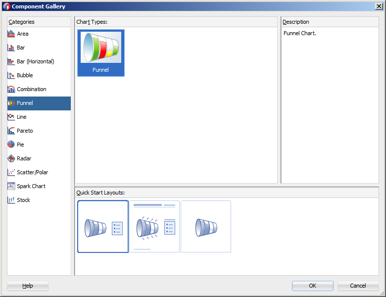
Note:
The area, bar, bar (horizontal), combination, line, pie, and scatter charts are client-side components, and their use is favored over the legacy graph components. For additional information about creating databound charts, see Section 35.2, "Creating Databound Charts."You can also create a graph by dragging a graph component from the Components window. This approach allows you the option of designing the graph's user interface before binding the component to data. A Create Graph dialog appears to view graph types, descriptions, and quick layout options. For more information about creating graphs using UI-first development, see "Using Graph Components" in Developing Web User Interfaces with Oracle ADF Faces.
Table 35-2 lists the categories that appear in the Component Gallery for graphs.
Table 35-2 ADF Graph Categories in the Component Gallery
| Category | Description |
|---|---|
|
Funnel |
Creates a graph that is a visual representation of data related to steps in a process. The steps appear as vertical slices across a horizontal cylinder. As the actual value for a given step or slice approaches the quota for that slice, the slice fills. Typically a funnel graph requires actual values and target values against a stage value, which might be time. For example, use this component to watch a process (such as a sales pipe line) move towards a target across the stage of the quarters of a fiscal year. |
|
Pareto |
Creates a graph in which data is represented by bars and a percentage line that indicates the cumulative percentage of bars. Each set of bars identifies different sources of defects, such as the cause of a traffic fatality. The bars are arranged by value, from the largest number to the lowest number of incidents. A pareto graph is always a dual-y graph in which the first y-axis corresponds to values that the bars represent and the second y-axis runs from 0 to 100% and corresponds to the cumulative percentage values. Use the pareto graph to identify and compare the sources of defects. |
|
Radar |
Creates a graph that appears as a circular line graph. Use to show patterns that occur in cycles, such as monthly sales for the last three years. |
|
Stock |
Creates a graph in which data shows the high, low, and closing prices of a stock and, optionally, the opening price and trading volume of the stock. |
35.3.1 How to Create a Stock Graph Using Name-Value Pairs
You can create a graph where the data collection is arranged in a series of name-value pairs instead of typed attributes. For example, stock values may be arranged in a single numeric column of data with multiple data points and multiple attributes to designate these points
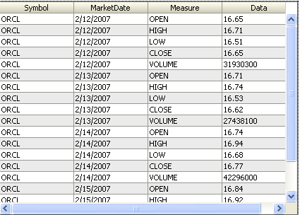
Figure 35-18 shows an example of a data collection arranged in name-value pairs. For each MarketDate, the Measure attribute contains the names for the values stored in the Data attribute: OPEN, HIGH, LOW, CLOSE, and VOLUME.
It may be helpful to have an understanding of databound data visualization graphs. For more information, see Section 35.3, "Creating Databound Graphs."
You may also find it helpful to understand functionality that can be added using other Oracle ADF features. For more information, see Section 35.1.3, "Additional Functionality for Data Visualization Components."
It may also be helpful to understand name-value pairs data shapes. For information, see Section 35.3.3, "What You May Need to Know About Using Name-Value Pairs."
You will need to complete these tasks:
-
Create an application module that contains instances of the view objects that you want in your data model, as described in Section 13.2, "Creating and Modifying an Application Module."
-
Create a JSF page as described in the "How to Create JSF Pages" section of Developing Web User Interfaces with Oracle ADF Faces.
To create a graph using a name-value pairs data shape:
-
From the Data Controls panel, select a collection.
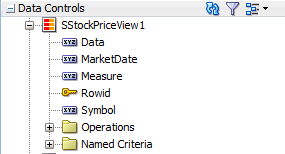
In the example to create a graph that displays the open, high, low, and close stock values over a week's time, select the collection
SStockPriceView1. Figure 35-19 shows theSStockPriceView1collection in the Data Controls panel. -
Drag the collection onto a JSF page and, from the context menu, choose Graphs.
-
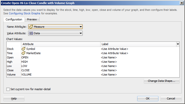
In the Component Gallery, select the Stock graph category, then the Open-Hi-Lo-Close Candle with Volume graph type, and click OK.
-
Do the following to change the dialog to support a name-value pairs data shape:
-
Click Change Data Shape.
-
In the Change Chart Data Shape dialog, select Name-Value Pairs, and click OK.
-
If prompted, confirm your selection.
-
-
Do the following in the modified dialog to configure the graph to display data:
-
For Name Attribute, select the attribute containing the names of the name-value pairs.
For example, choose Measure from the dropdown list to create a stock graph using the data collection in Figure 35-18.
-
For Value Attribute, specify the attribute containing the data for the name-value pairs.
For example, choose Data from the dropdown list to create a stock graph using the data collection in Figure 35-18.
-
In the Chart Values table, accept the default value or select a value from the dropdown list in the Label field to specify the label that appears at runtime.
The underlying data type determines the choices available in the Label field. The choice you make determines how that attribute's label is rendered in the graph. For more information, see Section 35.2.6, "What You May Need to Know About Using Attribute Labels."
-
Set the current row for master-detail: Select to use the graph's row selection listener to enable clicks on a bar, slice, or other graph data element to update the data in another ADF component. For more information see Section 35.3.2, "What You May Need to Know About Using a Graph's Row Selection Listener for Master-Detail Processing."
Note:
If the data collection is the child collection in a master-detail relationship, the dialog includes the option to Include Child Accessors (Hierarchical Graph). This option is included for backwards compatibility with older data models that mapped Tree collections onto the graph's cube model, and you normally would not check this box.
Figure 35-20 shows the Create Stock Graph dialog that generates a graph using the
Measureattribute in theSStockPriceView1collection. -
-
Optionally, click the Preview tab to display a live preview of the stock graph and its data. If necessary, go back to the Configuration tab so that you can adjust the stock graph specifications.
-
Click OK.
35.3.2 What You May Need to Know About Using a Graph's Row Selection Listener for Master-Detail Processing
You can use the row selection listener of a graph (which serves as a master view) to enable clicks on a bar, slice, or other graph data element to update the data in another ADF component (which serves as a detail view). For example, clicking on a bar that represents sales for a given product in a graph might cause the display of the detailed sales data for that product in a pivot table.
The following requirements must be met to achieve this master-detail processing declaratively:
-
You must use the same data control to provide data for both views as follows:
-
Bind the graph as a row set to the parent collection in the data control, for example,
DepartmentsView. -
Bind the other ADF view (such as a table or pivot table) to the dependent detail collection in the data control, for example
EmployeesView.
-
-
Select Set the current row for master-detail in the Create Graph dialog to set a value automatically for the
clickListenerattribute of the graph tag and use theprocessClickmethod that is already part of the graph binding.For example, if the
valueattribute of the graph tag isvalue="#{bindings.myGraph.graphModel}", then theclickListenerattribute is set toclickListener="#{bindings.myGraph.graphModel.processClick}".
You do not have to write Java code for handling clicks on data elements in the graph. The processClick event on the graph binding recognizes click events on data component in a graph and performs the necessary processing.
35.3.3 What You May Need to Know About Using Name-Value Pairs
When you configure a graph using data controls, by default the data binding dialog supports typed attributes, where each kind of data point in the collection is represented by a different attribute. For example, if you have data points for the sales and costs of multiple products, use typed attributes only if you have one attribute for the sales data of each product, and a second attribute for the cost of each product in the data collection.
Typed attributes data shape is also valid when there is only a single kind of data point in the graph. Figure 35-21 shows a typed attribute data shape.
You can select Change Data Shape in the data binding dialog to change the dialog to support name-value pairs, where there are two or more kinds of data points represented by exactly two attributes: a Name attribute that specifies the name of the data point and a Value attribute that specifies the data value. In this case, each dedicated attribute has values that identify each kind of data point. For example, the metrics attribute might have values for dales and costs for each product in a data collection. Figure 35-22 shows a data collection in a name-value pairs data shape.
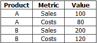
When using a name-value pairs data shape, specify these values in the graph data binding dialog:
-
Name Attribute: the attribute in the data collection representing the
Nameattribute, when its unique values categorize data points into different metrics. -
Value Attribute: the attribute in the data collection representing the numeric data points plotted on the graph. Each data point is categorized as belonging to a particular metric by the corresponding
Nameattribute value. -
Specify the values for the
Valueattribute in the relevant fields for the graph type as defined in the dialog, for example, Bubble Colors and Bubble Tooltips for a bubble graph. Values can be attributes in the data collection, or data values, representing a unique value of theNameattribute to be used at runtime to categorize data points into specific metrics.You must add one or more data values by selecting Data Value from the field Add dropdown list. Each data value represents a unique value of the
NameAttribute to be used at runtime to categorize data points into specific metrics. You are not required to select all the metrics available in theNameAttribute.After specifying attributes or data values for the input field, you can right-click any attribute to display a context menu for actions such as Move Right, Move Left, Delete, or Edit Data Value.
For example, you can create a stock graph that displays open, high, low, and close stock values bound to a data collection with a single numeric column of data in a name-value pairs shape as displayed in Figure 35-23.
35.4 Creating Databound Gauges
A gauge plots a single data value, such as a sales total, stock level, temperature, or speed. Using thresholds, gauges can show state information such as acceptable or unacceptable ranges using color. For example, a gauge value axis might show ranges colored red, yellow, and green to represent low, medium, and high states. One databound gauge component can create a single gauge or a column of gauges, depending on the number of rows in the data collection used. In a data collection, each row contains the value for a single gauge.
The Component Gallery for gauges allows you to choose from four gauge categories.
Table 35-3 ADF Gauge Categories in the Component Gallery
| Image | Category | Description |
|---|---|---|
 |
Dial |
Displays a metric value plotted on a circular axis. The gauge's background attribute determines whether the gauge's background is displayed as a rectangle, circle, or semicircle. An indicator points to the dial gauge's metric value on the axis. |
 |
LED |
Graphically depicts a measurement, such as a key performance indicator (KPI). Several styles of shapes are available for LED gauges, including round or rectangular shapes that use color to indicate status, and triangles or arrows that point up, left, right, or down in addition to the color indicator. |
 |
Rating |
Displays and optionally accepts input for a metric value. This gauge is typically used to show ratings for products or services, such as the star rating for a movie. |
 |
Status Meter |
Displays the metric value on a horizontal or circular axis. An inner rectangle shows the current level of a measurement against the ranges marked on an outer rectangle. Optionally, status meters can display colors to indicate where the metric value falls within predefined thresholds. |
Each category contains one or more gauge types. Explore the Component Gallery that appears when you create a single gauge to view all available gauge and category types, and descriptions for each one. Figure 35-24 shows the Component Gallery that appears for ADF gauges.
The data binding process is essentially the same regardless of which type of gauge you create. Only the metric value (that is, the measurement that the gauge is to indicate) is required. However, if a row in a data collection contains range information such as maximum, minimum, and thresholds, then these values can be bound to the gauge to provide dynamic settings. If information that you want to use in a gauge's upper or lower labels is available in the data collection, then you can bind these values to the gauge as well.
For information about customizing a gauge after the data binding is completed, see "Using Gauge Components" in Developing Web User Interfaces with Oracle ADF Faces.
35.4.1 How to Create a Databound Dial Gauge
You can use the ADF gauge component to create a dial gauge against a circle, dome, or rectangle background. The gauge's indicator specifies the current value of the metric.
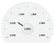
Figure 35-25 shows a single dial gauge that appears if you create a gauge from the AmountInStock data for inventory items in the Summit ADF DVT sample application. The value of the AmountInStock metric, which is 0.650K, appears in a label in the center of the gauge
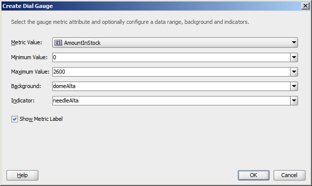
To create a dial gauge using a data control, you bind the gauge component to an attribute in a data collection. JDeveloper allows you to do this declaratively by dragging and dropping an attribute from the Data Controls panel. After you drag and drop the attribute, use the Create Dial Gauge dialog to configure the gauge.
Figure 35-26 shows the Create Dial Gauge dialog configured for the Amount in Stock dial gauge shown in Figure 35-25 and using the gauge type shown in Figure 35-24.
It may be helpful to have an understanding of databound data visualization gauges. For more information, see Section 35.4, "Creating Databound Gauges."
You may also find it helpful to understand functionality that can be added using other Oracle ADF features. For more information, see Section 35.1.3, "Additional Functionality for Data Visualization Components."
You will need to complete these tasks:
-
Create an application module that contains instances of the view objects that you want in your data model, as described in Section 13.2, "Creating and Modifying an Application Module."
-
Create a JSF page as described in the "How to Create JSF Pages" section of Developing Web User Interfaces with Oracle ADF Faces.
To create a databound dial gauge:
-
From the Data Controls panel, select an attribute from a collection.
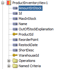
For example, to create a dial gauge in the Summit ADF DVT sample application to display the stock levels for an inventory item, you would select the
AmountInStockattribute in theProductInventoryView1collection. Figure 35-27 shows theProductInventoryView1collection in the Data Controls panel with theAmountInStockattribute selected. -
Drag the attribute onto a JSF page and, from the context menu, choose Gauges.
-
In the Component Gallery, choose the category and type of gauge, and then click OK.
-
In the Create Dial Gauge dialog, do the following:
-
In the Metric field, confirm the column in your data collection that contains the actual value that the gauge is to plot. This is the only required value in the dialog.
-
In the Minimum field, if your data collection stores a minimum value for the gauge range, select the column that contains this value from the dropdown list. Alternatively, specify a minimum number for the range. If you do not specify a value, the minimum defaults to
0. -
In the Maximum field, if your data collection stores a maximum value for the gauge range, select the column that contains this value from the dropdown list. Alternatively, specify a maximum value. If you do not specify a value, the maximum value defaults to
100. -
In the Background field, select a background from the dropdown list.
Available shapes include circle, dome, and rectangle, with alta, light, antique, or dark shading. By default, the gauge's background is set to
autowhich will return the primary design for the current skin. -
In the Indicator field, select an indicator style from the dropdown list.
Available indicators include alta, antique, dark, and light. By default the indicator is set to auto which will select the indicator that matches the gauge's background.
-
In the Show Metric Label check box, select the Show Metric Label check box to show a metric label for the gauge. The metric label contains the actual metric value for the gauge. For example, if the amount in stock for a given item is 63, then the metric label will display 63.
-
-
Click OK.
In the Properties window, after you complete the binding of the gauge, you can set values for additional attributes in the gauge tag and its child tags to customize the component. For example, to configure the Amount In Stock gauge to show inventory amounts without scaling, set the scaling attribute of the metric and tick labels to none.
You can also examine and adjust the existing gauge bindings by clicking the Edit icon in the Properties window for the gauge component.
For additional information about customizing a gauge after the data binding is completed, see "Using Gauge Components" in Developing Web User Interfaces with Oracle ADF Faces.
35.4.2 What Happens When You Create a Dial Gauge from a Data Control
Dropping a gauge from the Data Controls panel has the following effect:
-
Creates the bindings for the gauge and adds the bindings to the page definition file
-
Adds the necessary code for the UI components to the JSF page
Example 35-7 shows the bindings that JDeveloper generated for the dial gauge that displays the inventory level for a product in a warehouse. This code example shows that the gauge metric receives its value dynamically from the AmountInStock attribute in the ProductInventoryView1 data collection.
Example 35-7 Binding for a Dial Gauge
<bindings>
  <attributeValues IterBinding="ProductInventoryView1Iterator" id="AmountInStock">
    <AttrNames>
      <Item Value="AmountInStock"/>
    </AttrNames>
  </attributeValues>
</bindings>
Example 35-8 shows the code that JDeveloper generated in the JSF page for a dial gauge.
35.4.3 How to Create a Databound Rating Gauge
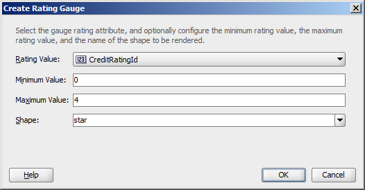
The rating gauge displays and optionally accepts input for a metric value. This gauge is typically used to show ratings for products or services, such as the star rating for a movie.
Figure 35-28 shows an example of a rating gauge used to indicate a customer's credit rating in the Summit ADF sample application. In this example, the customer has a poor credit rating and is assigned one star. Other ratings include two stars for fair credit, three stars for good credit, and four stars for excellent.
To create a rating gauge using a data control, you bind the rating gauge to an attribute in a data collection. JDeveloper allows you to do this declaratively by dragging and dropping an attribute from the Data Controls panel. After you drag and drop the attribute, use the Create Rating Gauge dialog to configure the gauge.
Figure 35-29 shows the Create Rating Gauge dialog completed for the rating gauge in Figure 35-28. In this example, the rating gauge is set to a maximum value of four to reflect the four credit ratings.
It may be helpful to have an understanding of databound data visualization gauges. For more information, see Section 35.4, "Creating Databound Gauges."
You may also find it helpful to understand functionality that can be added using other Oracle ADF features. For more information, see Section 35.1.3, "Additional Functionality for Data Visualization Components."
You will need to complete these tasks:
-
Create an application module that contains instances of the view objects that you want in your data model, as described in Section 13.2, "Creating and Modifying an Application Module."
-
Create a JSF page as described in the "How to Create JSF Pages" section of Developing Web User Interfaces with Oracle ADF Faces.
To create a databound rating gauge:
-
From the Data Controls panel, select an attribute from a collection.
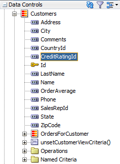
For example, to create the rating gauge in the Summit ADF sample application to display the credit ratings for a customer, you would select the
CreditRatingIdattribute in theCustomercollection. Figure 35-27 shows theCustomercollection in the Data Controls panel with theCreditRatingIdattribute selected. -
Drag the attribute onto a JSF page and, from the context menu, choose Gauges.
-
In the Component Gallery, choose the category and type of gauge, and then click OK.
-
In the Create Rating Gauge dialog, do the following:
-
In the Rating Value field, confirm the column in your data collection that contains the actual value that the gauge is to plot. This is the only required value in the dialog.
-
In the Minimum field, if your data collection stores a minimum value for the gauge range, select the column that contains this value from the dropdown list. Alternatively, specify a minimum number for the range. If you do not specify a value, the minimum defaults to
0. -
In the Maximum field, if your data collection stores a maximum value for the gauge range, select the column that contains this value from the dropdown list. Alternatively, specify a maximum value. If you do not specify a value, the maximum value defaults to
5. -
In the Shape field, select a background from the dropdown list.
Available shapes include circle, diamond, rectangle, and star.
-
-
Click OK.
In the Properties window, after you complete the binding of the gauge, you can set values for additional attributes in the gauge tag and its child tags to customize the component. For example, to configure the rating gauge to allow the customer's credit rating to be updated, set the readOnly attribute of the rating gauge to false.
In the Summit ADF example, the rating gauge's value was set to the CreditRatingId during creation. However, the CreditRatingId actually ranges between 1 and 4, with 1 being the highest rating. To convert the rating to stars for the rating gauge, edit the source code in the Code Editor after the gauge is credited and replace the rating gauge's value with: #{5 - bindings.CreditRatingId.inputValue}.
Example 35-9 shows the code on the JSF page for the Summit ADF rating gauge.
Example 35-9 Code on JSF Page for the Summit ADF Rating Gauge
<dvt:ratingGauge id="ratingGauge1" minimum="0" maximum="4"
                 value="#{5 - bindings.CreditRatingId.inputValue}" shape="star"/>
You can also examine and adjust the existing gauge bindings by clicking the Edit icon in the Properties window for the gauge component.
For additional information about customizing a gauge after the data binding is completed, see "Using Gauge Components" in Developing Web User Interfaces with Oracle ADF Faces.
35.4.4 Including Gauges in Databound ADF Tables
You can add databound gauges to a databound ADF table by choosing the gauge component when specifying column content during table editing or creation.
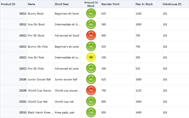
Figure 35-31 shows a portion of a table that displays all the products in a warehouse in the Summit ADF DVT sample application. In this example, the AmountInStock column includes a LED gauge that shows the amount in stock for each product and whether the value falls within an acceptable range.
35.4.4.1 How to Include a Gauge in a Databound ADF Table
To add a gauge to a databound ADF table, drag a data collection that includes the gauge metric from the Data Controls panel to the JSF page and specify the type of gauge to create.
It may be helpful to have an understanding of databound data visualization gauges. For more information, see Section 35.4, "Creating Databound Gauges."
You may also find it helpful to understand functionality that can be added using other Oracle ADF features. For more information, see Section 35.1.3, "Additional Functionality for Data Visualization Components."
You will need to complete these tasks:
-
Create an application module that contains instances of the view objects that you want in your data model, as described in Section 13.2, "Creating and Modifying an Application Module."
-
Create a JSF page as described in the "How to Create JSF Pages" section of Developing Web User Interfaces with Oracle ADF Faces.
To include a gauge in a databound ADF table:
-
From the Data Controls panel, select the collection to use for the ADF table.
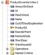
For example, to create the table that displays the inventory levels for each product in a warehouse in the Summit ADF DVT sample application, select the
ProductInventoryView1collection. Figure 35-32 shows theProductInventoryView1collection in the Data Controls panel. -
Drag the collection onto a JSF page and, from the context menu, choose Table -> ADF Table.
-
In the Edit Table Columns dialog, select the column that represents the gauge metric.
For example, select the
AmountInStockcolumn to use as the gauge metric. -
From the Component to Use dropdown menu, choose the type of gauge to create.
For example, choose Gauge Status Meter to add a status meter to the table.
-
Complete the table configuration.
If you need help, press F1 or click Help.
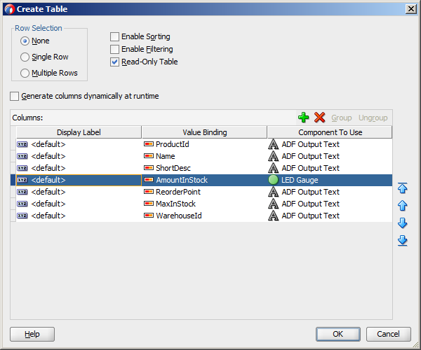
Figure 35-33 shows the completed dialog for the table displayed in Figure 35-31, with the LED Gauge selected for the
AmountInStockcolumn. -
Click OK to add the table to the JSF page.
In the Properties window, after you complete the binding of the table, you can set values for additional attributes in the gauge tag and its child tags to customize the component. For example, the LED gauge in Figure 35-31 is configured to use thresholds to indicate whether the stock level is within an acceptable range. For additional information about configuring gauge thresholds, see "How to Configure Gauge Thresholds" in Developing Web User Interfaces with Oracle ADF Faces.
You can also examine and adjust the existing table bindings by clicking the Edit icon in the Properties window for the table component.
For additional information about creating and configuring databound ADF tables, see Chapter 29, "Creating ADF Databound Tables." For additional information about using and customizing gauge components, see "Using Gauge Components" in Developing Web User Interfaces with Oracle ADF Faces.
35.4.4.2 What Happens When You Include a Gauge in an ADF Table
When you include a gauge in a databound ADF table, the gauge's metric attribute is added to the page definition file, and the UI components are updated on the JSF page.
Example 35-10 shows the binding for the ADF table shown in Figure 35-31.
Example 35-10 Binding for ADF Table with LED Gauge
<bindings>
  <tree IterBinding="ProductInventoryView1Iterator" id="ProductInventoryView1">
    <nodeDefinition DefName="model.ProductInventoryView"
                    Name="ProductInventoryView10">
      <AttrNames>
        <Item Value="ProductId"/>
        <Item Value="Name"/>
        <Item Value="ShortDesc"/>
        <Item Value="AmountInStock"/>
        <Item Value="ReorderPoint"/>
        <Item Value="MaxInStock"/>
        <Item Value="WarehouseId"/>
      </AttrNames>
    </nodeDefinition>
  </tree>
</bindings>
Example 35-11 shows the code added to the JSF page for the ADF table. The gauge elements are highlighted in bold. For the sake of brevity, only the first three table columns are displayed.
Example 35-11 Sample Code on JSF Page Showing Gauge in Databound Table
<af:table value="#{bindings.ProductInventoryView1.collectionModel}" var="row"
          rows="#{bindings.ProductInventoryView1.rangeSize}"
          emptyText="#{bindings.ProductInventoryView1.viewable ?
                    'No data to display.' : 'Access Denied.'}"
          rowBandingInterval="0"
          fetchSize="#{bindings.ProductInventoryView1.rangeSize}" id="t1"
          summary="Table Showing Product Inventory">
  <af:column headerText="#{bindings.ProductInventoryView1.hints.ProductId.label}"
             id="c1" width="100"
             rowHeader="true">
    <af:outputText value="#{row.ProductId}"
             shortDesc="#{bindings.ProductInventoryView1.hints.ProductId.tooltip}"
             id="ot1">
      <af:convertNumber groupingUsed="false"
                        pattern="#{bindings.ProductInventoryView1.hints.ProductId.format}"/>
    </af:outputText>
  </af:column>
  <af:column headerText="#{bindings.ProductInventoryView1.hints.Name.label}"
             id="c2" width="100">
    <af:outputText value="#{row.Name}"
                   shortDesc="#{bindings.ProductInventoryView1.hints.Name.tooltip}" id="ot2"/>
  </af:column>
  <af:column headerText="#{bindings.ProductInventoryView1.hints.ShortDesc.label}"
             id="c3" width="100">
    <af:outputText value="#{row.ShortDesc}"
                   shortDesc="#{bindings.ProductInventoryView1.hints.ShortDesc.tooltip}" id="ot3"/>
  </af:column>
  <af:column headerText="#{bindings.ProductInventoryView1.hints.AmountInStock.label}"
             id="c4" width="72" align="center">
    <dvt:ledGauge id="ledGauge1" value="#{row.bindings.AmountInStock.inputValue}"
                  shortDesc="#{bindings.ProductInventoryView1.hints.AmountInStock.tooltip}"
                  maximum="3000">
      <dvt:gaugeMetricLabel rendered="true" scaling="none" id="gml1"/>
      <dvt:gaugeThreshold id="gt1" maximum="#{row.bindings.ReorderPoint.inputValue}"
                          color="#d62800"/>
      <dvt:gaugeThreshold id="gt2" maximum="#{row.bindings.MaxInStock.inputValue}"
                          color="#63a500"/>
      <dvt:gaugeThreshold id="gt3" color="#e7e700"/>
    </dvt:ledGauge>
  </af:column>

... remaining columns omitted
</af:table>