34 Using Tag Cloud Components
This chapter describes how to use the ADF Data Visualization Tag Cloud component to display data in tag clouds using simple UI-first development. The chapter defines the data requirements, tag structure, and options for customizing the look and behavior of these components.
If your application uses the Fusion technology stack, you can use data controls to create tag clouds. For more information, see "Creating Databound Tag Clouds" in Developing Fusion Web Applications with Oracle Application Development Framework
34.1 About the Tag Cloud Component
An ADF DVT Tag Cloud is a visual representation for text data, typically used to visualize free form text or tag metadata for a website. Tag clouds are useful for displaying non-prioritized data collections, such as a list of countries or states, or mutually exclusive data in a collection, such as music genres.
The importance or frequency of each tag is shown with font size or color. This visualization is useful for quickly identifying the most prominent terms in a set.
34.1.1 Tag Cloud Use Cases and Examples
Tag Clouds are made up of an array of tags. There are a number of use cases.
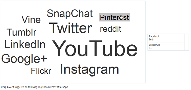
Tag clouds are most useful to quickly gauge the relative percentage power of an item in a population. For example, Figure 34-1 shows the results of a survey wherein respondents disclosed which social media networks they use.
Figure 34-1 Simple Tag Cloud with Cloud Layout

Description of "Figure 34-1 Simple Tag Cloud with Cloud Layout"
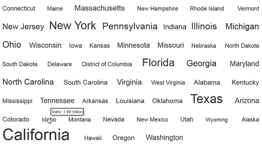
Tag Clouds may also be displayed in a rectangular layout. This is most useful for formal data, website tag searches, or if the cloud needs to be contained within a fixed container. Figure 34-2 shows the latest census data for population of the states in the US. The tags are configured to show the population in the tooltip for the tag.
Figure 34-2 Tag Cloud with Rectangular Layout
Description of "Figure 34-2 Tag Cloud with Rectangular Layout"
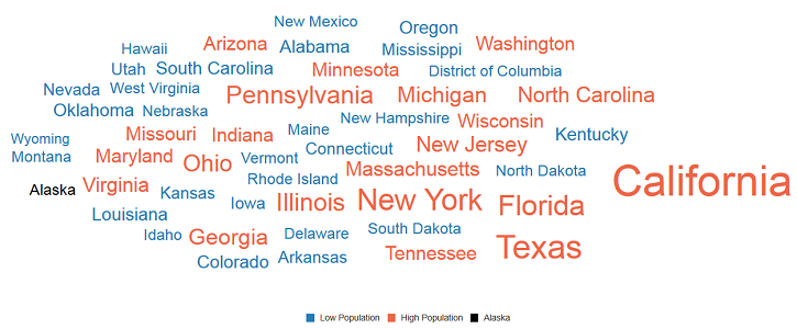
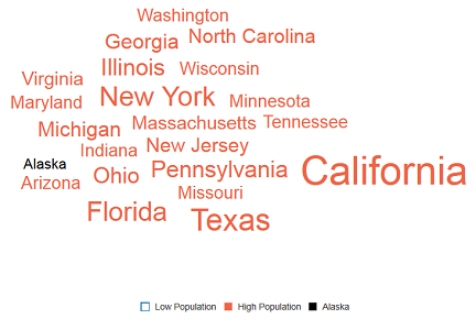
Tags may be divided into groups, and these groups may be represented in a legend. This is useful for quickly dividing tags by criteria. For example, Figure 34-3 shows US states bifurcated into groups of low or high population. The condition provided classifies states with less than 5 million people as low population and with more than 5 million people as high population. Tag clouds accept both match and exception rules to allow for complex grouping.
Figure 34-3 Tag Cloud with Colored Groups and Legend
34.1.2 End User and Presentation Features of Tag Clouds
Tag Clouds have a number of presentation features that make it a versatile and useful tool for tag representation.
Tag Clouds can be configured to hide and show series using legend items. By clicking on a legend item, all tags mapped to that legend item will be hidden. This is indicated by a hollow square in the legend. Figure 34-4 shows the high and low population tag cloud with the low population states hidden.
Figure 34-4 Tag Cloud Hide and Show Series
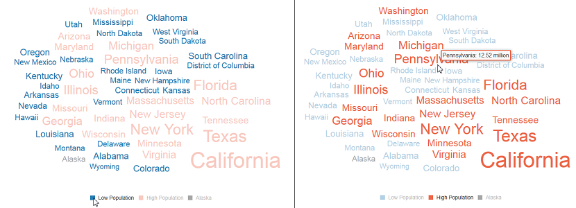
Tag Clouds can be configured to highlight groups by hovering over the tags or the corresponding legend items. Figure 34-5 shows the high and low population tag cloud. In the first case, hovering over the low population legend item dims all other groups. In the second case, hovering over a high population tag dims all other groups.
Figure 34-5 Tag Cloud Highlighting
Tag Cloud items support drag and drop using the af:dragSource and af:dropTarget attributes. Items may be dragged across any items that support those two attributes. For example, Figure 34-6 shows the social media usage tag cloud, with two items dragged out of the cloud and dropped into a table component.
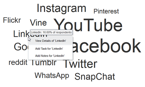
Tag Clouds support context menus. Figure 34-7 shows the social media tag cloud configured with a custom context menu to display additional options for each tag.
Tag clouds also support single action behavior, such as linking, via the action and actionListener attributes, or individual tag links via the destination attribute.
34.1.3 Additional Functionality for Tag Cloud Components
You may find it helpful to understand other ADF Faces features before you implement your tag cloud. Additionally, once you have added a tag cloud to your page, you may find that you need to add functionality such as validation and accessibility.
Following are links to other functionality that tag cloud components can use:
-
Client-side framework: DVT components are rendered on the client when the browser supports it. You can respond to events on the client using the
af:clientListenertag. For more information, see Listening for Client Events. -
Partial page rendering: You may want a tag cloud to refresh to show new data based on an action taken on another component on the page. For more information, see Rerendering Partial Page Content.
-
Personalization: When enabled, users can change the way the tag cloud displays at runtime, those values will not be retained once the user leaves the page unless you configure your application to allow user customization. For information, see Allowing User Customization on JSF Pages.
-
Accessibility: You can make your tag cloud components accessible. For more information, see Developing Accessible ADF Faces Pages.
-
Touch devices: When you know that your ADF Faces application will be run on touch devices, the best practice is to create pages specific for that device. For additional information, see Creating Web Applications for Touch Devices Using ADF Faces.
-
Skins and styles: You can customize the appearance of tag cloud components using an ADF skin that you apply to the application or by applying CSS style properties directly using a style-related property (
styleClassorinlineStyle). For more information, see Customizing the Appearance Using Styles and Skins. -
Automatic data binding: If your application uses the Fusion technology stack, then you can create automatically bound tag clouds based on how your ADF Business Components are configured. For more information, see "Creating Databound Tag Cloud Components" in Developing Fusion Web Applications with Oracle Application Development Framework.
Note:
If you know the UI components on your page will eventually use ADF data binding, but you need to develop the pages before the data controls are ready, then you should consider using placeholder data controls, rather than manually binding the components. Using placeholder data controls will provide the same declarative development experience as using developed data controls. For more information, see the "Designing a Page Using Placeholder Data Controls" section in Developing Fusion Web Applications with Oracle Application Development Framework.
Additionally, data visualization components share much of the same functionality, such as how data is delivered, automatic partial page rendering (PPR), and how data can be displayed and edited. For more information, see Common Functionality in Data Visualization Components.
34.2 Using the Tag Cloud Component
To use the ADF DVT Tag Cloud component, add the tag cloud to a page using the Component Palette window. Then define the data for the tag cloud and complete the additional configuration in JDeveloper using the tag attributes in the Properties window.
34.2.1 Tag Cloud Data Requirements
Tag clouds require a collection of string items which are represented as the tags or words in the component.
The label attribute accepts a string item or a collection of strings to display as tags.
Optionally, you can also provide a numeric value for the tags to the value attribute, which will be used to modify the relative size of each tag. You can also provide grouping information using the dvt:attributeGroups child tag, wherein tags in the same group will be rendered in the same color.
34.2.2 How to Add a Tag Cloud to a Page
When you are designing your page using simple UI-first development, you use the Components window to add a tag cloud to a JSF page. When you drag and drop a tag cloud component onto the page, the tag cloud is added to your page, and you can use the Properties window to specify data values and configure additional display attributes.
value attribute.
Note:
If your application uses the Fusion technology stack, then you can use data controls to create a Tag Cloud and the binding will be done for you. For more information, see the "Creating Databound Tag Clouds" section in Developing Fusion Web Applications with Oracle Application Development Framework.
Before you begin:
It may be helpful to have an understanding of how tag cloud attributes and tag cloud child tags can affect functionality. For more information, see Configuring Tag Clouds.
You may also find it helpful to understand functionality that can be added using other ADF Faces features. For more information, see Additional Functionality for Tag Cloud Components
You must complete the following tasks:
-
Create an application workspace as described in Creating an Application Workspace.
-
Create a view page as described in Creating a View Page.
- In the ADF Data Visualization page of the Components window, drag and drop a Tag Cloud from the Common panel to the page.
- In the Properties window, view the attributes for the Tag Cloud. Use the Help button or press F1 to display the complete tag documentation for the
tagCloudcomponent. - In the Structure window, expand the dvt:tagCloud element to find the dvt:tagCloudItem element. View and modify the attributes for the dvt:tagCloudItem in the Properties window.
34.2.3 What Happens When You Add a Tag Cloud to a Page
JDeveloper generates only a minimal set of tags when you drag and drop a tag cloud from the Components window onto a JSF page.
The generated code is:
<dvt:tagCloud id="tc1"/>
After inserting a tag cloud component into the page, you can use the visual editor or Properties window to add data or customize tag cloud features. For information about setting component attributes, see How to Set Component Attributes.
If you choose to bind the data to a data control when creating the tag cloud, JDeveloper generates code based on the data model. For more information, see the "Creating Databound Tag Clouds" section in Developing Fusion Web Applications with Oracle Application Development Framework
34.2.4 Configuring Tag Clouds
The Tag Cloud component has configurable attributes and child components that you can add or modify to customize the display or behavior of the tag cloud.
The prefix dvt: occurs at the beginning of the name of each tag cloud component, indicating that the component belongs to the ADF Data Visualization Tools (DVT) tag library. You can configure Tag Cloud child components, attributes, and supported facets in the following areas:
-
Tag Cloud (
dvt:tagCloud): Wraps the tag cloud child tags. Configure the following attributes to control the tag cloud display:-
hideAndShowBehavior: Specifies the hide/show behavior when clicking on legend items. This attribute is only applicable when attribute groups are used to color the tag cloud items. -
hoverBehavior: Specifies the behavior when hovering over word cloud or legend items. This attribute is only applicable when attribute groups are used to color the tag cloud items. -
layout: Specifies the built-in layout to use for tag display. The attribute may be set torectangular, wherein items are displayed in a rectangular shape, orcloud, wherein items are displayed with weighted words in the center and lighter words towards the edges. -
legendSource: Specifies the id of thedvt:attributeGroupsused for display in the legend. Thisdvt:attributeGroupselement must be a child of advt:tagCloudItemwithin this component. -
selectionMode: Specifies whether a tag cloud item can be selected or not. Allows for single or multiple selection.
-
-
Tag Cloud Item (
dvt:tagCloudItem): Use to define the properties for the displayed data in the tag cloud. Configure the following attributes to control the display of the tag cloud item display:Table 34-1 Tag Cloud Child Component Attributes
Child Tag Attributes Description actionSpecifies a reference to an action method sent by the component, or the static outcome of an action.
actionListenerSpecifies a method reference for an action listener.
destinationSpecifies the URL this component references.
shortDescSpecifies the custom tooltip text for the tag cloud item.
inlineStyleSpecifies the CSS style for the tag item. It accepts font-related CSS attributes like font-name, font-family, font-weight, font-style, and color. Font-size will be ignored as font-size is determined by the layout.
labelSpecifies the text string for this tag cloud item.
valueSpecifies the value of this tag cloud item. The value determines the relative size of the node within the tag cloud.
-
Tag Cloud Facets: Tag clouds do not support facets.
