2 Exploring Your Content
This topic describes the many ways that you can explore and work with content.
Topics
Typical Workflow for Exploring Content
Here are the common tasks for exploring content.
| Task | Description | More Information |
|---|---|---|
|
Select data sources |
Select data sources for a project. | |
|
Add data elements |
Add data elements from a selected data source to visualizations. | |
|
Adjust the canvas layout |
Add, remove, and rearrange visualizations. |
|
|
Filter content |
Streamline the content shown in visualizations. |
|
| Set visualization interaction properties | Specify how visualizations synchronize. |
Choosing Data Sources
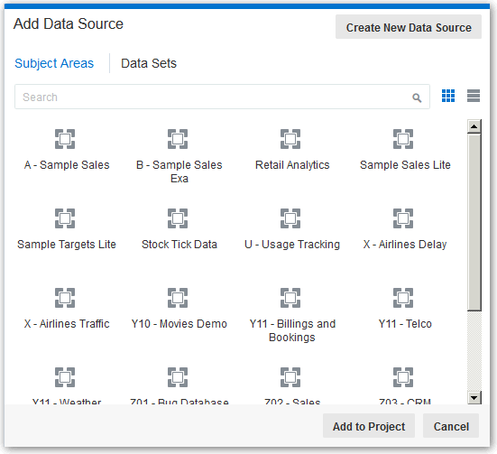
Before you can begin to explore data in a project, you must select a data source for that information. You can select subject areas, Oracle Applications, databases, or uploaded data files as your data sources.
Adding Data Elements to Visualizations
There are various ways that you can add data elements such as columns and calculations to your visualizations.
Adding Data Elements to Drop Targets
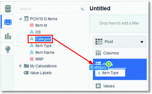
After you select the data sources for your project, you can begin to add data elements such as measures and attributes to visualizations. A drop target is the visualization element (for example, Columns) onto which you can drop a compatible data element (for example, Category) from the data source.
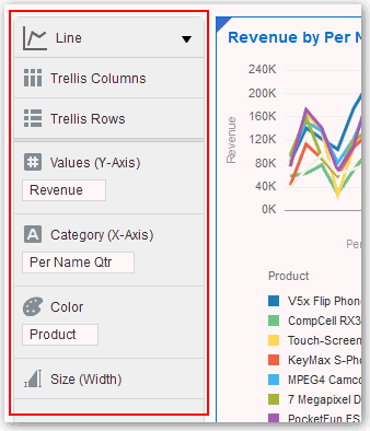
Description of the illustration GUID-423B1D42-AB5E-4DB0-B9F3-23ADEE5B7CCB-default.gif
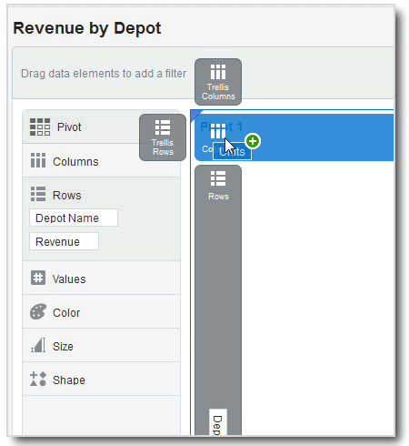
Here are some of the ways that you can add data elements to drop targets:
Adding Data Elements to Visualization Drop Targets
You can use visualization drop targets to help you position data elements in the optimal locations for exploring content.
Adding Data Elements to a Blank Canvas
You can add data elements directly from the Data Elements pane to a blank canvas.
Note:
If there are visualizations already on the canvas, then you can drag and drop data elements between them.Sorting Data in Visualizations
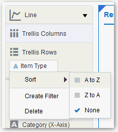
Sometimes you're working with a lot of data in visualizations. To optimize your view of that data, you need to sort it.
Adjusting the Canvas Layout
You can adjust the look and feel of visualizations on the canvas to make them more visually attractive. For example, you can create a visualization and then copy it to the canvas. You can then modify the data elements in the duplicated visualization, change the visualization type, and then resize it.
- To delete a visualization from the canvas, right-click it and select Delete Visualization.
- To rearrange a visualization on the canvas, drag and drop the visualization to the location (the space between visualizations) where you want it to go. The target drop area is displayed with a blue outline.
- To resize a visualization, use your cursor to drag the edges to size it.
- To copy a visualization on the canvas, right-click it and select Copy Visualization.
- To paste a copied visualization on the canvas, right-click the canvas and select Paste Visualization.
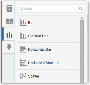
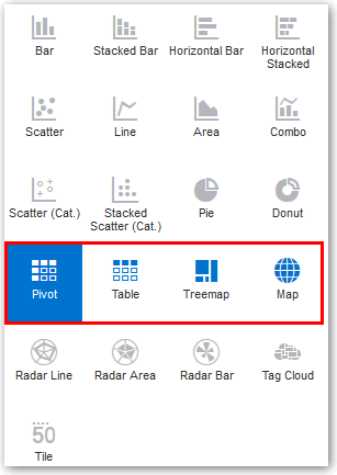
Changing Visualization Types
You can change visualization types to maximize the graphical representation of the data you’re exploring.
The visualization type is automatically chosen based on the selected data elements. However, this is true when you create a new visualization by dragging data elements to a blank area on the canvas. After a visualization is created, dragging additional data elements to it won’t change the visualization type automatically.
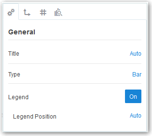
Adjusting Visualization Properties
You generally don’t need to change visualization properties because the default selections cover most cases. You might want to make adjustments such as hiding the legend, changing axis labels, or adding a URL link.
Working With Color
This topic covers working with color in projects and visualizations.
Applying Color to Projects
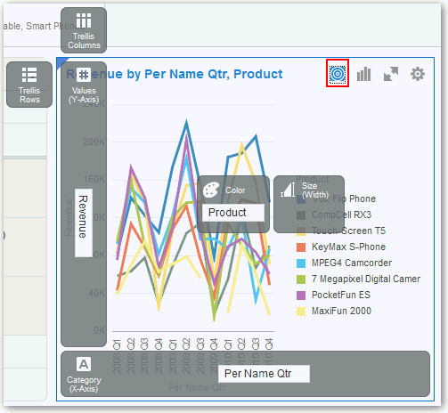
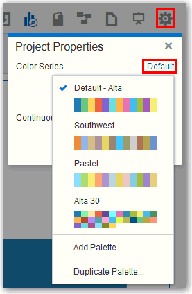
You can work with color to make visualizations appear more dynamic on the canvas. For example, you can color a series of measures (Sales and Costs) or a series of attribute values (2015 and 2016).
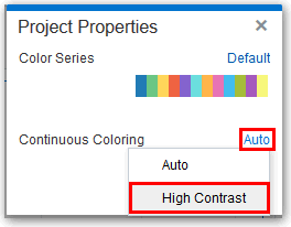
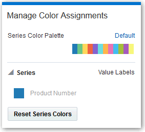
Visualizations also have a Color drop target that can contain a measure or set of attributes. When a measure is in color, continuous coloring is used, and the brightness of the measure color is based on the measure value. When attributes are in color, series coloring is used, and each attribute value in the series is assigned a color. By default, colors are auto-assigned based on the current palette, but series colors can also be customized.
Setting Visualization Colors
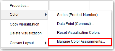
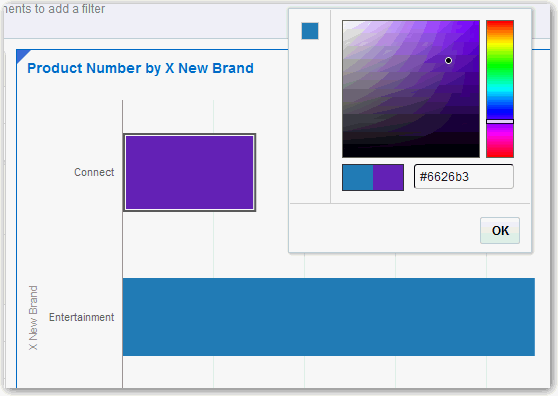
You can work with color for specific visualizations on the canvas. Series and data point coloring are shared across all visualizations within a project, so if you change the series or data point color in one visualization, this can affect the colors in other visualizations.
Note:
Color management tools apply to all visualization types with the exception of Tile.Undoing and Redoing Edits
You can quickly undo your last action and then redo it if you change your mind. For example, you can try a different visualization type when you don’t like the one you’ve just selected, or you can go back to where you were before you drilled into the data. These options are especially useful as you experiment with different visualizations.
On the project toolbar, click the Undo Last Edit or the Redo Last Edit button.
![]()
Description of the illustration GUID-045EA7D3-8FE6-4DD0-9910-AE08C73E859A-default.gif
Reversing Visualization Edits
You can easily reverse changes you make in a project, as long as the project has not been saved since making the changes. For example, if you accidentally place data elements in the wrong drop targets in a visualization, and can easily undo your changes.
You can reverse edits in two ways:
-
To undo all edits that you made to a project since you last saved it, on the project toolbar click Canvas Settings and select Revert.
-
To undo the last edit you made to a project, on the project toolbar click Undo Last Edit. You can click Redo Last Edit to reapply the edit that you undid. You can only use these options if you have not saved the project since making the changes.
Refreshing Visualization Content
To see if newer data is available for your project, you can refresh the data source data and metadata.
-
On the project toolbar click Canvas Settings and select Refresh Data. This action clears the data cache and reruns queries that retrieve the latest data from the data sources. This data is then displayed on the canvas.
-
Click Canvas Settings on the project toolbar and select Refresh Metadata and Report.
This action refreshes the data and any project metadata that has changed since you started working in it. For example, a column is added to the subject area used by the project. You use this menu to bring the new column into the project.
Exploring Data Using Filters
This topic describes how you use filters to explore your content.
About Filters and Filter Types
Filters reduce the amount of data shown in visualizations, canvases, and projects. The types of filters you can use are Range, List, Date, and Expression.
Filter types are automatically determined based on the data elements you choose as filters.
-
Range filters are generated for data elements that are number data types and that have an aggregation rule set to something other than none. Range filters are applied to data elements that are measures, and that limit data to a range of contiguous values, such as revenue of $100,000 to $500,000. Or you can create a range filter that excludes (as opposed to includes) a contiguous range of values. Such exclusive filters limit data to noncontiguous ranges (for example, revenue less than $100,000 or greater than $500,000). See Applying Range Filters.
-
List filters are applied to data elements that are text data types and number data types that aren’t aggregatable. See Applying List Filters.
-
Date filters use calendar controls to adjust time or date selections. You can either select a single contiguous range of dates, or you can use a date range filter to exclude dates within the specified range. See Applying Date Filters.
-
Expression filters let you define more complex filters using SQL expressions. See Building Expression Filters.
How Visualizations and Filters Interact
There are several ways to specify how visualizations and filters interact.
How Filters Interact
Note how filters are applied and interact:
-
Filter Bar: Any filters that are added to the filter bar are applied to all visualizations on all canvases in the project. These project-level filters are always applied first, before any filters you include on the visualizations.
-
Filter Bar with Limit Values Applied: If you add more than one filter to the filter bar, then by default the filters restrict each other based on the values that you select. For example, if you have filters for Product Category and Product Name, and if you set the Product Category filter to Furniture and Office Supplies, then the options in the Product Name filter value pick list is limited to the product names of furniture and office supplies. However, you can use the Limit Values option to remove or limit how the filters in the filter bar restrict each other.
-
Filters on Visualizations: Filters that you specify on an individual visualization are applied to that visualization after the filters on the filter bar are applied. If you select the Use as Filter option and select the data points that are being used as a filter in the visualization, then filters are generated in the other visualizations.
How Visualizations Interact
You use the Synchronize Visualizations setting to specify how the visualizations on your canvas interact. By default, visualizations are linked for automatic synchronization. You can deselect Synchronize Visualizations to unlink your visualizations and turn automatic synchronization off.
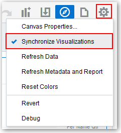
Description of the illustration GUID-6681C810-D795-409B-A449-451E74AAAF92-default.jpg
When Synchronize Visualizations is on (selected), then all filters on the filter bar and actions that produce filters (such as Drill, Keep Selected, Remove Selected) are applied to all visualizations on the canvas. For example, if you have a canvas with multiple visualizations and you drill into one of the visualizations, a corresponding filter is added to the filter bar and it affects all visualizations on the canvas. Note that any visualization-level filters are applied to only the visualization.
When Synchronize Visualizations is off (deselected), then analytic actions such as Drill or Keep Selected affect the visualization to which you applied the action. In this mode, the filters are displayed in a small gray filter bar within each visualization.
The analytic actions such as Drill, or Keep Selected affect only the visualization to which you applied the action.
There is an additional option, Use as Master, that is available from all visualizations’ context menu. If Use as Master is turned on for a given visualization, then that one becomes the master visualization for the canvas. This means that selecting data in the master applies a filter to all other visualizations on the canvas. 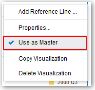
Description of the illustration GUID-F104E81D-73A9-4196-85B2-C46DE8C77E48-default.jpg
About Automatically Applied Filters
By default, the filters in the filter bar and filter drop target are automatically applied. However, you can turn this behavior off if you want to manually apply the filters.
When the Auto-Apply Filters is selected in the filters bar’s settings, the selections you make in the filters bar or filters drop target are immediately applied to the visualizations. When Auto-Apply Filters is off (deselected), the selections you make in the filters bar or filters drop aren’t applied to the canvas until you click the Apply button in the list filter panel.
To turn off Auto-Apply, go to the filters bar, click Actions, and then select Auto-Apply Filters.
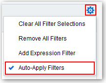
Description of the illustration GUID-34A253EB-B2F5-4C54-9D1B-BCDE6BB299D2-default.jpg
Creating Filters on a Project
You can add filters to limit the data that’s displayed in all the visualizations on all of the canvases in your project.
There are several options that you can use to define how filters interact with each other. See How Visualizations and Filters Interact.
Any filters included on the canvas are applied before the filters chosen from an individual visualization.
-
Go to the Data Elements pane and drag a data element to the filter bar.
-
Set the filter values. How you set the values depends upon the data type that you’re filtering.
-
Apply a range filter to filter on columns such as Cost or Quantity Ordered. See Applying Range Filters.
-
Apply a list filter to filter on columns such as Product Category or Product Name. See Applying List Filters.
-
Apply a date filter to filters on columns such as Ship Date and Order Date. See Applying Date Filters.
-
-
(Optional) Click the Filters Bar Menu and select Auto Apply Filters to turn off the automatic apply. When you turn off the automatic apply, then each filter’s selection displays an Apply button that you must click to apply the filter to the visualizations on the canvas.
Moving Filter Panels
You can move filter panels from the filter bar to a different spot on the canvas.
When you expand filters in the filter bar, it can block your view of the visualization that you’re filtering. Moving the panels makes it easy to specify filter values without having to collapse and reopen the filter selector.
-
To detach a filter panel from the filter bar, place the cursor at the top of the filter panel until it changes to a scissors icon, then click it to detach the panel and drag it to another location on the canvas.
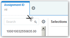
Description of the illustration GUID-F706A8DE-CCEE-40EE-8116-9107ECED4FC8-default.gif -
To reattach the panel to the filter bar, click the reattach panel icon.
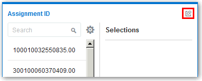
Description of the illustration GUID-8E84D261-4A59-4DBF-B2F2-DA4BBC65C29B-default.gif
Applying Range Filters
You use Range filters for data elements that are number data types and that have an aggregation rule set to something other than none.
Applying List Filters
List filters are applied to data elements that are text data types and non aggregatable number data types. After you add a list filter, you can change the selected members that it includes and excludes.
- Click the filter to view the Selections list.
- Optionally, to the left of the Selections list, use the Search field to find the members you want to add to the filter.
- Locate the member you want to include and click it to add it to the Selections list. You can locate members to include in two ways:
- Scroll through the list of members.
- Search for members. You can use the wildcards * and ? for searching.
- Optionally, in the Selections list, you can click a member to remove it from the list.
- Optionally, in the Selections list, you can click the eye icon next to a member to cause it to be filtered out but not removed from the selections list.
- Optionally, in the Selections list, you can click the actions icon at the top, and select Exclude Selections to exclude the members in the Selections list.
- Optionally, click Add All or Remove All at the bottom of the filter panel to add or remove all members to or from the Selections list at one time.
- Click outside of the filter panel to close it.
- Optionally, to clear the filter selections or remove all filters at one time, right-click in the filter bar, and then select Clear Filter Selections or Remove All Filters.
- Optionally, to remove a single filter, right-click the filter in the filter bar, and then select Remove Filter.
Applying Date Filters
Date filters use calendar controls to adjust time or date selections. You can select a single contiguous range of dates, or use a date range filter to exclude dates within the specified range.
Building Expression Filters
Using expression filters, you can define more complex filters using SQL expressions. Expression filters can reference zero or more data elements.
For example, you can create the expression filter "Sample Sales"."Base Facts"."Revenue" < "Sample Sales"."Base Facts"."Target Revenue". After applying the filter, you see only the items that didn’t achieve their target revenue.
You build expressions using the Expression Builder. You can drag and drop data elements to the Expression Builder and then choose operators to apply. Expressions are validated for you before you apply them. See About Composing Expressions.
- On the filter bar, click Action and then select Add Expression Filter.
- In the Expression Filter panel, compose an expression.
- In the Label field, give the expression a name.
- Click Validate to check if the syntax is correct.
- When the expression filter is valid, then click Apply. The expression is applied to the visualizations on the canvas.
Exploring Data in Other Ways
While adding filters to visualizations helps you narrow your focus on certain aspects of your data, you can take a variety of other analytic actions to explore your data (for example, drilling, sorting, and selecting). When you take any of these analytic actions, the filters are automatically applied for you.
Here are some of the analytic actions that you can take when you right-click content in visualizations:
Composing Expressions
You can compose an expression to use in an expression filter or in a calculation. For both expression filters and calculations, you use the Expression Builder. Expressions that you create for expression filters must be Boolean (that is, they must evaluate to true or false). Expressions that you create for calculations aren’t limited in this way.
Note:
While you compose expressions for both expression filters and calculations, the end result is different. A calculation becomes a new data element that you can add to your visualization. An expression filter, on the other hand, appears only in the filter bar and can’t be added as a data element to a visualization. You can create an expression filter from a calculation, but you can’t create a calculation from an expression filter. See Creating Calculated Data Elements and Building Expression Filters.-
Directly enter text and functions in the Expression Builder.
-
Add data elements from the Data Elements pane (drag and drop, or double-click).
-
Add functions from the function panel (drag and drop, or double-click).
Creating Calculated Data Elements
You can create a new data element (typically a measure) to add to your visualization. For example, you can create a new measure called Profit that uses the Revenue and Discount Amount measures.
Building Stories
You can capture insights, group them into stories, and share them with others.
Topics:
Capturing Insights
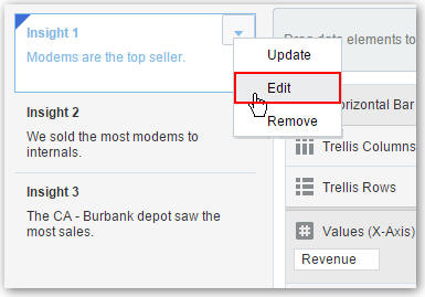
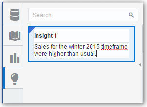
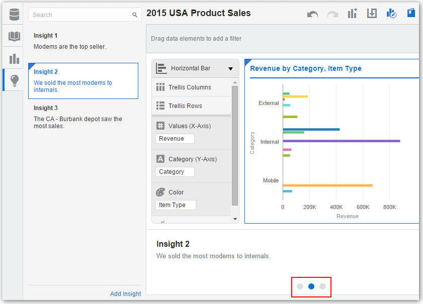
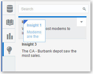
As you delve into data in visualizations, you can capture key information within an insight. Insights are live in that they can be changed and polished as many times as you need before you are ready to share them with others.
Insights enable you to take a snapshot of the information you see in a visualization, and help you remember “ah ha” moments while you work with the data. You can share insights in the form of a story, but you don’t have to. They can simply remain as a list of personal "ah ha" moments that you can use to go back to, and perhaps explore further. You can combine multiple insights in a story and you can link them to visualizations. See Adjusting Visualization Properties.
Note:
Insights don't take a snapshot of data. They only take a snapshot of the project definition at a certain point in time. If someone else views the same insight, but that person has different permissions to the data, they might see different results than you do.Shaping Stories
After you begin creating insights within a story, you can cultivate the look and feel of that story. For example, you can include another insight or hide an insight title.
Note:
You can have only one story in a project.Sharing Stories
After you save a story, you can share it with others using the project URL.
The best way for users to see a story is in presentation mode. You can set a project to be view-only for all users by adding the parameter reportMode = presentation to the project URL, and then sharing that URL directly with others, for example, by e-mail or instant message. See Viewing Streamlined Content.
Note:
Project authors see the Story Navigator if they launched it before they shifted into presentation mode.Exploring Data Without Authoring
This topic covers how authors can interact with others in projects without worrying about non-authors compromising the data.
Investigating Data Using Interactions
Project content authors can interact with view-only users in projects while still maintaining project integrity. View-only users have an optimized view of the project data without seeing the clutter of unnecessary authoring content controls.
View-only users can’t perform authoring tasks such as creating projects, modifying data, editing visualizations, or modifying canvas layouts, so those controls aren’t displayed to them while they are investigating project content.
However, view-only users can still:
-
Perform analytic functions to delve into data provided by project authors such as sorting and drilling in data elements. See Exploring Data in Other Ways.
-
Perform the undo and redo actions in projects. See Undoing and Redoing Edits.
Note:
View-only users can also use presentation mode to look at projects in an even more simplified mode, without the header, and with the filter bar controls limited to opening and editing the existing filter selections only. See Viewing Streamlined Content.Viewing Streamlined Content
You can use the presentation mode to view a project and its visualizations without the visual clutter of the canvas toolbar and authoring options.
Tip:
In the project editor, click the Filter Panel toggle icon to collapse the filter bar before starting the presentation mode. You can hide the filters bar to maximize the canvas space and provide a cleaner view of the project’s visualizations.-
On the canvas toolbar, click Presentation Mode.

Description of the illustration GUID-7D3DB92B-5C78-4905-A537-A5EB900B66BB-default.jpgThe project is displayed in presentation mode.
-
To return to the interaction mode, click Presentation Mode.
Exploring Data on Mobile Devices
Explore your data at your desk and on the move. You can use mobile devices using Android, Windows, or Apple operating systems.
What You See on a Tablet
This topic covers the differences you see in projects when you explore data on a tablet.
-
You can search for and use existing data sources in projects. See Choosing Data Sources.
-
To create a project, on the Home page, tap Add Data on the canvas to display the Explore pane.
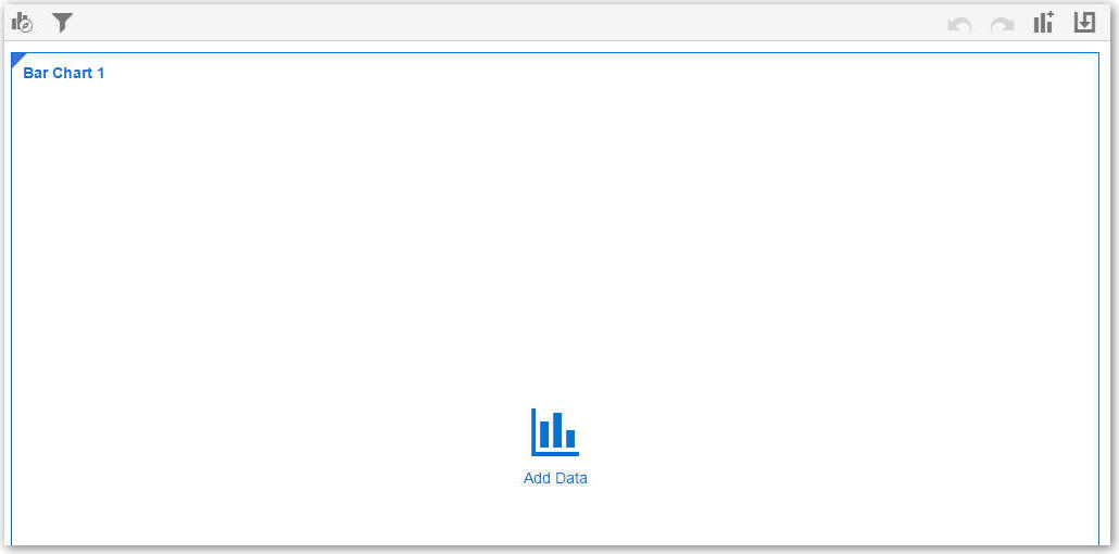
Description of the illustration GUID-8A19734E-65B9-44EE-A87A-95A25298D931-default.jpgIn the Explore pane, tap Auto-Add to select data elements. This action automatically positions the selected data elements and picks the best visualization type on the canvas.
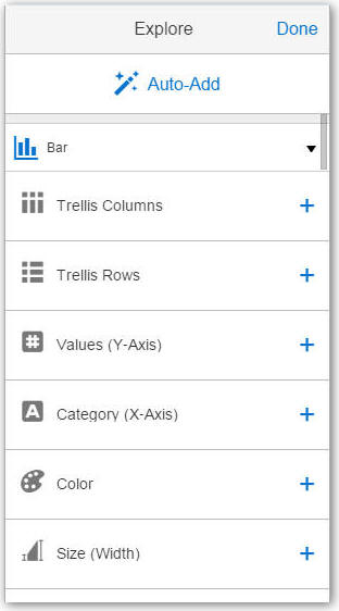
Description of the illustration GUID-7250373C-CE97-4B85-A6A5-116DFD9F03FB-default.jpgSee Adding Data Elements to Visualizations and Changing Visualization Types.
-
To create a filter, tap Filter to display the Filter pane, and add data elements to the filter.
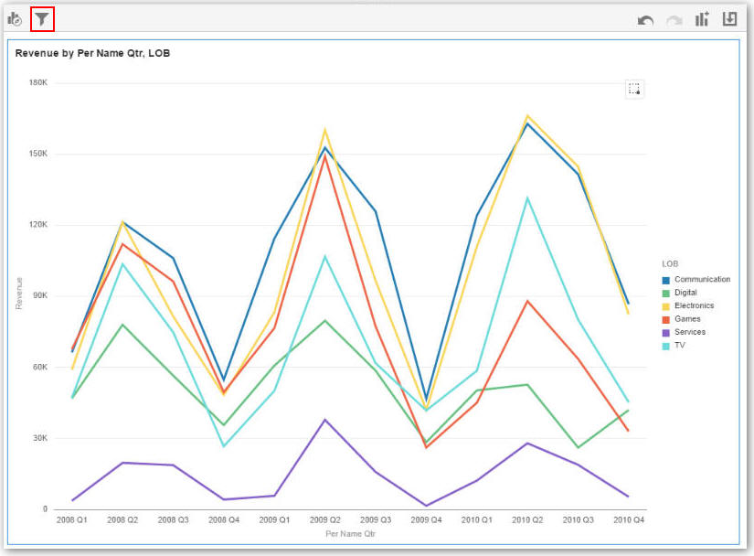
Description of the illustration GUID-65CD21D9-CFF2-48C8-8CAC-D38F4811BC11-default.jpg
What You See on a Mobile Phone
This topic covers the differences you’ll see in projects when you explore data on a mobile phone.
-
You can only search for and use existing data sources in projects. See Choosing Data Sources.
-
To create a project, on the Home page, tap the mobile slider, and then select VA Project.
Description of the illustration GUID-4CC69379-AB53-44FA-BFC8-7CFB2B2D11E0-default.jpgIn the Explore pane, tap Auto-Add to select data elements. This action automatically positions the selected data elements and picks the best visualization type on the canvas.
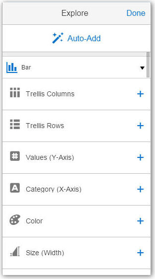
Description of the illustration GUID-80FD35B4-773C-488D-92FD-5B24433BFF38-default.jpg -
When a project contains multiple visualizations on the canvas, they are each displayed as the same size in a summary view.
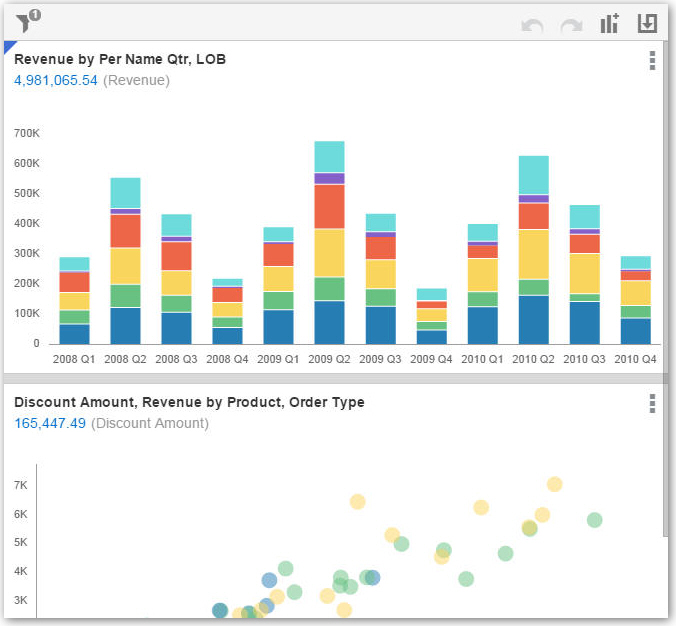
Description of the illustration GUID-8DC4E728-7825-4E27-BA6D-54859E5577DF-default.jpg -
A visualization can display an aggregated value of all measures within it. To set this display value, tap Visualization Properties to select the measure that you want to aggregate or to show or hide the value.

Description of the illustration GUID-6F80961D-FB55-45AF-A40E-97D4773DF242-default.jpg
