2 Exploring and Analyzing Data in Visualization Canvases
This topic describes the many ways that you can explore and analyze your data in visualization canvases.
Typical Workflow for Visualizing Data
Here are the common tasks for exploring your data.
| Task | Description | More Information |
|---|---|---|
|
Create a project and add data sets to it |
Create a new data visualization project and select one or more data sets to the project. | |
|
Add data elements |
Add data elements (for example, data columns or calculations) from the selected data set to the visualizations on the Prepare canvas. | |
|
Adjust the canvas layout |
Add, remove, and rearrange visualizations. |
|
|
Filter content |
Specify how many results and which items to include in the visualizations. |
|
| Set visualization interaction properties | Define how you want visualizations affect each other. | |
| Build stories | Capture your notes (insights) about visualizations within a story to revisit later, include in a presentation, or share with a team member. |
Creating a Visualization Project and Adding Data
Projects contain visualizations that help you explore your content in productive and meaningful ways. When you create a project you select one or more data sets containing the data that you want to explore. Data sets contain data from subject areas, Oracle Applications, databases, or uploaded data files such as spreadsheets.
Adding Data from Data Sets to Visualization Canvases
There are various ways that you can add data elements such as columns and calculations to your visualizations.
Adding Data to Blank Canvases
You can add data elements directly from the Data Elements pane to a blank canvas.
You must create a project or open an existing project and add one or more data sets to the project before you can add data elements to a blank canvas. See Creating a Visualization Project and Adding Data.
-
Confirm that you’re working in the Visualize canvas.
-
Drag one or more data elements to the blank canvas or between visualizations on the canvas.
A visualization is automatically created and the best visualization type and layout are selected.
For example, if you add time and product attributes and a revenue measure to a blank canvas, the data elements are placed in the best locations and the Line visualization type is selected.
If there are visualizations already on the canvas, then you can drag and drop data elements between them.
About Adding Data to the Visualization Grammar Pane
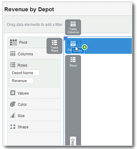
After you have selected the data sets for your project, you can begin to add data elements such as measures and attributes to visualizations. You can select compatible data elements from the data sets and drop them onto the Visualization Grammar Pane in the Visualize canvas. Based on your selections, visualizations are created on the canvas. The Visualization Grammar Pane contains sections such as Columns, Rows, Values, and Category.
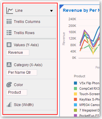
Description of the illustration GUID-423B1D42-AB5E-4DB0-B9F3-23ADEE5B7CCB-default.gif
You must create a project or open an existing project and add one or more data sets to the project before you can add data elements to the Visualization Grammar Pane. See Creating a Visualization Project and Adding Data. You can only drop data elements based on attribute and type onto a specific Visualization Grammar Pane section.
Confirm that you’re working in the Visualize canvas. Use one of the following methods to add data elements to the Visualization Grammar Pane:
About Adding Data to the Visualization Assignments Pane
You can use the visualization Assignment pane to help you position data elements in the optimal locations for exploring content.
You must create a project or open an existing project and add one or more data sets to the project before you can add data elements to the visualization Assignment pane. See Creating a Visualization Project and Adding Data.
Confirm that you’re working in the Visualize canvas. Use one of the following methods to add data elements to Visualization Assignments Pane
Adding Advanced Analytics to Visualization Canvases
Advanced analytics are statistical functions that you apply to enhance the data displayed in visualizations. Examples of advanced analytics functions are Clusters, Outliers, and Trend Lines.
As well as the Analytics menu options available in the user interface, you can also use analytics functions to create your own calculated columns that reference statistical scripts. See Evaluate_Script in Analytics Functions.
You can easily apply advanced analytics functions to a project to augment its visualizations. For example, you can use advanced analytics to highlight outliers or overlay trendlines.
Prerequisites
Before you can use analytic functions in Data Visualization, you must create a project or visualization to which you can apply one or more analytic functions.
Using Analytic Functions
-
To display the available analytic functions, click the Analytics icon in the Data Panel.
-
To edit analytics for a visualization object such as a chart, highlight the visualization on the Visualize canvas, and in the properties pane click the Analytics tab.
-
Apply a function to the chart by:
-
Drag and drop – Click an analytic function from the Analytics tab menu and drag it to the Visualize canvas.
-
Right-click – Right-click anywhere on a visualization, and select an analytic function from the menu.
-
Creating Calculated Data Elements in a Data Set
You can create a new data element (typically a measure) to add to your visualization. For example, you can create a new measure called Profit that uses the Revenue and Discount Amount measures.
Undoing and Redoing Edits
You can quickly undo your last action and then redo it if you change your mind. For example, you can try a different visualization type when you don’t like the one you’ve just selected, or you can go back to where you were before you drilled into the data. These options are especially useful as you experiment with different visualizations. You can also undo all edits made since you last saved a project.
Refreshing Visualization Content
To see if newer data is available for your project, you can refresh the data and metadata.
-
On the project toolbar click Canvas Settings and select Refresh Data. This action clears the data cache and reruns queries that retrieve the latest data from the data sets. This data is then displayed on the canvas.
-
Click Canvas Settings on the project toolbar and select Refresh Metadata and Report.
This action refreshes the data and any project metadata that has changed since you started working in it. For example, a column is added to the subject area used by the project. You use this menu to bring the new column into the project.
Adjusting the Visualization Canvas Layout
You can adjust the look and feel of visualizations on the Visualize canvas to make them more visually attractive.
You can copy a visualization and paste it within or between canvases in a project. You can also duplicate canvases and visualizations to create multiple copies of them. After copying and pasting or duplicating, you can modify the visualization by changing the data elements, selecting a different visualization type, resizing it, and so on. See Keyboard Shortcuts for Data Visualization.
| Option | Location | Description |
|---|---|---|
| Canvas Properties | Canvas Settings menu or Canvas tab Menu | Change the name, layout, width, and height of the canvas in the Canvas Properties dialog.
Use the Synchronize Visualizations setting to specify how the visualizations on your canvas interact. See How Visualizations and Filters Interact. |
| Add Canvas | Canvas tabs bar | Add a new canvas to the project.
You can right-click and drag a canvas to a different position on the canvas tabs bar. |
| Rename | Canvas tab Menu | Rename a selected canvas. |
| Duplicate Canvas | Canvas tab Menu or right-click a canvas tab | Add a copy of a selected canvas to the project’s row of canvas tabs. |
| Clear Canvas | Canvas tab Menu or right-click a canvas tab | Clear all the visualizations on the canvas. |
| Delete Canvas | Canvas tab Menu or right-click a canvas tab | Delete a specific canvas of a project. |
| Duplicate Visual | Visualization Menu or right-click a visualization | Add a copy of a selected visualization to the canvas. |
| Copy Visual | Visualization Menu or right-click a visualization | Copy a visualization on the canvas. |
| Paste Visual | Visualization Menu, or right-click a visualization or blank canvas | Paste a copied visualization into the current canvas or another canvas. |
| Delete Visual | Visualization Menu or right-click a visualization | Delete a visualization from the canvas. |
| Canvas Layout | Visualization Menu, or right-click a visualization or blank canvas | Select one of the following:
|
Changing Visualization Types
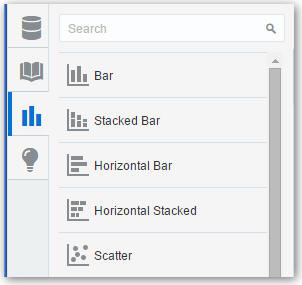
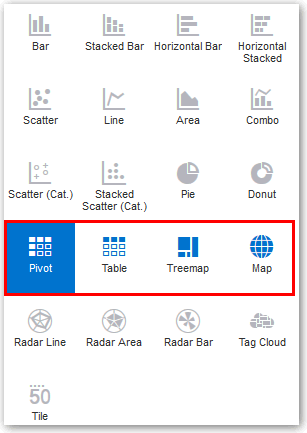
You can change visualization types to best suit the data you’re exploring.
When you create a project and add a visualization, Data Visualization chooses the most appropriate visualization type based on the data elements you selected. After a visualization type is added, dragging additional data elements to it won’t change the visualization type automatically. If you want to use a different visualization type, then you need to select it from the visualization type menu.
Adjusting Visualization Properties
You can change the visualization properties such as legend, type, axis values and labels, data values, and analytics.
Assigning Color to Visualize Data
This topic covers how you can work with color to enhance visualizations.
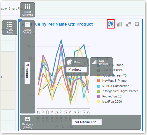
You can work with color to make visualizations more attractive, dynamic, and informative. You can color a series of measure values (for example, Sales or Forecasted Sales) or a series of attribute values (for example, Product and Brand).
The Visualize canvas has a Color section in the Visualization Grammar Pane where you can put a measure column, attribute column, or set of attributes columns. Note how the canvas assigns color to the columns that are included in the Color section:
-
When a measure is in the Color section, then you can select different measure range types (for example, single color, two color, and three color) and specify advanced measure range options (for example, reverse, number of steps, and midpoint).
-
When you have one attribute in the Color section, then the stretch palette is used by default. Color palettes contain a set number of colors (for example, 12 colors), and those colors repeat in the visualization. The stretch palette extends the colors in the palette so that each value has a unique color shade.
-
If you have multiple attributes in the Color section, then the hierarchical palette is used by default, but you can choose to use the stretch palette, instead. The hierarchical palette assigns colors to groups of related values. For example, if the attributes in the Color section are Product and Brand and you have selected Hierarchical Palette, then in your visualization, each brand has its own color, and within that color, each product has its own shade.
Managing Color Settings
Use the Visualize canvas to modify the visualization’s color. Your color choices are shared across all visualizations on the canvas, so if you change the series or data point color in one visualization, then it appears on the other visualizations.
Accessing Color Options
-
To edit color options for the whole project, click Canvas Settings, then Project Properties, and use the General tab to edit the color series or continuous coloring.
-
To edit color options for a visualization, highlight the visualization and in the visualization’s toolbar, click Menu, then select Color. The available color options depend on how the measures and attributes are set up in your visualization.
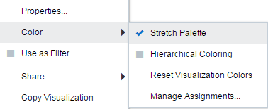
Description of the illustration GUID-E51B69E4-DC81-4994-8250-F0BCF363ABBF-default.gif
Changing the Color Palette
Data Visualization includes several color palettes. Each palette contains 12 colors, but you can use the color stretching option to expand the colors in the visualization.
-
If your project contains multiple visualizations, click the visualization that you want to change the color palette for. In the visualization’s toolbar, click Menu, select Color, and then select Manage Assignments. The Manage Color Assignments dialog is displayed.
-
Locate the Series Color Palette and click the color palette that’s currently used in the visualization (for example, Default or Alta).
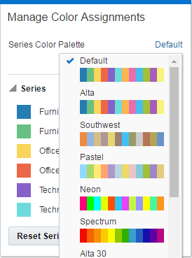
Description of the illustration GUID-0F894BBA-306A-4093-9AF4-86A05A4DDF46-default.gif -
From the list, select the color palette that you want to apply to the visualization.
Managing Color Assignments
Instead of using the palette’s default colors, you can use the Manage Color Assignments feature to choose specific colors to fine-tune the look of your visualizations.
-
If your project contains multiple visualizations, click the visualization that you want to manage the colors for. In the visualization’s toolbar, click Menu, select Color, and then select Manage Assignments. The Manage Color Assignments dialog is displayed.
-
If you’re working with a measure column, you can do the following:
-
Click the box containing the color assigned to the measure. From the color picker dialog, select the color that you want to assign to the measure. Click OK.
-
Specify how you want the color range to be displayed for the measure (for example, reverse the color range, pick a different color range, and specify how many shades you want in the color range).
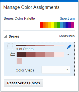
Description of the illustration GUID-8D548B1A-F027-45C6-BADD-BF314E860F13-default.gif
-
-
If you’re working with an attribute column, then click the box containing the color assignment that you want to change. From the color picker dialog, select the color that you want to assign to the value. Click OK.
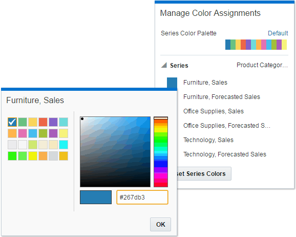
Description of the illustration GUID-5995D721-EDC1-461E-8938-289F76F8CFDD-default.gif
Resetting Colors
You can experiment with visualization colors and then easily revert to the visualization’s original colors.
-
If your project contains multiple visualizations, click the visualization that you want to reset the colors for. In the visualization’s toolbar, click Menu, select Color, and then select Reset Visualization Colors.
Applying or Removing the Stretch Palette
Color palettes have a set number of colors, and if your visualization contains more values than the number of color values, then the palette colors are repeated. Use the Stretch Palette option to expand the number of colors in the palette. Stretch coloring adds light and dark shades of the palette colors to give each value a unique color. For some visualizations, stretch coloring is used by default.
-
If your project contains multiple visualizations, click the visualization that you want to adjust the stretch palette from. In the visualization’s toolbar, click Menu, select Color, and then select Stretch Palette to turn this option on or off.
Applying a Repeating Color Palette
In some cases, you might want to use a repeating color palette in your visualization. If your visualization contains more values than colors in the palette, then the colors are reused and aren’t unique.
-
In the Visualize canvas, click Color and click Stretch Palette to turn this option off.
Formatting Numeric Data Properties
You can format numeric data in your visualizations using a wide range of ready-to-use formats. For example, you might change an aggregation type from Sum to Average.
Applying Map Layers and Backgrounds to Enhance Visualizations
You can add and maintain custom map layers to enhance map visualizations.
Enhancing Visualizations with Map Backgrounds
You can use map backgrounds to enhance visualizations in a project.
Using Color to Interpret Data Values in Map Visualizations
You can use color features to interpret the measure columns and attribute values in projects that include map visualizations.
In the map visualization, you can also use the following color features to interpret measure columns and attribute values:
-
Legend – If the measure column or attribute has multiple values, then the legend is displayed. It defines the value of the various colors.
-
Tooltip – Hover the mouse pointer over a color bubble to see the values in a tooltip. If there are multiple values, then a Plus (+) symbol is displayed.
Adding Custom Map Layers
You can add custom map layers to use in map visualizations.
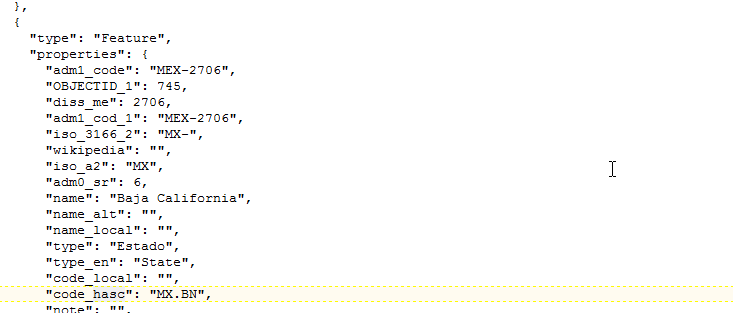
Description of the illustration GUID-D2030B58-F826-4DD4-B632-05E02C6020B3-default.gif
Updating Custom Map Layers
You can maintain custom map layers that you have added to Data Visualization.
Making Maps Available to Users
For visualization projects, administrators make maps available to end users or hide them from end users.
You can include or exclude a map from users.
-
On the Home page, click Console.
-
Click Maps.
-
Use the Include option to make a map layer available to end users or hide it from end users.
You can hide or display custom map and system map layers.
Sorting and Selecting Data in Visualization Canvases
While adding filters to visualizations helps you narrow your focus on certain aspects of your data, you can take a variety of other analytic actions to explore your data (for example, drilling, sorting, and selecting). When you take any of these analytic actions, the filters are automatically applied for you.
Select a visualization to display its properties in the properties pane. Here are some of the analytic actions that you can perform:
- Use Sort to sort attributes in a visualization, such as product names from A to Z. If you’re working with a table view, then the system always sorts the left column first. In some cases where specific values display in the left column, you can’t sort the center column. For example, if the left column is Product and the center column is Product Type, then you can’t sort the Product Type column. To work around this issue, swap the positions of the columns and try to sort again.
- Use Drill to drill to a data element and drill through hierarchies in data elements, such as drilling to weeks within a quarter. You can also drill asymmetrically using multiple data elements. For example, you can select two separate year members that are columns in a pivot table, and drill into those members to see the details.
- Use Drill to [Attribute Name] to directly drill to a specific attribute within a visualization.
- Use Keep Selected to keep only the selected members and remove all others from the visualization and its linked visualizations. For example, you can keep the sales that are generated by a specific sales associate.
- Use Remove Selected to remove selected members from the visualization and its linked visualizations. For example, you can remove the Eastern and Western regions from the selection.
- Use Add Reference Line or Band to add a reference line to highlight an important fact depicted in the visualization, such as a minimum or maximum value. For example, you might add a reference line across the visualization at the height of the maximum Revenue amount. You also might add a reference band to more clearly depict where the minimum and maximum Revenue amounts fall on the Revenue axis.
About Warnings for Data Issues in Visualizations
You see a data warning icon when the full set of data associated with a visualization isn't rendered or retrieved properly. If the full set of data can't be rendered or retrieved properly, then the visualization displays as much data as it can as per the fixed limit, and the remaining data or values are truncated or not displayed.
-
Next to the title of a visualization that has a data issue.
When you hover over the warning icon, you see a message that includes text such as the following:
Data sampling was applied due to the large quantity of data. Please filter your data. The limit of 500 categories was exceeded.
You see the warning icon associated with the visualization until the data issue is resolved. The warning icon is displayed only in the visualization Canvas; it's not displayed in Presentation Mode.
-
On the Canvas tabs bar if any visualization on the Canvas page has the data warning.
By default, visualization warning icons aren't displayed; You can show or hide the warning icon beside the title of the visualization by clicking the icon on the Canvas tabs bar. The warning icon is only displayed if a Canvas includes a visualization with a data issue. If a visualization with a data issue is in multiple canvases, you see the icon in all those canvases.
