Using JavaFX UI Controls
25 Pagination Control
This chapter explains how to add a pagination control to your JavaFX application. It teaches how to add a pagination control to your application, manage its page items, and style the elements of the control with CSS styles.
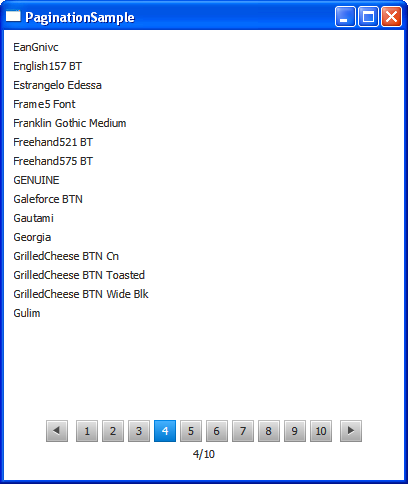
The pagination control that is used to navigate through multiple pages of content that are divided into smaller parts. Typical uses include navigating through email messages in a mailbox or choosing among search results. In touch devices, a pagination control can be used to browse through single pages of an article or to navigate between screens. Figure 25-1 shows a pagination control that displays the fonts available in an operating system.
Creating a Pagination Control
A pagination control consists of the page content and the page navigation areas. The Page content area renders and lays out the content according to the application logic. The Page navigation area contains a prefabricated control to preview a particular part of the content. Figure 25-2 shows the structure and basic elements of the navigation area.
Figure 25-2 Navigation Area of a Pagination Control

Description of "Figure 25-2 Navigation Area of a Pagination Control"
You can navigate through the pages by clicking a particular page indicator or by clicking the Next page and Previous page buttons. When the first page is selected, the Previous page button is disabled. Similarly, when the last navigation indicator is selected, the Next page button is disabled.
The JavaFX SDK API provides the Pagination class to add the pagination control to your JavaFX application. Example 25-1 shows three available constructors of the Pagination class.
Example 25-1 Three Constructors of the Pagination Class
//Creates a Pagination control with an INDETERMINATE page count
//and the current page index equal to zero
pagination1 = new Pagination();
//Creates a Pagination control with 5 pages
//and the current page index equal to zero
pagination2 = new Pagination(5);
//Creates a Pagination control with 5 pages
//and the current selected index equal to 2
pagination3 = new Pagination(5, 2);
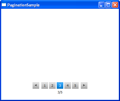
The pagination3 control from Example 25-1 is displayed in Figure 25-3.
Figure 25-3 Pagination Control without the Content
Description of "Figure 25-3 Pagination Control without the Content"
Note that page indexes start with 0. Therefore, to start with the third page selected, you need to set the currentPageIndexProperty to 2.
The pages of the pagination3 control are empty, because no content is added to the control.
You cannot add any items directly to the pagination control, it requires setting a page factory. Use the setPageFactory method of the Pagination class to define the page content by implementing a page factory.
Implementing Page Factories
The setPageFactory is used to define a page factory for the pagination control. The application developer creates a callback method and sets the pagination page factory to use this callback. The callback method is called when a page has been selected. It loads and returns the content of the selected page. The null value must be returned if the selected page index does not exist. Example 25-2 creates a pagination control with 28 pages and populates the pages with the search results, allocating eight items per page.
Example 25-2 Adding Hyperlinks to a Pagination Control
import javafx.application.Application;
import javafx.scene.Scene;
import javafx.scene.control.Pagination;
import javafx.scene.Node;
import javafx.scene.control.Hyperlink;
import javafx.scene.control.Label;
import javafx.scene.layout.AnchorPane;
import javafx.scene.layout.VBox;
import javafx.stage.Stage;
import javafx.util.Callback;


public class PaginationSample extends Application {
    private Pagination pagination;

    public static void main(String[] args) throws Exception {
        launch(args);
    }

    public int itemsPerPage() {
        return 8;
    }

    public VBox createPage(int pageIndex) {
        VBox box = new VBox(5);
        int page = pageIndex * itemsPerPage();
        for (int i = page; i < page + itemsPerPage(); i++) {
            VBox element = new VBox();
            Hyperlink link = new Hyperlink("Item " + (i+1));
            link.setVisited(true);
            Label text = new Label("Search results\nfor "+ link.getText());
            element.getChildren().addAll(link, text);
            box.getChildren().add(element);
        }
        return box;
    }

    @Override
    public void start(final Stage stage) throws Exception {
        pagination = new Pagination(28, 0);
        pagination.setStyle("-fx-border-color:red;");
        pagination.setPageFactory(new Callback<Integer, Node>() {
            @Override
            public Node call(Integer pageIndex) {
                return createPage(pageIndex);
            }
        });

        AnchorPane anchor = new AnchorPane();
        AnchorPane.setTopAnchor(pagination, 10.0);
        AnchorPane.setRightAnchor(pagination, 10.0);
        AnchorPane.setBottomAnchor(pagination, 10.0);
        AnchorPane.setLeftAnchor(pagination, 10.0);
        anchor.getChildren().addAll(pagination);
        Scene scene = new Scene(anchor);
        stage.setScene(scene);
        stage.setTitle("PaginationSample");
        stage.show();
    }
}
The number of pages and the selected page are defined within the constructor of the Pagination class. Alternatively, you can create a Pagination control and set the number of pages and the index of the selected page afterward by using the setPageCount and setCurrentPageIndex methods.
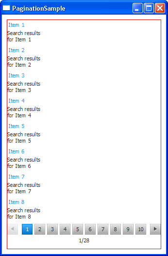
The content of the Pagination control is declared within the createPage method that serves as a page factory and is called by the setPageFactory method. The createPage method creates the pairs of hyperlinks and the corresponding labels, and arranges them vertically, setting a five-pixel interval between the elements.
When you compile and run Example 25-2, you should see the output shown in Figure 25-4.
Figure 25-4 Using a Pagination Control to Preview Search Results
Description of "Figure 25-4 Using a Pagination Control to Preview Search Results"
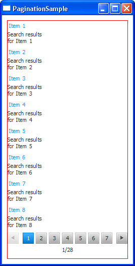
The current implementation of the Pagination control displays 10 page indicators if the number of pages exceeds 10. To set an alternative value for the displayed page indicators, use the setMaxPageIndicatorCount method of the Pagination class. For example, add the following line to Example 25-2 to show seven page indicators: pagination.setMaxPageIndicatorCount(7);. Figure 25-5 shows the PaginationSample application after the change has been applied.
Figure 25-5 Changing the Number of Page Indicators
Description of "Figure 25-5 Changing the Number of Page Indicators"
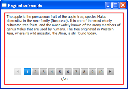
Example 25-3 shows another use for the pagination control. The application renders the text fragments, one per page. The number of the fragments is five, and the number of the declared pages of the pagination control is 28. To avoid an ArrayIndexOutOfBoundsException condition, add the page index check (highlighted in bold in Example 25-3) and make the callback method return null when the number of pages exceeds five.
Example 25-3 Adding Text Snippets to a Pagination Control
import javafx.application.Application;
import javafx.scene.Scene;
import javafx.scene.control.Pagination;
import javafx.scene.Node;
import javafx.scene.control.TextArea;
import javafx.scene.layout.AnchorPane;
import javafx.scene.layout.VBox;
import javafx.stage.Stage;
import javafx.util.Callback;

public class PaginationSample extends Application {

    private Pagination pagination;
    final String[] textPages = new String[]{
        "The apple is the pomaceous fruit of the apple tree, species Malus "
        + "domestica in the rose family (Rosaceae). It is one of the most "
        + "widely cultivated tree fruits, and the most widely known of "
        + "the many members of genus Malus that are used by humans. "
        + "The tree originated in Western Asia, where its wild ancestor, "
        + "the Alma, is still found today.",
        "The hawthorn is a large genus of shrubs and trees in the rose family,"
        + "Rosaceae, native to temperate regions of the Northern Hemisphere "
        + "in Europe, Asia and North America. The name hawthorn was "
        + "originally applied to the species native to northern Europe, "
        + "especially the Common Hawthorn C. monogyna, and the unmodified "
        + "name is often so used in Britain and Ireland.",
        "The ivy is a flowering plant in the grape family (Vitaceae) native to "
        + " eastern Asia in Japan, Korea, and northern and eastern China. "
        + "It is a deciduous woody vine growing to 30 m tall or more given "
        + "suitable support,  attaching itself by means of numerous small "
        + "branched tendrils tipped with sticky disks.",
        "The quince is the sole member of the genus Cydonia and is native to "
        + "warm-temperate southwest Asia in the Caucasus region. The "
        + "immature fruit is green with dense grey-white pubescence, most "
        + "of which rubs off before maturity in late autumn when the fruit "
        + "changes color to yellow with hard, strongly perfumed flesh.",
        "Aster (syn. Diplopappus Cass.) is a genus of flowering plants "
        + "in the family Asteraceae. The genus once contained nearly 600 "
        + "species in Eurasia and North America, but after morphologic "
        + "and molecular research on the genus during the 1990s, it was "
        + "decided that the North American species are better treated in a "
        + "series of other related genera. After this split there are "
        + "roughly 180 species within the genus, all but one being confined "
        + "to Eurasia."
    };

    public static void main(String[] args) throws Exception {
        launch(args);
    }

    public int itemsPerPage() {
        return 1;
    }

    public VBox createPage(int pageIndex) {
        VBox box = new VBox(5);
        int page = pageIndex * itemsPerPage();
        for (int i = page; i < page + itemsPerPage(); i++) {
            TextArea text = new TextArea(textPages[i]);
            text.setWrapText(true);
            box.getChildren().add(text);
        }
        return box;
    }

    @Override
    public void start(final Stage stage) throws Exception {
        pagination = new Pagination(28, 0);
        pagination.setStyle("-fx-border-color:red;");
        pagination.setPageFactory(new Callback<Integer, Node>() {

            @Override
            public Node call(Integer pageIndex) {
                if (pageIndex >= textPages.length) {
                    return null;
                } else {
                    return createPage(pageIndex);
                }
            }
        });

        AnchorPane anchor = new AnchorPane();
        AnchorPane.setTopAnchor(pagination, 10.0);
        AnchorPane.setRightAnchor(pagination, 10.0);
        AnchorPane.setBottomAnchor(pagination, 10.0);
        AnchorPane.setLeftAnchor(pagination, 10.0);
        anchor.getChildren().addAll(pagination);
        Scene scene = new Scene(anchor, 400, 250);
        stage.setScene(scene);
        stage.setTitle("PaginationSample");
        stage.show();
    }
}
When you compile and run Example 25-3, you will see the output shown in Figure 25-6.
Figure 25-6 Rendering Text Fragments in a Pagination Control
Description of "Figure 25-6 Rendering Text Fragments in a Pagination Control"
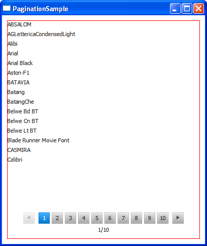
In some cases you cannot set the exact number of items to render and, therefore, the number of pages in a pagination control. In such situations, you can include a line of code that calculates the number of pages within the constructor of the Pagination object. Example 25-4 outputs a list of system fonts and calculates the number of pages as the length of the fonts array divided by the number of items per page.
Example 25-4 Adding Content of an Undetermined Size
import javafx.application.Application;
import javafx.scene.Scene;
import javafx.scene.control.Pagination;
import javafx.scene.Node;
import javafx.scene.control.Label;
import javafx.scene.layout.AnchorPane;
import javafx.scene.layout.VBox;
import javafx.scene.text.Font;
import javafx.stage.Stage;
import javafx.util.Callback;

public class PaginationSample extends Application {

    private Pagination pagination;
    String[] fonts = new String[]{};

    public static void main(String[] args) throws Exception {
        launch(args);
    }

    public int itemsPerPage() {
        return 15;
    }

    public VBox createPage(int pageIndex) {
        VBox box = new VBox(5);
        int page = pageIndex * itemsPerPage();
        for (int i = page; i < page + itemsPerPage(); i++) {
            Label font = new Label(fonts[i]);
            box.getChildren().add(font);
        }
        return box;
    }

    @Override
    public void start(final Stage stage) throws Exception {
        fonts = Font.getFamilies().toArray(fonts);

        pagination = new Pagination(fonts.length/itemsPerPage(), 0);
        pagination.setStyle("-fx-border-color:red;");
        pagination.setPageFactory(new Callback<Integer, Node>() {

            @Override
            public Node call(Integer pageIndex) {
                return createPage(pageIndex);
            }
        });

        AnchorPane anchor = new AnchorPane();
        AnchorPane.setTopAnchor(pagination, 10.0);
        AnchorPane.setRightAnchor(pagination, 10.0);
        AnchorPane.setBottomAnchor(pagination, 10.0);
        AnchorPane.setLeftAnchor(pagination, 10.0);
        anchor.getChildren().addAll(pagination);
        Scene scene = new Scene(anchor, 400, 450);
        stage.setScene(scene);
        stage.setTitle("PaginationSample");
        stage.show();
    }
}
When you compile and run this example, it produces the application window shown in Figure 25-7.
Figure 25-7 Using a Pagination Control to Render the System Fonts
Description of "Figure 25-7 Using a Pagination Control to Render the System Fonts"
Styling a Pagination Control
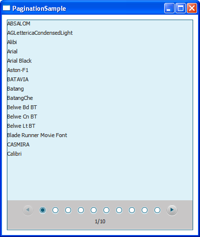
You can customize the pagination control to display bullet page indicators instead of numeric page indicators by setting the style class STYLE_CLASS_BULLET. In addition, you can modify the default pagination styles in the caspian style sheet.
Example 25-5 shows some alternative styles for the visual elements of the pagination control in Example 25-4.
Example 25-5 Modified Styles of the Pagination Control
.pagination {
    -fx-border-color:  #0E5D79;
}

.pagination .page {
    -fx-background-color: #DDF1F8;
}

.pagination .pagination-control {
    -fx-background-color: #C8C6C6;
}

.pagination .pagination-control .bullet-button {
    -fx-background-color: transparent, #DDF1F8, #0E5D79, white, white;
}

.pagination .pagination-control .bullet-button:selected {
    -fx-background-color: transparent, #DDF1F8, #0E5D79, white, #0E5D79;
}

.pagination .pagination-control .left-arrow, .right-arrow{
    -fx-background-color: #DDF1F8, #0E5D79;
}
Example 25-6 applies these styles to the pagination control and sets the bullet style for the page indicators.
Example 25-6 Enabling the Modified Pagination Control Style in the PaginationSample Application
import javafx.application.Application;
import javafx.scene.Scene;
import javafx.scene.control.Pagination;
import javafx.scene.Node;
import javafx.scene.control.Label;
import javafx.scene.layout.AnchorPane;
import javafx.scene.layout.VBox;
import javafx.scene.text.Font;
import javafx.stage.Stage;
import javafx.util.Callback;

public class PaginationSample extends Application {

    private Pagination pagination;
    String[] fonts = new String[]{};

    public static void main(String[] args) throws Exception {
        launch(args);
    }

    public int itemsPerPage() {
        return 15;
    }

    public VBox createPage(int pageIndex) {
        VBox box = new VBox(5);
        int page = pageIndex * itemsPerPage();
        for (int i = page; i < page + itemsPerPage(); i++) {
            Label font = new Label(fonts[i]);
            box.getChildren().add(font);
        }
        return box;
    }

    @Override
    public void start(final Stage stage) throws Exception {
        fonts = Font.getFamilies().toArray(fonts);

        pagination = new Pagination(fonts.length/itemsPerPage(), 0);
        pagination.getStyleClass().add(Pagination.STYLE_CLASS_BULLET);
        pagination.setPageFactory(new Callback<Integer, Node>() {

            @Override
            public Node call(Integer pageIndex) {
                return createPage(pageIndex);
            }
        });

        AnchorPane anchor = new AnchorPane();
        AnchorPane.setTopAnchor(pagination, 10.0);
        AnchorPane.setRightAnchor(pagination, 10.0);
        AnchorPane.setBottomAnchor(pagination, 10.0);
        AnchorPane.setLeftAnchor(pagination, 10.0);
        anchor.getChildren().addAll(pagination);
        Scene scene = new Scene(anchor, 400, 450);
        stage.setScene(scene);
        stage.setTitle("PaginationSample");
        scene.getStylesheets().add("paginationsample/ControlStyle.css");
        stage.show();
    }
}
When you apply the newly defined styles to the PaginationSample application, and compile and run it, you see the application window shown in Figure 25-8.
Figure 25-8 PaginationSample with Bullet Page Indicators and the New CSS Styles Applied
Description of "Figure 25-8 PaginationSample with Bullet Page Indicators and the New CSS Styles Applied"
In addition to the applied styles you can consider the following styles to alter the appearance of the pagination control in your applications:
-
-fx-max-page-indicator-count— Sets the maximum number of page indicators. -
-fx-arrows-visible— Toggles visibility of the Next and Previous button arrows,trueby default. -
-fx-tooltip-visible— Toggles visibility of the page indicator tooltip,trueby default. -
-fx-page-information-visible— Toggles visibility of the page information,trueby default. -
-fx-page-information-alignment— Sets the alignment of the page information.
Related API Documentation
 Alla is a technical writer for Oracle. She lives in St. Petersburg, Russia, and develops tutorials and technical articles for Java and JavaFX technologies. Prior to her assignment at Oracle, she worked as a technical writer in different IT companies.

