Using JavaFX UI Controls
4 Radio Button
This chapter discusses the radio button control and the RadioButton class, a specialized implementation of the ToggleButton class.
A radio button control can be either selected or deselected. Typically radio buttons are combined into a group where only one button at a time can be selected. This behavior distinguishes them from toggle buttons, because all toggle buttons in a group can be in a deselected state.
Figure 4-1 shows three screen captures of the RadioButton sample, in which three radio buttons are added to a group.
Study the following paragraphs to learn more about how to implement radio buttons in your applications.
Creating a Radio Button
The RadioButton class available in the javafx.scene.control package of the JavaFX SDK provides two constructors with which you can create a radio button. Example 4-1 shows two radio buttons. The constructor with no parameters is used to create rb1. The text caption for this radio button is set by using the setText method. The text caption for rb2 is defined within the corresponding constructor.
Example 4-1 Creating Radio Buttons
//A radio button with an empty string for its label
RadioButton rb1 = new RadioButton();
//Setting a text label
rb1.setText("Home");
//A radio button with the specified label
RadioButton rb2 = new RadioButton("Calendar");
You can explicitly make a radio button selected by using the setSelected method and specifying its value as true. If you need to check whether a particular radio button was selected by a user, apply the isSelected method.
Because the RadioButton class is an extension of the Labeled class, you can specify not only a text caption, but also an image. Use the setGraphic method to specify an image. Example 4-2 demonstrates how to implement a graphical radio button in your application.
Adding Radio Buttons to Groups
Radio buttons are typically used in a group to present several mutually exclusive options. The ToggleGroup object provides references to all radio buttons that are associated with it and manages them so that only one of the radio buttons can be selected at a time. Example 4-3 creates a toggle group, creates three radio buttons, adds each radio button to the toggle group, and specifies which button should be selected when the application starts.
Example 4-3 Creating a Group of Radio Buttons
final ToggleGroup group = new ToggleGroup();

RadioButton rb1 = new RadioButton("Home");
rb1.setToggleGroup(group);
rb1.setSelected(true);

RadioButton rb2 = new RadioButton("Calendar");
rb2.setToggleGroup(group);

RadioButton rb3 = new RadioButton("Contacts");
rb3.setToggleGroup(group);
When these radio buttons are laid out by using the layout containers and added to the content of the application, the output should resemble Figure 4-2.
Figure 4-2 Three Radio Buttons Combined in a Group

Description of "Figure 4-2 Three Radio Buttons Combined in a Group"
Processing Events for Radio Buttons
Typically, the application performs an action when one of the radio buttons in the group is selected. Review the code fragment in Example 4-4 to learn how to change an icon according to which radio button is selected.
Example 4-4 Processing Action for Radio Buttons
ImageView image = new ImageView();

rb1.setUserData("Home")
rb2.setUserData("Calendar");
rb3.setUserData("Contacts");

final ToggleGroup group = new ToggleGroup();
group.selectedToggleProperty().addListener(new ChangeListener<Toggle>(){
    public void changed(ObservableValue<? extends Toggle> ov,
        Toggle old_toggle, Toggle new_toggle) {
            if (group.getSelectedToggle() != null) {
                final Image image = new Image(
                    getClass().getResourceAsStream(
                        group.getSelectedToggle().getUserData().toString() +
                            ".jpg"
                    )
                );
                icon.setImage(image);
            }
        }
});
The user data was assigned for each radio button. The ChangeListener<Toggle> object checks a selected toggle in the group. It uses the getSelectedToggle method to identify which radio button is currently selected and extracts its user data by calling the getUserData method. Then the user data is applied to construct an image file name to load.
For example, when rb3 is selected, the getSelectedToggle method returns "rb3," and the getUserData method returns "Contacts." Therefore, the getResourceAsStream method receives the value "Contacts.jpg." The application output is shown in Figure 4-1.
Requesting Focus for a Radio Button
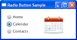
In the group of radio buttons, the first button initially has the focus by default. If you apply the setSelected method to the second radio button in the group, you should expect the result shown in Figure 4-3.
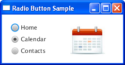
The second radio button is selected, and the first button remains in focus. Use the requestFocus function to change the focus, as shown in Example 4-5.
When applied, this code produces the result shown in Figure 4-4.
Figure 4-4 Setting Focus for the Selected Radio Button

Description of "Figure 4-4 Setting Focus for the Selected Radio Button"
Related API Documentation
 Alla is a technical writer for Oracle. She lives in St. Petersburg, Russia, and develops tutorials and technical articles for Java and JavaFX technologies. Prior to her assignment at Oracle, she worked as a technical writer in different IT companies.


