Using JavaFX UI Controls
15 Separator
This chapter explains how to use separator to organize UI components of you JavaFX applications.
The Separator class that is available in the JavaFX API represents a horizontal or vertical separator line. It serves to divide elements of the application user interface and does not produce any action. However, you can style it, apply visual effects to it, or even animate it. By default, the separator is horizontal. You can change its orientation by using the setOrientation method.
Creating a Separator
The code fragment in Example 15-1 creates one horizontal separator and one vertical separator.
Example 15-1 Vertical and Horizontal Separators
//Horizontal separator
Separator separator1 = new Separator();
//Vertical separator
Separator separator2 = new Separator();
separator2.setOrientation(Orientation.VERTICAL);
The Separator class is an extension of the Node class. Therefore, the separator inherits all the instance variables of the Node class.
Typically, separators are used to divide groups of the UI controls. Study the code fragment shown in Example 15-2. It separates the spring month checkboxes from the summer month checkboxes.
Example 15-2 Using a Separator Between Checkbox Categories
final String[] names = new String[]{"March", "April", "May",
    "June", "July", "August"};
final CheckBox[] cbs = new CheckBox[names.length];
final Separator separator = new Separator();
final VBox vbox = new VBox();

for (int i = 0; i < names.length; i++) {
    cbs[i] = new CheckBox(names[i]);
}

separator.setMaxWidth(40);
separator.setAlignment(Pos.CENTER_LEFT);
vbox.getChildren().addAll(cbs);
vbox.setSpacing(5);
vbox.getChildren().add(3, separator);
When this code fragment is added to an application, it produces the controls shown in Figure 15-1.
A separator occupies the full horizontal or vertical space allocated to it. The setMaxWidth method is applied to define a particular width. The setValignment method specifies the vertical position of the separator within the allocated layout space. Similarly, you can set the horizontal position of the separator line by applying the setHalignment method.
In Example 15-2, the separator is added to the vertical box by using a dedicated method add(index, node). You can use this approach in your application to include separators after the UI is created or when the UI is dynamically changed.
Adding Separators to the UI of Your Application
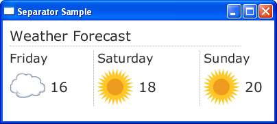
As previously mentioned, separators can be used to divide groups of UI controls. You can also use them to structure a user interface. Consider the task of rendering the weather forecast data shown in Figure 15-2.
Figure 15-2 Structuring Weather Forecast Data with Separators

Description of "Figure 15-2 Structuring Weather Forecast Data with Separators"
For the application shown in Figure 15-2, separators are used to divide Label and ImageView objects. Study the source code of this application shown in Example 15-3.
Example 15-3 Using Separators in a Weather Forecast Application
import javafx.application.Application;
import javafx.geometry.Insets;
import javafx.geometry.Orientation;
import javafx.geometry.VPos;
import javafx.scene.Group;
import javafx.scene.Scene;
import javafx.scene.control.*;
import javafx.scene.image.Image;
import javafx.scene.image.ImageView;
import javafx.scene.layout.GridPane;
import javafx.scene.text.Font;
import javafx.stage.Stage;

public class Main extends Application {

    Label caption = new Label("Weather Forecast");
    Label friday = new Label("Friday");
    Label saturday = new Label("Saturday");
    Label sunday = new Label("Sunday");

    @Override
    public void start(Stage stage) {
        Group root = new Group();
        Scene scene = new Scene(root, 500, 300);
        stage.setScene(scene);
        stage.setTitle("Separator Sample");

        GridPane grid = new GridPane();
        grid.setPadding(new Insets(10, 10, 10, 10));
        grid.setVgap(2);
        grid.setHgap(5);

        scene.setRoot(grid);

        Image cloudImage = new Image(getClass().getResourceAsStream("cloud.jpg"));
        Image sunImage = new Image(getClass().getResourceAsStream("sun.jpg"));

        caption.setFont(Font.font("Verdana", 20));
        GridPane.setConstraints(caption, 0, 0);
        GridPane.setColumnSpan(caption, 8);
        grid.getChildren().add(caption);

        final Separator sepHor = new Separator();
        sepHor.setValignment(VPos.CENTER);
        GridPane.setConstraints(sepHor, 0, 1);
        GridPane.setColumnSpan(sepHor, 7);
        grid.getChildren().add(sepHor);

        friday.setFont(Font.font("Verdana", 18));
        GridPane.setConstraints(friday, 0, 2);
        GridPane.setColumnSpan(friday, 2);
        grid.getChildren().add(friday);

        final Separator sepVert1 = new Separator();
        sepVert1.setOrientation(Orientation.VERTICAL);
        sepVert1.setValignment(VPos.CENTER);
        sepVert1.setPrefHeight(80);
        GridPane.setConstraints(sepVert1, 2, 2);
        GridPane.setRowSpan(sepVert1, 2);
        grid.getChildren().add(sepVert1);

        saturday.setFont(Font.font("Verdana", 18));
        GridPane.setConstraints(saturday, 3, 2);
        GridPane.setColumnSpan(saturday, 2);
        grid.getChildren().add(saturday);

        final Separator sepVert2 = new Separator();
        sepVert2.setOrientation(Orientation.VERTICAL);
        sepVert2.setValignment(VPos.CENTER);
        sepVert2.setPrefHeight(80);
        GridPane.setConstraints(sepVert2, 5, 2);
        GridPane.setRowSpan(sepVert2, 2);
        grid.getChildren().add(sepVert2);

        sunday.setFont(Font.font("Verdana", 18));
        GridPane.setConstraints(sunday, 6, 2);
        GridPane.setColumnSpan(sunday, 2);
        grid.getChildren().add(sunday);

        final ImageView cloud = new ImageView(cloudImage);
        GridPane.setConstraints(cloud, 0, 3);
        grid.getChildren().add(cloud);

        final Label t1 = new Label("16");
        t1.setFont(Font.font("Verdana", 20));
        GridPane.setConstraints(t1, 1, 3);
        grid.getChildren().add(t1);

        final ImageView sun1 = new ImageView(sunImage);
        GridPane.setConstraints(sun1, 3, 3);
        grid.getChildren().add(sun1);

        final Label t2 = new Label("18");
        t2.setFont(Font.font("Verdana", 20));
        GridPane.setConstraints(t2, 4, 3);
        grid.getChildren().add(t2);

        final ImageView sun2 = new ImageView(sunImage);
        GridPane.setConstraints(sun2, 6, 3);
        grid.getChildren().add(sun2);

        final Label t3 = new Label("20");
        t3.setFont(Font.font("Verdana", 20));
        GridPane.setConstraints(t3, 7, 3);
        grid.getChildren().add(t3);

        stage.show();
    }
    public static void main(String[] args) {
        launch(args);
    }
}
This application uses both horizontal and vertical separators and makes the separators span rows and columns in the GridPane container. In your application, you can also set the preferred length for a separator (width for a horizontal separator and height for a vertical separator), so that it can change dynamically when the user interface resizes. You can also alter the visual appearance of a separator by applying the CSS classes available for Separator objects.
Styling Separators
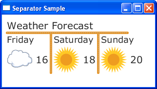
To apply the same style to all the separators in Example 15-3, you create CSS file (for example, controlStyle.css) and save this file in the same package as the main class of your application. Example 15-4 demonstrates the CSS classes that you can add to the controlStyle file.
Example 15-4 Using CSS Classes to Style Separators
/*controlStyle.css */

.separator{
    -fx-background-color: #e79423;
    -fx-background-radius: 2;
}
You can enable the separator style in the application through the getStylesheets method of the Scene class, as shown in Example 15-5.
Example 15-5 Enabling Style Sheets in a JavaFX Application
scene.getStylesheets().add("separatorsample/controlStyle.css");
Figure 15-3 shows how the separators in the weather forecast look when the modified application is compiled and run.
Related API Documentation
 Alla is a technical writer for Oracle. She lives in St. Petersburg, Russia, and develops tutorials and technical articles for Java and JavaFX technologies. Prior to her assignment at Oracle, she worked as a technical writer in different IT companies.


