| Bookshelf Home | Contents | Index | Search | PDF | |
Siebel Tools Reference > Special-Purpose Applets and Controls > Chart Applets >
Chart Layout Options
The user can select different chart types from the Type picklist at the upper right in most chart applets. Chart types provide various layout options, including horizontal bar, stacked bar, pie, line, scatter, spline, and combo (combined line and bar). Several of these are available in either 2- or 3-dimensional format. The 3-dimensional types are functionally the same as the corresponding 2-dimensional types, but provide the illusion of bar, line, or pie thickness for visual attractiveness.
The following styles of charts are available (although not all styles are supported for all chart applets).
Bar Charts
Bar charts are typically used to compare the absolute difference in data from one category to another.
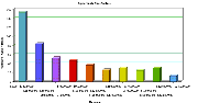
- 3dBar. The 3dBar type divides data from the source records into categories, and displays the total for each category as a vertical bar. This is shown in Figure 193.
If the chart is configured with a Z (series) axis, a cluster of bars appears for categories rather than a single bar. This is shown in Figure 194.
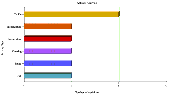
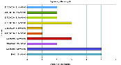
- 3dHorizBar. A 3dHorizBar chart is functionally equivalent to a 3dBar chart, but has the X and Y axes switched, with the result that the bars are horizontal. A 3dHorizBar chart appears in Figure 195.
The individual horizontal bars are replaced by clusters of horizontal bars if a series axis is present, as shown in Figure 196.
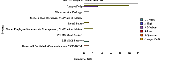
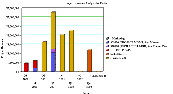
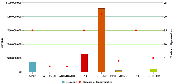
- 3dStackedBar. A 3dStackedBar chart normally has a series axis. The chart displays a single stack of bars for each category, within which appears a bar of a different color for each series. Stacked bar charts are useful for seeing the individual value for each series within the category as well as their total for the category. An example of a 3dStackedBar chart appears in Figure 197.
This figure displays a Project Revenue Analysis chart. The data values axis corresponds to project revenue, the category axis corresponds to a quarter, and the series axis corresponds to the project name. So for each quarter along the X axis, there is a stack of bars. Each bar in the stack indicates the revenue reached in a particular quarter. The stacks within each bar indicate the individual projects.
- 2dBar. A 2dBar chart is functionally equivalent to a 3dBar chart, but is displayed without the illusion of depth. Two-dimensional charts are generally easier to read accurately, but may seem less visually attractive than their three-dimensional counterparts. A 2dBar chart appears in Figure 198.
Like the 3dBar chart, a 2dBar chart displays bars in clusters if a series axis is present.
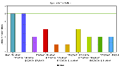
- 2dHorizBar. The 2dHorizBar chart type is functionally equivalent to the 3dHorizBar type, but is displayed without the illusion of depth. A sample 2dHorizBar chart appears in Figure 199.
- 2dStackedBar. The 2dStackedBar chart type is functionally equivalent to the 3dStackedBar type, but is displayed without the illusion of depth. A sample 2dStackedBar chart appears in Figure 200.
Line Charts
Line Charts are used to observe trends across categories or over time.
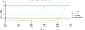
- 2dLine. The 2dLine chart type displays one or more line curves plotted against the X-Y grid. If there is no series axis, a single line curve appears. If there is a series axis, one line curve appears for each color in the legend. A 2dLine chart appears in Figure 201.
- 3dLine. The 3dLine chart type is functionally equivalent to the 2dLine type, but appears with the illusion of depth. A 3dLine chart (showing the same data as the 2dLine chart in Figure 201) appears in Figure 202.
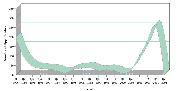
- 2dSpline. The 2dSpline chart type displays one or more line curves plotted against the X-Y grid, with the points plotted accurately but the line between them smoothed mathematically. If there is no series axis, a single curve and set of points appear. If there is a series axis, one curve and corresponding set of points appear for each color in the legend. A 2dSpline chart appears in Figure 203.
- 3dSpline. The 3dSpline chart type is functionally equivalent to the 2dSpline type, but appears with the illusion of depth, and does not display the actual data points, only the smoothed curve. A 3dSpline chart (showing the same data as the 2dSpline chart in Figure 203) appears in Figure 204.
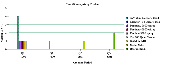
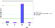
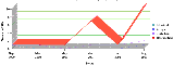
- Combo. A chart of the Combo type displays a single bar chart with dots superimposed on it. The two charts share the category axis, but each has its own data points axis (on the left for the bar chart, and on the right for the line chart). A sample Combo chart appears in Figure 205.
Pie Charts
Pie Charts are used to compare the relative difference across categories by dividing a circle into segments that represent each category's percentage of the whole.
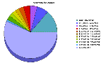
- 3dPie. The 3dPie chart type aggregates data point data in the records by category, and displays each category as a separate segment in the pie. The category (X) axis is the set of pie slices and corresponding labels. The data points (Y) axis determines the relative size of each pie slice as a percentage of the total. You cannot specify a series axis for pie charts. The 3dPie chart type gives the illusion of depth, for visual attractiveness. A sample 3dPie chart appears in Figure 206.
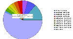
- 2dPie. The 2dPie chart type is functionally the same as the 3dPie type, but without the illusion of depth. A sample 2dPie chart appears in Figure 207.
Scatter Charts
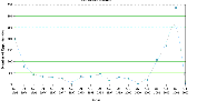
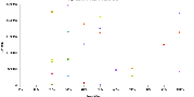
- 2dScatter. A scatter chart—a chart with the 2dScatter type—displays the distribution of data according to two attributes. This is useful for probability distributions, among other applications. The category axis must contain numeric, as opposed to date or text data. This makes the 2dScatter type unsuitable for conversion to other chart types such as bar, line, or pie. For this reason, the 2dScatter type does not appear in Type picklists, and a 2dScatter chart does not have a Type picklist. A 2dScatter chart appears in Figure 208.
| Bookshelf Home | Contents | Index | Search | PDF | |
Siebel Tools Reference Published: 20 October 2003 |