| Bookshelf Home | Contents | Index | Search | PDF | |
Siebel Tools Reference > Special-Purpose Applets and Controls > Chart Applets >
Configuring Chart Applets
A chart is built as an applet containing one or more Chart object definitions. The Chart object type is a child of applet. The Chart object type has Chart Element children. This section describes how chart applets are configured.
You can also use the Chart Applet Wizard to create chart applets. See Using the Chart Applet Wizard.
Business Component Mapping
A chart applet has, like all applets, a business component identified in its Business Component property. Records in this business component—subject to the current view, the current query, and visibility considerations—provide the data displayed in the applet. In the case of a chart applet, specific fields are used to provide the data for the category, data point, and series axes. The correspondence between axes and fields is specified in properties in the Chart object definition.
In the simplest case—a single bar or line graph, with no series axis—a category field and a data point field are specified. Pairs of category and data point field values are plotted as points or bars. If multiple records have the same category value, their data point values are added together.
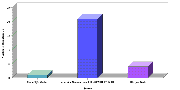
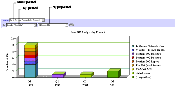
The Oppty Chart Applet - Source Analysis applet provides an illustration of this process (Figure 209).
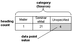
This applet displays the number of opportunities on the data point axis plotted against the source of the opportunity (referral, magazine article, Web site, and so on) on the category axis. To generate the data required for the curve, the Source field in each record is checked and the number of opportunities for each distinct source value is tallied. The result is a two-row temporary table with a column for each source, as shown in Figure 210.
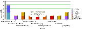
For a multiple-curve chart, a row is added to the temporary table for each curve in the series (Figure 211).
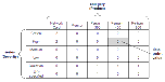
The temporary table for a multiple-curve chart is illustrated in Figure 212.
To define the data mapping from the business component into the chart applet, you need to define the following properties in the Chart object:
- Category Field. Contains the name of a text or date field in the business component (except for scatter charts, which use a numeric category field). When the business component records are scanned, the different values found in this field are mapped into different categories. These values are displayed on the chart's X-axis labels.
- Data Point Field. Contains the name of a numeric field in the business component, or is unspecified. If specified, the value in this field in each record is added to the total for the category field value in the same record. If a data point field is not specified, the count for the corresponding category field is incremented rather than adding the data point value to the total for the category field. These counts or totals determine the height along the Y-axis of a bar or line curve point for each unique category field value in the curve. Rather than a total or a count, some other function (specified in the Data Function property) may determine the use of the data point field data.
- Series Field. Contains the name of a text field in the business component, or is unspecified. When the business component records are scanned, the different values found in this field are mapped into different curves. These values are displayed on the chart's legend labels.
NOTE: The maximum number of Series cannot exceed 50 when running the chart. If it does exceed 50, an error message is displayed. The user may have to run another query that results in less than 50 Series.
- Data Function. The Data Function property determines how the data point field values are converted into the new table's cell values. Possible values are Sum (simple addition), Count (number of occurrences of a cell value), Average (average value per record), and Plot (different from Count only in that when a cell is empty, it is charted as NULL instead of 0).
The preceding descriptions cover the use of these properties for the most general cases. There are a number of special cases in which these properties are configured differently than described. Some special case configuration scenarios are described in the sections that follow. For descriptions of the properties, see Object Types Reference.
Configuring the Picklists
A chart applet typically provides one or more picklists along the upper edge that allow the user to reconfigure the chart's presentation or use of data. These picklists are illustrated in Figure 213.
These picklists are described as follows:
- Type picklists. This is the most common of the four picklists, and appears in most chart applets. It provides the user with the means to select a different type of chart for the same data, such as a pie chart instead of a bar chart, or a
two-dimensional line chart instead of a three-dimensional one. The chart types are described in detail in Chart Layout Options.The options for the Type picklist are specified in the Picklist Types property of the Chart object definition, as a comma-separated list of chart type names such as the following:
3dBar,3dStackedBar,3dPie,3dHorizBar,2dBar,2dStackedBar,2dPie,
2dHorizBarThere cannot be any spaces between the elements in the comma-separated list.
The default type—the chart type to appear when the chart is initially displayed—is specified in the Type property. Charts without a Type picklist use the Type property to specify the chart type of the chart; in that situation the chart type cannot be changed by the user.
- Show picklists. This picklist allows the user to change what is displayed on the Y axis. The choices available depend on the configuration of certain properties in the Chart object definition. The Show picklist displays a selection list of field/function combinations which determines what values are plotted along the Y axis.
For information on configuring the Show picklist, refer to Configuring Show Picklists.
- By Picklist. This picklist allows the user to change what is displayed on the X axis. This can provide any one of three roles, depending on the configuration of certain properties in the Chart object definition:
- In period Charts, the By picklist is populated with different periods. This allows the user to select from a list of possible X-axis periods for calendar (day/week/month/quarter/year) data. This requires selection options to be specified in the Picklist Periods property in the Chart object definition.
- When a list of source fields is specified rather than a single source field, the picklist allows the user to choose which source field populates the X axis.
- It can allow the user to invert the X and Z axes, so the user can see the data from a source field in a business component displayed along the X or Z axis per the picklist selection.
For information on configuring the By picklist, refer to Configuring the By Picklist.
- Second "By" picklists. This picklist allows the user to choose which source field populates the Z axis. For information on configuring the second By picklist, refer to Configuring the Second By Picklist.
Each of the four picklists requires a corresponding control of type ComboBox, as a child object definition of the chart applet. Each has required values in the Name and MethodInvoked properties, as detailed in Table 48.
Configuring Show Picklists
The Show picklist (the combo box control named ChartPickfunction) can be configured to display a selection list of field/function combinations, the selection from which determines what values are plotted along the Y axis. Multiple combinations of source field and function are provided in the selection list. The Y axis title is obtained from the text in the user's Show picklist selection.
To configure the Show picklist, the following three properties of the Chart object definition are used:
- Data Point Field. You enter a comma-separated list of source fields, one for each entry that is to appear in the Show picklist. The first entry in the list is the default. If only one field name is entered, it applies to all functions in the picklist.
- Data Function. You enter a comma-separated list consisting of the following function names: SUM, COUNT, AVERAGE, or PLOT. PLOT indicates that the Y values are derived directly from the values in the source field. The order in the comma list determines the association with a data point field and title (picklist function). If the comma-separated list is omitted or it contains fewer elements than the list of names in the Picklist Functions property, the list
Sum,Count,Average,Plotis substituted.- Picklist Functions. You enter a comma-separated list of Y-axis titles, which are also the text which appears in the picklist. The order in the comma list determines the association with a data point field and data function.
For example, you could configure a Show picklist with explicit syntax that offers three choices: Number of Opportunities, Opportunity Revenue and Opportunity Expected Revenue. This is configured with the property settings shown in Table 49.
As can be seen from the table, there are three values in each comma-separated list. The first entry, Number of Opportunities, performs a Count function on the Name field. The second entry, Opportunity Revenue, performs a Sum function on the Revenue field. The third entry, Opportunity Expected Revenue, performs a Sum function on the Expected Revenue field.
An example of a Show picklist configured with implicit syntax and the standard function list is in the Lead Source Analysis chart in the Opportunity New Business Analysis view in Siebel Sales (Oppty Chart Applet - New Business). The picklist offers three choices: Number of Opportunities, Opportunity Revenue, and Average Opportunity Revenue. This is configured with the property settings shown in Table 50.
The value of Revenue in the Data Point Field property applies to all entries in the picklist.
The value of Count in the Data Function property is unnecessary; it could be left blank instead. Whenever the number of entries in the Data Function property is not the same as the number in the Picklist Functions property, the system supplies a standard Data Function list. This list is the following:
The first picklist entry, Number of Opportunities, performs a Count function on the Revenue field. The second entry, Opportunity Revenue, performs a Sum function on the same field. The third entry, Avg Opportunity Revenue, performs an Average function.
This means of configuring Show picklist behavior predates the ability to specify triplets of name, function, and field, and is more restrictive. It has been retained for backwards compatibility with earlier versions of Siebel applications. Generally it makes more sense to explicitly specify the values in the three properties.
Configuring the By Picklist
The contents of the Category Field property in the Chart object definition determine the behavior of the By picklist (ChartPickBy combo box control), as follows:
- Calendar increments in the picklist and X axis. If the Category Field property contains the name of a single field that has a DTYPE_DATE data type, the X axis displays calendar increments and the chart is considered a period chart. In this situation, the picklist is populated with calendar increment options, including user defined periods (specified in View > Site Map > Application Administration >Periods) such as Day, Week, Month, Quarter, and Year.
For example, in the New Business Analysis chart, the category field is Created (the date of creation of the record, hence of the opportunity). As a result, the category axis contains date increments, based on the increment the user selects in the By picklist.
- Text labels in the X axis, category and series field names in the picklist. If the Category Field property contains the name of a single text field from the business component, and a series field has also been specified (in the Series Field property), the By picklist is populated with the names of the category field and the series field. The user can select either field to populate the X axis with labels derived from the contents of that field; the unselected field populates the legend box (Z axis) with labels. The category field is the default, and is initially displayed on the X axis.
For example, the chart in the Service Request Product Analysis view in Siebel Service has a category field of Product and a series field of Severity. When the chart is initially displayed, the X axis labels are product names and the legend labels are severity levels. However, the field names Product and Severity appear in the By picklist, and the latter selection allows the user to display severity levels in the X axis and product names in the legend.
- Text Labels in the X axis, multiple field names in the picklist. If the Category Field property contains a comma-separated list of field names, the user is provided with this list of fields at run time in the By picklist. The user's selection determines the field which populates the X axis. The first value in the comma-separated list is the default. (You should avoid blank spaces before or after field names in the list.)
- Numeric values in the X axis, no picklist. If the Category Field property contains the name of a single numeric field, the X axis is populated with numeric increments, similar to the process of generating increments for the Y axis. In this situation, the By picklist is not shown.
For example, the Probability Cluster Analysis chart in the Opportunity Probability Cluster Analysis view has a category field of Rep % (the probability of a sale). In this chart, probability is plotted against the X axis, the X axis increments are percentages from 0% to 100%, and no By picklist appears.
Configuring the Second By Picklist
The contents of the Series Field property in the Chart object definition determine the behavior of the second By picklist (the combo box control named ChartPickBy2), as follows:
- If the Series Field property is blank, all records are mapped into a single series.
- If the Series Field property contains the name of a field from a business component, the Z axis (legend) is populated with labels derived from the contents of that field.
- If the Series Field property contains a comma-separated list of field names, the user is provided with this list of fields at run time in the second By picklist. The user's selection determines the field which populates the Z axis. The first value in the comma-separated list is the default.
Charts with Multiple Curves Plotted Against One Y Axis
Multiple line graph curves can be plotted against the same Y axis, based on different source field/function combinations. The name for each curve appears in the legend. For example, you may want revenue, expected revenue, and net profit to appear as superimposed curves on the same line graph. To accomplish this, set the following property values in the Chart object definition:
- Data Point Field. Provide a comma-separated list of source fields, one for each curve to appear in the graph.
- Data Function. Provide a comma-separated list consisting of some of the following function names: SUM, COUNT, AVERAGE, or PLOT. PLOT indicates that the Y values are derived directly from the values in the source field. The list of function names must have the same number of entries as the Data Point Field list. The order in the comma list determines the association with a data point field and title.
- Picklist Functions. Provide a comma-separated list of Y-axis titles, which identify the individual curves in the Legend. The list of titles must have the same number of entries as the Data Point Field list. The order in the comma list determines the association with a data point field and data function.
- Series Field. Remove any existing value(s) from this property; it must be blank. Otherwise, the multiple curves are converted to a Z axis.
- Multi Data Point. Set to TRUE. This indicates that multiple curves are to be plotted.
You should also remove the Show combo box and its label in the Applet Web Editor.
Charts with Two Y Axes
Two line graph curves can appear in the same Chart, plotted against different Y axes (one to the left of the graph, the other to the right). Any field/function combination can be used on the left Y axis, and likewise for the right. To accomplish this, set the following property values in the Chart object definition:
- Data Point Field. Specify two fields, separated by a comma. The first is for the left Y axis, the second is for the right Y axis.
- Data Function. Specify two functions, separated by a comma. The first is for the left Y axis, the second is for the right Y axis.
- Type. Set to Combo.
Axis Points—Limiting and Sorting
The number of X axis (category) or Z axis (series) labels can be limited to some predefined number. This can be useful if you are interested in displaying only the N highest or N lowest values for some field or calculated Y value. For example, you could display the 10 highest revenue accounts by charting the Revenue field in descending order and limiting the X axis to 10 data points. This is accomplished using two properties of the axis label Chart Element for the appropriate axes, as follows:
- Divisions property (X or Z axis). Enter an integer to limit the number of X axis or Z axis labels to the number you enter. Note that the AxisId property must be either XAxis or ZAxis, and the Type property must be AxisLabel.
- SortSpecification property (Y axis). Enter a value of Ascending or Descending. Note that the AxisId property must be set to YAxis and the Type property must be AxisLabel.
You can set up a sort specification on the Y axis independent of limiting the number of X or Z axis divisions. A sort specification on Y will order the data points regardless of whether you are limiting the display to the first N points. The converse is not true, however; it would not make sense to set a number of X or Z axis divisions without also setting a sort specification on Y.
You also can sort on X axis or Z axis labels instead of Y axis values. To accomplish this, you set the Sort Specification in the X axis (or Z axis) label Chart Element object definition rather than in the Y axis label. For example, if the X axis is displaying country names, they can appear alphabetically from left to right. This is different from sorting on Y axis values, which are numeric values from a field in a business component or function based on that field.
Chart Element Object Type
Chart Element is a child object type of Chart. The following types of Chart Elements (as specified in the Type field in the Chart Element object type) are supported:
- AxisLabel. Displayed along each axis, with one label for each division of the axis.
- AxisLineGrid. Grids make it easier to comprehend a Chart. You can set various grid properties, such as grid color, width, and visibility, on an axis-by-axis basis.
- AxisTitle. Displayed along each axis, with one title per axis.
- Graphic. A line, rectangle, or ellipse used to emphasize a region of the Chart.
- Legend. The list of colored rectangles with accompanying category labels on the left side of the Chart.
- Plot. The area that contains the graphs, usually in the center of the Chart.
- Title. The large string of text, usually at the top of a Chart.
- Font, Color, and Size. For most Chart Elements that contain text, you can set such text properties as font, color, and size.
- Fill color. You can set the fill color of the Chart and Plot Chart Element types.
The properties of the Chart Element that apply to the axis label for the X axis (Coordinates, Display Format, Divisions, List Of Values, Sort Specification, and Text) should not be used when specifying a list of X axis source fields, as they can be relevant only for one X axis field. Also, the text of the X axis title is determined dynamically from the combo box selection if the By combo box provides a list of source fields. Whatever is in the Text property in the AxisTitle chart element for the X axis is overridden at run time.
The same restrictions are relevant for the Z axis.
Making X-Axis Labels Vertical
You can make x-axis labels vertical so that they do not overlap with each other. To do this, set the Vertical property to TRUE for the Chart Element object whose Axis Id property is set to XAxis.
Sizing Chart Images
You can change the size of a chart applet by setting the HTML Width and HTML Height properties (in pixels) for the Chart control child object of the applet.
The default values are 1012 for HTML Width and 560 for HTML Height.
| Bookshelf Home | Contents | Index | Search | PDF | |
Siebel Tools Reference Published: 20 October 2003 |