


| Bookshelf Home | Contents | Index | Search | PDF | |
Siebel Tools Reference > Logical User Interface Objects Layer > Applets >
Form Applets
A form applet presents business component information in a data entry form layout. An example of a form applet in Siebel Call Center appears in Figure 136.
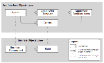
Users enter data using text boxes, check boxes, buttons, and similar visual constructs known collectively as controls. The Control object type implements data controls, as well as buttons and links that invoke methods. The controls that display data show a value from a particular field in the current business component row. The relationships between objects used to implement a form applet appear in Figure 137.
A form applet is implemented in Siebel Tools by means of an applet object definition, multiple control object definitions, applet Web template definitions, and applet Web template item definitions. These object types have the following roles:
- Applet. Provides the properties that belong to the entire applet, such as the Name, Business Component, and specifies in the Class property that the applet is a form applet (CSSFrame class).
- Control. Identifies individual data controls in the data entry form, such as text boxes and command buttons. A control either corresponds to one field in the business component, or invokes program logic (in the case of a button control).
- Applet Web Template. Associates an applet to a Web template. Web templates determine the layout and format of the applet when it is rendered in the user interface. An applet can be displayed in four of the five standard modes. An Applet Web template is defined for each mode. The modes are listed below:
- Base. Read only.
- Edit. Used for editing records where users can update values. You can also use the edit for creating new records and querying.
NOTE: Typically, New and Query modes are not necessary because Edit mode can be used for these type of actions.
- New. Used for creating a new record where the requirements for new mode are different from the edit mode.
- Query. Used for querying where the requirements for the query mode are different from the edit mode.
- Edit List. Not applicable for form applets.
- Applet Web Template Items. Maps controls to placeholders tags in a Web template. It contains the name of a control or list column as well as unique identifier of a template placeholder. The placeholder determines its position of the control or list column in the Web page rendered at runtime. Applet Web Template Items are automatically populated when users drag and drop controls into placeholders using the Applet Web Layout editor.
For more information about mapping controls and list columns to Web templates, see Editing the Web Layout of Applets.
Form Applet Controls
Following creation and placement of data controls in the applet using the Applet Web Layout Editor, the properties of the corresponding control object definitions can be edited in the Object List Editor.
NOTE: Controls for form applets using the "Applet Form 4 Column (Edit/New)" Web template can be associated to either a "2-Column Wide field" or a "1-Column Wide field". To associate a control to a "2-Column Wide field", you must set the HTML Width property to 412. If you do not specify an HTML Width property, the control will appear as a "1-Column Wide field" even when it is associated to a "2-Column Wide field" on a form applet.
All control object styles have the following important properties, except where otherwise noted:
- Name. The name of the control, for identification by other objects.
- HTML Type. Specifies the style of the control. Examples of control types include Field, Text, ComboBox, CheckBox, Button, and Active X. These Control styles are described in a subsection below.
See the sections below for descriptions of some controls.
NOTE: HTML Type values in the repository that begin with the prefix "cfg" are used for Siebel Product Configurator.
- Caption. The Caption property provides descriptive text in, on, or near the control, depending on the type of the control. The caption specified for a button control is the text that appears on the button face. The Caption property is unspecified for control styles which do not have identifying text. An example of a Text control with a caption is shown in Figure 138.
- HTML Sequence. An integer value specifying the tab sequence of this control relative to other controls in the applet. Tab sequence is the order in which the tab key moves the focus from control to control on the applet. The lower the integer value you enter for sequence in a particular control in the applet, the sooner the tab key will access this control relative to others.
Some control styles (as specified in the Type property) are described briefly in the following sections.
Text Controls
A text control displays text inside a rectangular box. An example of a text control is Name, shown in Figure 139.
Some characteristics of Text controls are as follows:
- A text control allows the entry and editing of text, unless the Text control is read-only (in which case it has a gray background, and displays text which cannot be altered).
- A text control displays data of a particular data type, such as alphanumeric, numeric, date, or currency.
- A Select icon is automatically attached to the right edge of a Text control when the MVG Applet property has a non-blank value or the Pop-up Edit property is TRUE. This enables the user to call up a multi-value group applet or a calendar or calculator widget.
NOTE: The Runtime property must also be TRUE any time the field is supposed to pop up a Calendar or Calculator type control.
- The Select button is attached to the right edge of a text control when the Pick Applet property has a non-blank value. This allows the user to call up a picklist by clicking the icon.
Static picklists and pick applets are discussed in Pick Applets and Static Picklists.
NOTE: Trailing spaces are truncated in data displayed through the Siebel application user interface or through Siebel Tools.
Controls of type Text have the following essential properties:
- Field. The field in the business component from which the Text control displays data.
- Display Format. A format specification for data displayed by the Text control, used for numeric, date, currency, and similar non-text data types. Used as follows:
- For DTYPE_NUMBER data, the property can be left blank (indicating that the appearance of numeric values should be as set in the Regional Settings section of the Windows Control Panel) or explicitly specified using 0, #, +, minus sign, comma, and period symbols.
- For DTYPE_CURRENCY data, the property can be specified explicitly using the same symbols as for DTYPE_NUMBER, plus the dollar sign. The display of currency values can also be controlled using the Scale field in the Currencies view under the Application Administration screen.
- For DTYPE_DATETIME data, one of the keywords Date, Date Time, Date TimeNoSec, and TimeNoSec may be specified.
- For DTYPE_DATE data, the property can be left blank (indicating that the appearance of date values should be as set in the Windows Control Panel) or explicitly specified using combinations of M, D, Y, and / symbols.
- For DTYPE_TIME data, the keyword TimeNoSec can be entered, the property may be left blank (indicating that the appearance of time values should be as set in the Windows Control Panel), or a format mask may be explicitly specified using combinations of H, h, m, s, and : symbols.
- For DTYPE_PHONE data, the Display Format property is left blank, and the Windows Control Panel setting is used.
NOTE: Postal code formatting options are not explicitly provided, and hyphens in a postal code are not supported. Generally, for postal codes you should use the DTYPE_NUMBER data type, and a format mask in the Display Format property consisting of number signs and blank spaces, such as ##### #### for U.S. Zip+4 postal codes.
- Read Only. A TRUE/FALSE value. Indicates if the user can edit the value displayed in the text box.
NOTE: The Read Only property must be set to FALSE to use the Runtime property to access multi-value groups and pick applets.
- Runtime. This is a TRUE/FALSE value. When the text box control has an MVG Applet or Pick Applet property setting other than blank, a value of TRUE in the Runtime property directs the system to activate an icon or drop-down arrow to the right of the text box. A FALSE value directs the system not to provide the icon or arrow. This makes the multi-value group or pick applet inaccessible.
NOTE: A Runtime setting of TRUE, combined with blank MVG Applet and Pick Applet property settings, directs the system to determine from the data type of the underlying field if an icon for a calculator, calendar, or currency pop-up applet should be provided.
- MVG Applet. Identifies the applet to use for the multi-value group dialog box (multi-value group applet). The field for the control must be a multi-value field, and the Runtime property must be set to TRUE.
- Pick Applet. Identifies the applet to use for the picklist dialog box (pick applet). The field for the control must have a picklist specified, and the Runtime property must be set to TRUE.
Button Controls
Button controls initiate an action when clicked. There are several types of button controls, including Button, MiniButtonEdit, and MiniButtonNew. The Button control type is rendered as an HTML button. MiniButtons are custom controls whose formatting is defined in a .swf file. All button types are formatted slightly different. Example buttons are illustrated in Figure 140.
For more information on customized controls, see Creating Custom HTML Control Types.
A button can invoke a built-in method (supplied with Siebel applications), or a custom method programmed in Siebel VB, Siebel eScript, or Browser Script.
The Method Invoked property is the name of the method invoked when the button control is clicked.
There are instances when you might want to put your own custom methods in the Method Invoked property. For example, this is the only way to invoke Siebel VB, Siebel eScript, or Browser Script on a button-click event.
NOTE: The Runtime property must be set to TRUE for button controls. Otherwise the method associated with it will not execute.
Combo Box Controls
A combo box is implemented as a control with a Type property setting of ComboBox. It consists of a text box with a drop-down button attached at the right edge. The user clicks the drop-down button, which activates a selection list, and then clicks a selection in the list. The selected value replaces the previous value in the box. An example of a combo box is shown in Figure 141.
Combo box controls implement special-purpose picklists in chart, calendar, and pick applets. In chart applets they implement the Show and By combo boxes. In calendar applets they implement the user name combo box. In pick applets they implement the Find combo box. Combo box controls appear and behave almost identically to static picklists, but they are implemented through a different control type (ComboBox rather than Text Box).
For information on the use and configuration of the specialized combo boxes in a chart applet and information on static picklists, refer to Pick Applets and Static Picklists.
Check Box Controls
A check box is implemented as a control with a HTML Type property setting of CheckBox. It is a small, open square into which an X can be inserted or removed by clicking the box. An example of a check box appears in Figure 142.
A check box is used to represent a TRUE/FALSE field with a data type of DTYPE_BOOL. A TRUE value is represented as an X, and a FALSE value as an empty box.
ActiveXControl
Allows the placement of an ActiveX control in the applet.
File
Creates a user interface element that can be used to attach a file.
Hidden
Creates an HTML input of type Hidden. These controls are not visible in the Web page but can be accessed through scripting.
Link
Used with controls that have an "InvokeMethod" specified (this could be a built-in method that is supplied with Siebel applications). Creates an HTML hyperlink that will invoke the method when activated.
Mailto
Used with controls that contain an email address. The control value will be displayed as a link, which when activated will open the user's default email program with the address filled in with the control value.
Password
Creates a user interface element that can be used to input a password field. The characters entered in this control will be masked by the "*" character.
PositionOnRow
Custom control that shows the currently selected record in a list.
TextArea
Used to create a user interface element that can be used to enter text in multiple lines.
URL
Used with controls that contain URL values. The value will be displayed as a hyperlink, which when activated will take the user to the URL.
Label Controls
A label control, is a visual aid only. It has no data display or entry capabilities. Use a label control when you need to place wording somewhere inside the form applet. There are also some specialized label controls, such as the Applet Title.
NOTE: If a caption has any HTML reserved characters, such as &, <, >, ", then it should be HTML encoded as &, <, >, ", respectively.
| Bookshelf Home | Contents | Index | Search | PDF | |
Siebel Tools Reference Published: 20 October 2003 |