User Interface Templates
This chapter covers the following topics:
- Introduction to User Interface Templates
- User Interface Master Templates
- User Interface Content Templates
- Referencing a User Interface Content Template
- Displaying Pricing and ATP Using a UI Content Template
Introduction to User Interface Templates
Important: There are new User Interface templates available when using the Fusion Configurator Engine (FCE). The FCE is an alternative to the configuration engine described in this document. For all information about the FCE, see the Oracle Configurator Fusion Configurator Engine Guide.
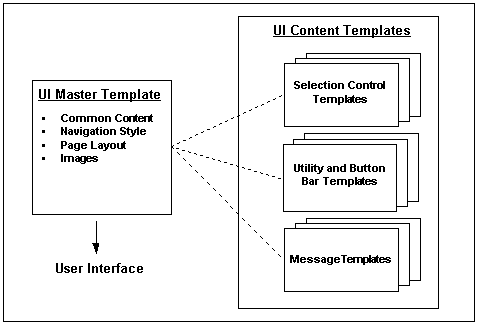
There are two types of User Interface templates: User Interface Master Templates and User Interface Content Templates. A UI Master Template consists of various settings that are used when you generate a User Interface, and specifies which UI Content Templates are used to display Model content, images, messages, and so on. See User Interface Templates.
Configurator Developer provides predefined UI Master Templates and UI Content Templates. These templates are located in the UI Templates Folder in the Main area of the Repository. All predefined UI templates are read-only and cannot be modified or deleted. However, if a predefined template does not meet your needs, you can either create a copy of it and modify it, or create a new template from scratch.
For details about each type of template, see:
User Interface Master Templates
A UI Master Template consists of settings that control:
-
The UI’s default structure, pagination, navigation style, and layout
-
Which UI Content Templates display UI elements for Model structure nodes
-
How page-level buttons appear at runtime
-
How the Configuration Summary page appears at runtime
-
How required and optional messages appear at runtime
-
The images to use at runtime to indicate the state of all options
You must select a UI Master Template when generating a UI that is based on the Model structure, or when generating an empty UI. When you generate a UI that is based on the Model structure, Configurator Developer generates UI elements for Model structure nodes using the UI Content Templates specified by your UI Master Template. The Master Template also determines the Message Templates, Utility Templates, and images that are used at runtime.
When you generate an empty UI, the UI Master Template you select determines only which Message Templates, Utility Templates, and images are used at runtime. You must define the UI’s content, including UI Pages, selection and navigation controls, and so on. This is described in Editing a User Interface.
Tip: Plan to spend time designing and customizing UI templates to produce the optimal User Interfaces for your configuration models and your end users. For example, generate UIs using the predefined UI Master Templates and review them at runtime. Then experiment with creating your own templates and customizing them until you are satisfied with the UI’s appearance and behavior. When your UI Master Templates are complete, they can easily be reused to generate UIs that meet your specific requirements.
For more information, see:
Default Settings for the Predefined User Interface Master Templates
Configurator Developer provides the following predefined UI Master Templates:
-
Oracle Browser Look and Feel with Step-by-Step Navigation UI Master Template
-
Oracle Browser Look and Feel with Dynamic Tree Navigation UI Master Template
The predefined UI Master Templates and any Master Template that you create have default values for each setting, such as which UI Content Templates are used to display controls for selecting options, runtime messages, images, and so on.
The only difference between the predefined UI Master Templates is the navigation style that each provides. All of the other settings are the same, except where indicated in Default Settings for the Predefined UI Master Templates.
All settings in the predefined UI Master Templates are read-only, but you can create a copy of any predefined template and then modify it to meet your needs.
| Setting | Default Value |
|---|---|
| Primary Navigation | Step-by -Step or Dynamic Model Tree |
| Show Train for all Multi-Page Flows | Yes, for Step-by-Step template, No for Dynamic Model Tree |
| Pagination | More, smaller pages |
| Nested Option Classes | Add to Parent Page |
| Nested Components | Add to Parent Page |
| Referenced Models | Create New Drilldown Pages |
| Maximum Number of Model Elements per Page | 100 |
| Control Type (Drilldown Controls region) | Button |
| Control Text (Drilldown Controls region) | Configure &DISPLAYNAME &DISPLAYNAME refers to the associated node’s DisplayName System Property. For details, see System Properties.) |
| Template Usage (for all UI Content Templates) | Incorporate by Reference (see Specifying How a User Interface Uses Content Templates ) |
For more information about these settings, see UI Master Template Information and Settings.
Default Pagination Settings
When choosing a Pagination setting, you can select either "Fewer, larger pages" or "More, smaller pages." These settings determine the default values for the detailed pagination settings, which are visible in the Custom Pagination page. See Default Pagination Settings.
| High-Level Setting | Detailed Settings (Custom Pagination page) |
|---|---|
| Fewer, larger pages | Maximum Number of Model Elements per Page = 100 Nested Option Classes = Add to Parent Page Nested Components = Add to Parent Page Referenced Models = Create New Drilldown Pages Number of Rows Shown in Tables = 25 |
| More, smaller pages | Maximum Number of Model Elements per Page = 30 Nested Option Classes = Create New Pages in Primary Navigation Nested Components = Create New Pages in Primary Navigation Referenced Models = Create New Drilldown Pages Number of Rows Shown in Tables = 25 |
For more information, see Defining Custom Pagination and Layout.
UI Master Template Information and Settings
This section describes information and settings that are common to all UI Master Templates. You access these settings by clicking links that appear in the left-hand side of each page in a UI Master Template.
When viewing or editing a UI Master Template, the UI Content Template that it refers to are displayed with an icon that displays the path to the template in the Main area of the Repository. For example, to view the Folder in which a specific template resides, place the cursor over the icon or press the Tab key until the path information appears.
All UI Master Templates contain the following sections:
General Section
These settings include the name, description, and any notes about the UI Master Template.
Pagination and Layout Section
These settings define the overall structure and organization of the UI.
The Pagination and Layout page contains the following settings:
-
Primary Navigation: This indicates the type of navigation that the UI Master Template provides at runtime. For details about each type, refer to the descriptions of each UI Master Template in Default Settings for the Predefined User Interface Master Templates.
For details about primary navigation styles in referenced UIs, see Runtime Navigation.
To display a progress indicator at runtime when an end user is performing a task that consists of three or more steps, select Show Train for all Multi-Page Flows.
-
Transaction Management: Use this setting to enable or disable nested transactions in the UI at runtime. Nested components and transactions are defined in Pagination of Model Structure Section (Custom Pagination Settings).
Select one of the following:
-
Drilldown Begins Nested Transaction: This is the default setting. Accept this setting if you want Oracle Configurator to begin a nested transaction when the end user "drills down" to configure a Component, referenced Model, or a BOM Option Class (in other words, a subcomponent). For example, an end user can drill down into a subcomponent by clicking the Configure icon in an Instance Management Table.
If this setting is selected, the end user must explicitly save any pending changes before navigating out of a nested transaction. Otherwise, the changes will be lost (in other words, Oracle Configurator retracts any selections made within the nested transaction).
-
Drilldown Maintains Single Transaction: Select this setting if you want Oracle Configurator to disable nested transactions and treat the entire configuration as a single transaction.
In this case, Oracle Configurator automatically saves each change as it is made.
After generating a UI, you can change the runtime transaction management behavior by modifying the UI Definition. For details, see Modifying the User Interface Definition.
The settings that determine the type of drilldown controls to display are described in Defining Custom Pagination and Layout.
-
-
Pagination: Specify whether you want the UI to have more pages with fewer options per page (More, smaller pages), or fewer pages with more options on each page (Fewer, larger pages). For more information, see Default Pagination Settings.
For greater control over the pagination, select Custom Settings, and then click Define. See Defining Custom Pagination and Layout.
-
Page Status Area Template: This setting controls which template Configurator Developer uses to generate the content of the page status area.
By default, this setting is set to Icon Legend Template for all UI Master Templates. For details about this template, see Icon Legend Template.
-
Outer Page Template: Use this setting to specify which UI Content Template Configurator Developer uses to display common content on every UI page by default.
For more information, see Outer Page Templates.
Defining Custom Pagination and Layout
This section describes the settings that are available when you choose to define custom pagination and layout settings for a UI Master Template. That is, when editing a UI Master Template, you go to the Pagination and Layout section, select Custom Settings, and then click Define.
Pagination of Model Structure Section (Custom Pagination Settings)
The settings in this section specify how end users access "nested" configurable components at runtime. Nested configurable components include BOM Option Classes, nested components, and referenced Models. A nested component exists when a node contains another node of the same type, such as a Component within another Component.
For the Nested Option Classes and Nested Components settings, specify one of the following:
-
Add to Parent Page: Select this setting to display the selection control on the same page as its parent.
-
Create New Drill Down Pages: Select this setting to require the end user to "drill down" into a nested component by clicking a button or other navigation control. Note that this action begins a nested transaction. For more information about nested transactions, refer to the Transaction Management setting in Pagination and Layout Section.
For more information about drilldown controls, see Drilldown Controls Section.
-
Create New Pages in Primary Navigation: Select this setting to create a separate UI Page for each nested component.
For example, if you want a UI control that represents a BOM Option Class to appear on its parent node’s UI Page (for example, a BOM Item Selection Table), select Add to Parent Page. To create a new Page that end users access using the UI’s primary navigation style (such as Step-by-Step), select Create New Pages in Primary Navigation.
Note: When the UI Master Template’s Primary Navigation is anything other than “Single Page,” Configurator Developer generates new UI Pages for the Model root and its first-level child Components and Option Classes. Configurator Developer uses the Pagination of Model Structure settings to determine how to generate content for nested Components and Option Classes that exist below the first-level children.
Number of Model Elements per Page: This setting limits how many UI controls can appear in the same UI Page. Examples of UI controls include list boxes, drop-down lists, input fields, and so on. When a table contains UI controls, each row counts toward the maximum allowed per page. Limiting how many elements appear on each page may improve the usability and performance of a User Interface.
For example, your Model contains 100 Option Features within Component X and each Feature contains many Options. You do not want to display all of the Features on a single UI Page, because end users may find it difficult to make selections. If you specify 10 Model elements per page, Configurator Developer creates ten UI Pages for Component X and displays 10 Features on each page. If your UI Master Template displays a Menu, the runtime UI displays a separate Page Link for each UI Page and numbers the Page Links sequentially (for example, Component X (1), Component X (2), and so on).
Drilldown Controls Section
These settings specify the type of controls that provide drilldown navigation into a nested transaction, such as when configuring a referenced Model, a non-instantiable subcomponent, or a BOM Option Class.
Control Type: Use this setting to specify whether a Button, Link, or Image is provided to enable end users to access nested UI structure. For example, Model A contains a Reference to Model B. The UI Page for Model A must contain a control to enable the end user to navigate to Model B.
Control Text: The text you enter here appears as the Button label, the text of the link, or the text that appears when the end user places the cursor over the image at runtime. Where the text appears depends on the Control Type selected.
Image URL: If the Control Type is Image, then use this field to enter the path and file name of the image to display. For example, /OA_MEDIA/drilldown_control.gif. To appear at runtime, the file must exist on the server on which Oracle Configurator is running.
Note: For additional information about configuring items in a nested transaction, such as a referenced Model, see Runtime Navigation.
BOM Content Section
The BOM UI Layouts setting controls how BOM Models and BOM Option Classes appear in the UI. Select Standard Layout if you want all BOM Option Classes and BOM Standard Items to appear in BOM Item Tables. Select Compact Layout to display BOM Option Classes and BOM Standard Items as drop-down lists, check box groups, and radio button groups.
Which control appears depends on whether an end user can enter a quantity at runtime, and whether the node is:
-
A BOM Standard Item
-
Mutually exclusive
-
Nested BOM structure
For a definition of nested structure, see Defining Custom Pagination and Layout.
Note: Pricing and ATP information does not appear if you select Compact Layout, even if pricing and ATP are enabled.
To specify different settings, select Custom Settings, and then click Define (see below).
Customizing the Display of BOM Content
Use the settings in the BOM Content Custom Settings page to change the default UI Content Templates that Configurator Developer uses to generate BOM content. You access these settings when defining or editing a UI Master Template by navigating to the BOM Content page, selecting Custom Settings, and then clicking Define.
For each setting, a BOM Selection Control UI template determines which type of UI control Configurator Developer generates for each BOM item in your Model. For a description of these templates, see The Predefined Control UI Content Templates.
Specify a BOM Control Template Usage to control how each UI Content Template is incorporated into the generated UI. For details, see Specifying How a User Interface Uses Content Templates.
For each type of BOM structure listed in the Custom Settings page, specify the UI Control Template you want to use for:
-
BOM Standard Items that are mutually exclusive or not
For a definition of mutually exclusive, see Imported BOM Rules.
-
BOM Standard Items for which entering a quantity at runtime is required or optional (see Note below)
-
Nested BOM structure for which entering a quantity at runtime is required or optional (see Note below)
Note: "Quantities Required" and "Quantities Optional" refers to whether a UI control that accepts a quantity for the BOM Item is provided at runtime. By default, a quantity input control is provided if the Maximum Quantity setting in Oracle Bills of Material for the Item is greater than 1. If the Maximum Quantity is less than 1, a quantity input control does not appear.
In either case, you can choose a UI Control Template that provides a quantity input control, or one that does not.
-
Nested BOM structure (such as a BOM Option Class) that is mutually exclusive or not
For a definition of nested structure, see Defining Custom Pagination and Layout.
-
BOM Model References that can have multiple instances or a single, optional instance
Non-BOM Content Section
Use the settings in this page to specify how Model structure created in Configurator Developer appears in the UI. These nodes include Components, Features, non-BOM Model References, Totals, Resources, and Connectors. Select Standard Layout to display single-select Option Features (min/max = 1/1) as radio button groups. Select Compact Layout to display them as drop-down lists.
To specify different settings, select Custom Settings, and then click Define (see below).
Customizing the Display of Non-BOM Content
Use the settings in the Non-BOM Content Custom Settings page to change the default UI Content Templates that Configurator Developer uses to generate non-BOM content in the runtime UI.
Specify a Non-BOM Control Template Usage to determine how each UI Content Template is incorporated into the generated UI. For details, see Specifying How a User Interface Uses Content Templates.
Specify the UI Control Template you want to use to display:
-
Option Features for which only one Option or multiple Options can be selected, with or without a quantity (see Enhanced Check Box Group and Enhanced Radio Button Group Control Templates)
-
Instantiable Components and References to non-imported Models that are either optional with a single instance, or may have multiple instances (see Instance Management Control Templates)
-
Other content, including Totals, Resources, Connectors, Boolean Features, Text Features, and Numeric Features (see The Predefined Control UI Content Templates)
Utility Templates Section
In this section, specify which templates are used to display common UI content, such as button bars, connection choosers, and the Configuration Summary page.
In the Button Bar Templates section, select templates that control the type of button bar displayed for the following:
-
Basic Transaction: Specifies the template to use for both top-level and nested transactions (processes) when not in a step-by-step flow. For a definition of nested structure, see Defining Custom Pagination and Layout.
-
Two-Page Flow Navigation: Specifies the template to use for step-by-step navigation when there are only two steps in a task flow.
-
Multi-Page Flow Navigation: Specifies the template to use for task flows that consist of more than two pages.
The predefined Navigation Button Bar Templates are described in The Predefined Button Bar UI Content Templates.
In the Utility Page Templates section, specify the templates to use for the standard Configuration Summary page, the Configuration Summary page that is displayed when upgrading a configuration (Complete and Filtered versions), and the Connection Chooser page. The Configuration Summary page is described in The Configuration Summary Page.
The predefined Configuration Summary page UI Content Templates are described in Summary Page Templates. The predefined Connection Chooser template is described in Connection Chooser Template.
Message Templates Section
Use the settings in this page to specify the templates to use with various required and optional runtime messages. For each optional Message Template, either specify the template to use, or click Clear if you do not want to display a message at runtime. For example, if you do not want end users to see a confirmation message when deleting a component at runtime, be sure no template is specified for the Confirm Delete Instance setting.
After generating the UI, you can modify which Message Templates are used at runtime. For details, see Modifying the User Interface Definition.
The predefined Message Templates are described in The Predefined Message UI Content Templates.
Images Section
These settings specify the images to display in a runtime User Interface for Enhanced Check Boxes, Enhanced Radio Buttons, and Status Indicator images. Each setting has a default file name and absolute path.
You can override the images specified here after generating a UI. For details, see Modifying the User Interface Definition.
The images that Configurator Developer provides are located in the OA_MEDIA directory. For example:
/OA_MEDIA/chkbox_userselected.gif
You can optionally use different images for each setting. For example, you may want to display a red "X" next to options that the system has excluded from the configuration, or a green asterisk next to options that contain required selections. Note that all images that you specify in this page must be 16x16 pixels.
If you specify a different image file that is stored in a subdirectory within OA_MEDIA, enter the file name with a path relative to OA_MEDIA. For example:
/OA_MEDIA/MySubdirectory/ImageName.gif
You can also specify a complete path to an image. For example:
http://www.MyWebSite.com/Images/Image001.gif
Note: The images that appear in a referenced Model’s UI may be different than those used in the parent Model’s UI. For details, see Integrating Referenced User Interfaces.
Enhanced Check Box and Radio Button Images
If your UI Master Template uses the Enhanced Radio Button Group or Enhanced Check Box Group UI Control Templates, these settings control which images are used to indicate an option’s selection state at runtime. The default images are shown in Default Selection State and Status Indicator Images.
For more information, see Enhanced Check Box Group and Enhanced Radio Button Group Control Templates.
Status Indicator Images
The runtime UI uses the images specified in this section to indicate the selection state of options that appear as standard HTML controls (for example, check boxes and radio buttons). When these images appear in a table that contains options, they appear in a separate column.
The Unsatisfied setting specifies the image to display next to unsatisfied items. For more information about unsatisfied items, see Unsatisfied Items List with Links.
For more information about selection state, see Selection State.
The default Status Indicator images are shown in Default Selection State and Status Indicator Images.
Default Selection State and Status Indicator Images
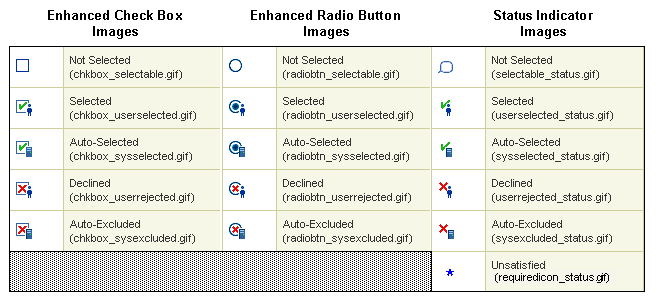
Note: If you specify different selection state or status indicator images, you must also update the Icon Legend template so that it displays the new images in your UI. See Icon Legend Template.
Oracle Browser Look and Feel with Step-by-Step Navigation UI Master Template
Use this template to create a UI that uses the step-by-step navigation style. In a step-by step UI, navigation buttons on each page allow end users to navigate to each page sequentially, access the Configuration Summary page, and either cancel or save the configuration. A progress indicator also appears at the top of each page by default. This indicator shows all of the required steps to create a valid configuration and highlights the current step in the process. You can prevent this image from appearing by deselecting the Show Train for all Multi-page Flows setting, which appears in the template’s Pagination and Layout section.
This template uses the Standard Layout to display BOM and non-BOM content. For a description of the Standard Layout and additional information about displaying BOM and non-BOM content, see:
Default Settings for the Predefined UI Master Templates lists the other default settings for this UI Master Template.
Oracle Browser Look and Feel with Dynamic Tree Navigation UI Master Template
Use this template to display a list of links to each page in the left-hand region of each page at runtime. This list reflects the Model’s structure and is dynamic, which means Oracle Configurator adds or removes links when an end user adds or deletes component instances at runtime.
At runtime, all UI Pages that contain one or more items requiring end-user input appear with a distinguishing icon in the navigation tree. This is true of any UI generated in Configurator Developer that provides a navigation tree.
The tree is automatically expanded to display the currently selected node, and also expands to display any children of the currently selected node. The expansion state of the tree is maintained when instances are added or deleted, and is also restored when the user returns after navigating to a different style of UI (such as Step-by-Step Navigation for a referenced Model, or a custom JSP UI). When a node is added to the configuration by a Partial Page Rendering (PPR) request, the added node's parent hierarchy is expanded to show the node.
You can optionally display a pair of links that allow users to expand and collapse the Dynamic Tree UI. The links are positioned above the tree, and are labeled Expand All and Collapse All. When the runtime user clicks Expand All, the tree expands to show all nodes; clicking Collapse All hides all nodes except the immediate children of the root node. To display this pair of links, set the value of the servlet property cz.runtime.treebehavior to ShowLinks. By default, the links are not displayed. For details, see the Oracle Configurator Installation Guide.
This template uses the Standard Layout to display BOM and non-BOM content. For a description of the Standard Layout and additional information about displaying BOM and non-BOM content, see:
Default Settings for the Predefined UI Master Templates lists the other default settings for this UI Master Template.
Step-by-Step Navigation UI Master Template
Use this template if you want a UI that is similar to one generated using the Oracle Browser Look and Feel with Step-by-Step Navigation UI Master Template, but you want to use the Compact Layout to display BOM and non-BOM content.
For a description of what the Compact Layout setting provides and additional information about displaying BOM and non-BOM content, see:
Default Settings for the Predefined UI Master Templates lists the other default settings for this UI Master Template.
For more information about the Oracle Browser Look and Feel with Step-by-Step Navigation UI Master Template, see Oracle Browser Look and Feel with Step-by-Step Navigation UI Master Template.
Dynamic Model Tree Navigation UI Master Template
Use this template if you want a UI that is similar to one generated using the Oracle Browser Look and Feel with Dynamic Model Tree Navigation UI Master Template, but you want to use the Compact Layout to display BOM and non-BOM content.
For a description of what the Compact Layout setting provides and additional information about displaying BOM and non-BOM content, see:
Default Settings for the Predefined UI Master Templates lists the other default settings for this UI Master Template.
For more information about the Oracle Browser Look and Feel with Dynamic Tree Navigation UI Master Template, see Oracle Browser Look and Feel with Dynamic Tree Navigation UI Master Template.
Single-Level Side Navigation UI Master Template
Use this template to create a UI that displays a Menu containing a link for each page in the UI. (When editing a UI, these links appear as elements that are called Page Links.) At runtime, the Menu appears in the top left region of each page. Unlike the Dynamic Model Tree navigation style, the Menu does not reflect the Model’s structure.
In the Single-Level Side Navigation Menu, Configurator Developer generates a Page Link only for the first level of nodes beneath the root Model node. In other words, a Page Link appears at runtime for each BOM Option Class and Component that is a child of the Model’s root node. After generating the UI using this template, you can edit each Page Link or create new Page Links in the User Interface area of the Workbench.
For more information about Menus and Page Links, see Menus and Page Links.
When you use this template, the list of Page Links is static at runtime. That is, Oracle Configurator does not update the list of Page Links when the end user adds or deletes component instances.
This template uses the Compact Layout to display BOM and non-BOM content. For details, see:
Default Settings for the Predefined UI Master Templates lists the other default settings for this UI Master Template.
Multiple-Level Side Navigation UI Master Template
This template is similar to the Single-Level Side Navigation template, but it generates a Page Link for the first and second levels of nodes beneath the Model’s root node. In other words, it generates Page Links for BOM Option Classes and Components that are children of the root Model node, and for BOM Option Classes and Components that are "nested" one or more levels beneath the root node.
After generating the UI using this template, you can edit each Page Link or create new Page Links in the User Interface area of the Workbench. For more information about Menus and Page Links, see Menus and Page Links.
When you use this template, the list of Page Links is static at runtime. That is, Oracle Configurator does not update the list of Page Links when the end user adds or deletes component instances.
For additional details, see Single-Level Side Navigation UI Master Template.
Default Settings for the Predefined UI Master Templates lists the other default settings for this UI Master Template.
Subtab Navigation UI Master Template
Use this template to create a UI that displays links to each page in the UI as tabs at the top and bottom of each page. How many tabs are created is based on the Model’s structure and the UI Master Template’s pagination settings. After generating the UI using this template, you can edit each link or create new links in the User Interface area of the Workbench.
When you use this template to create a UI, the number of links (tabs) that appear does not change at runtime. That is, Oracle Configurator does not add or remove links when an end user adds or deletes component instances.
This template uses the Compact Layout to display BOM and non-BOM content. For details, see:
Default Settings for the Predefined UI Master Templates lists the other default settings for this UI Master Template.
Single Page Layout UI Master Template
Use this template to create a UI that displays all of your Model’s options on a single page. You may want to create this kind of UI if your Model is small or if you want your end users to be able to quickly make all required selections without navigating to multiple pages. If your Model contains instantiable Components or Model References, Configurator Developer generates additional pages to display their content.
Because all options appear in a single page at runtime, a UI generated using this template does not contain any navigation controls.
Default Settings for the Predefined UI Master Templates lists the other default settings for this UI Master Template.
User Interface Content Templates
When you generate a UI, the UI Content Templates specified by your UI Master Template control the appearance and behavior of the User Interface. These templates contain reusable UI elements such as Layout Regions, Tables, Buttons, Check Boxes, and so on. For a description of all available UI elements, seeIntroduction to User Interface Structure and Design.
A UI Content Template’s type determines the UI element Configurator Developer creates when you generate a UI. For example, Configurator Developer uses:
-
Selection Control Templates to display controls that enable an end user to select options during a configuration session
-
Button Bar Templates to display buttons that enable an end user to navigate the runtime UI, connect components, save a configuration, and so on
-
Message Templates to display the messages that appear at runtime
You can also use UI Content Templates to create UI elements after generating a UI. for details, see Creating a Region from a User Interface Content Template.
The predefined UI Content Templates appear in the Main area of the Repository in the UI Templates Folder. The various types of Content Templates are grouped within subFolders beneath the UI Templates Folder. The names of these Folders correspond to the type of UI Content Templates they contain. For example, Selection Control, Instance Management, Button Bar, and so on.
The predefined UI Content Templates are read-only and cannot be modified or deleted. However, you can make a copy of any predefined template and then modify it. For details, see Editing a User Interface Content Template.
A UI Content Template is comprised of UI elements. You can view a UI Content Template’s structure in the User Interface area of the Workbench. Structure of the Instance Management Table UI Content Template shows the predefined Instance Management Table template.
Structure of the Instance Management Table UI Content Template
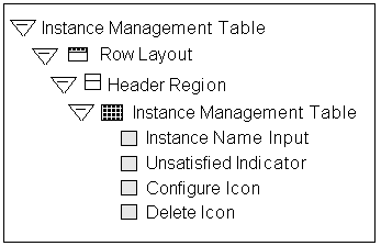
In this template, Instance Name Input is a Text Input element, while Configure Icon and Delete Icon are both Image elements. For details about these and other UI elements, see Introduction to User Interface Structure and Design.
Outer Page Templates
Use an Outer Page Template to display specific content on all pages in a UI, or only on pages that you specify. For example, you may want to use an Outer Page Template to display branding information for a product on every page at runtime, or only on pages in which an image of that product appears.
The Outer Page Template setting in a UI Master Template specifies the template to use. This setting is described in Pagination and Layout Section. When a UI Master Template that specifies an Outer Page Template is used to create a UI, all pages display the Outer Page Template’s content (in addition to any other page content) by default at runtime.
Additionally, an Outer Page Template setting appears in the following locations when you are editing a UI in Configurator Developer:
-
UI Definition details page: At this level, the Outer Page Template setting specifies the template that is used by all UI Pages by default. This setting is derived from the UI Master Template that was used to create the UI. Modifying this setting affects all UI Pages whose Outer Page Template setting is set to Use UI Default.
-
UI Page details page: This setting specifies the Outer Page Template that is used by the selected UI Page. The default is Use UI Default, which means the Page uses the template specified in the UI Definition details page. You can select a different Outer Page Template, or select None if you do not want the selected Page to use an Outer Page Template.
For details, see Creating a User Interface Page.
The predefined Outer Page Template is described in Outer Template with Status Region. If the Outer Page Template setting in your UI Master Template specifies this template, then by default each page displays a list of all unsatisfied and invalid items in the configuration at runtime.
To create an Outer Page Template, see Creating a User Interface Content Template.
When defining an Outer Page Template’s content, be sure to create a Page Include Region element. This element displays the content of the UI Page.
When creating a Page Include Region in an Outer Page Template, you cannot specify a Target Page or an Associated Model Node. This is because:
-
The Page Include Region’s target (included) page is the page that uses the Outer Page Template
-
The Page Include Region’s Associated Model Node is inherited from the page that uses the Outer Page Template
Page Include Regions are described in Page Include Region.
Specifying How a User Interface Uses Content Templates
The Template Usage setting controls how UI Content Templates are used by a generated UI. You can specify a Template Usage in the following sections of a UI Master Template: BOM Content, Non-BOM Content, Utility Templates, and Message Templates.
Following are the available Template Usages:
-
Incorporate by Reference: Select this setting if you want the UI to reference the the templates when displaying their content at runtime. In other words, the UI structure will contain a reference to each UI Content Template that uses this setting, and any changes to the template automatically appear at runtime when unit testing the UI from Configurator Developer.
This is the default setting for the predefined UI Master Templates.
In the UI structure, elements that are incorporated by reference appear as UI Template References. See User Interface Template References.
-
Copy to UI as Page Content: Select this setting to copy a UI Content Template’s structure into the UI. When you select this option, the template is used only to create page content (UI elements) that can be edited manually in the User Interface area of the Workbench. The advantage to this is that multiple copies of page content can be made from a single UI Content Template, and you can then modify the content as necessary.
Note: Message, Summary Page, Page Status Area, Outer Page, and Button Bar templates cannot be copied as page content. These templates can only be incorporated by reference and loaded as needed at runtime. Additionally, some predefined templates reference another template (for example, the Multi-Select BOM Item Table with Header template). A nested template is still referenced after you generate a UI, even when you select Copy to UI as Page Content for the parent template.
Copying a Template as Page Content
One template might not meet your needs for all Model nodes of a given type (as defined in the Master UI Template). Therefore, you may want to copy certain classes of template content into a UI Page when generating a UI, or convert individual template references into page content after generating the UI.
For example, when you generate a UI, Configurator Developer uses a single Control Template for all single-selection BOM Option Classes without quantity input. However, depending on how they are used in the Model, you may want some BOM Option Classes to be drop-down lists and some to be radio button groups. Or, you may want to display different sets of Property columns in Item Selection Tables that display different BOM Option Classes. By copying the template into the UI as page content, you can make these changes by editing the generated UI.
For more information, see:
The Predefined Button Bar UI Content Templates
These templates display buttons that appear:
-
In various messages (for example, Yes, No, and Cancel)
-
In a transaction flow (for example, Cancel, Preview Configuration, and Apply)
-
In the Connections Chooser page (for example, Cancel, Set, and Clear)
These templates appear in the predefined Button Bar Templates Folder in the Main area of the Repository.
Note: The predefined Button Bar Templates do not provide a button to perform an intermediate save during a configuration session. Do not add a Save button or link to a template or custom UI unless you know that the host application supports this action.
Basic Transaction Button Bar
This template displays the following buttons every page: Cancel, Preview Configuration, Apply, and Finish. Recalculate Price and Availability buttons also appear if pricing and ATP are enabled. See Displaying Prices and Available to Promise Dates.
A Return button also appears when nested transactions are disabled in the configuration and the end user "drills down" to configure a subcomponent. This button navigates directly to the page from which the nested transaction orginated.
For details about disabling nested transactions, refer to the description of the Transaction Management setting in Pagination and Layout Section.
Connection Chooser Button Bar
This template displays buttons that appear in the Connection Chooser page. They include Cancel, Set Connection, and Clear Connection.
This template is used only by the Connection Chooser Template and is not available as a setting in a UI Master Template. The Connection Chooser Template is described in Connection Chooser Template.
Preview Page Button Bar
This template displays the buttons that appear in the Configuration Summary page. These buttons are labeled Cancel, Return to Configuration, and Finish.
For more information, see The Configuration Summary Page.
Step-by-Step Navigation Bar
This template displays the following buttons on every page at runtime: Cancel, Back, Next, and Preview Configuration. Either a Finish or Apply button appears on the last page of a transaction flow, depending on the nesting level. For a definition of nested structure, see Defining Custom Pagination and Layout.
If pricing and ATP are enabled, Recalculate Price and Availability buttons also appear. See Displaying Prices and Available to Promise Dates.
A Return button also appears when nested transactions are disabled in the configuration and the end user "drills down" to configure a subcomponent. This button navigates directly to the page from which the nested transaction orginated.
For details about disabling nested transactions, refer to the description of the Transaction Management setting in Pagination and Layout Section.
Two-Page Navigation Bar
This template displays the following buttons on both pages in a task flow containing two pages: Cancel, Continue (on the first page), Back (on the second page), and Preview Configuration. Either a Finish or Apply button also appears on the last page of a transaction flow, depending on the nesting level. For a definition of nested structure, see Defining Custom Pagination and Layout.
If pricing and ATP are enabled, Recalculate Price and Availability buttons also appear. See Displaying Prices and Available to Promise Dates.
A Return button also appears when nested transactions are disabled in the configuration and the end user "drills down" to configure a subcomponent. This button navigates directly to the page from which the nested transaction orginated.
For details about disabling nested transactions, refer to the description of the Transaction Management setting in Pagination and Layout Section.
Yes or No Confirmation Button Bar
This template displays Yes and No buttons that appear in messages created by the various Message Templates. This template is referenced by the Message Templates and is not available as a setting in a UI Master Template.
The predefined Message Templates are described in The Predefined Message UI Content Templates.
The Predefined Control UI Content Templates
Control templates display UI controls for the various types of selectable nodes in your Model. For example, all of the predefined UI Master Templates use a Multi-Select BOM Item Table for BOM Standard Items that are not mutually exclusive and require a quantity.
These templates appear in the predefined Control Templates Folder in the Main area of the Repository.
The Runtime Display Name setting in the General area of the Workbench determines the default caption for each UI control. For details, see Runtime Display Names.
All of the predefined Control Templates are available as choices when you are defining or customizing a UI Master Template, except where indicated. For details, see UI Master Template Information and Settings.
BOM Item Table Control Templates
These templates display Required Single Instance Model References, BOM Option Classes, and BOM Standard Items in a table. (For details about the Required Single Instance setting, see Instances.) For example, when an Item Selection Table is associated with a BOM Option Class, the BOM Option Class’s children appear as the rows of the table.
Select a template based on whether you want to display quantities, and whether end users can select only one or multiple options.
Following are the available BOM Item Table Templates:
-
Single-Select BOM Item Table: This template displays a table containing mutually exclusive BOM Standard Items which users select using radio buttons. The table provides a field for entering a quantity, shows each option’s selection state, logic state, description, and pricing and availability (if pricing and ATP are enabled).
-
Single-Select BOM Item Table without Quantity: Same as the preceding template, but the table generated by this template does not provide a field for entering a quantity.
-
Multi-Select BOM Item Table: Same as the Single-Select BOM Item Table template, but this template is used for BOM Standard Items that are not mutually exclusive. (In other words, users select options using check boxes, rather than radio buttons.)
-
Multi-Select BOM Item Table without Quantity: Same as the preceding template, but does not provide a field for entering a quantity.
BOM Item Status Region Template
This template displays the status, quantity, price and ATP information for a single BOM item.
This template is referenced by the Message Templates and is not available as a setting in a UI Master Template.
Instance Management Control Templates
These templates display UI controls for instantiable Components, BOM Model References, and non-BOM Model References and are available when defining BOM and non-BOM content settings. See UI Master Template Information and Settings.
Following are the Instance Management Control Templates:
-
The BOM Single Instance Control template displays a check box and button to enable an end user to select and configure an optional single instance of a BOM Model. Therefore, the end user can add only one instance of the BOM Model to the configuration at runtime. (The Optional Single Instance setting is described in Instances.)
-
The Single Instance Control template displays a check box and a button to enable an end user to select and configure an optional single instance of a Component or Reference to a non-imported Model. (An optional single instance means the end user can add only one instance of the Component or Reference.) This template is the default for instantiable Components and non-imported Model References that are defined as having an optional single instance. See Customizing the Display of BOM Content.
-
The BOM Instance Management Table template displays a table with a Quantity field and buttons to configure and add multiple instances of a BOM Model Reference.
-
The Instance Management Table template displays a table with buttons to configure and add instances of a Component or non-imported Model References to a non-imported Model that can have multiple instances. The structure of this template is shown in Structure of the Instance Management Table UI Content Template.
An example of how this element might appear at runtime is shown in An Instance Management Table at Runtime.
An Instance Management Table at Runtime
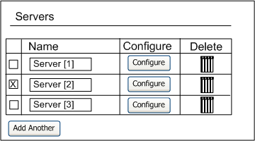
The controls in an Instance Management Table apply only to entire instances, and do not show the content of the instances (such as Features belonging to those instance nodes). If you want to display the content of an instance on a page that is the parent of those instances, then use an Instance List Layout Region. See Instance List Layout and Displaying Optionally Instantiable Component Details on a Parent UI Page for more information.
Counted Option Table Templates
These templates display a table for Option Features that allow end users to enter quantities for selected options. For details, see Option Features.
Use the Single-Select Counted Option Table template to display a table that has a Select column with radio buttons, a Quantity column containing input fields, and a Description column that displays read-only text.
The Multi-Select Counted Option Table template displays a table similar to the one described above but displays check boxes, rather than radio buttons, in the Select column.
Dynamic and Non-Dynamic Drop-Down Control Templates
These templates display a drop-down list for mutually exclusive BOM Option Classes and Option Features whose Maximum Selections are set to 1. For example, a drop-down list that is associated with an Option Feature node displays all of the Feature’s Options as items in the list.
In the Non-Dynamic Drop-down template, the default Excluded Items Suffix is "[x]" (without the quotes). At runtime, Oracle Configurator inserts a space between the item’s display name and the suffix.
By default, these templates do not show price and availability (ATP) information. To display pricing and ATP within these templates, you can copy one of the predefined templates and customize it to display the pricing and ATP data, or create a new template from scratch. For details, see:
Enhanced Check Box Group and Enhanced Radio Button Group Control Templates
These templates use image-based versions of check boxes and radio buttons to indicate logic state of options for BOM structure and Option Features. These templates display all options in a group and indicate each option’s selection state using the images specified in the Images page of a UI Master Template. For details, see Images Section.
Boolean Feature Check Box Template
This template displays a check box that indicates a Boolean Feature’s selection state. You specify the icons used to display status in the Images page of a UI Master Template. See Images Section.
For more information about Boolean Features, see Boolean Features.
Numeric Input Template
This template displays an input field for a Decimal or Integer Feature. At runtime, the input field accepts either a decimal or an integer value, depending on the Feature’s type.
Text Input Template
This template displays an input field that accepts alphanumeric values for all Text Features in your Model.
This template supports an Initial Value that occupies only one line at runtime. If you need to insert one or more hard returns when specifying a Text Feature’s Initial Value in Configurator Developer, create a new UI Content Template for Text Features (for example, by copying the predefined Text Input template), and then open it for editing. Open the Text Input element for editing, and then change the "Display Height (in lines)" setting to the number of rows that the Text Feature’s Initial Value requires at runtime (for example 3). Update your UI Master Template to use the new template, and then generate a UI.
Read-Only Text Data Template
This template displays a read-only value for Totals and Resources. You can also use this template for read-only presentation of Numeric Features.
Connection Control Template
This template displays a Choose Connection button that enables end users to connect components at runtime.
When you generate a new User Interface, Configurator Developer generates a connector control for each Connector in your Model. This control appears in the Connector’s parent page and enables an Oracle Configurator user to connect the component to another Model instance at runtime. If a connection is required, an unsatisfied indicator image appears in the control at runtime. For details about indicator images, see Status Indicator Images.
For general information about connectivity, seeIntroduction to Connectivity.
Connection Chooser Template
This template displays a list of Model instances to which a component can be connected at runtime, and provides buttons that allow an Oracle Configurator end user to set or clear an existing connection. The list appears when an end user clicks a button to create a connection.
Connection Navigator Template
This template displays a table containing a list of components that are connected to the associated Component or Model at runtime. Each component appears as a link the end user can click to navigate to that component.
Generating a UI does not create this type of UI element automatically. If you want to display a Connection Navigator Table on a page at runtime, you must create it in the User Interface area of the Workbench. See Creating a Connection Navigator Table.
The Predefined Message UI Content Templates
These templates display the messages that appear at runtime. For a description of how a UI Master Template uses these templates, see Message Templates Section.
These templates appear in the predefined Message Templates Folder in the Main area of the Repository.
The following types of messages are available:
-
A Message Box appears at the top of the current page, above the page content. You may want to display validation warnings and notifications using a Message Box, for example, as it conveys useful information but allows the end user to continue without acknowledging the message.
-
A Modal Message Box appears at the top of a page, but prevents any actions in the page until the end user acknowledges the message (for example, by clicking Yes or No). The Overridable Contradiction Modal Message Box template displays this type of message.
-
When a message appears as a Dialog Page, its content fills the entire page. In this case, the end user must acknowledge the message before proceeding.
Following is a description of each predefined Message Template.
Notifications Message Box Template
This template displays a Message Box that includes validation messages, pricing and ATP notifications, and any messages generated by Configurator Extensions.
Invalid Input Message Box Template
This template displays the message that appears when and end user enters an invalid value at runtime (for example, when a user enters text in a field that requires a numeric value).
Overridable Contradiction Message Templates
These templates display messages that appear when a contradiction occurs at runtime. These messages allow the end user to either confirm or cancel the selection that caused the contradiction.
Depending on the type of message you want to display, use either the Overridable Contradiction with Confirmation Dialog Page template or the Overridable Contradiction with Confirmation Modal Message Box template. For a description of each message type, see The Predefined Message UI Content Templates.
Non-Overridable Contradiction Message Box Template
This template displays a message that appears when a contradiction requires the end user’s previous action to be cancelled (for example, when the end user makes a selection that causes a resource to be overconsumed).
Confirmation Message Templates
These templates display messages that prompt the end user to confirm a requested action, such as exiting a configuration session when the configuration is incomplete.
Confirm Load Instance Dialog Page Template
The Confirm Load Instance Dialog Page template displays a message that appears when an end user is reconfiguring an installed configuration and navigates to a component that was not loaded in the current configuration session. (See Note below.)
Confirm Edit Instance Dialog Page Template
This template displays a message that appears when an end user is reconfiguring an installed instance and makes a change that requires additional components to be modified in the configuration session. (See Note below.)
Note: For information about reconfiguring installed instances, see the Oracle Telecommunications Service Ordering Process Guide.
Confirm Delete Instance Message Template
This template displays a message that appears when an end user deletes a component from the configuration.
This template is the default for the Confirm Delete Instance setting in a UI Master Template. See Message Templates Section.
Query Delete Instance Dialog Page Template
This template displays a message that appears when an end user deselects or enters a quantity of 0 (zero) for a BOM Model instance. By default, this message contains Yes and No buttons, and the following text: "You have deselected instance name. Do you also want to delete the instance?"
Confirm Save Dialog Page Template
This template displays a message that allows the end user to save an incomplete or invalid configuration.
This template is the default for the Confirm Save/Finish setting in a UI Master Template. See Message Templates Section.
For examples of what can cause a configuration to be incomplete or invalid, see:
Confirm Cancel Dialog Page Template
This template displays a message that appears when an end user clicks Cancel to end a configuration session (that is, without saving the configuration).
This template is the default for the Confirm Cancel setting in a UI Master Template. See Message Templates Section.
Other UI Content Templates
The templates described in this section appear in the predefined Other Templates Folder in the Main area of the Repository.
Combination Status Region Template
This template displays configuration status information when the end user ends a configuration session (for example, by clicking Finish). It displays status messages that indicate whether the configuration is valid and complete or still contains invalid or unsatisfied items.
This template references the Validation Failures List template and the Unsatisfied Items List template to display invalid or unsatisfied items. For details, see:
The Combination Status Region template is not available as a setting in a UI Master Template, but it is referenced by the Summary with Status Region template. The Summary with Status Region template is the default for the Configuration Summary/Preview setting in the predefined UI Master Templates (see Utility Templates Section).
You can create a Combination Status Region manually in the User Interface area of the Workbench, but it is not required in a UI.
Combination Status Region Template with Links
This template displays both unsatisfied and invalid items in the Configuration Summary page as text links. These links allow the end user to navigate to the page on which each item appears.
For more information, see The Configuration Summary Page.
Icon Legend Template
This template displays the default icons that a generated UI displays at runtime to indicate:
-
Each option’s selection state (for example, Auto-Selected, Declined, and so on)
-
Any items that are unsatisfied
These icons are shown in Default Selection State and Status Indicator Images.
This template also displays a UI control that enables end users to hide or show the list of icons and their descriptions.
This template is referenced by other templates, and is therefore not available as a setting in a UI Master Template.
For more information, see:
Outer Template with Status Region
Use this Outer Page Template to display a list of all unsatisfied and invalid items on a UI page at runtime.
For more information, see Outer Page Templates.
Summary Page Templates
The Summary Page templates display the content of the Configuration Summary page. For details about this page, see The Configuration Summary Page.
Which Summary Page template a UI uses depends on whether the Model contains trackable BOM items and the end user is reconfiguring an installed instance. BOM Models that contain trackable items support reconfiguration of installed instances. For more information about reconfiguring installed instances, see the Oracle Telecommunications Service Ordering Process Guide.
If the Model does not contain any trackable BOM items and the end user is not reconfiguring an installed configuration, then the UI uses the Summary with Status Region template. For details about this template, see Summary with Status Region.
If the Model contains trackable BOM items, then end users can reconfigure installed configurations of the selected Model. In this case, the UI uses both of the following Summary Templates:
-
Upgrade Summary with Status Region, Complete: This template is similar to the standard Summary Page with Status Region template, but also displays a Line Type column by default. This template shows all items in the configuration and displays an icon next to items that have been added, removed, or have changed relative to Oracle Install Base. It also provides a button the end user can click to switch to a summary view generated by the template described below (Upgrade Summary with Status Region, Changes Only).
This template is the default for the "Configuration Upgrades Summary Page, Complete" setting in a UI Master Template.
-
Upgrade Summary with Status Region, Changes Only: This template shows only the items that have changed relative to Oracle Install Base, and their ancestors. It provides a button the end user can click to switch back to the summary view generated by the template described above (Upgrade Summary with Status Region, Complete).
This template is the default for the "Configuration Upgrades Summary Page, Filtered Only" setting in a UI Master Template.
For details about reconfiguring installed instances, see the Oracle Telecommunications Service Ordering Process Guide.
Summary with Status Region
This template displays all items the Oracle Configurator end user has selected in a table in the Configuration Summary page. This table includes the following columns: Item, Name and Quantity. If the UI is set up to display pricing and available to promise (ATP) information, the following columns also appear: Unit List Price, Unit Selling Price, Extended Price, and Availability.
Standard Summary Table
This template displays a table containing the following columns in the Configuration Summary page: Name, Quantity, List Price, Selling Price, Extended Price, ATP.
Unsatisfied Items List
This template displays a list of unsatisfied items. An item is unsatisfied if it must be selected, contains one or more required selections, or requires input to create a complete configuration. For example: an Option Feature whose Minimum Selections is set to 1 is unsatisfied until the end user selects at least one of the Feature’s Options.
The following nodes can be unsatisfied at runtime: BOM Option Classes, Option Features, Connectors, and Text Features.
The Summary Page templates also refer to this template to display unsatisfied items in the Configuration Summary page. The Configuration Summary page is described in The Configuration Summary Page. The Summary Page templates are described in Summary Page Templates.
To display each item as a link that an end user can click to navigate to the item, use the Unsatisfied Items List with Links template. See Unsatisfied Items List with Links.
Unsatisfied Items List with Links
This template displays a list of unsatisfied items as text links. These links allow the end user to navigate to the page on which each unsatisfied item appears. For more information about unsatisfied items, see Unsatisfied Items List.
For more information, see Displaying Unsatisfied and Invalid Items as Links in the Configuration Summary Page.
Upgrade Summary Table, Changes Only
This table includes the following columns: Name, Quantity, Current Value, Installed Value, Line Type, List Price, Selling Price, Extended Price, ATP.
Upgrade Summary Table, Complete
This table includes the following columns: Name and Changed Item, Quantity, Current Value, Installed Value, Line Type, List Price, Selling Price, Extended Price, ATP. The table also displays a Changed Indicator icon next to each item.
Validation Failures List
This template displays a list of invalid items. Examples of invalid items include an over-consumed Resource (value is less than zero), a Numeric Feature with a value that is not within the range specified in Configurator Developer, and a quantity that is outside the range defined for a BOM item.
The Summary Page templates also refer to this template to display invalid items in the Configuration Summary page. The Configuration Summary page is described in The Configuration Summary Page. The Summary Page templates are described in Summary Page Templates.
To display each invalid item as a link that an end user can click to navigate to the item, use the Validation Failures List with Links template. See Validation Failures List with Links.
Validation Failures List with Links
This template displays a list of invalid items as text links. These links allow the end user to navigate to the page on which the invalid item appears. For examples of invalid items, see Validation Failures List.
For more information, see Displaying Unsatisfied and Invalid Items as Links in the Configuration Summary Page.
Referencing a User Interface Content Template
By default, the predefined UI Master Templates reference UI Content Templates. The benefits of referencing a template, rather than copying it into a UI as content, include:
-
The template can be shared by multiple UIs simultaneously
-
Changes to a template automatically appear at runtime in any UIs that reference the template
For details, see Specifying How a User Interface Uses Content Templates .
The predefined UI Content Templates appear in the Main area of the Repository in the UI Templates Folder. However, you can store UI Content Templates that you create anywhere in the Main area of the Repository.
You select from the available UI Content Templates when creating or modifying a UI Master Template. For example, from the Message Templates page in a UI Master Template, you click Choose to select a template for displaying overridable contradiction messages. When you do this, Configurator Developer displays all UI Content Templates that are stored in the Content Templates Folder in the Main area of the Repository. You then expand sub-Folders to locate and select the template you want to use.
UI Content Templates must be published to make them available to a runtime Oracle Configurator that is launched from a host application (such as Oracle Order Management). All Content Templates that a UI references are published automatically when you publish a Model and UI. See Creating a New Model Publication.
For more information, see:
Displaying Pricing and ATP Using a UI Content Template
The predefined non-BOM Control Templates do not show pricing and Available to Promise (ATP) information, even if pricing and ATP is enabled. If you want to show pricing and ATP information for non-BOM nodes, you must create your own templates. See Creating a User Interface Content Template.
If you want to show pricing or ATP information for BOM nodes using one of the predefined UI Content Templates, use a template that displays content in a tabular format, rather than one that displays items in a radio button or check box group. In other words, the UI Master Template you select should use the Standard Layout. If your UI Master Template uses the Compact Layout, pricing and ATP information does not appear when you generate the UI. This setting is described in BOM Content Section.
If you use a custom UI Content Template (that is, one that you created), you can display prices and ATP information using other types of UI controls, such as radio buttons or other types of layout.
If pricing or ATP is not enabled, any related columns or buttons that are provided by the predefined Content Templates do not appear at runtime. If you are using a custom UI Content Template, it is recommended that you define a display condition to hide or disable pricing and ATP columns and UI controls whenever pricing or ATP is disabled.
To do this, the define a condition and specify Configuration Session as the object, and then select one of the following session properties:
-
PricingEnabled
-
ListPriceEnabled
-
SellingPriceEnabled
-
ATPEnabled
-
PriceAndATPDisabled
For more information, see: