Drawers
A drawer is an extension of a panel. You can open and close a drawer in the same way that you can show and hide a panel. A drawer can contain all panel objects, including launchers, menus, applets, other panel objects, and other drawers. When you open a drawer, you can use the objects in the same way that you use objects on a panel.
The following figure shows an open drawer that contains two panel objects.

The arrow on the drawer icon indicates that the icon represents a drawer or menu.
You can add, move, and remove objects from drawers in the same way that you add, move, and remove objects from panels.
To Open and Close a Drawer
To open a drawer, click on the drawer object in a panel. You can close a drawer in the following ways:
-
Click on the drawer.
-
Click on the drawer hide button.
To Add a Drawer to a Panel
You can add a drawer to a panel in the following ways:
-
From the panel popup menu
Right-click on any vacant space on the panel, then choose Add to Panel -> Drawer.
-
From any menu
You can add a menu as a drawer object to a panel.
To add a menu as a drawer to a panel, open the menu from the panel. Right-click on any launcher in the menu, then choose Entire menu -> Add this as drawer to panel.
To Add an Object to a Drawer
You add an object to a drawer in the same way that you add objects to panels. For more information, see To Add an Object to a Panel.
To Modify Drawer Properties
To modify preferences for all panels and drawers, choose Applications -> Desktop Preferences -> Advanced -> Panel, then make the changes that you require. For example, you can select various options related to the appearance and behavior of objects on panels and drawers. You can also select options that relate to drawers only. For example, you can select an option to close your drawers when you click on a launcher in the drawer.
You can also modify other properties for each individual drawer. You can change features for each drawer, such as the visual appearance of the drawer and whether the drawer has hide buttons.
To modify properties for a drawer perform the following steps:
-
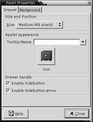
Right-click on the drawer, then choose Properties to display the Panel Properties dialog. The dialog displays the Drawer tabbed section.

-
Select the properties for the drawer in the dialog. The following table describes the elements on the Drawer tabbed section:
Dialog Element
Description
Size
Select the size of the drawer.
Tooltip/Name
Use this text box to specify a name for the drawer. The name appears as a tooltip when you point at the drawer on the panel.
Icon
Choose an icon to represent the drawer. Click on the Icon button to display an icon selector dialog. Choose an icon from the dialog. Alternatively, click Browse to choose an icon from another directory. When you choose an icon, click OK.
Enable hide button
Select this option to display a hide button when the drawer opens.
Enable hide button arrow
Select this option to display an arrow on the hide button if the hide button is enabled.
-
You can use the Background tabbed section to set the background for the drawer. For information on how to complete the Background tabbed section, see the step on this topic in To Modify Panel Properties. You can also drag a color or image on to a drawer to set the color or image as the background of the drawer. For more information, see To Drag a Color or Image to the Background of a Panel.
-
Click Close to close the Panel Properties dialog.
- © 2010, Oracle Corporation and/or its affiliates
