60 Creating a Look and Feel for Portals
This chapter describes how to use the various features available in WebCenter Portal, such as page templates and skins, to create the look and feel for a portal. The chapter also describes how to optimize the look and feel of a portal for displaying in mobile devices.
This chapter includes the following topics:
Permissions:
This chapter is intended for web developers who want to utilize WebCenter Portal features to create a compelling look and feel to the portals in their organization.
To work with the features that control the look and feel of portals, you must have the application-level Create, Edit and Delete permission on the appropriate assets. Users with the Application Specialist role automatically have these permissions. For more information about application-level permissions, see the "Understanding Application Roles and Permissions" section in Oracle Fusion Middleware Administering Oracle WebCenter Portal.
60.1 About Creating a Look and Feel
One of the roles of a web developer is to create a compelling corporate look and feel that can be applied across all portals to provide a consistent, branded appearance for an organization's web presence.
There are several technologies involved with creating a look and feel:
-
HyperText Markup Language (HTML) is the main language for displaying web pages and other information that can be displayed in a web browser.
-
Cascading Style Sheets (CSS) provide a simple mechanism for ensuring a consistent look and feel or adding style, such as fonts, colors, and spacing, to web documents. CSS allows you to separate content from presentation, improving accessibility, and allowing you to easily render content for different situations (for example, for mobile phones or screen reader devices).
-
JavaScript is a scripting language commonly implemented as part of a web browser in order to create enhanced user interfaces and dynamic web sites.
-
Oracle Application Development Framework (ADF) provides a range of technologies aimed at making Java EE application development faster and simpler for developers while at the same time taking advantage of proven software patterns to ensure that the developed application is scalable, performant, and the like.
-
Expression Language (EL) provides a shorthand way of working with web application data by providing operators for retrieving and manipulating application data residing in a Java EE web container.
WebCenter Portal provides the following features that utilize these technologies to control the look and feel of the application, individual portals, pages, components, and content:
-
Page Templates define the structure and layout of pages. A page template typically includes a header on top of the page; a navigation structure at the top of the page or in a sidebar to link to important targets; a content area; and footer at the bottom of the page.
For more information on page templates, see Chapter 21, "Working with Page Templates."
-
Navigation provides links to access content in a portal or external resources. For example, a portal might include a series of tabs or menus along the top of each page, a tree structure or list of links on the side of each page, or a trail of breadcrumbs showing the path a user has taken to reach the current location in a portal.
For more information on navigation, see Chapter 22, "Working with Portal Navigation."
-
Skins define colors, fonts, and other aspects to give individual portals or the entire WebCenter Portal application a distinct personality or to provide specific branding.
For more information on skins, see Chapter 24, "Working with Skins."
-
Page Styles describe the layout of a newly created page and may also dictate the type of content the page supports. For example, the Wiki page style provides an instant wiki; a Blank page style has few restrictions on the types of content users can add to the pages that are based on it.
For more information on page styles, see Chapter 25, "Working with Page Styles."
-
Content Presenter Display Templates define the style and layout for the selected content.
For more information on Content Presenter display templates, see Chapter 26, "Working with Content Presenter Templates."
60.2 Tips on Defining Page Templates
This section includes the following topics:
60.2.1 Page Template Layout
The biggest challenge in page template design is how to lay out components, both elements of the template and page content. There are two basic strategies:
-
Flow layout—Components have fixed sizes and are arranged side by side. If necessary, the browser displays scroll bars.
-
Stretch layout—Components are stretched to occupy the available space on the page. If necessary, individual components display scroll bars (which might mean that you have multiple scroll bars on one page). Stretching enables you to maximize the usage of the viewable area. Use tabs, accordions, menus, and popups to virtually expand your viewable area.
Because most web sites use a flow layout, you will probably also want to use a flow layout as it will likely feel more familiar to your users. However, stretch layouts are good for dashboards and applications that are rich in nature or when you want to mimic a desktop experience. You can also combine flow and stretch layout on the same page.
Depending on the strategy you use, the vertical behavior of the page differs:
-
Flow layout:
-
The header and/or footer might not always be visible
-
The height of the page is calculated based on the components
-
The content is never stretched vertically
-
The browser might display a scroll bar
-
-
Stretch layout:
-
The header and footer are always visible
-
The height of the page is determined by the browser window
-
The content is stretched vertically
-
The content might display a scroll bar
-
Depending on the strategy you use, the horizontal behavior of the page differs:
-
Flow layout:
-
If your page includes a side bar (for example, left-side navigation), the side bar might not always be visible
-
The width of the page is calculated based on the components
-
Some components might be stretched to fill up existing space
-
The browser might display a scroll bar
-
-
Stretch layout:
-
If your page includes a side bar (for example, left-side navigation), the side bar is always visible
-
The width of the page is determined by the browser window
-
The content is stretched horizontally
-
The content might display a scroll bar
-
Additional Page Layout Considerations
There are a few additional considerations when defining your page template layout:
-
As a template developer, you control whether the content facet is in a flowing or stretching region of the page, but you cannot control the content. Therefore, page content creators should be aware of the layout strategy and take that into consideration.
-
Because a page template can be changed, create pages and design custom components that display properly in flowing and stretching context.
-
We recommend you use ADF Faces containers to create page layouts, though you can also use Trinidad or HTML tags.
60.2.1.1 Layout Building Blocks
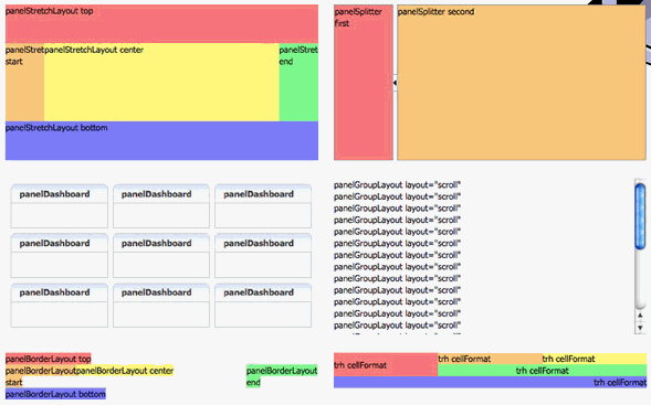
Layout building blocks (shown in Figure 60-1):
-
af:panelStretchLayout—a stretched frame with top, start, center, end, and bottom -
af:panelSplitter—a stretched box divided into two user-modifiable sections -
af:panelDashboard—a stretched, tiled structure of boxes -
af:panelGroupLayout—a series of components - default, horizontal, vertical, scroll structures -
af:panelBorderLayout—a flowing frame with top, start, center, end, and bottom -
trh:tableLayout,trh:rowLayout, andtrh:cellFormat—flowing raw HTML table structure
See Also:
Some of these layout building blocks are discussed in further detail in Chapter 16, "Working with Layout Components on a Page."
For details on what different layout components look like, see the ADF Faces Rich Client demo online tool:
http://jdevadf.oracle.com/adf-richclient-demo/faces/visualDesigns/index.jspx
When viewing a component, select Page or Page Template from the View Source menu to see what tags and attributes are used as well as what the component structure looks like for the page.
60.2.1.2 Tips on Creating Stretch Layouts
Creating stretch layouts:
-
Build outer structure with containers that can be stretched and can stretch their children. Use containers such as
decorativeBox,panelStretchLayoutandpanelSplitterinside yourdocumentcomponent to create the stretchable outer frame.Note:
Each layout or panel component's tag documentation identifies whether it is stretchable and how to achieve it in its "Geometry Management" documentation. Some components have attributes to determine whether children will be stretched or not. For example:
documenthas amaximizedattribute,showDetailItemhas astretchChildrenattribute. -
Create flowing islands. Inside of the stretchable outer structure, create islands of flowing (non-stretched) components. To make this transition from stretching to flowing, use
panelGroupLayoutwithlayout="scroll"orlayout="vertical"since it supports being stretched but will not stretch its children. -
Do not embed stretching components inside flowing islands.
-
Do not stretch something vertically (by using a height with a percent value) when inside a flowing container.
-
Many leaf components do not make sense in isolation. For example, if you have a series of input components, you would never want to just place these in a
panelGroupLayoutbecause it would be much better for usability if you placed them in apanelFormLayoutso the labels and fields align. -
Do not use the
positionstyle.
Note:
The following components are just some of the components that cannot be reliably stretched:
-
Most input components
-
panelBorderLayout -
panelFormLayout -
panelGroupLayout(withlayout="default") -
panelGroupLayout(withlayout="horizontal") -
panelHeader(withtype="flow") -
panelLabelAndMessage -
panelList -
Apache MyFaces Trinidad HTML Component -
tableLayout -
JSF HTML Component -
panelGrid
60.2.1.3 Tips on Creating Flow Layouts
Creating flow layouts:
-
Use non-stretching containers such as
panelGroupLayoutandpanelBorderLayout. You can usepanelBorderLayoutto approximate an HTML table component. -
To avoid multiple scroll bars, do not nest scrolling
panelGroupLayoutcomponents, instead uselayout="vertical". -
Most stretchable ADF components also work in flowing context with
dimensionsFrom="auto". -
To stretch a component horizontally, use
styleClass="AFStretchWidth"(instead ofinlineStyle="width:100.0%").
To approximate an af:div:
<af:group id="pt_navbarright" rendered="#{securityContext.authenticated}">
     <div id="navbarright" class="floatright">
       right side menu stuff...
     </div>
</af:group>
The af:group protects the DOM structure. The div lets you apply CSS styling and positioning.
Working with customizable components:
-
In
panelCustomizable, uselayout="auto"to detect whether to stretch its children. -
To support flow and stretch layouts, use
showDetailFramewithstretchChildren="auto".
60.2.2 Customizing the Appearance of Components
You can customize the appearance of components using the following mechanisms:
-
For custom styling use a declarative approach (theme, hint, or other attribute), for example, make the page dark blue with
af:document'stheme="dark" -
Use themed
decorativeBoxcomponents to organize your page layers with visual distinction and decorative borders as seen in some of the sample skins. Note that not all skins have alternative themes so you may not see any distinction. If yourdecorativeBoxcomponents are not showing up with different colored backgrounds and you know that you are using a skin that has definitions for alternate themes, you might be missing aweb.xmlcontext-paramsetting fororacle.adf.view.rich.tonalstyles.ENABLEDbeing set tofalse. -
Your document component also has a theme attribute so you can use it to change the main background styling of your page.
-
Use a custom skin for consistently modified appearances if the existing skin doesn't provide all that you need.
-
For instance-specific alternative styling, use the
styleClassattribute. Keep the corresponding style definitions in an easy-to-maintain location such as in a custom skin, in themetaContainerfacet of the document component, or in a style provided by the resource tag. -
As a last resort, use component attributes such as
inlineStyle,contentStyle, andlabelStyle. These are less declarative, harder to maintain, contribute more to the page's raw HTML size, and may not even be needed if one or more of the above mechanisms are used.Styles are directly processed by the web browser, which gives you a great deal of power but at the cost of being less declarative and error-prone. Browsers do not support all styles on all elements and certain combinations of styles produce non-obvious results. Here is some guidance on style configurations to avoid:
-
An
inlineStylewith aheightvalue with%units -
An
inlineStylewith awidthvalue between90%and100%(usestyleClass="AFStretchWidth"orstyleClass="AFAuxiliaryStretchWidth"instead) -
An
inlineStylewithheight,top, andbottomvalues -
An
inlineStylewithwidth,left, andrightvalues -
An
inlineStylewith apositionvalue -
In a child being stretched by a parent component, an
inlineStylewithwidthorheightvalues
-
60.2.3 Defining Scrolling
-
You should only have scrollbars around flowing island content. The recommended transition component for switching from a stretching outer frame into a flowing island is the
panelGroupLayoutwithlayout="scroll". If the contents of thispanelGroupLayoutcannot fit in the space allocated, the browser will determine whether scrollbars are needed and will add them automatically. -
Do not nest scrolling
panelGroupLayoutcomponents because this will make the user see multiple scrollbars. Also, this should only be used at transitions from stretching to flowing areas and since you should not have stretching areas inside of flowing areas, you would generally never end up with nested scrollbars. It is best to minimize the number of areas that users must scroll in order to see what they are looking to find. Take time to consider what scrolling users will need. In cases where undesired scrollbars exist, you may want to change thelayoutattribute of thepanelGroupLayouttovertical. -
There is a known scrolling issue that has been filed against Internet Explorer 7.0.5730.11. The issue is only resolved in Internet Explorer 8 when running in pure IE8 rendering mode. If a scrolling box has contents that are set to be as wide as the containing box and if the contents are large enough to warrant the need for a vertical scrollbar, an unnecessary horizontal scrollbar will be added. The browser is failing to adjust the width of the contents for the presence of the vertical scrollbar and thus a horizontal scrollbar appears. This horizontal scrollbar lets you scroll the small amount of space equal to the width of the vertical scrollbar. With this issue, it is not recommended to specify a width anywhere between 90% and 100%. Smaller widths will generally not encounter the bug. Workarounds (as seen in this page) involve setting the widths of the contents to be smaller than full width so that the browser has enough space for a vertical scrollbar to fit. For your convenience, a
styleClassnamedAFStretchWidthis built into the skin to specify that a component with thisstyleClasswill get a reduced width in Internet Explorer 7 or full width in other browsers. If you need a smaller size for a thin auxiliary column, you can alternatively useAFAuxiliaryStretchWidthor you may create a similar skin definition in your own skin as follows:@agent ie and (version: 7.0) { .AFIEOverflowWorkaround75 { width: 75%; } }
60.2.4 Defining Margins, Borders, and Padding
Due to the browser's CSS Box Model Rules, defining margins, borders and padding on components might be complex. Refer to the Navigation-Master-Detail, Tiled Flowing, and Tiled Stretching layout pattern examples for various mechanisms to apply padding.
In many cases, to apply these kinds of styles, you need to use multiple components together. In a scrolling area, adding an extra panelGroupLayout with layout="vertical" with the padding defined on it, inside of the outer layout="scroll" panelGroupLayout, will be required. In a stretching area, you may need to wrap a component inside a panelStretchLayout with spacers in its top, start, end, and bottom facets for the padding.
60.3 Tips on Defining Skins
When skinning WebCenter Portal, you can look at it from coarse-grain and fine-grain standpoint. At the coarse-grain level many large elements on the page, such as the background and the center of the page, can use very basic styling techniques to impart a look and feel to particular corporate brand with very little effort. At the fine-grain level you can apply the styling to specific components and controls within the page. The most efficient way to develop your skin is to start by defining the coarse-grain elements and then use fine-grain styling to tune your overall look and feel to be inline with your corporate brand.
In many cases a hybrid model of styling works very well. Taking the coarse-grained elements (page background, main portion of the body, and so on) and using traditional CSS approaches with those, but then getting specific using the ADF skinning, will work together to generate the overall appearance for WebCenter Portal.
An example of a hybrid approach would be using technology in WebCenter Portal to generate a menu that uses unordered lists and list items, then applying traditional CSS to them. Even though you are benefiting from WebCenter Portal's navigation models, you are not doing traditional ADF skinning – but instead using standard CSS.
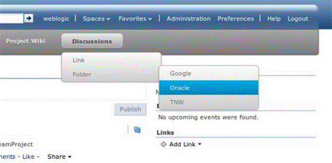
The CSS navigation pictured in Figure 60-2 uses expression language that WebCenter Portal provides to place the various items within the navigation into the markup that WebCenter Portal renders for the client. It then applies coarse-grained styling that uses traditional CSS techniques to style the menu.
Expression Language (EL) allows you to access the various objects for navigation within your template design. Looping in EL is simple and coding is done inline with the page template. You can mix regular HTML directly into the looping markup.
60.3.1 Externalizing Static Assets
When using coarse-grained techniques in addition to ADF styling, it is often helpful to hold various styling assets outside of WebCenter Portal. To do this you can use Content Server to manage all of the unstructured assets for WebCenter Portal. They can include things like CSS and images that you want manage within your environment and provides revision control and workflow. This is a best practice if you want to allow design teams to access and work with WebCenter Portal without involving the development team for each and every change
60.4 Optimizing Portals for Mobile Devices
Responsive Web Design allows web pages to flexibly adapt to different form factors. It has caught fire in the web world as one approach to delivering web content to desktop browsers, tablets, and smart phones.
These techniques enable you to rapidly go from HTML/CSS markup to a portal with similar look and feel. They also improve the experience of using a portal when viewed from mobile devices.
To make WebCenter Portal accessible via smart phones and tablets you can take several approaches:
-
The simplest solution is to leverage your existing WebCenter Portal application with a browser-based option that requires no changes other than ensuring that WebCenter Portal renders within the native browsers of devices. However, this solution might not provide the best user experience.
-
You can leverage your existing WebCenter Portal application by generating HTML based on device profiles, and configuring device-specific templates and pages. This solution might provide a slightly better user experience.
-
For the best user experience, you can create native applications developed using ADF Mobile or native iOS or Android SDK. Although this provides the best user experience, it also requires more up-front development time and more support.
You can use adaptive programming techniques, designing applications to adjust to the available viewport.
When you design a portal, design for a tablet, then scale up the design for the desktop. You should create a separate design for smart phones. Achieve these designs through page templates.
The two most important things to do when designing for mobile devices are:
-
Set the
viewportmeta tag, which causes mobile browsers to set a good initial zoom.Set the
viewportparameter in the parameters section of your page template's page definition as follows:<parameter id="viewport" value="width=device-width, initial-scale=1.0"/>
For information about how to edit the source code of a page template, see Section 20.4.2, "Editing the Source Code of an Asset."
The value of the
viewportparameter is used as the value for thecontentattribute of theviewportmeta tag, so if you set it the recommended value of"width=device-width, initial-scale=1.0", then the following meta tag is added to the page:<meta name="viewport" content="width-device, initial-scale=1.0"/>
-
Set
max-widthon images, which causes images to fit nicely on mobile browsers.Add the following code to your CSS:
img, object {
     max-width: 100%;
}
ADF skins can work with portlets to achieve a common look and feel, but they insert a lot of styles into your HTML, so make sure to create a Reset skin and use the -tr-inhibit property.
Your Reset skin should look like the following:
body {
     color: inherit;
     font: inherit;
}
af|document {
     -tr-inhibit: all;
}
af|commandLink {
     -tr-inhibit: all;
}
af|goLink {
     -tr-inhibit: all;
}
af|inputText::content {
     font: inherit;
}
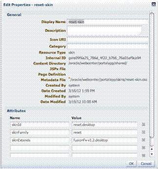
Set the Reset skin to inherit settings from V1.2 ADF skins as shown in Figure 60-3.
Figure 60-3 Reset Skin Inheritance Setting

Description of "Figure 60-3 Reset Skin Inheritance Setting"
CSS3 media queries allow you to write CSS rules specifically for certain situations, such as adapting to small screens or adjusting for orientation. Here is an example of a CSS3 media query:
@media only screen and (max-width: 480px) {
     #content {
          margin: 0;
     }

     #navbarright {
          display: none;
     }
}
ADF Rich Faces provides the following mobile support:
-
Supports iPad
-
DVT components render via HTML
-
Touch gesture support
-
Page size reduced by up to 20%
Although adaptive techniques allow web and tablet design to work, you need to refine your design for phones. Focus on specific smart phone use cases. Build a separate site and separate templates, then build in code to detect smart phones and redirect them to the appropriate design.
Here is an example of a simple JavaScript redirect that can be added to WebCenter Portal's index.html:
<script>
     car Browser = navigator.userAgent;

     if (Browser.indexOf('iPad') > 0)
     {
          location.replace('http://<host>/CustomerAccount/faces/pages_home');
     }
     else if (Browser.indexOf('iPhone') > 0)
     {
          location.replace('http://<host>/CustomerAccount/faces/PhonePage.jspx');
     }
     else {
          location.replace('http://<host>/CustomerAccount/faces/pages_home');
     }
</script>
Here is an example of a manual redirect within the application that displays a message providing a link to the mobile version of WebCenter Portal's welcome page:
#{requestContext.agent.platformName=='windows' ? '' :
'Click <A HREF="http://<host>/myApp/faces/PhoneWelcome.jspx">here</A> to view the mobile site.' }
Here is an example of a redirect within the application that automatically redirects a mobile device to the mobile version of WebCenter Portal:
#{requestContext.agent.platformName=='windows' ? '' :
'<META HTTP-EQUIV="Refresh" CONTENT="0; URL=http://<host>/myApp/faces/PhoneWelcome.jspx">' }
See Also:
For information about to use device settings to determine the page template and skin to use for different mobile devices, see Chapter 9, "Managing Device Groups for a Portal."
For information about how to create alternative pages designed for display on mobile devices, see Section 12.3, "Creating a Page Variant for a Device Group."
60.5 Useful Design Tools
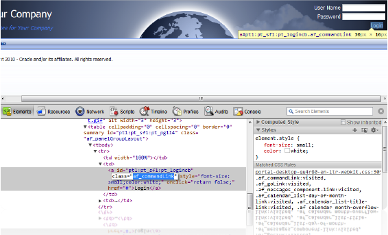
Using visualization and inspection features in chrome and Firefox you are able to work very quickly through the CSS needed to style your work. In addition, CSS3 is very powerful for providing visualizations that previously required images to achieve. For example, you can use a CSS3 generator to expedite designs such as drop shadows and gradients. Finally, using something like JQuery you can manipulate the Document Object Model to achieve any change using client-side technology.
Figure 60-4 shows an example of inspection within Google Chrome. As you hover over the Login link in the upper right-hand corner, you can get a good sense of which styles are being applied to this particular element of the page. This makes it easy to go back and adjust your skin for a particular component. This is an example of fine-grained skinning.


