Scatter charts show the strength of assumption correlations by plotting pairs of values generated during a simulation, one on the Y-axis and the other on the X-axis. The correlation charts shown in Figure 100, Define Correlations Dialog in List View with All Assumptions Added and Figure 101, Define Correlations Dialog in Matrix View, Unlinked are scatter charts between two selected assumptions (Correlation Chart).
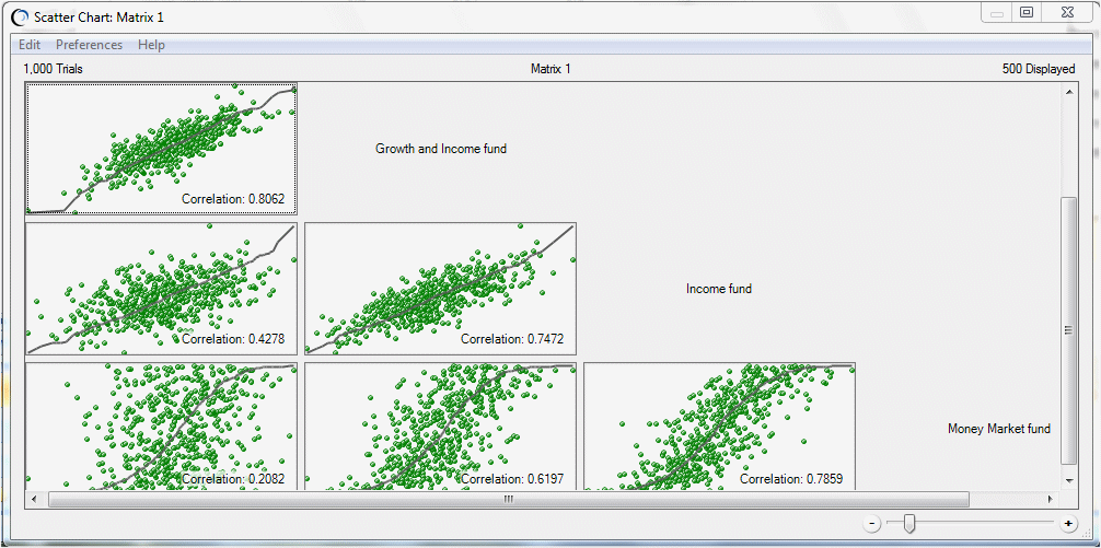
You can also display scatter charts showing correlations among all assumptions in a matrix (Figure 106, Correlation Scatter Chart for the Matrix in Figure 105, Define Correlations Dialog in Matrix View with a Linked Matrix Loaded from the Worksheet).
Figure 106. Correlation Scatter Chart for the Matrix in Figure 105, Define Correlations Dialog in Matrix View with a Linked Matrix Loaded from the Worksheet
 To display a correlation scatter chart:
For more information about scatter charts and how to modify them, see Using Scatter Charts.