Charts are the main analysis tools provided in Crystal Ball. Each chart offers several views and many customization settings to enhance data presentation.
Table 1. Crystal Ball Charts
| Name and Reference | Example | Description |
|---|---|---|
Forecast charts (Analyzing Forecast Charts) |
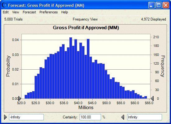
| Forecast charts are the basic tool for Crystal Ball results analysis. They show a range of values representing possible and probable values for a given forecast based on assumption definitions. You can use forecast charts to evaluate the certainty of obtaining a particular value or range of forecast values. You can also fit standard distributions to charted forecasts. |
Overlay charts (Using Overlay Charts) |
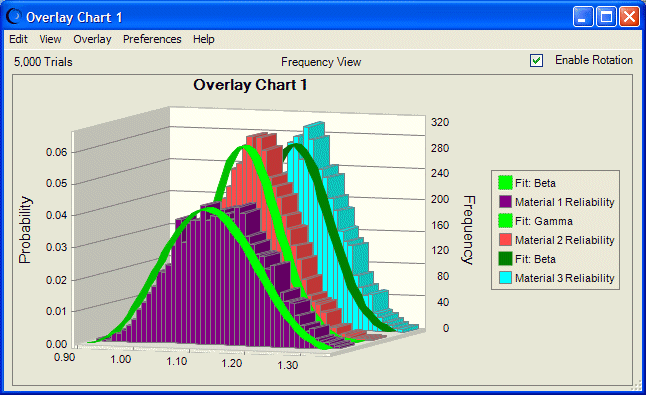
| Overlay charts display frequency data from multiple forecasts in one location so you can compare differences or similarities among them. You can customize them and fit distributions as for forecast charts. |
Trend charts (Using Trend Charts) |
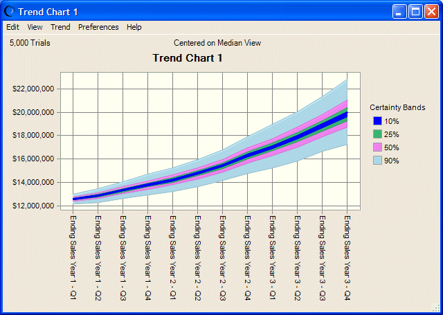
| Trend charts display the certainty ranges of all forecasts on a single chart as a series of patterned bands. For example, the band that represents the 90% certainty range shows the range of values into which a forecast has a 90% chance of falling. |
Sensitivity charts (Using Sensitivity Charts) |
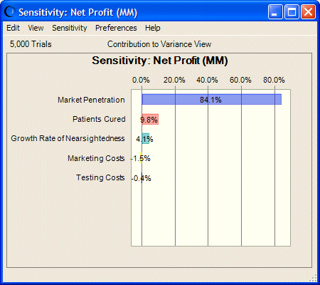
| Sensitivity charts use rank correlations to show the influence of each assumption cell on a particular forecast cell, indicating which assumptions are the most or least important in the model. |
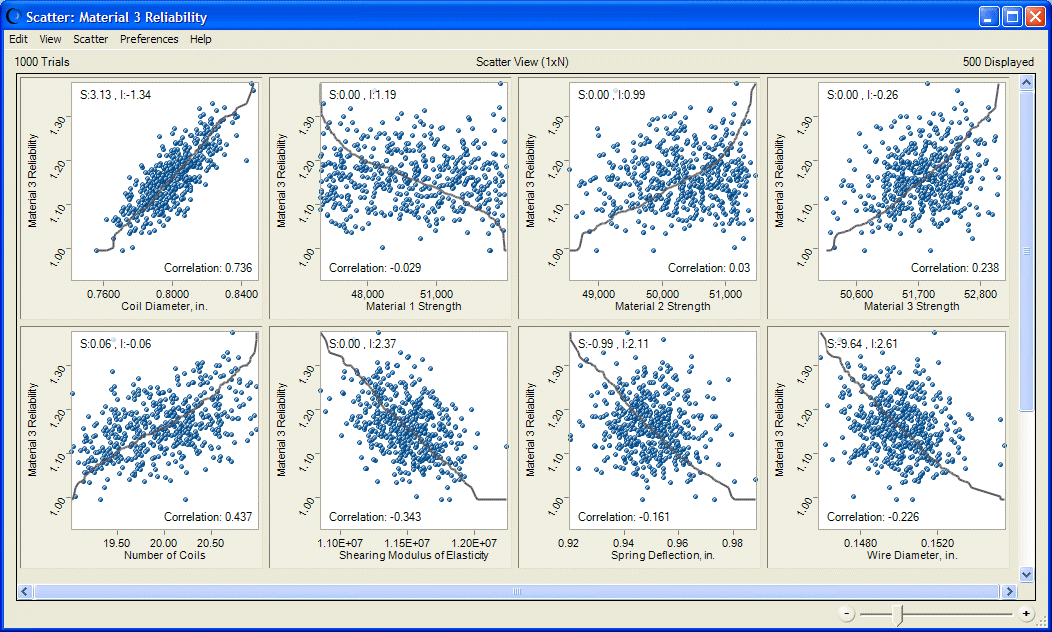
Scatter charts (Using Scatter Charts) |
| Scatter charts show correlations, dependencies, and other relationships between pairs of forecasts and assumptions plotted against each other. Relationships are plotted as a cloud of points or symbols aligned in a grid. In Matrix view, each selected variable is plotted against the other selected variables to show the relationships among them. |
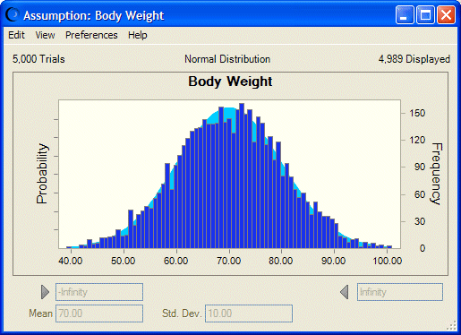
Assumption charts (Using Assumption Charts) |
| Assumption charts show random values for the current simulation layered over the assumption’s ideal probability distribution. They are generated automatically each time a simulation runs. |
OptQuest charts (Goal Optimization with OptQuest) | N/A | OptQuest charts, available in Crystal Ball Decision Optimizer, display variable optimization results. |
Predictor charts (Trend Analysis with Predictor) | N/A | Predictor charts display the results of time-series and linear regression analyses performed by the Predictor tool in Crystal Ball. |