8.2 Understanding Common Page Designer UI Elements
The section describes common UI elements of Page Designer.
Tip:
Developer Navigation tools display in the header region on many Oracle Application Express pages. To learn more, see "Developer Navigation Tools."See Also:
"Using Page Designer"8.2.1 Page Designer Toolbar
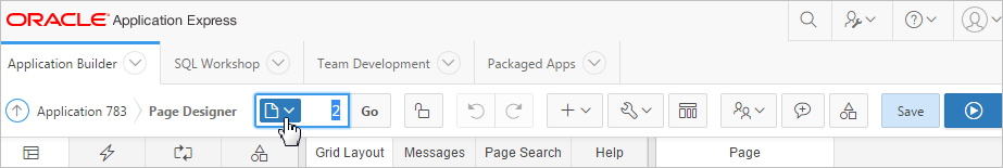
Description of the illustration ''pd_toolbar.png''
The Page Designer toolbar displays at the top of the page. When you pass your cursor over an active button and menu, a tooltip displays as shown in the previous illustration. The Page Designer toolbar features the following buttons and menu options:
-
Page Finder. Displays the Page Finder to search for pages. See "Searching for Pages."
-
Page Unlocked and Page Locked. The Page Unlocked and Page Locked button indicates whether a page is available for editing. If a page is unlocked, the button appears as an open padlock. If the page is locked, the button appears as a locked padlock and the tooltip includes the user who locked the page. A green locked padlock indicates that you have locked the page. A red locked padlock indicates another developer has locked the page. To change the lock status of a page or update the lock comment,, click this button. See "Locking and Unlocking a Page."
-
Undo. Applies to actions that result in a change to the page data. Click Undo to revert the previous change.
-
Redo. Applies to actions that result in a change to the page data. Click Redo to repeat the previously reverted change.
-
-
Page as Copy. See "Copying a Database Application Page in Page Designer."
-
Form Region. See "Creating a Form in Page Designer."
-
Report Region. See "Creating a Report in Page Designer Using a Wizard."
-
Page Component. Provides a summary of how to create page components in Page Designer.
-
Shared Component. See "Managing Shared Components."
-
Page Group. See "Creating Page Groups."
-
Developer Comment. See "Adding Developer Comments."
-
Team Development. Displays the submenus Feature, To Do, and Bug. See "Tracking Features," "Tracking To Dos," and "Managing Bugs."
-
-
Delete Page. See "Deleting Pages in Page Designer."
-
Advisor. See"Running Advisor to Check Application Integrity."
-
Caching. See "Utilizing Region Caching in Page Designer" and "Utilizing Region Caching in Component View."
-
Attribute Dictionary. See "Using the Attribute Dictionary."
-
Export. See "Exporting an Application and Application Components."
-
Cross Page Utilities. See "Utilizing Cross Page Utilities."
-
Application Utilities. See "Using Application Builder Utilities."
-
Page Groups. See "Creating Page Groups."
-
Upgrade Application. See "Running Upgrade Application."
-
-
Component View - Displays the page in Component View. See "Managing Pages in Component View."
-
Tip:
Team Development only displays if this feature is enabled for the workspace. See "Managing Team Development" in Oracle Application Express Administration Guide.-
Features. Links to Create Feature. See "Tracking Features."
-
To Do - Links to Create To Do. See "Tracking To Dos."
-
Bugs - Links Create Bug. See "Managing Bugs."
-
Feedback Entries - Links to the Feedback report. See "Managing Feedback."
-
-
Developer Comments - Displays the View Developer Comments window. See "Adding Developer Comments."
-
Shared Components. Links to the Shared Components page. Shared components can display or be applied on any page within an application. See "Managing Shared Components."
-
Save and Run Page. Saves and then runs the current page. See "Running a Page in Page Designer."
8.2.2 Tree Pane
Description of the illustration ''pd_tree_view.png''
The Tree pane displays in the left pane and displays regions, page items, buttons, application logic (such as computations, processes, and validations), dynamic actions, branches, and shared components as nodes on a tree. The Tree pane features four tabs:
-
Rendering - Displays regions, page items, page buttons, page components, and application logic as nodes in a tree.
-
Dynamic Actions - Displays dynamic actions defined on this page. By creating a dynamic action, you can define complex client-side behavior declaratively without the need for JavaScript. See "Managing Dynamic Actions."
-
Processing - Displays application logic defined on this page. See "Managing Computations, Validations, and Processes."
-
Page Shared Components - Displays shared components associated with this page. See "Managing Shared Components."
The Dynamic Actions and Page Shared Components trees are grouped by event or component type and then ordered by sequence. The Rendering and Processing trees are grouped and ordered based on how Oracle Application Express processes them. This organization enables you to better understand when a component is processed and how the page is laid out. The Rendering and Processing tree have an option to group the nodes by component type. To control how tree components display click the Group by Processing Order or Group by Component Type buttons in the tree header bar.
Key features of the Tree pane include:
-
Context menus. Right-click a component or control to display a context menu.
-
Quick Access to the Property Editor. Select a component or multiple components to display the corresponding attributes in the Property Editor in the right pane.
-
Drag and Drop. Reorder components and controls by dragging and dropping within the tree.
-
Tooltips. Position the mouse over a component or control to view a tooltip of basic information, such as the region type, item type, and so on.
8.2.3 Central Pane

Description of the illustration ''pd_central.png''
The central pane in Page Designer contains four tabs:
-
Grid Layout - Grid Layout is a visual representation of the regions, items, and buttons that define a page. See "Grid Layout." You can add new regions, items and buttons to a page by selecting them from the Gallery at the bottom of the page. See "Gallery."
-
Messages - Displays to right of Grid Layout. When you create components or edit attributes in Page Designer, Messages notifies you of errors and warnings you need to address. See "Messages."
-
Page Search - Displays to the right of Messages. Use Page Search to search all page metadata including regions, items buttons, dynamic actions, columns, and so on. See "Page Search."
-
Help - Displays to the right of Page Search. Help displays Help text for Property Editor attributes. See "Help."
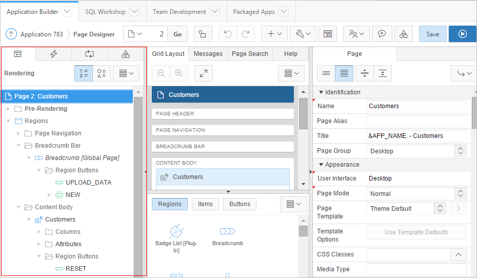
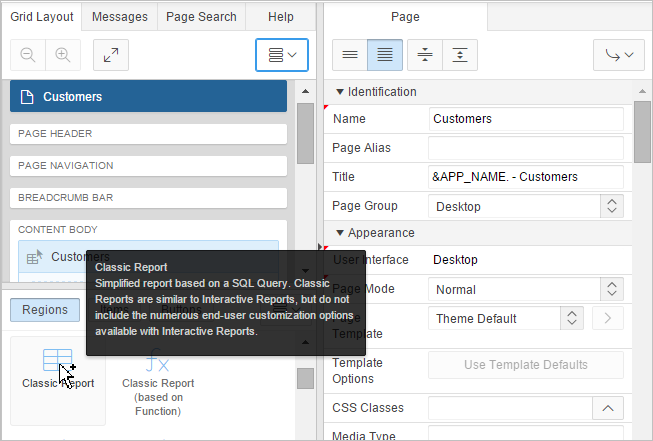
8.2.4 Grid Layout
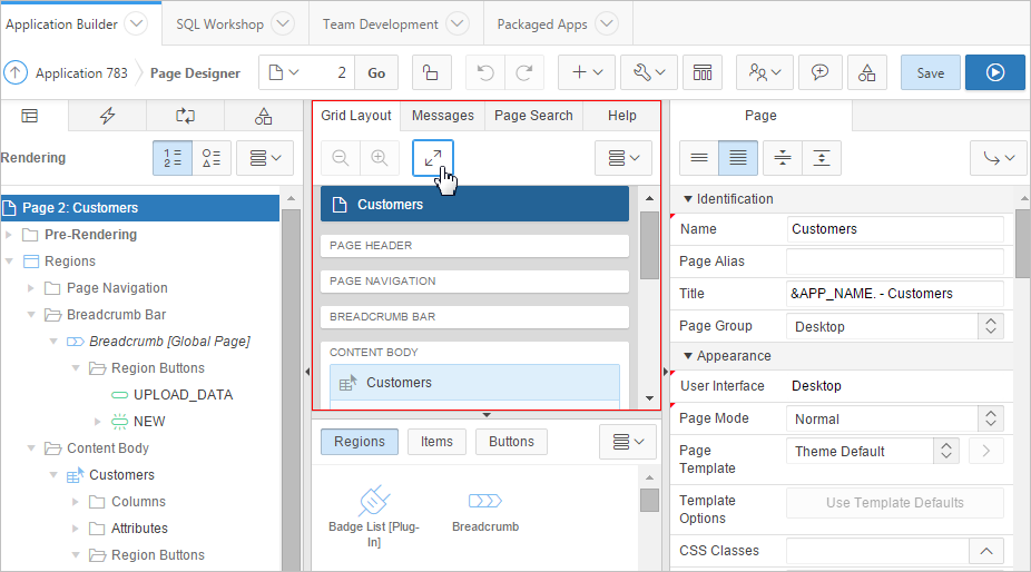
Description of the illustration ''pd_grid_layout.png''
Grid Layout displays in the central pane and is a visual representation of the regions, items, and buttons that define a page. You can adjust the size of Grid Layout using the window splitters. Alternatively, you can click the Expand button to make Grid Layout larger and then Restore to return it to the previous size.
The Grid Layout menu displays on the right side of the pane. Use this menu to customize the type and amount of information that displays and to delete, move, and copy selected components. To have a specific region fill the Grid Layout pane, select the region and select Display from Here from the Grid Layout menu. The selected region fills Grid Layout. To restore the view, select Display from Page.
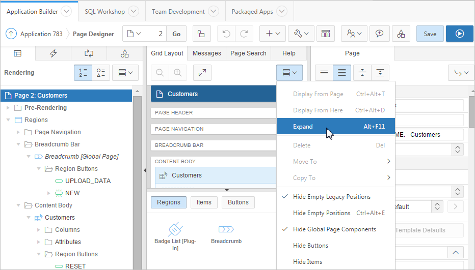
Description of the illustration ''pd_grid_layout_menu.png''
You can move, copy, and reorder regions, items, and buttons by dragging and dropping. You can add new regions, items, and button by dragging them from the Gallery and dropping them to the desired position on the page. When dragging components to a new position, such as dragging an item onto the same line as an exiting item, you need to drag the component into the desired position and wait until the grid changes and the new drop position displays.
Key features of the Grid Layout include:
-
Context menus. Right-click a component or control to display a context menu.
-
Quick Access to the Property Editor. Select a component or multiple components to display the corresponding attributes in the Property Editor in the right pane.
-
Drag and Drop. Create new or move, copy, and reorder regions, items, and buttons by dragging and dropping.
-
Tooltips. Position the mouse over a component or control to view a tooltip of basic information, such as the region type, item type, and so on.
Tip:
Hidden items do not display in Grid Layout, but do display in the Rendering tree.8.2.5 Gallery
Description of the illustration ''pd_gallery.png''
The Gallery displays at the bottom of the Grid Layout pane and features three tabs: Regions, Items, and Buttons. By default, only supported controls and components appear. When you pass the cursor over a control or component, a tooltip displays that describes it. You can add new controls and components to a page by selecting them in the Gallery and dragging and dropping them into Grid Layout.
8.2.6 Messages
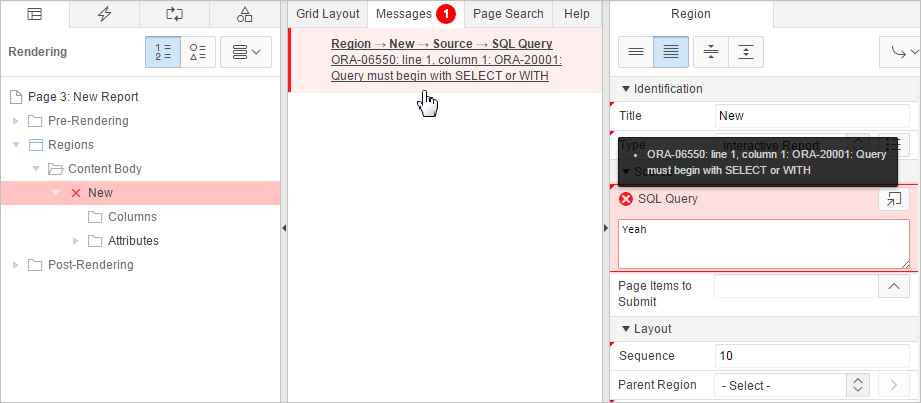
Description of the illustration ''pd_messages.png''
When you create components or edit attributes in Page Designer, Messages notify you of errors and warnings you need to address. The Messages tab displays a red or yellow badge indicating the number of messages you need to address. The Message tab displays two types of messages:
-
Errors - Error messages display in red. Selecting an error message displays the associated attribute in red in the Property Editor. You must address errors before a page can be saved.
-
Warnings - Warning messages display in yellow. Selecting a warning message displays the associated attribute in yellow in the Property Editor. You can save a page without addressing warning messages.
Tip:
Components that have errors or warnings display in red with a X icon or yellow with a triangle icon in both the tree and Grid Layout.8.2.7 Page Search
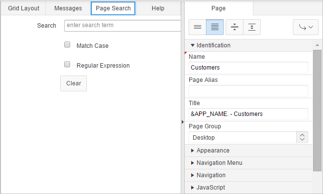
Description of the illustration ''pd_pg_search.png''
Page Search displays to the right of Messages in the central pane. Use Page Search to search all page metadata including regions, items, buttons, dynamic actions, columns, and so on. To search a page, enter a search terms in the field provided. To match the case, select Match Case. To search for a regular expression, select Regular Expression.
8.2.8 Help
Description of the illustration ''pd_help.png''
Page Designer includes Help for every Property Editor attribute. To view Help, select the attribute and click the Help tab. Once you activate the Help pane, the content that displays changes every time you select another attribute.
See Also:
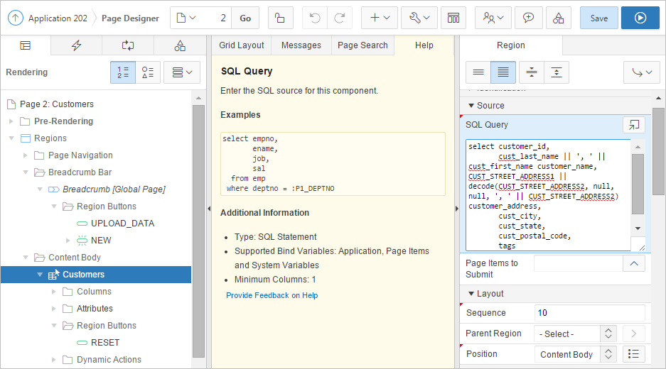
"Viewing Help in Page Designer"8.2.9 Property Editor
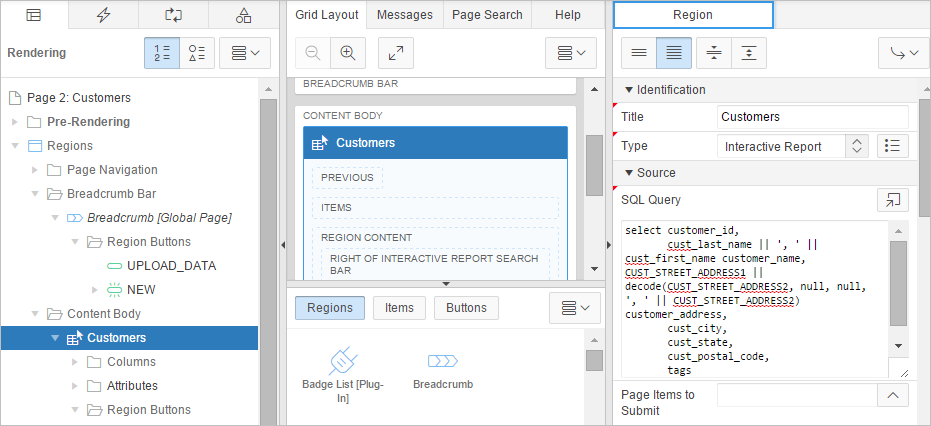
Description of the illustration ''pg_edit_region.png''
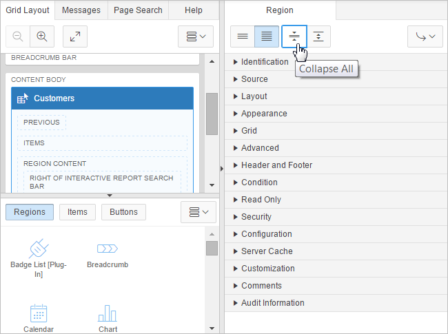
The Property Editor displays in the right pane and displays all attributes for the current component. As you select different components in either Tree View or Grid Layout, the Property Editor automatically updates to reflect the current selection. Attributes are organized into functional groups that describe their purpose. Required attributes display a red triangle in the upper left corner above the attribute label.
You can control the amount of information that displays using the following buttons at the top of the pane:
-
Show Common - Displays only those attributes for which the default value has changed or are commonly edited.
-
Show All - Displays all attributes (default).
-
Collapse All - Shows only functional group headings.
-
Expand All - Shows all attributes under each group heading.
-
Go to Group - Selects to the first attribute in the group you select.
Description of the illustration ''pd_prop_editor2.png''
8.2.10 Code Editor
For attributes requiring large amounts of code (for example, a Region Source), you can:
-
Enter text directly in to the field.
-
Click Code Editor to enter text a full featured code editor.
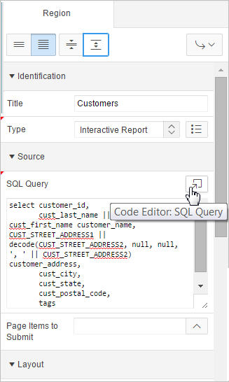
Description of the illustration ''pd_prop_editor3.png''
See Also:
"Accessing the Property Editor"A Code Editor displays as a modal dialog. You use the Code Editor to edit attributes requiring a large amount of code. The Code Editor provides an enhanced code editor to edit PL/SQL, SQL, HTML, CSS, and JavaScript component properties. The code highlighting is determined by the input required for the specific property.

Description of the illustration ''pd_copy_editor.png''
Key features of the Code Editor include:
-
Undo
-
Redo
-
Find
-
Replace
-
Query Builder
-
Autocomplete
-
Validate
-
Syntax highlighting
-
Block indent and unindent
-
Resize dialog
Tip:
To switch to a plain text editor, select Use Plain Text Editor from the Settings menu.