| Oracle® Retail Xstore Point of Service Mobile User Guide Release 20.0 F35714-03 |
|

 Previous |
 Next |
| Oracle® Retail Xstore Point of Service Mobile User Guide Release 20.0 F35714-03 |
|
Previous |
Next |
The interface for Xstore Mobile POS is made up of common elements in any mobile application. These elements include text fields, numeric fields, buttons, links, lists, and menus used to select options, enter data, or open new screens.
Select an element to learn more about its use.
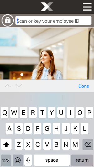
A text field is used for keying in information. When a text field is selected, an on-screen keyboard opens on the mobile device, which you can use to enter the requested information.
Figure 2-1 Text Field with Keyboard Example
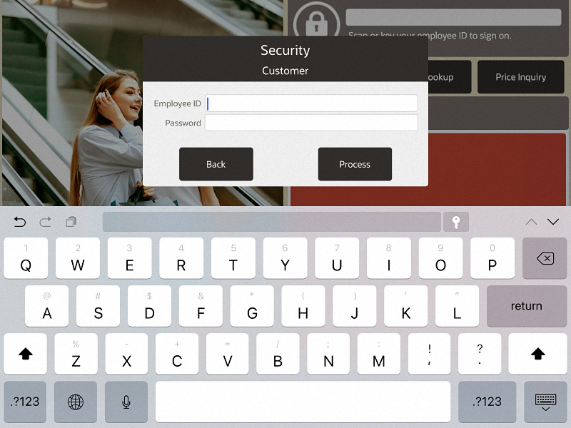
The appearance of the keyboard will depend upon the device on which you run Xstore Mobile POS. An on-screen keyboard is also displayed for alphanumeric entries such as login/passwords and postal codes.
Figure 2-2 Handheld - Text Field with Keyboard Example
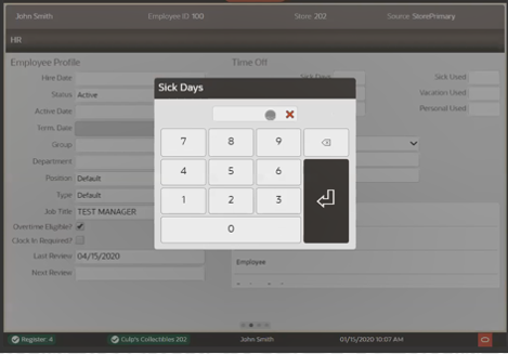
Whenever a numeric entry is required on the Xstore Mobile Handheld, Mobile Tablet, or Thin Client, a prompt displaying the field name is automatically shown. The prompt allows you to enter numbers as required.
Upon completion of a numeric entry the prompt closes.
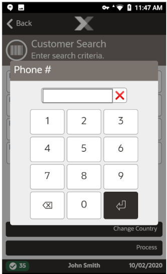
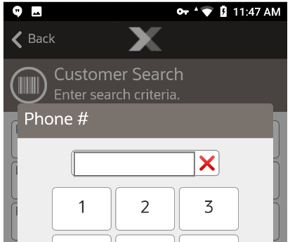
When a phone number entry field is selected, the phone number keypad displays automatically.
By selecting a button on the screen, you select the action that button performs. Buttons can take many forms, depending on their use. Some menu buttons may not be available to every associate. Security configuration determines which options are available to an individual associate.
Table 2-1 Buttons
| Buttons | Description |
|---|---|
 |
Standard Buttons |
|
|
Back Button |
|
|
Context Menu Button |
|
|
Item Lookup Button |
The Back button exits out of the current activity and returns to the previous activity. You are prompted whether to save current work before canceling an action. The text in a Back button may differ and the activity to which it returns depends upon its location in the application.
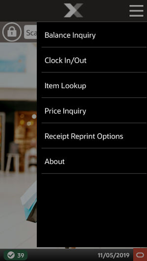
The Context Menu button will not be present on all screens.
When it is present, the Context Menu button (touch icon) will always be in the upper-right hand corner of the screen and opens a context menu showing appropriate options.
The options in the Context Menu itself will depend upon the screen in which it is located. The options available are equivalent to the Function buttons shown on the desktop.
Examples of the Context Menu for the Mobile POS from the home screen are shown below:
Figure 2-6 Context Menu on Mobile Tablet and Thin Client
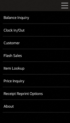
Select the respective option to access the appropriate functionality.
Table 2-3 Mobile Tablet and Thin Client Context Menu Options Home Screen - No Login
| Context Menu Option |
|---|
|
Balance Inquiry |
|
Clock in/Out |
|
Customer |
|
Flash Sales |
|
Item Lookup |
|
Price Inquiry |
|
Receipt Reprint Options |
|
About |
Table 2-4 Mobile Tablet and Thin Client Context Menu Options Within Sale Mode
| Context Menu Option | Sub-Menu Option |
|---|---|
|
Return Item |
n/a |
|
Sell Non-Merch |
Sell Non-Merch |
|
Sell Gift Card |
|
|
Sell Gift Certificate |
|
|
Extended Transaction |
Order |
|
Send Sale |
|
|
Warranty |
|
|
Layaway |
|
|
Special Order |
|
|
Work Order |
|
|
Pre-Sale |
|
|
Hold |
|
|
Register Options |
Balance Inquiry |
|
Reissue Gift Receipt |
|
|
House Account Payment |
|
|
House Account Reversal |
|
|
Redeem Rain Check |
|
|
Assign Gift Registry |
|
|
Lock Register |
|
|
Customer Options |
Assign Customer |
|
Remove Customer |
|
|
View Customer |
|
|
Find Item |
Price Inquiry |
|
Item Lookup |
|
|
Inventory Locator |
|
|
Resume/Suspend Transaction |
n/a |
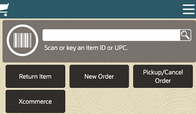
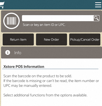
Different buttons provide quick access to functionality from either the Home screen or when you are in the Sale screen. These short cut buttons are not available on Mobile Handheld.
Quick action buttons when in the Home screen include the following functions:
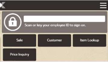
Sale - Selecting the Sale button allows you to enter your login and password and then based on the configuration of the store, either prompt for sales associate and or prompt for customer and then take you into the sales screen.
Customer - Selecting the Customer button gives you quick access to the customers transaction history and not only opens the customer maintenance area but using the Context Menu, you can start a sales transaction with the customer already assigned to the transaction. Known as a Customer Journey, you do not need to exit the customer screens to begin a sale and re-attach the customer.
Item Lookup - Select Item Lookup to search for an item and learn its stock availability, even when the register is closed.
Price Inquiry - Scan or enter an item ID in Price Inquiry to give you the price of that item in an instant.
Quick action buttons when in the Sale screen include the following functions:
Returns
New Order
Pickup/Cancel Order
Xcommerce - See Xcommerce.
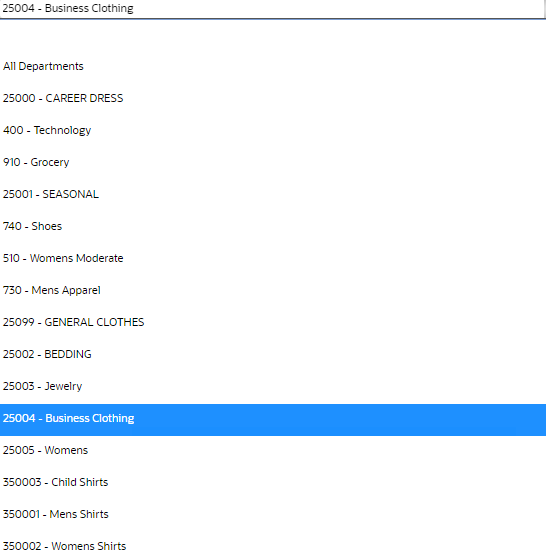
A selection menu displays a list of options among which one item can be picked. Selection menus are generally used as part of a set of entry fields within a form.
A closed selection menu displays the option that has been selected (below).
Figure 2-10 Selection Menu Displaying Selected Option

To change the option selected, select the selection menu to display the list of possible options (right), then select the correct option in the list.
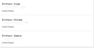
A list displays a series of items. Each item in the list can be selected to open it.
Lists are frequently used to display search results, such as customers returned by a Change Country, or documents returned when you Search for a Receiving Document.
Lists are also used for standard menus throughout the Xstore Mobile POS application.
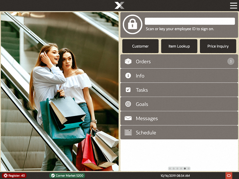
This window displays different messages that are selected by the options and they are equivalent to the tabs at the top of the window on the desktop version of Xstore. Rolling your finger up and down the tab section will give you access to the list selection. Select an option to put it in the focus area. Similarly, the tabs can be swiped left - to - right or vice versa to view each tab. A page indicator towards the bottom of the screen indicates the selected tab.
In a base implementation, Xstore Mobile Tablet and Thin Client displays the following options:
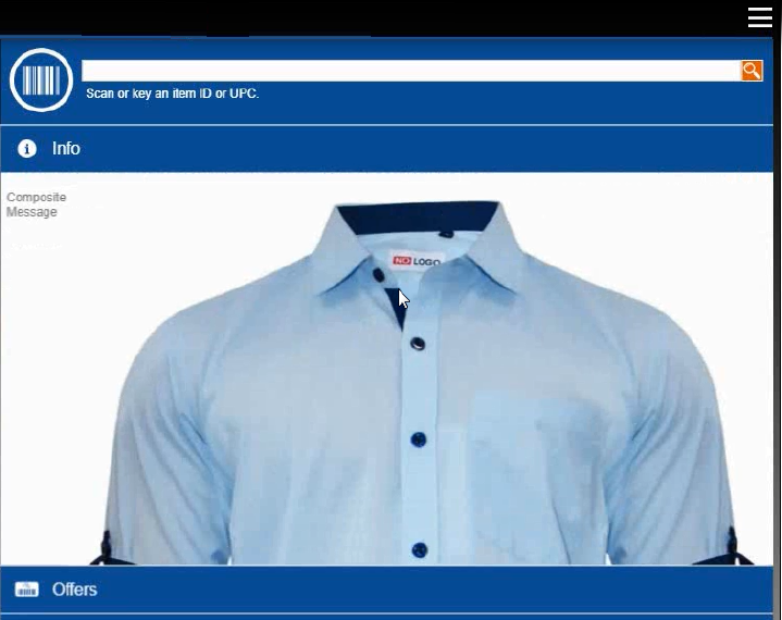
The Info tab may display product-specific information for an item-entry scenario, customer/item detail information for a layaway transaction, or instructions for recording a repair or alteration selection.
Only one message displays per item in the Info tab. This may be a text message, an image or a composite message (graphic and text). This information may relate to the item directly or to recommend other products that relate to the item being purchased. A couple examples of this would be a customer purchasing a shirt that has a coordinating jacket and tie. These two items, the jacket and tie, could be set up to display on the Information Tab in Xstore for the associate to recommend to the customer. Another example would be the purchase of an item that would require another purchase, for instance a watch that does not come with a battery.
If DisplayMessageAsNotify setting is configured, then multiple item text messages pop up in Xstore during the sales process.
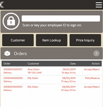
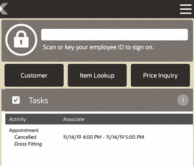
The Tasks tab displays open and in progress tasks with start date/time prior to the current date and end date/time equal to the current date or in the future. Tasks shown here are view only.
The following information is displayed for each task:
Activity - The type, status, and description associated with the task.
Associate - The assigned associate, appointment start date and time, and end date and time.
The Goals tab displays information from the corporate office about the goals set for your store for a specified date range. You are not required to log in to view store goals. These goals are visible to all employees.
The goals are listed in the following order:
Completed goals
Active goals
Future goals
The goals are displays in color, based on their status:
Green - Goals completed and met.
Red - Goals completed but not met.
Black - Active, current, and future goals.
Each goal has an effective date and an end date. The store goal is shown in the Goal column and the current amount achieved toward the goal is shown in the % To Date column.
|
Note: Future goals display ”N/A”' in the % To Date column until they become active. |
Sales Goal to date progress is calculated using net sales. Progress toward store goals can also be found in the Store Goals report and on the Dashboard.
You are not required to log in to view messages. These messages are visible to all employees. The information shown on the Messages tab may be from the corporate office, or from your store management.
Messages require no action, and may be store-specific (only displayed in your store, not corporate-wide) or register-specific (only displayed on a designated register).
These messages are time-based and do not display after the expiration date has passed.
|
Note: If the message contains a URL, click the link icon to open the URL. |
Messages use icons to indicate priority:
Exclamation Point - High priority
No icon - Medium priority
Down Arrow - Low Priority
Shows customer detail.
Offers Tab: The Offers tab displays e-awards, coupons and entitlements that are available and whether they have been applied to the transaction. When a customer is linked to a transaction, the number of offers is displayed. As qualifying items are added to the transaction, entitlements are automatically applied to the basket. Coupons need to be scanned or entered to be applied to the transaction. The different offer types are represented by distinguishing icons on both the offers tab and the sales display panel.
The following information is displayed for each offer:
Offer ID - ID for the e-award, coupon or entitlement.
Description - Description of the coupon.
Expires - Expiration of offer.
Applied? - Indicates whether the coupon has been applied to the transaction.
If a customer decides they do not want to use an offer for that transaction, it can be removed manually. To remove an offer, select the discount from the sales display panel and void the line from the transaction. The offer shows as canceled under the applied column.
This tab allows users to call customers' attention to items they may be interested in, based upon their purchases. Oracle Retail Xstore Point of Service displays a picture of each item, with a description of the item beneath it.
The status bar is shown on the bottom of the screen. It is divided into several parts, each displaying information about the system.
The status bar has the following organization:
Mobile Tablet and Thin Client
On the left, the register number and whether the register is open or closed.
If the register is open, the first indicator will be green and a check mark next to it.
If the register is closed, the first indicator will be red and a cross next to it.
Next to it is the store name, number, and whether the store is currently open or closed.
If the store is open, the first indicator will be green and a check mark next to it.
If the store is closed, the first indicator will be red and a cross next to it.
In the center, the name of the logged-in user. If no user is currently logged in, nothing will be displayed in the middle.
On the right, Xstore Mobile POS displays the business date and time, and the Oracle logo. Tapping the Oracle logo takes you to the About Information page.
Mobile Handheld
On the left, the register number and whether the register is open or closed.
If the register is open, the first indicator will be green and a check mark next to it.
If the register is closed, the first indicator will be red and a cross next to it.
In the center, the name of the logged-in user. If no user is currently logged in, nothing will be displayed in the middle.
On the right, Xstore Mobile displays the business date and time.
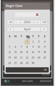
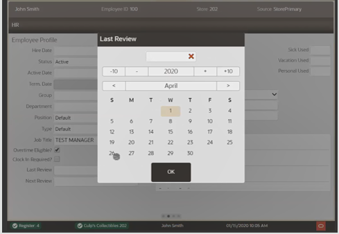
The Date/Time Picker is used on all date entry fields in the Mobile POS. Select the Month, Day and Year as required.
Figure 2-20 Mobile Tablet and Thin Client Date Picker Example
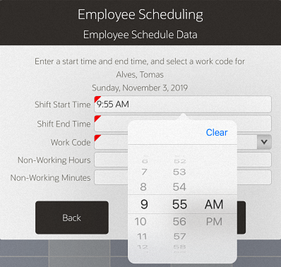
For times, select the Hour, Minute and AM/PM as required.
Figure 2-22 Mobile Tablet and Thin Client Time Picker Example
Available for iOS mobile devices only, the status bar is displayed at the top of the mobile and shows:
Battery life
WiFi connection status
|
Note: The details of the information displayed on the status bar is dependent on the settings (under Settings) on the iOS device. For example, battery percentage can be turned off and will not display in the status bar. |
Required fields are underlined for distinction on Xstore Mobile Handheld, Mobile Tablet and Thin Client.
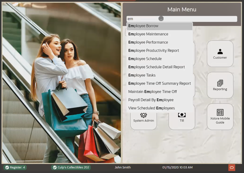
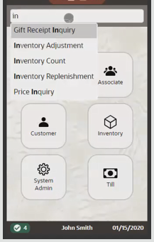
From the Main Menu you can quickly navigate to the menu option needed on the Xstore Mobile Handheld, Mobile Tablet and Thin Client. Start typing in the search bar and the Xstore Mobile POS intuitively shows matches. Select the function required.