The tables below provide an overview of available components, sorted by component type.
Containers
Containers allow users to group components on the page.
| Component Name | Summary | Screenshot |
|---|---|---|
| Column Container |
Used to group components on the page. Users can configure the number of columns and overall layout. |
 |
| Tabbed Container |
Used to create a tabbed interface, with each tab containing a different set of components. |
|
Data Record Displays
Data record displays allow users to view lists of records.
| Component Name | Summary | Screenshot |
|---|---|---|
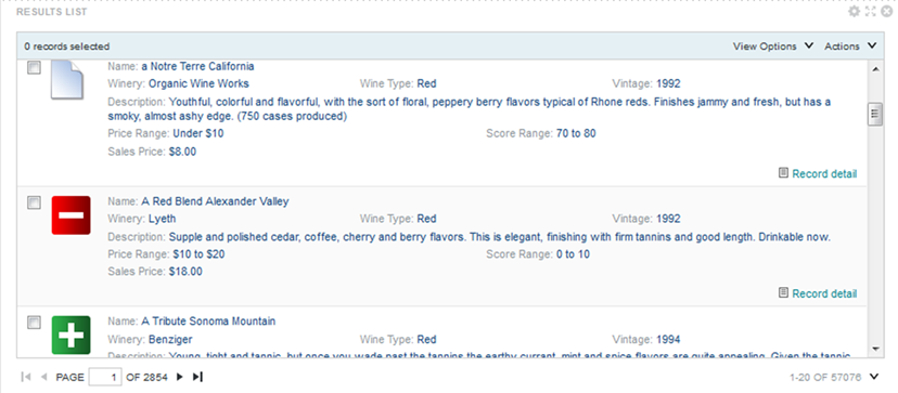
| Results List |
Displays the list of records for the current refinement. Each record displays a subset of attributes as configured for the component. Users can export and print the list. They can also compare records, display details for a record, and refine the data. |
|
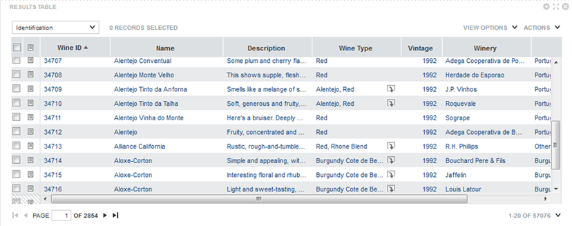
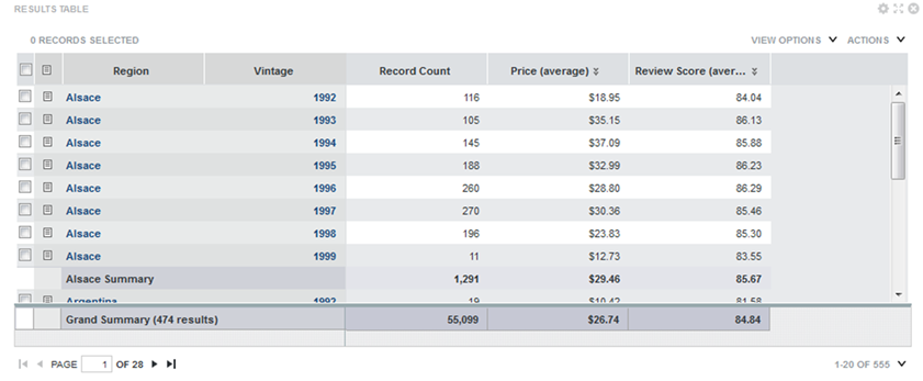
| Results Table |
Displays a table containing either a list of records for the current refinement, or a set of metrics aggregated by one or more dimensions. The table can include links to display the Record Details dialog, refine the data set, or display related content. Selected values can also be highlighted. Users can export and print the list. They can also use the Compare dialog to compare selected rows. |
|
Charts
Big Data Discovery provides several types of charts to use to visualize data and the distribution of data values.
| Component Name | Summary | Screenshot |
|---|---|---|
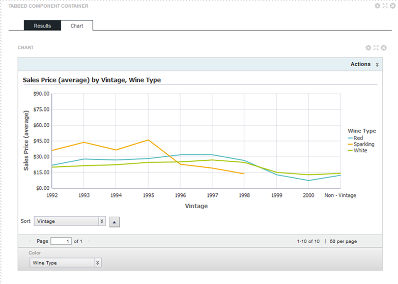
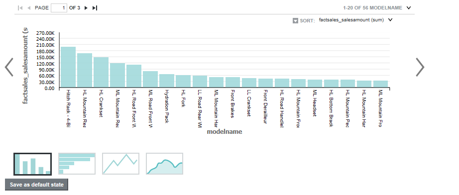
| Chart |
A
Chart displays data using standard
chart formats, including:
Depending on the configured chart type, users may be able to select the data view and metrics to plot. They can also save the currently displayed chart as an image. |
 |
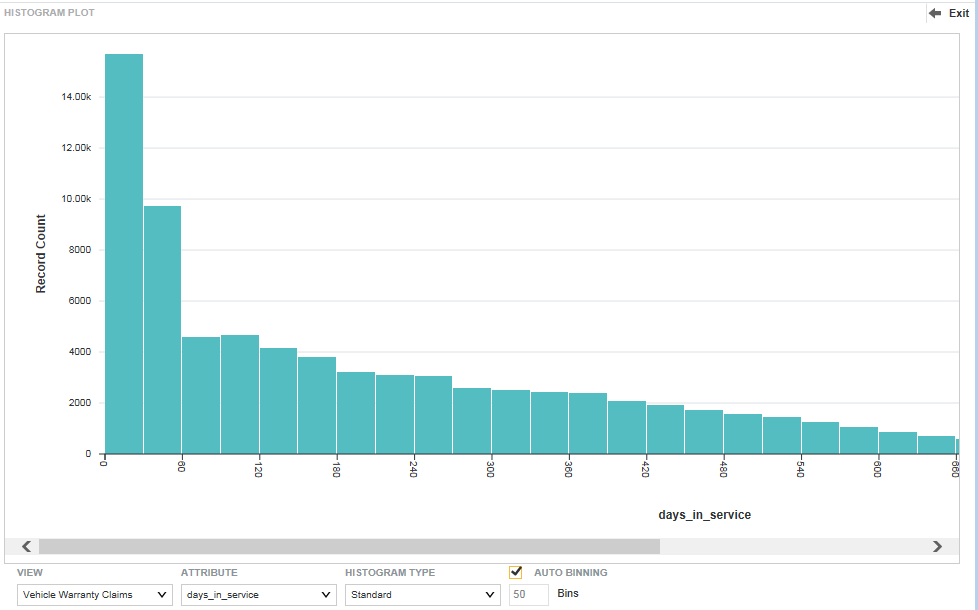
| Histogram Plot |
A Histogram Plot is a basic visualization for showing the distribution of values for a single metric. The values are grouped into bins, each representing a range of values and displaying the number of values in that range. Users can select the data view, the X-axis metric, the number of X-axis bins, and the type of histogram to display |
 |
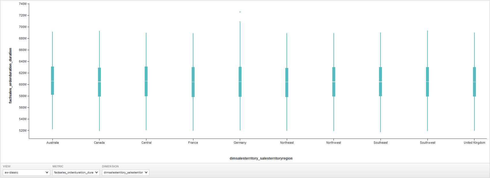
| Box Plot |
A Box Plot provides a capsule summary of values for a metric for each value of a String attribute. For example, you can show a summary of the values for Number Ordered against each value of Product Category. Users can select the data view, as well as the values to plot on each axis. |
 |
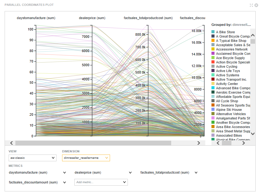
| Parallel Coordinates Plot |
A Parallel Coordinates Plot plots the values of multiple metrics for each value of a single dimension. Users can select the data view, the dimension, and the metrics and aggregation methods to use. |
 |
Other Data Visualizations
Other visualizations allow users to explore and visualize data on the page.
| Component Name | Summary | Screenshot |
|---|---|---|
| Custom Visualization Component |
A Custom Visualization Component is an extension to Studio that lets you create customized visualizations in cases where the default components in Studio do not meet your specific data visualization needs. |
You implement a unique rendering for a Custom Visualization Component to meet your data visualization needs. For details about creating a Custom Visualization Component, see the Extensions Guide. |
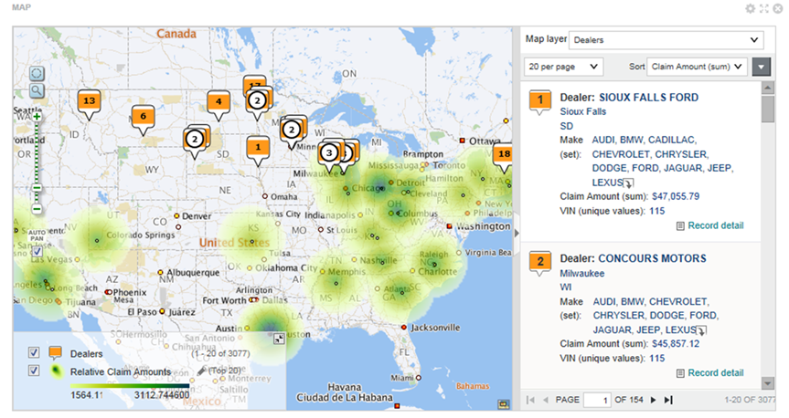
| Map |
Displays one or more map layers. Each layer represents a set of geographic locations. Users can search for locations and display details for a specific location. |
|
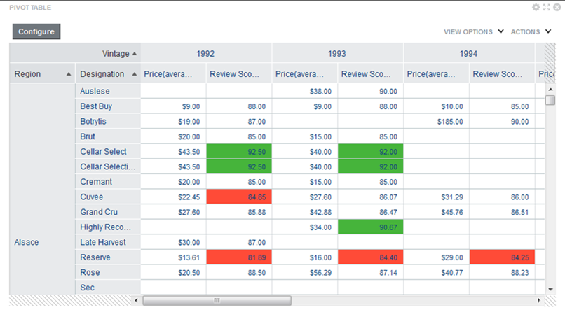
| Pivot Table |
Generates a table that allows users to perform comparisons and identify trends across several cross sections of data. Users can change the table layout and export the data to a spreadsheet. |
|
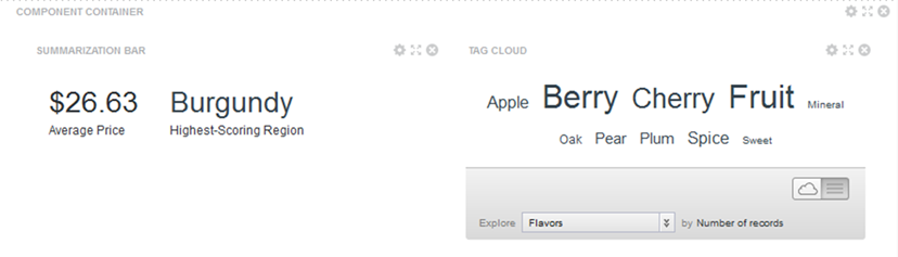
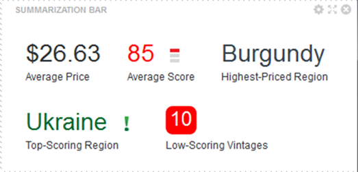
| Summarization Bar |
Displays a set of summary items that contain summary values from the data. A summary value can be a metric (such as average sales), a dimension value associated with the lowest or highest value of a metric (such as the region with the highest sales), or a number of flags. Flags indicate the dimension values that have associated metric values which have passed a specified threshold. |
 |
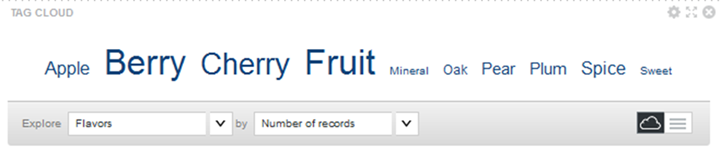
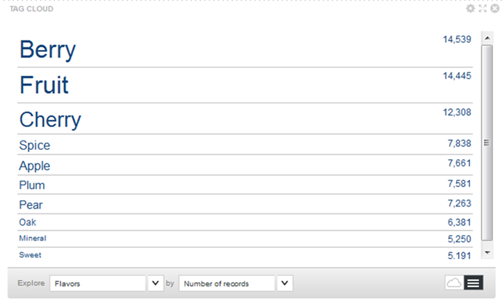
| Tag Cloud |
Displays a distribution of terms based on the value of an associated metric. Larger fonts indicate a higher metric value. The component can display in cloud view, with the terms in alphabetical order, or in list view, with the terms ordered by the metric value. Users can refine by the displayed terms. |
 |
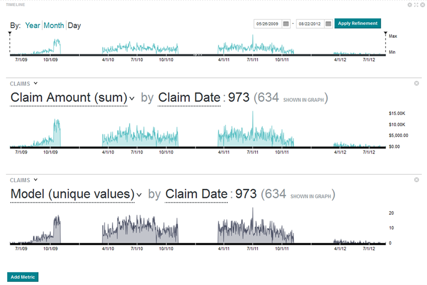
| Timeline |
Displays one or more metric values over the period of time. It consists of a master timeline to set the date/time range, and individual metric timelines showing the value of a metric for a selected date/time attribute. Users can:
There is no edit view for the component, but administrators can save a configuration to be the default displayed when users first display the page. |
 |
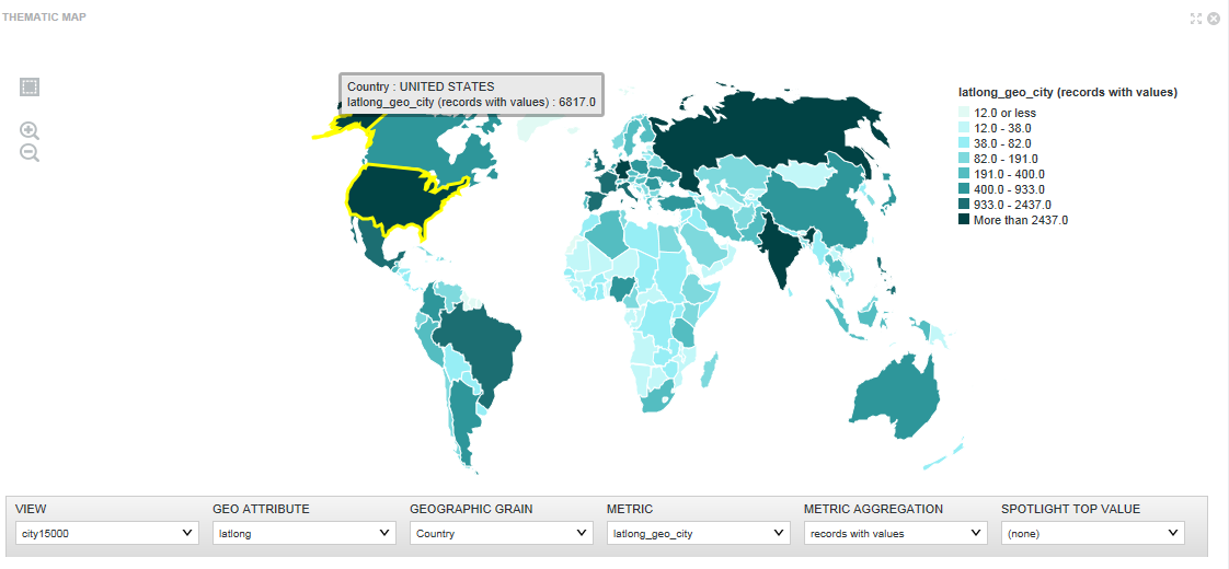
| Thematic Map |
Plots regions on a map and distinguishes the regions by color and record count per metric. For a
Thematic Map, you can select:
|
 |
Web-based Content
Data record displays allow users to view lists of records.
| Component Name | Summary | Screenshot |
|---|---|---|
| IFrame |
Displays the content of an external URL on the page. |
 |
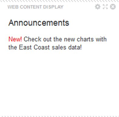
| Web Content Display |
Displays HTML content. Users can create and edit the content within the component. |
 |
