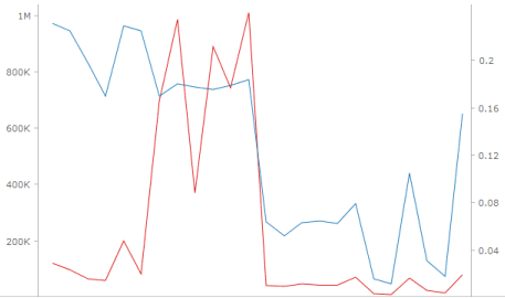
A dual-axis graph is useful for displaying metrics that contain very different ranges of values. For example, a dashboard includes a Profit metric that returns currency information in the thousands and millions. The same dashboard also includes a Profit Margin metric that returns percentages such as 25%. These two metrics would benefit from being shown on graph axes that use different graph scales to display values.
A dual-axis graph displays two different graph axes, displayed on opposite sides of the graph. This can be the left and right vertical axes, as shown in the image below, or the top and bottom horizontal axes. The following example is a dual-axis graph that displays the Profit and Profit Margin metrics on different axes, with different scales.
To create a dual-axis graph, you create an area, bar, or line graph and add a metric to be displayed on the graph’s second axis. Steps to create a dual-axis graph are below.
Dual-axis graphs that contain a bar graph on each axis or an area graph on each axis are not supported.
The steps below assume that you have already created the dashboard that you want to modify. For steps, see Creating a dashboard.
The steps below assume that you have already created an area, bar, or line graph to modify. For steps, see Creating area, bar, or line graphs.
To create and add a dual-axis graph to a dashboard:
Click the name of the dashboard to run it.
If the Datasets panel is not displayed, from the View menu, select Datasets Panel.
If the Editor panel is not displayed,
from the View menu, select
Editor Panel. If the
Editor panel is hidden behind another panel, click the Editor
icon  to display the Editor panel.
Add data to the visualization. From the Datasets panel, click and drag objects to the Editor panel, as described in the steps below. You can also drag objects from the Datasets panel directly onto the visualization.
Note: To view data requirements for a graph style, hover your cursor over the visualization icon in the Visualization Gallery. For example images for each graph style, see Minimum data requirements to create each Graph visualization style.
To display the values of a metric on the graph’s second axis, from the Datasets panel, click and drag a metric onto the second axis. The second axis must be placed on the axis that is opposite from the graph axis that you have already placed metric values on.
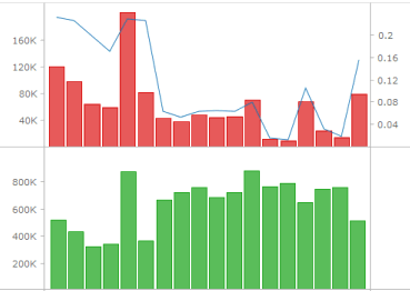
You can add multiple dual-axis graphs to the same Graph visualization. For example, you can create a dual-axis graph that displays Profit and Profit Margin, then add a dual-axis graph with axes for Revenue and Revenue Per Employee. Perform the following steps:
If the first dual-axis graph in your visualization displays metrics on the vertical axes:
To add a new dual-axis graph to the visualization, from the Datasets panel, click the metric to place on the first axis of the new dual-axis graph, and drag it to the bottom of the Vertical area.
In the Editor panel, right-click Metric Names, then select Left Row. A second dual-axis graph is added to the visualization.
From the Datasets panel, click and drag a metric onto the second axis in the new dual-axis graph.
Repeat the appropriate steps above as necessary to continue adding dual-axis graphs to the visualization.
If the first dual-axis graph in your visualization displays metrics on the horizontal axes:
To add a new dual-axis graph to the visualization, from the Datasets panel, click the metric to place on the first axis of the new dual-axis graph, and place it on the bottom of the Horizontal area.
In the Editor panel, right-click Metric Names, then select Top Column. A second dual-axis graph is added to the visualization.
From the Datasets panel, click and drag a metric onto the second axis in the new dual-axis graph.
Repeat the appropriate steps above as necessary to continue adding dual-axis graphs to the visualization
An example of adding a second dual-axis graph to a Graph visualization is displayed below.
Once you have added data to the visualization, you can choose to slice the data into rows and columns of separate graphs, based on attributes. If you slice the data into both rows and columns, a table of graphs is displayed, with a graph for each combination of the attribute elements. Choose from the following:
To display a row of graphs in the visualization, click and drag at least one attribute to the top of the Vertical area. Each graph is displayed in a separate row, one for each element in the attribute.
To display a column of graphs in the visualization, click and drag at least one attribute to the top of the Horizontal area. Each graph is displayed in a separate column, one for each element in the attribute.
For each attribute in the Editor panel, you can select which attribute forms are displayed in the visualization. An attribute form is a descriptive category for an attribute. For a more detailed description, including how to select what attribute information to display in the headers, see Selecting which attribute forms to display in a visualization.
To select the attribute forms, in the Editor panel, right-click the attribute and point to Display Attribute Form. Select one of the following:
To display an attribute form in the visualization, select the check box next to its name.
To hide an attribute form in the visualization, clear the check box next to its name.
Click the Save
icon  to save your changes.
Creating a Graph visualization
Minimum data requirements to create each Graph visualization style
Creating area, bar, or line graphs
Creating bubble or scatter graphs
Creating a graph with graph markers displayed in a grid layout
_____________________________
Copyright © 2019, Oracle and/or its affiliates. All rights reserved.
Legal Notices