You can quickly explore your data in a polished graphical display with a Graph visualization. The Graph visualization is a powerful, interactive visualization that allows you to display your data using a variety of graph styles, then customize it to suit your needs. You can choose from a variety of graph styles to use to display the data, including:
Area Chart
Bar Chart
Bubble Chart
Combo Chart
Line Chart
Pie Chart
Using a Graph visualization, you can:
Organize the data displayed in the graph based on a specific attribute. For example, a bar graph contains unit sales data for several regions. You can choose to display a different bar for each individual store within each region.
Color graph items (such as bubbles, lines, or bar risers) by an attribute or a metric. For example, you can choose to display a different color for each element in an attribute. You can choose to have graph items automatically colored based on the value of a metric, with the darkest colors being displayed for the largest metric values.
Automatically size graph items based on the value of a metric, with the largest elements being displayed for the largest metric values.
Slice your data, by displaying a graph for each combination of attribute elements in the rows and columns of the Graph visualization. For example, you can display the revenue data for each Region as a separate line graph, or display a bar graph containing store sales for each year.
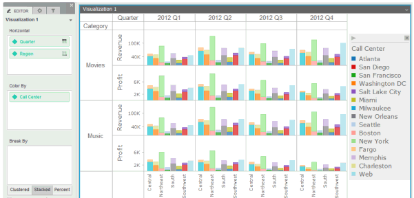
An example of a Graph visualization is displayed in the image below. The data in the visualization is shown as a series of bar graphs, with a separate bar riser displayed for each Call Center. The bar riser for each Call Center is displayed in a different color. Finally, the data is split (or sliced) to display a separate graph for the revenue and profit data for each product category by quarter.
The following are general steps to create a Graph visualization:
Determine the graph style that you want to use, based on the data that you want to display. For example images and data requirements for each graph style, see Minimum data requirements to create each Graph visualization style.
Add attributes and metrics to the visualization, to display the data using the graph style that you have chosen.
Select additional display options, such as whether to size or color graph items (such as bar risers or bubbles) based on attributes or metric values.
Slice the data to show the graphs at the level of data that you want to display. Slicing means separating data into rows or columns of graph with an attribute. Alternatively, you can display a single set of graphs, with one graph for each combination of attributes. For a more detailed description, including example images, see Splitting a graph into separate columns or rows with an attribute.
For steps to create a specific type of Graph visualization, see the appropriate link below:
For steps to create area, bar, and line graphs, see Creating area, bar, or line graphs.
For steps to create bubble or scatter graphs, see Creating bubble or scatter graphs.
For steps to create a graph with graph markers displayed in a grid layout, see Creating a graph with graph markers displayed in a grid layout.
For steps to create a pie or ring graph, see Creating pie or ring graphs.
For steps to create a combination graph, see Creating combination graphs.
For steps to create a dual-axis graph, see Creating dual-axis graphs.
Before you create a Graph visualization, you should be familiar with adding and displaying data in a Graph visualization. The following sections provide a general overview:
Splitting a graph into separate columns or rows with an attribute
Displaying metric data in a visualization using the Metric Names attribute
You can add data to a Graph visualization by clicking and dragging dataset objects onto the Vertical or Horizontal areas on the visualization’s Editor panel. You can also click and drag dataset objects onto the visualization itself; the dataset objects are automatically placed on the correct area in the Editor panel, depending on where you placed them in the visualization.
Each dataset object on the Vertical or Horizontal areas displays an icon indicating the location in which the object is displayed:
Left
Axis  The dataset object is displayed on the left vertical axis.
Right
Axis  :
The dataset object is displayed on the right vertical axis.
:
The dataset object is displayed on the right vertical axis.
Top
Axis  The dataset object is displayed on the top horizontal axis.
Bottom
Axis  The dataset object is displayed on the bottom horizontal axis.
Top
Column  (available for attributes):
The attribute is used to split the data into columns of graphs. A
separate column is displayed for each element in the attribute
(available for attributes):
The attribute is used to split the data into columns of graphs. A
separate column is displayed for each element in the attribute
Left
Row  (available
for attributes): The attribute is used to split the data into rows
of graphs. A separate row is displayed for each element in the attribute.
(available
for attributes): The attribute is used to split the data into rows
of graphs. A separate row is displayed for each element in the attribute.
You can quickly add or rearrange the display of dataset objects in the Graph visualization by dragging them directly onto the graph area.
If you are adding a new metric to an axis that already contains a metric, you can determine where the new metric will be displayed, as follows:
To display the metric as a separate metric series above the metric already on the axis, click and drag the metric to the top of the axis.
To display the metric as a separate metric series below the metric already on the axis, click and drag the metric to the bottom of the axis.
To display both metrics on the same axis, click and drag the metric to the center of the axis.
Similarly, you can add a metric to the left, right, or to the same axis as a metric that has already been placed on a horizontal graph axis.
You can place metrics on the top, bottom, left, or right axes of a graph visualization. Metrics can be added to up to two different axes at one time. These may be adjacent axes, in the case of scatter and bubble graphs, or opposite axes, in the case of dual-axis graphs.
Attributes can be placed on the left vertical axis or the bottom horizontal axis (also called the traditional graph axes).
If you place more than one attribute on either the Vertical area or the Horizontal area, the attributes at the top of the area are used to separate (or slice) your data into rows or columns of graphs.
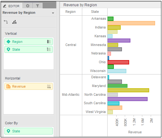
For example, in the graph below, Region and State are placed on the
Vertical area. By default, Region is used to separate the data into rows
of graphs. A separate row is displayed for each element in the attribute,
in this case, for each region. This is indicated by the Left Row icon
next
to the Region name. Each region’s row contains a bar graph for each state
in the region.
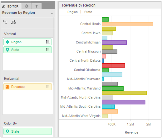
You can instead display one set of bar graphs, with a bar graph for
each region and state combination. To do this, display Region on the left
axis, along with State. Both attributes are displayed with the Left Axis
icon
You can separate data based on any attribute, including the Metric Names attribute, which contains the names of the metrics in the graph. For an introduction to the Metric Names attribute, see Displaying metric data in a visualization using the Metric Names attribute.
If you separate the data into both rows and columns, a table of graphs is displayed, with a graph for each combination of the attribute elements.
Steps to use an attribute to separate data into rows or columns of graphs, or display all attribute combinations in a single set of graphs, are included in Creating area, bar, or line graphs.
The Metric Names attribute is an attribute that contains the names of the metrics displayed in a graph. You can determine how to display these metrics by placing the Metric Names attribute on the appropriate area of the Editor panel. For example, you can add the Metric Names attribute to the Break By area of a line graph to display a separate line for each metric in the graph. The Metric Names attribute can be placed on any area that accepts attributes.
The Metric Names attribute is automatically added to the Editor panel when you add metrics to the visualization. You can then choose how to display the metrics by placing the Metric Names attribute on one of the following areas:
Vertical: The metrics can be used either to separate data into rows of graphs, or to display values along the Y-axis.
Horizontal: The metrics can be used either to separate data into columns of graphs, or to display values along the X-axis.
Break By: Display a graph item for each metric, such as a bar or line.
Slice: Display a wedge for each metric in the Angle area. This option is available for pie or ring graphs.
You can also color graph items based on the metrics that they represent, by clicking and dragging the Metric Names attribute from any of the above areas to the Color By area.
In a pie or ring graph, if you have placed at least two metrics in the Angle area and there are no metrics in the Horizontal area or Vertical area, the Metric Names attribute controls the location in which the names of the metrics in the Angle area are displayed. If you have placed metrics on the Horizontal area or the Vertical area, or for all other types of graphs, the Metric Names attribute controls the display of the metrics in the Horizontal area or Vertical area.
Minimum data requirements to create each Graph visualization style
Creating area, bar, or line graphs
Creating bubble or scatter graphs
Creating a graph with graph markers displayed in a grid layout
Dashboard Editor: Graph: Properties
_____________________________
Copyright © 2019, Oracle and/or its affiliates. All rights reserved.
Legal Notices