You can view the contribution of attribute elements or metrics to a total by displaying your data in a pie or ring graph.
You can take advantage of a variety of display styles to display pie or ring graphs. For example, you can display pie graphs in a scatter layout, or display ring graphs in a grid. For a list of available display styles, see Display styles for pie or ring graphs. If your Graph visualization contains pies or rings displayed in the same position in the visualization, the graphs are overlaid on top of each other, as shown in the image below. A white circle is displayed around pie graphs that have been overlaid on top of other pie graphs to distinguish them as separate graphs.
The steps below assume that you have already created the dashboard that you want to modify. For steps, see Creating a dashboard.
You should be familiar with the general workflow for slicing your data into rows and columns. For details, see Slicing the data in a Graph visualization.
To create and add a pie or ring graph to a dashboard:
Click the name of the dashboard to run it.
From the toolbar, click the Insert Visualization icon  . A new blank visualization
is added to the dashboard and displayed.
. A new blank visualization
is added to the dashboard and displayed.
If the Visualization Gallery is not displayed, from the View menu, select Visualization Gallery.
From the Visualization Gallery, click the Pie Chart icon.
If the Datasets panel is not displayed, from the View menu, select Datasets Panel.
If the Editor panel is not displayed,
from the View menu, select
Editor Panel. If the
Editor panel is hidden behind another panel, click the Editor
icon  to display the Editor panel.
Add data to the visualization. From the Datasets panel, click and drag objects to the Editor panel, as described in the steps below. You can also drag objects from the Datasets panel directly onto the visualization.
Note: To view data requirements for a graph style, hover your cursor over the visualization icon in the Visualization Gallery. For example images for each graph style, see Minimum data requirements to create each Graph visualization style.
To determine the size of wedges in the pie or ring graph, place at least one metric on the Angle area. Wedges that represent larger metric values are displayed as larger than wedges that represent smaller metric values. If you add multiple metrics to the Angle area, each metric in the Angle area is used to display a separate pie or ring graph in the visualization.
To determine the number of wedges in the pie or ring graph, choose from the following:
To display a wedge for each element of an attribute, place at least one attribute on the Slice area.
To display a wedge for each metric in the Angle area, place the Metric Names attribute on the Slice area.
You can display the pie or ring graphs in a visualization using a variety of different display layouts. For example, you can display pie graphs in a scatter graph, or arrange ring graphs in a grid, with a ring graph for each combination of attribute elements displayed on the X-axis and Y-axis. The table below displays a list of possible layouts that you can choose from when designing pie or ring graphs and the data requirements to display each layout type, as well as example images. Click and drag attributes and metrics to the Horizontal and Vertical areas on the Editor panel to display the graph using a specific display layout.
For each attribute in the Editor panel, you can select which attribute forms are displayed in the visualization. An attribute form is a descriptive category for an attribute. For a more detailed description, including how to select what attribute information to display in the headers, see Selecting which attribute forms to display in a visualization.
To select the attribute forms, in the Editor panel, right-click the attribute and point to Display Attribute Form. Select one of the following:
To display an attribute form in the visualization, select the check box next to its name
To hide an attribute form in the visualization, clear the check box next to its name.
To determine color, break by, and sizing options:
To color the wedges in a visualization, choose from the following:
To color
the wedges based on the attribute element each wedge represents, place
at least one attribute on the Color
By area. Each element in the attribute is displayed using a
different color.
Note: If other graphs and heat
maps are colored based on the same attribute, each attribute element
will display in the same color across all the graphs and heat maps.
The application automatically selects the colors based on the color
palette, but you can select a color for each attribute element. For
steps, see Formatting
a Graph visualization.
To color the wedges based on the value of a metric, place one metric on the Color By area. Wedges corresponding to smaller metric values are displayed as lighter in color than wedges corresponding to larger metric values.
To color the wedges based on the metric each wedge represents, place the Metric Names attribute on the Color By area. Each metric in the Angle area is displayed using a different color.
You can display a separate ring or pie graph for each element in an attribute, each metric in the Angle area, or both. For example, you can display the revenue data for each Region as a separate pie graph. This option is available if the Slice area is empty and there are no attributes or metrics displayed on the X-axis or Y-axis, or if there is an attribute in the Slice area and at least one metric on either the X-axis or Y-axis of the graph.
To display a separate graph for each element in an attribute, place at least one attribute in the Break By area. If you add more than one attribute to the Break By area, a graph is displayed for each combination of the attribute elements.
To display a separate graph for each metric in the Angle area, click and drag the Metric Names attribute onto the Break By area.
To have the pie or ring graphs automatically sized based on the value of a metric, place one metric in the Size By area. Pie or ring graphs corresponding to large metric values are automatically displayed as larger in size, while pie or ring graphs for small metric values are displayed as smaller in size.
To slice the data into rows and columns:
Once you have added data to the visualization, you can choose to slice the data into rows and columns of separate graphs, based on attributes. If you slice the data into both rows and columns, a table of graphs is displayed, with a graph for each combination of the attribute elements. Choose from the following:
To display a row of graphs in the visualization, click and drag at least one attribute to the top of the Vertical area. Right-click the attribute at the bottom of the Vertical area and select Left Row. Each graph is displayed in a separate row, one for each element in the attribute
To display a column of graphs in the visualization, click and drag at least one attribute to the top of the Horizontal area. Right-click the attribute at the bottom of the Horizontal area and select Top Column. Each graph is displayed in a separate column, one for each element in the attribute
To display additional metrics in a tooltip when you hover the cursor over a graph item, place the metrics you want to display on the Tooltip area.
Click the Save
icon  to save your changes.
You can display the pie or ring graphs in a visualization using a variety of different display layouts. For example, you can display pie graphs in a scatter graph, or arrange ring graphs in a grid, with a ring graph for each combination of attribute elements displayed on the X-axis and Y-axis. The table below displays a list of possible layouts that you can choose from when designing pie or ring graphs and the data requirements to display each layout type, as well as example images.
Goal |
Minimum Data Requirements |
Example |
|||||||||
|---|---|---|---|---|---|---|---|---|---|---|---|
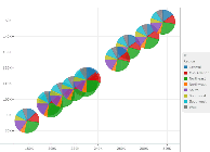
Display the pie or ring graphs in a vertical layout |
|
|
|||||||||
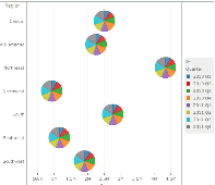
Display the pie or ring graphs in a horizontal layout |
|
|
|||||||||
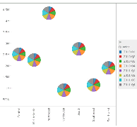
Display the pie or ring graphs in a scatter graph layout
|
|
|
|||||||||
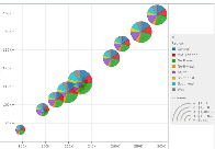
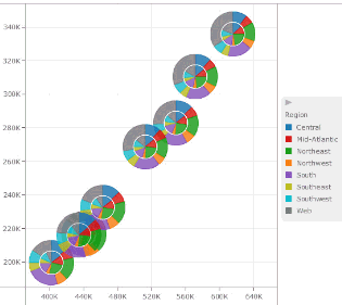
Display the pie or ring graphs in a bubble graph layout |
|
|
|||||||||
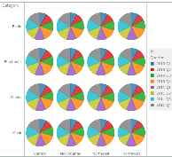
Display the pie or ring graphs in a grid layout |
|
|
Creating a Graph visualization
Minimum data requirements to create each Graph visualization style
Creating area, bar, or line graphs
Creating bubble or scatter graphs
Creating a graph with graph markers displayed in a grid layout
_____________________________
Copyright © 2019, Oracle and/or its affiliates. All rights reserved.
Legal Notices