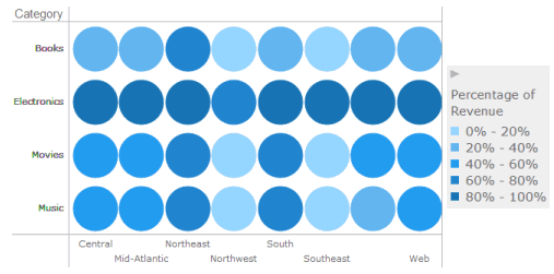
You can allow users to analyze trends across combinations of data using markers displayed in a grid layout. You can size or color each marker in the grid based on the value of a metric.
In the example graph below, a separate marker is displayed for each combination of product category and sales region. Markers representing large revenue values are displayed in dark blue, and markers for smaller revenue values are displayed in light blue.
The steps below assume that you have already created the dashboard that you want to modify. For steps, see Creating a dashboard.
To create and add a graph that displays markers in a grid layout to a dashboard:
Click the name of the dashboard to run it.
From the toolbar, click the Insert Visualization icon  . A new blank visualization
is added to the dashboard and displayed.
. A new blank visualization
is added to the dashboard and displayed.
If the Visualization Gallery is not displayed, from the View menu, select Visualization Gallery.
On the Visualization Gallery, click the Bubble Chart icon.
If the Datasets panel is not displayed, from the View menu, select Datasets Panel.
If the Editor panel is not displayed,
from the View menu, select
Editor Panel. If the
Editor panel is hidden behind another panel, click the Editor
icon  to display the Editor panel.
Add data to the visualization. From the Datasets panel, click and drag objects to the Editor panel, as described in the steps below. You can also drag objects from the Datasets panel directly onto the visualization.
Note: To view data requirements for a graph style, hover your cursor over the visualization icon in the Visualization Gallery. For example images for each graph style, see Minimum data requirements to create each Graph visualization style.
Place at least one attribute in the Horizontal area. A column of bubbles will be displayed for each element in this attribute.
Place at least one attribute in the Vertical area. A row of bubbles will be displayed for each element in this attribute.
To color the graph markers, place objects on the Color By area, as follows:
To color the graph markers based on an attribute, place at least one attribute on the Color By area. Each element in the attribute is displayed using a different color. For example, you can display the sales data for each employee using a different bubble color. If you add more than one attribute to the Color By area, each combination of the attribute elements is displayed using a different color.
If other graphs and heat maps are colored based on the same attribute, each attribute element will display in the same color across all the graphs and heat maps. The application automatically selects the colors based on the color palette, but you can select a color for each attribute element. For steps, see Formatting a Graph visualization.
To color markers in the grid based on the value of a metric, place the metric in the Color By area.
To size markers in the grid based on the value of a metric, place the metric in the Size By area.
For each attribute in the Editor
panel, you can select which attribute forms are displayed in the visualization.
An attribute form is a descriptive category for an attribute. For
a more detailed description, including how to select what attribute
information to display in the headers, see Selecting
which attribute forms to display in a visualization.
To select the attribute forms, in the Editor panel, right-click the
attribute and point to Display Attribute
Form. Select one of the following:
To display an attribute form in the visualization, select the check box next to its name.
To hide an attribute form in the visualization, clear the check box next to its name.
To display additional metrics in a tooltip when you hover the cursor over a graph item, place the metrics that you want to display on the Tooltip area.
You can define other options, such as the shape of graph markers. For steps, see Formatting a Graph visualization.
Click the Save
icon  to save your changes.
Creating a Graph visualization
Minimum data requirements to create each Graph visualization style
Creating area, bar, or line graphs
Creating bubble or scatter graphs
_____________________________
Copyright © 2019, Oracle and/or its affiliates. All rights reserved.
Legal Notices