Combination graphs display a combination of different graph shapes in the same Graph visualization. For example, you can use combination graphs for stock volume graphs, which combine the line graph and bar graph. You can display a graph that contains sales statistics, with actual sales values displayed using bar risers and target sales values displayed as tick marks overlaid on top of the bars. Each metric in a combination graph can be displayed using a different shape. Steps to create and add a combination graph to a dashboard are provided below.
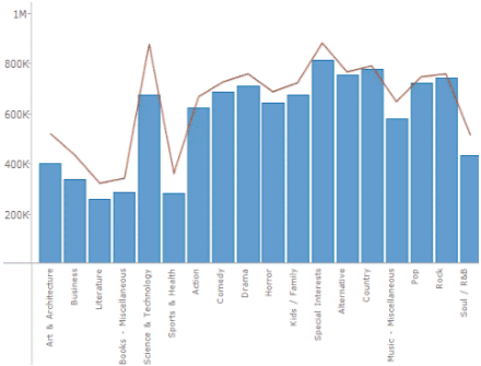
In the image above, multiple metrics are displayed in a single graph. You can also slice your data to display multiple rows or columns of graphs. For example, you can display each metric in a separate graph, and use a different graph shape for each metric. To do so, you slice the graph using the Metric Names attribute.
A combination graph can display the following graph shapes:
Areas
Bars
Circles
Squares
Lines
Ticks (also called tick marks)
In a stacked combination graph, each metric is displayed in the graph in the order in which it appears in the Vertical or Horizontal area on the visualization’s Editor panel.
In an absolute combination graph, each metric is displayed in order according to the shape used to represent the metric’s values in the graph, as follows (shapes with higher priority are displayed at the top of the list):
Areas
Bars
Circles or Squares
Lines or Ticks
If more than one metric is displayed using shapes with the same display priority, the order in which they appear in the Vertical or Horizontal area determines the order in which they are displayed.
You can convert an existing area, bar, or line graph into a combination graph by right-clicking the name of a metric in the graph, pointing to Change Shape, and selecting the type of shape to use to display metric values. For steps to create an area, bar, or line graph, see Creating area, bar, or line graphs.
The steps below assume that you have already created the dashboard that you want to modify. For steps, see Creating a dashboard.
Click the name of the dashboard to run it.
From the toolbar, click the Insert Visualization icon  . A new blank visualization
is added to the dashboard and displayed.
. A new blank visualization
is added to the dashboard and displayed.
If the Visualization Gallery is not displayed, from the View menu, select Visualization Gallery.
On the Visualization Gallery, select the Combo Chart icon.
If the Datasets panel is not displayed, from the View menu, select Datasets Panel.
If the Editor panel is not displayed,
from the View menu, select
Editor Panel. If the
Editor panel is hidden behind another panel, click the Editor
icon  to display the Editor panel.
Add data to the visualization. From the Datasets panel, click and drag objects to the Editor panel, as described in the steps below. You can also drag objects from the Datasets panel directly onto the visualizatio
Note: To view data requirements for a graph style, hover your cursor over the visualization icon in the Visualization Gallery. For example images for each graph style, see Minimum data requirements to create each Graph visualization style.
To display values along the X-axis and Y-axis of the graph, perform the following steps:
To display a vertical combination graph:
To display attribute elements on the X-axis, place at least one attribute in the Horizontal area.
To display metric values on the Y-axis, place at least one metric in the Vertical area.
To display a horizontal combination graph:
To display metric values on the X-axis, place at least one metric in the Horizontal area.
To display attribute elements on the Y-axis, place at least one attribute in the Vertical area.
To color the items in the graph based on attributes or metrics, place objects on the Color By area, as follows:
To color the graph items based on an attribute, place at least one attribute on the Color By area. Each element in the attribute is displayed using a different color. For example, you can display the sales data for each employee using a different bar riser color. If you add more than one attribute to the Color By area, each combination of the attribute elements is displayed using a different color.
If other graphs and heat maps are colored based on the same attribute, each attribute element will display in the same color across all the graphs and heat maps. The application automatically selects the colors based on the color palette, but you can select a color for each attribute element. For steps, see Formatting a Graph visualization.
To color graph items based on the value of a metric, place one metric on the Color By area. The graph items in the visualization are automatically shaded based on the value of the metric. For example, you can automatically color the areas in a graph based on the value of the Profit metric, with larger profit values displayed using darker colors and smaller profit values displayed using lighter colors.
To color graph items based on the metric that each item represents, place the Metric Names attribute on the Color By area. Each metric in the visualization is displayed using a different color. For example, you can display the Revenue, Cost, and Profit metrics using a different color for each metric.
To display a separate graph item for each element in an attribute, place at least one attribute in the Break By area. For example, you can display the revenue data for each Region as a separate line, or display a bar riser for each year of data. If you add more than one attribute to the Break By area, a graph item is displayed for each combination of the attribute elements.
For each attribute in the Editor panel, you can select which attribute forms are displayed in the visualization. An attribute form is a descriptive category for an attribute. For a more detailed description, including how to select what attribute information to display in the headers, see Selecting which attribute forms to display in a visualization.
To select the attribute forms:
In the Editor panel, right-click the attribute and point to Display Attribute Form. Select one of the following:
To display an attribute form in the visualization, select the check box next to its name.
To hide an attribute form in the visualization, clear the check box next to its name.
You can select which graph subtype to display in the visualization, or allow the subtype to be automatically chosen. Do one of the following:
To select a specific graph subtype, select Absolute, Stacked, or Percent.
To allow the application to determine the graph subtype to use to display your data, select the Automatic subtype check box.
To size the graph items based on the value of a metric, place one metric in the Size By area. Graph items corresponding to large metric values are displayed as larger in size, while graph items for small metric values are displayed as smaller in size. For example, lines representing larger metric values are displayed as thicker than lines representing smaller metric values.
Once you have added data to the visualization, you can choose to slice the data into rows and columns of separate graphs, based on attributes (including the Metric Names attribute). If you slice the data into both rows and columns, a table of graphs is displayed, with a graph for each combination of the attribute elements. Choose from the following:
To display a row of graphs in the visualization, click and drag at least one attribute to the top of the Vertical area. Each graph is displayed in a separate row, one for each element in the attribute.
To display a column of graphs in the visualization, click and drag at least one attribute to the top of the Horizontal area. Each graph is displayed in a separate column, one for each element in the attribute.
To display additional metrics in a tooltip when you hover the cursor over a graph item, place the metrics that you want to display on the Tooltip area.
To change the shape used to display a metric in the graph, right-click the name of the metric in the Editor panel. You can also select the name of the metric in the graph. Point to Change Shape, then select the shape to use to display the metric. Repeat this step as necessary to define the shape to use to display each metric in the graph.
Click the Save
icon  to save your changes.
Creating a Graph visualization
Minimum data requirements to create each Graph visualization style
Creating area, bar, or line graphs
Creating bubble or scatter graphs
Creating a graph with graph markers displayed in a grid layout
_____________________________
Copyright © 2019, Oracle and/or its affiliates. All rights reserved.
Legal Notices