4Records, Fields, and Field Controls
Records, Fields, and Field Controsl
This chapter describes records, fields, and field controls in your application. It includes the following topics:
Records
A record is a group of related data organized into fields. For example, information about a contact, such as the last name, first name, address, and phone number, makes up a contact record. A record can appear in a list of related records, such as a list of contact records, or it can appear individually in a form.
In some situations, you cannot see every field associated with a record. To view additional fields in a record, you can drill down on a field in the record in a list. You can also show more columns for a record, and then use the horizontal scroll bar, if necessary, to see the rest of the fields.
About Drilldown from the List View
Drilldown from the List view changes focus to the detail applet on the detail view. Since the focus is usually on the second applet (for example, detail activities), an attempt is made to show the entire applet. This might result in part of the title and some buttons in the title area being hidden. You can press Page Up to immediately see the previous applet header information or scroll using the mouse tablet or keyboard actions.
You can modify this behavior by doing the following:
Reducing the number of rows displayed in the detail applet thereby allowing the view to render with everything visible initially.
Changing the focus to the previous applet in the detail view by controlling the focus behavior. For more information about controlling the focus behavior, see article 1622877.1 (Doc ID) on My Oracle Support.
Related Topics
Fields
A field is a location in a record in which a particular type of data is stored. For example, a contact record might contain the following fields: last name, first name, address, and phone number. A field is characterized by its maximum length and the type of data (for example, numeric or alphabetic) it can contain.
Required Fields
In the application, required fields have an asterisk (a star icon) next to the field name. You cannot save a record until you enter data in the required fields.
Read-Only Fields
If a field is disabled, then the field is read-only, and you cannot change the field content.
Maximum Number of Characters
Many fields can hold only a specific number of characters. For alphabetic and alphanumeric fields, the allowed number of characters varies in the application. Numeric fields can hold up to a maximum of 22 characters.
Resizing the Notes Field
You can dynamically size the Notes field so that it is in line with the user interface. However, be aware that resizing the Notes field might result in dynamically changing the screen layout.
Text Fields
You can type text directly into a text field. You click in the field before typing this text.
To more easily enter text in text fields that can contain a large amount of text, you can click to select the resizing indicator in the corner of the field and then move the resizing indicator to make the field larger. You can also use the resizing indicator to make the field smaller. In some browsers, you must click in the text field to see the resizing indicator.
Developers can customize the application to save or to not save the size of a field that you resize. They can also customize the application to not use this resize feature for fields.
Field Controls
You can enter data into the Siebel application by typing directly into fields or by using field controls. A field control can be a check box, a drop-down list, a button, and so on.
Field controls allow you to do such things as choose from a list of predefined values, enter values in a multi-value field, specify dates, and calculate values.
A field control can appear within a form or as part of a record in a list. In a list, the field control appears when you click in a field that includes it. To use a field control to edit a record in a list, click the control to activate it. In a form, you can see the field controls if they are available.
Related Topics
Check Boxes
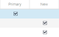
Click the box beside or after an option to select or clear the check box. When you click an empty box, a check mark or an X appears in the box. If you click a box that is selected, then the check mark or X disappears.
In query mode, check boxes have a third possible state. For more information about using check boxes in query mode, see Tips for Queries.
You can press the space bar to select and deselect check boxes.
The following image shows an example of check boxes.
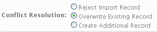
Option Buttons
Option buttons, also called radio buttons, allow you to choose one of several options in a set. An option button appears empty when not selected, and full or filled in when selected. You cannot select more than one option button in a set.
The following image shows an example of option buttons. On your keyboard, you can use the up or down navigation arrows and the space bar to select the option.
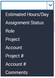
Drop-Down Lists
A drop-down list enables you to click a down arrow next to a field to select from a list of available values. You can type the field value in a field for drop-down list. You can also type part of the text string for a field value to automatically decrease the number of available values that appears in the drop-down list for the field, and then you can select the appropriate value for the field.
The following image shows an example of a drop-down list.
Field Control Buttons
The field control buttons appear in many fields. The following table describes these buttons. You use field controls to work with records in the application.
Table Description of Field Control Buttons
Button |
Button Name |
Description |
Related Information |
|---|---|---|---|
 |
Calculator |
Launches a calculator for entering amounts. |
|
 |
Calendar select |
Launches a calendar control for entering a date and optionally, time, in a date or date and time field. You can also type a date (or date and time) directly into a field. |
|
 |
Currency calculator |
Launches the currency calculator. |
|
 |
Multiple select |
Launches a multiple selection dialog box. |
|
 |
Single select |
Launches a single selection dialog box. |
|
 |
Telephone |
Launches the default telephone application on for your device. This feature is device-dependent. |
None |
Calendar Control
You use the calendar control to select date and time information for a field. You access the calendar control by clicking the calendar select button in a date field or a date and time field.
The following image shows an example of the calendar control, which contains the following elements: Month and Year, Calendar, Time field, Hour slide bar, Minute slide bar, Now button, and Done button..
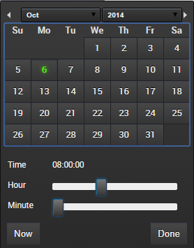
The following table describes each element of the calendar control.
Table Description of Calendar Control Elements
Element |
Description |
|---|---|
Month and Year |
Shows the month and year. Use the navigation arrows to go to the next and previous month. Use the drop-down arrow next to the month to select a different month, and use the drop-down arrow next to the year to select a different year. |
Calendar |
Shows the calendar for the month. Use the calendar to select a date by clicking the date in the calendar. |
Time field |
Shows the time. This field appears only if you access the calendar control for a field that requires a time. |
Hour slide bar |
Sets the hour in the Time field. This field appears only if you access the calendar control for a field that requires a time. |
Minute slide bar |
Sets the minute in the Time field. This field appears only if you access the calendar control for a field that requires a time. |
Now button |
Sets the value for a date field to the current date and the value for a date and time field to the current date and time. |
Done button |
Saves your selections. If you do not want to save your selections, then click outside of the control to cancel your selections. |
The current date is not assumed as the default when using the calendar control. An explicit click is required to make a selection. Other things to note about selecting a date include the following:
When you query a date field that has a calendar select button to display the calendar control, then you must include the date field value in quotes if you execute the query without specifying a time. For more information about entering query criteria, see Simple Query Operators.
Planned Start is a date and time field (not just a date field), and this allows a high granularity when searching.
When specifying a date and time, the calendar control remains open until Done is selected.
You cannot enter an incorrect value for a date. For example, if you enter a date of 221/45/1902, then your entry is not populated in the field. When you enter only two digits to represent a year, an assumption is made about whether the digits are preceded by 19 or 20 (19xx or 20xx). If the two digits are greater than or equal to 50, then the year of 19xx is assumed. If the two digits are less than 50, then the year of 20xx is assumed.
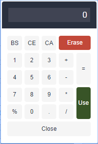
Calculator
You access the calculator by clicking the calculator button that appears in a field for an amount.
The following image shows an example of the calculator.
Currency Calculator
You access the currency calculator by clicking the dollar sign button that appears in a field for a currency amount. You can use the currency calculator to specify financial transaction information in foreign currencies.
The following image shows an example of the currency calculator.
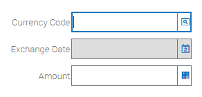
The following table describes each field control in the currency calculator.
Table Description of Currency Calculator Fields
Field |
Field Control |
Description |
|---|---|---|
Currency Code |
Single select button |
Launches a dialog box where you can select the country and currency code. |
Exchange Date |
Calendar select button |
Launches the calendar control where you can select the exchange date. The field does not appear in all currency calculators. For more information, see Calendar Control. |
Amount |
Calculator button |
Launches the calculator where you can enter the amount. You can also type the amount directly into the field. For more information, see Calculator. |