3User Interface Overview
User Interface Overview
This chapter describes the user interface. It includes the following topics:
Elements of the Application Window
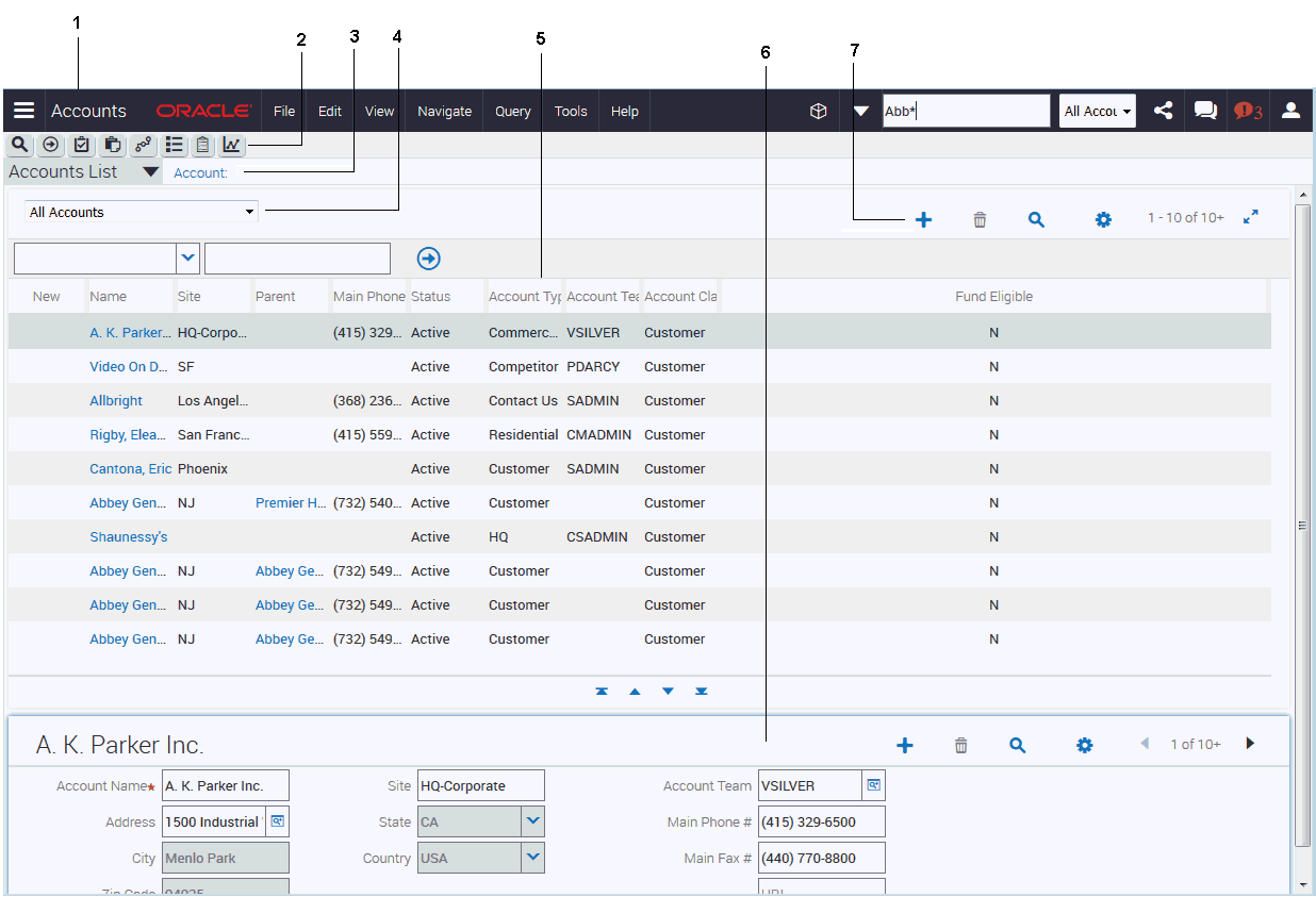
The following image shows the main elements of an example application window using the default web application UI theme. Typically, the main elements of the application window are:
Application Banner, which contains the following elements: side menu, application-level menu, and application toolbar.
Application Taskbar, which contains the following options: New Query, Execute Query, Apply Target List, Save Target List, Site Map, How Do I, Tasks, Reports.
Second Level View Bar, which appears immediately after the application taskbar.
Visibility Filter, which appears on a screen or view in the application (provided a visibility filter is available for the screen or view).
List, which consists of multiple records presented as rows.
Form, which typically appears after a list and contains the data for the record you select in the list.
List and Form Toolbar, which appears on lists and forms.
These elements are highlighted in the following image.
Application Banner
The application banner, shown in the following image and in Elements of the Application Window, persists for all views. The following items are available on the application banner:
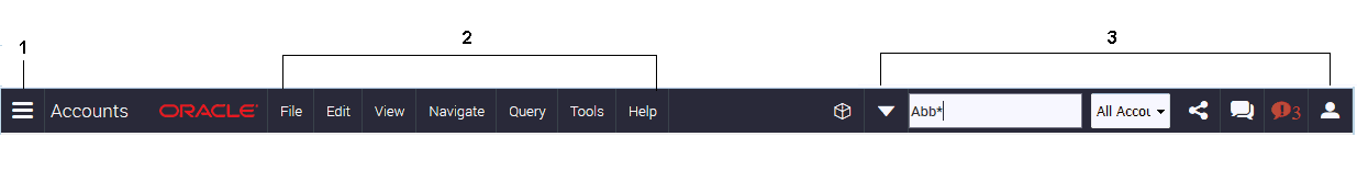
Side Menu
The side menu is the first item located on the application banner. It is characterized by three horizontal lines stacked on top of one another. Click Side Menu to view a list of available screen names.
Application-Level Menu
The application-level menu is located on the application banner and might include the following menu options: File, Edit, View, Navigate, Query, Tools, and Help.
The functionality provided by each of these menus depends on the application and the configuration you use. Each menu option lets you perform different tasks. Look for topics in this document that explain the task you want to perform to find out how to use a menu and its options.
Application Toolbar
The application toolbar is located on the application banner and includes the toolbar controls described in the following table.
Table Application Toolbar Controls
Control |
Control Name |
Control Type |
Description |
Related Information |
|---|---|---|---|---|
 |
Advanced Options |
Drop-down list |
Click the down arrow to access advanced search options. |
|
 |
Search Toolbar |
Text box |
Click in the empty single text field to perform a basic search. |
|
 |
Saved Queries |
Drop-down list |
Click the down arrow to access contextual saved queries. |
|
 |
Share |
Button |
Click to send email messages, faxes, pages, and outbound wireless messages. |
|
 |
Communications |
Button |
Click to open the communications panel. |
|
 |
Notification |
Button |
Click to open the Notification pane to read notifications. |
|
 |
Settings |
Button |
Click to change application behavior settings, such as, startup view or navigation control. |
Application Taskbar
The application taskbar, shown in Elements of the Application Window, appears after the application banner in the application window. The following table describes the controls available on the application taskbar.
Table Application Taskbar Controls
Button |
Button Name |
Description |
Related Information |
|---|---|---|---|
 |
New Query |
Starts a query. |
|
 |
Execute Query |
Executes a query. |
|
 |
Apply Target List |
Applies a target list to a view. |
Contact your administrator and see Siebel Applications Administration Guide. |
 |
Save Target List |
Creates a target list. |
Contact your administrator and see Siebel Applications Administration Guide. |
 |
Site Map |
Displays the Site Map. |
|
 |
How Do I |
Accesses iHelp, which provides guidance for tasks. |
|
 |
Tasks |
Activates a Task UI wizard to guide you through a series of steps to complete a specific task. |
|
 |
Reports |
Accesses reports for the screen you are working in. |
Second Level View Bar
After selecting a screen, you must determine the record set that you want to view in the screen. The record set names (or view names) appear in the second level view bar. The second level view bar appears immediately after the application toolbar. It looks similar to the view bars for other levels. Views can contain lists, forms, charts, explorer formats, subviews, and so on.
An example of a second level view bar is shown in Elements of the Application Window. You access a second level view by clicking the drop-down arrow in the second level view bar and then clicking the view name.
The name of the active view is highlighted (or selected) in the list. If the name of the view you want to use is not visible, then use the scroll bar on the side of the list to scroll down to the view name.
You can configure your application to show the object names for the second level view bar in a link bar under screen tabs across the start of the screen, or in tree format on the side of the screen. For more information, see Navigation Controls.
Third Level View Bar
After selecting a view, you can drill down on a field in a record of the view to display more view names in the third level view bar lower on the screen. The third level view bar looks similar to the view bars for other levels. Views can contain lists, forms, charts, explorer formats, subviews, and so on.
You access a third level view by clicking the drop-down arrow in the third level view bar and then clicking the view name. The view displays more data for the record that you drill down on. For example, if you drill down on a contact record in the Contacts List of the Contacts screen, then when you click the Activities view name in the third level view bar, activities that are associated with that contact record appear.
The name of the active view is highlighted (or selected) in the list. If the name of the view you want to use is not visible, then use the scroll bar on the side of the list to scroll down to the view name.
You can configure your application to show the names for the third level view bar in tab format lower on the screen. For more information, see Navigation Controls.
You can specify the third level views that appear in your application. For more information, see Showing, Hiding, and Reordering Screens or Views.
Fourth Level Subview Bar
After you access a view in the third level view bar, a fourth level subview bar can display subview names associated with the third level view. The fourth level subview bar appears next to the third level view bar. Many third level views do not have a fourth level subview. The fourth level subview bar looks similar to the view bars for other levels.
You access a fourth level subview by clicking the drop-down arrow in the fourth level subview bar and then clicking the subview name. The subview displays more data for the third level view.
The name of the active subview appears in a different color than the color for the other subview names in the list.
You can configure your application to show the names for the fourth level subview bar in a link bar under the view tabs lower on the screen or when you hover the curser over a view tab lower on the screen. For more information, see Navigation Controls.
Visibility Filter
An example of a visibility filter is shown in Elements of the Application Window. For information about using the visibility filter, see Using the Visibility Filter in Lists.
List
A list consists of multiple records, presented as rows. An example of a list is shown in Elements of the Application Window.
Each record in a list consists of multiple fields. The first record in a list is selected and highlighted when you access the list. You can select a record in a list by clicking any field in the record. Your selection highlights the selected record. If the field you click is editable, then the field converts to edit mode, and you can enter a value in the field.
In a list, you navigate and scroll vertically or horizontally to view data. For information about determining the number of records in a list, see Displaying Record Count.
Using the Visibility Filter in Lists
The visibility filter, which appears in list headers, lets you access a set of records by filter values, such as My Accounts, My Team’s Accounts, and so on.
For example, you want to query for information about an account. However, you do not own the account. The default filter value for the Accounts screen is My Accounts, which displays only your account records. To see every account record that you can access, use the visibility filter to choose the All Accounts filter value. You can then see all of the account records that you can access.
The following table describes each filter value in the visibility filter. In this table, the Accounts screen is used as an example, but these filters can appear in any screen. Because of your responsibilities, you might not see some filters in this table.
Table Visibility Filter Values
Filter |
Description |
|---|---|
My Accounts |
Shows items that are specific to you. You are the only user who can see these items, unless you are a member of a team that can access them. |
My Team’s Accounts |
Allows a manager to look at the items belonging to that manager’s team. For example, a manager can select the My Team’s Accounts visibility filter and view the accounts that each team member is currently working on. You cannot add a record to My Team’s Account view unless users report to you. |
All Accounts |
Shows all accounts that you are permitted to access. |
All Accounts Across Organizations |
Allows a user with the appropriate responsibilities to view all of the accounts in all of the companies. This view is for companies that have partnerships with other companies. |
Navigating Between Records in Lists
Use the navigation buttons that appear after a list to navigate between the records in the list. The following table describes the navigation buttons.
Table Description of Navigation Buttons for Lists
Button |
Button Name |
Description |
|---|---|---|
 |
First Record Set |
Navigates to the first record set. |
 |
Previous Record Set |
Navigates to the previous record set. |
 |
Next Record Set |
Navigates to the next record set. |
 |
Last Record Set |
Navigates to the last record set. |
The record number range for a list appears in the corner of the list, and shows the number range for the records that appear in the list. The record number range changes as you navigate between the records in the list. An estimate of the total number of list records appears beside the record number range. You must navigate to the end of the list to see the exact total number of list records beside the record number range.
Horizontal Scrolling in Lists
Use the horizontal scroll bar to navigate through all of the columns in a list. The horizontal scroll bar appears before the vertical navigation buttons in lists that contain more columns than can fit on the screen. For information about designating the columns that appear on the screen, see Organizing List Columns.
Expanding and Collapsing Lists
Every list has a show more button or a show less button in the corner. Click Show More or Show Less to see more or fewer records in a list. The following table describes the show more and show less buttons.
Table Description of Show More and Show Less Buttons
Button |
Button Name |
Description |
|---|---|---|
 |
Show More |
Displays more records to expand a collapsed list. |
 |
Show Less |
Displays fewer records to collapse an expanded list. |
Form
A form that appears after a list contains the data for the record you select in the list. Also, when you drill down on a field in a record in a list, you see a form on-screen that contains data for the record you drill down on. A form contains the data for one record. An example of a form is shown in Elements of the Application Window.
If you are authorized to edit the information in a form, then you can change field data directly in the form. Step off the form to save your changes. All required fields have an asterisk (a star icon) next to the field name in the form.
In some cases, you can click the show more button to access a long form, and then click the show less button to access the short form. These buttons appear in the corner of the form. For examples of the show more and show less buttons, see Expanding and Collapsing Lists.
Record navigation buttons are available on each form. Use the navigation buttons to navigate to the next and previous form records.
The record number for a form appears between the record navigation buttons. The record number changes as you navigate between forms. An estimate of the total number of form records appears beside the record number (for example: 7 of 10+). You must navigate to the last form to see the exact number of form records beside the record number (for example: 15 of 15).
List and Form Toolbar
A toolbar appears on lists and forms. The following table describes the typical icons that appear on the toolbar. Your application might contain additional icons or other elements on each list or form toolbar. An example of the list and form toolbar is shown in Elements of the Application Window.
Table List and Form Toolbar
Button |
Button Name |
Description |
|---|---|---|
 |
Screen Menu |
Click Menu (the cogwheel icon) to access a menu of options that apply to the active form, list, explorer view, or selected record in a list. Using the options in the menu, you can perform actions such as copying, deleting, and advanced sorting. |
 |
New or Add |
Click New or Add (the plus (+) icon) to create a record or add an existing record. In a list, clicking New inserts a row at the start of the list so you can create a record. In a form, clicking New displays a form with empty fields that you can fill in to create a record. Clicking Add opens a list from where you make further selections. |
 |
New |
Click New (the double plus (++) icon) to create a record. In a list, clicking New inserts a row at the start of the list so you can create a record. In a form, clicking New displays a form with empty fields that you can fill in to create a record. |
 |
Save |
Click Save (the arrow-pointing-to-a-box icon) to save the selected record. |
 |
Cancel |
Click Cancel (the arrow-pointing-up-and-back icon) to cancel modifications to the selected record. |
 |
Delete |
Click Delete (the trash can icon) to delete the selected record. |
 |
Query |
Click Query (the magnifying glass icon) to start a query in a form or list so that you can specify query criteria. For more information about querying, see Information Query. |
Sending Messages
You can send messages by clicking Share on the application toolbar. Alternatively, you can send messages by choosing File on the application-level menu. For more information, see Emailing, Faxing, Paging, and Sending Outbound Wireless Messages.
After you click Share on the application taskbar, the following options for sending messages appear – these options are also shown in the following image:
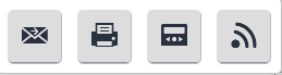
Email messages. Click to send email messages. On some screens, the Pick Recipient dialog box might appear. After you select a recipient in the Pick Recipient dialog box, and click OK, the Send Email dialog box appears. You prepare the email message in this dialog box, and then click Send. For more information, see Sending Email from Applications.
Fax messages. Click to send fax messages. On some screens, the Pick Recipient dialog box might appear. After you select a recipient in the Pick Recipient dialog box, and click OK, the Send Fax dialog box appears. You prepare the fax message in this dialog box, and then click Send.
Page messages. Click to send page messages. On some screens, the Pick Recipient dialog box might appear. After you select a recipient in the Pick Recipient dialog box, and click OK, the Send Page dialog box appears. You prepare the page message in this dialog box, and then click Send.
Outbound wireless messages. Click to send outbound wireless messages. On some screens, the Pick Recipient dialog box might appear. After you select a recipient in the Pick Recipient dialog box, and click OK, the Send Wireless Message dialog box appears. You prepare the outbound wireless message in this dialog box, and then click Send.
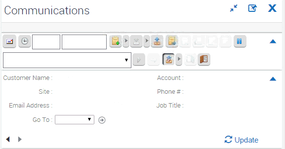
Communications Panel
You can access the communications panel by clicking Communications on the application toolbar in your Web client application. The following image shows an example of the communications panel, which contains the following elements:
Header area. Contains the label Communications and the following buttons: Expand, Popup Out, and Close.
Communications toolbar. Shows the available toolbar controls
Customer dashboard. Shows customer information, such as, name, account, site, email address, and so on.
Chat panel. Shows the content of the chat message.
Depending on the deployment of your Web client application, the communications panel might not contain all of these elements.
The communications panel can appear in a docked position or as a floating pane in your client application. You can dock and undock it by clicking Dock or Undock. When the communications panel is floating (undocked), you can move and position it anywhere within the confines of the main application client area. In addition, you can do the following:
Control the size of the communications panel by choosing a wide or narrow display for the panel.
Modify the display of the communications toolbar by choosing to display more or less of the toolbar.
Close the communications panel by clicking Close (X).
For more information about the communications panel and toolbar, see Siebel CTI Administration Guide. For more information about the chat panel and customer dashboard see Siebel Chat Guide. The following image shows an example of the communications panel.
Application Screens
Information in the application is organized into screens. You access a screen by clicking Side Menu on the application banner and then clicking the appropriate screen name, such as Opportunities, Calendar, or Accounts, from the list of screen names that appears. The name of the active screen appears in a different color than the color for the other screen names in the list.
You can also use Site Map on the application taskbar to navigate to a screen. If you select a screen name from the Site Map that does not appear in the screen list for the Side Menu, then the screen name appears in the screen list when you navigate to that screen. This screen is visible only for the current session. For more information, see Site Map.
You can configure your application to show the names for screens in tab format across the start of the screen, or in a tree format on the side of the screen. For more information, see Navigation Controls.
You can specify the screens that appear in your application. For more information, see Showing, Hiding, and Reordering Screens or Views.
Icons appear next to screen names. Administrators can change these icons in Siebel Tools. If you do not want to display these icons, then contact your administrator.
Home Pages for Screens
A screen home page is a gateway to the common functions for that screen. The following table describes the main elements in screen home pages.
Table Main Elements for Screen Home Pages
Element |
Description |
|---|---|
Frequently Viewed Screen name |
An area that contains a list of links to the lists of data with which you most frequently work. This list can be a combination of predefined queries and visibility filters. For more information, see View Links for Screen Home Pages. |
Recent Records |
An area that contains a list of the last five records that you accessed (by drilling down on the record), created, or modified. Enables you to return to a recent record with a single click. Recent records are stored in your user preferences. |
iHelp |
Task area that contains a list of links to the most important tasks for the screen. When you drill down on a task, iHelp is launched to guide you through the completion of the task. |
Search |
Query area where you enter query criteria directly into the fields, and click Go to navigate directly to the list with your query results. |
Add |
Add area that you use to add new records. You complete the fields, and click Add & Go to add the record to the database and navigate directly to the form containing the new record you add. |
Site Map
Your organization determines the screens that appear in the application window. These screens might be only a subset of the available screens. You access a screen by clicking Side Menu on the application banner and then selecting the screen name from the list of screen names. You can also use Site Map on the application taskbar to access the screen.
If the screen name that you want does not appear in the list of screen names for the Side Menu, then you can show that screen name with the other screen names so that you can easily access the screen. For more information about specifying the screens that appear in your application, see Showing, Hiding, and Reordering Screens or Views.
To see a list of all the screens available to you, use Site Map as shown in the following procedure. For information about specifying the screens that appear in your application, see Showing, Hiding, and Reordering Screens or Views.
To navigate to a screen using the Site Map
Do one of the following:
From the application-level menu, choose Navigate, then Site Map.
Click Site Map on the application taskbar.
(Optional) To restrict the hyperlinks that appear in the Site Map, enter appropriate text in the field for searching.
In the Site Map, click the hyperlink for the screen you want to navigate to.
The Site Map displays the screen name and all the view names available in that screen.
Click a hyperlink to navigate to the screen or view.
Action Pane
The action pane is a user interface element that displays the task pane, the iHelp pane, and the Search pane. You can access the individual Action Pane controls in one of the following ways:
Click the appropriate button on the application taskbar.
These buttons include the How Do I button and the Tasks button.
From the application-level menu, choose View, then Action Pane.
The available menu items include iHelp and Tasks.
The state of the Action Pane is retained across your sessions. For example, if the Action Pane is open in Task mode when you exit the application on Monday night, then the Action Pane is open in Task mode when you log in on Tuesday morning.
Explorer Views
The following image shows an example of an explorer view. An explorer view is an expandable tree view control, which displays data in a compact hierarchical format. The tree control appears in the side pane of the main content area. Use the tree control as follows:
Select a control for the tree branch that you want to view, and the detail information for that tree branch appears in the main content area.
A folder in the tree preceded by an arrow contains other folders. Click the arrow to expand the folder and show its contents. Click the arrow to collapse the folder again. The list in the main content area always shows the contents of the selected folder in the tree control.
Typically, you can access an explorer view from the second level view bar.
Application User Interface Behavior
Some issues to note about the application user interface behavior include the following:
Lock. The lock option is not supported in hierarchical list applets.
Pick lists and LOV’s. Pick lists and LOVs do not select a new value until a unique match is made. If you are using auto-fill but an exact match is not made, then the value reverts to the original. Double-quotes are not included when you select from an LOV.
Quotes. Quotes are not included when you select an option from an LOV. Double quotes are required for strings.