Specifying General Settings in My Preferences
To define general user preferences, access the My Preferences - General Settings page.
Navigation:
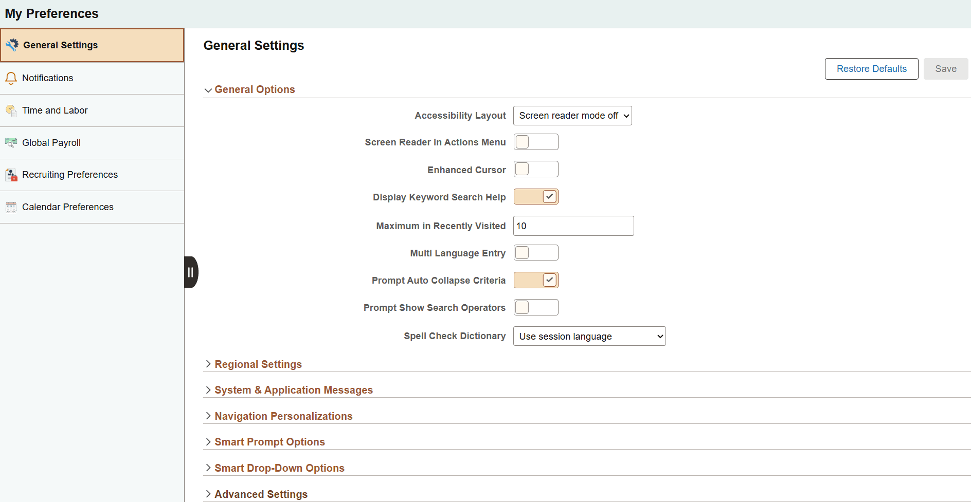
This example illustrates the fields and controls on the My Preferences - General Settings: General Options section. You can find definitions for the fields and controls later on this page.
General Options
Expand this section to specify signon and other general options.
| Field or Control | Description |
|---|---|
|
Accessibility Layout |
Note: Keyboard-only navigation features are available to all users and do not require users to enable accessibility features. Select one of the following options to specify the accessibility layout to use:
Note: After you select to enable screen reader mode or to disable the persistence of screen reader mode, a confirmation page is displayed that then transfers you back to the current context so that your changes are now in effect. |
|
Screen Reader in Actions Menu |
Select this option to display the Enable Screen Reader Mode link in the Actions menu. Note: This link is available on fluid homepages and fluid pages only. However, while this link is available in fluid applications, it is not displayed in fluid activity guides, fluid navigation collections, and in My Preferences. |
|
Enhanced Cursor |
This accessibility feature provides bold highlighting of page elements that have focus. Note: The enhanced cursor feature is available on classic pages only. |
|
Display Keyword Search Help |
When a component is keyword search enabled, show help for enhanced search. This option is enabled by default. |
|
Maximum in Recently Visited |
Set a value between 0 and 30 for the number of recently visited items. The default value is 10. |
|
Multi Language Entry |
Select this option to be able to enter data in the language you specify in the Data Language list in pages where multiple language entry is available. This option is disabled by default. |
|
Prompt Auto Collapse Criteria |
Select this option to auto-collapse the search criteria when the prompt page is opened or after a search is performed. This option is enabled by default. See Working with Fluid Lookup Pages. Note: In screen reader mode, this setting is ignored and the search criteria always remains expanded. |
|
Prompt Show Search Operators |
Select this option to display the search operators in the search criteria as changeable drop-down list values. This option is disabled by default. See Working with Fluid Lookup Pages. Note: In screen reader mode, this setting is ignored and the search operators in the search criteria are always displayed as changeable drop-down list values. |
|
Spell Check Dictionary |
Select the language to use as your spell check dictionary from the list. Note: Use session language is the default option, which selects the dictionary associated with your signon language as specified on the Manage Installed Languages page. See Using Spell Check. |
Saving Your Preferences
Click the Save button to save any updated preference settings. Except for changes to screen reader mode, which take effect immediately after confirmation, other changes to your preferences take effect the next time you login.
To revert all preference settings back to their default values, click Restore Defaults button.
Note:
After you change the setting for screen reader mode (either enabling it or disabling it), a confirmation page is displayed where the new setting is in effect. Click the Back button to return to the previous context retaining the new screen reader setting. If restoring default settings changes the screen reader mode, then you are also transferred to the confirmation page where the new setting is in effect.
Regional Settings
Expand this section to specify your preferred date, time, and calendar related settings.
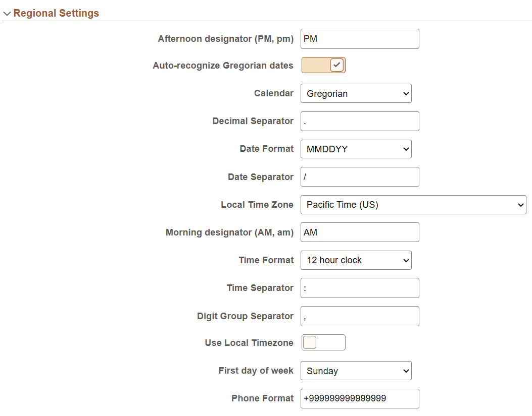
This example illustrates the fields and controls in the Regional Settings section of the My Preferences - General Settings page. Details about these options are described following the example.
| Field or Control | Description |
|---|---|
|
Afternoon designator (PM, pm) |
Select the format for designating afternoon when using a 12 hour clock. The default value is PM. |
|
Auto-recognize Gregorian dates |
When you enable this option, if your calendar preference is set to use a non-Gregorian calendar, a date entered with a year between 1800 and 2300 will be assumed to represent a Gregorian date. Once entered and saved, the date will still be displayed using your selected calendar. This option is enabled by default. |
|
Calendar |
Select the type of calendar. This setting takes effect for all date entry and display fields. The Gregorian calendar is the primary calendar used by international business. Other supported calendars include the Thai Buddhist calendar and the Islamic Hijri calendar. The default value is Gregorian. |
|
Date Format |
Select the format to use for date fields. MMDDYY is the default value. |
|
Local Time Zone |
Select your local time zone. This option determines which time zone is used when the Use Local Timezone option is set to Yes. The default value is Pacific Time (US). |
|
Morning designator (AM, am) |
Select the format for designating morning when using a 12 hour clock. The default value is AM. |
|
Time Format |
Select the format to use for time fields. Determines whether time will be displayed in civilian (8:05:00 PM) or military (20:05:00) time format. The determination of whether seconds and microseconds are displayed is made at the field level, and is not a personalization. The default value is 12 hour clock. |
|
Use Local Timezone |
Select this option to use your local time zone rather than the server time zone. This option is disabled by default. |
|
First day of week |
Select the day to use as the first day of the week. The default value is Sunday. |
|
Phone Format |
Specify the format to use for phone number fields. It should be an international phone number format (known as E.164), which is a number of up to fifteen digits in length starting with a + (plus) sign. The format should use the digit 9
to represent a number. For example, |
System & Application Messages
Expand this section to specify your preferences for displaying several system warnings and confirmation messages.
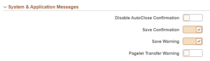
This example illustrates the fields and controls in the System & Application Messages section of the My Preferences - General Settings page. Details about these options are described following the example.
| Field or Control | Description |
|---|---|
|
Disable AutoClose Confirmation |
Enable this option to prevent confirmation messages from automatically closing. This option is required for WCAG 2.0 standards, so that accessibility users have adequate time to read confirmations. When set to Yes, you must close a message to dismiss it; it will not disappear automatically. This option is disabled by default. |
|
Save Confirmation |
Enable this option to display a message to the user indicating that a save request completed successfully. Yes is the default value. |
|
Save Warning |
Enable this option to display a warning when transferring from a page that has unsaved changes. This option is enabled by default. |
|
Pagelet Transfer Warning |
Enable this option to display a warning in screen reader mode when transferring from a pagelet (homepage or dashboard) to another object. This option is disabled by default. |
Navigation Personalizations
Expand this section to specify keyboard navigation preferences. For example, suppose you always prefer to type the date into a date field and then press tab to move quickly to the next field rather than opening the calendar prompt, selecting the date, and then closing the prompt. If you enable the Tab over Calendar Button, when you navigate with the tab key your cursor focus will never rest on a calendar button.
This example illustrates the fields and controls in the Navigation Personalizations section of the My Preferences - General Settings page. Details about these options are described following the example.
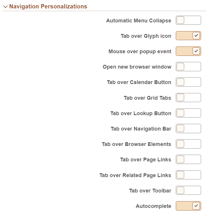
Select the navigation options to enable them. The following options are enabled by default:
-
Tab over Glyph icon.
-
Mouse over pop-up event.
-
Autocomplete.
| Field or Control | Description |
|---|---|
|
Automatic Menu Collapse |
Enable this option to cause the menu to automatically collapse when a transaction is selected. You can expand the menu either by using Ctrl+Y or the show menu icon. |
|
Tab over Glyph icon |
Enable this option to skip glyph icons when using the Tab key to move through page objects. A glyph icon displays the related contextual menu for a field. |
|
Mouse over popup event |
Enable this option to enable popup events when you mouse over items on a page. Mouse over pop-ups are enabled for some fields and will display a popup page with related information on it when you hover the mouse pointer over those fields. |
|
Open new browser window |
Enable this option to open a new page in a new browser window, even when the browser setting is set to open in a new tab. |
|
Tab over Calendar Button |
Enable this option to skip calendar button controls when using the Tab key to move through page objects. A calendar button is the icon next to date fields that can be used to display a calendar for date selection. |
|
Tab over Grid Tabs |
Enable this option to skip grid tabs when using the Tab key to move through page objects. Grid Tabs appear at the top of a grid. |
|
Tab over Lookup Button |
Enable this option to skip lookup button controls when using the Tab key to move through page objects. A lookup button is the magnifying glass icon following fields that have a defined list of valid values. |
|
Tab over Navigation Bar |
Enable this option to skip navigation bars when using the Tab key to move through page objects. A navigation bar appears at the top of grids and scroll areas, and controls which rows appear. |
|
Tab over Browser Elements |
Enable this option to skip over browser elements when using the Tab key to move through page objects, to restrict tabbing to PeopleSoft elements in the page. Depending on your browser, it can sometimes appear as if the focus is lost, when it is actually on a browser element, such as the URL address field. By enabling this option, you can avoid this browser issue. |
|
Tab over Page Links |
Enable this option to skip page links when using the Tab key to move through page objects. Page Links are the hyperlinks at the bottom of a page in a multi-page component. |
|
Tab over Related Page Links |
Enable this option to skip over the icon that takes you to a list of related links when using the Tab key to move through page objects. |
|
Tab over Toolbar |
Enable this option to skip the toolbar when using the Tab key to move through page objects. The toolbar is located at the bottom of a page and contains standard operations that are needed to work with the transaction, such as Save and Return to Search. |
|
Autocomplete |
Enable this option to have the system do a prompt lookup as you type to suggest appropriate values. Applicable only for fields with defined prompt edit values. |
Smart Prompt Options and Smart Drop-Down Options
Expand these sections to configure prompt options and drop-down options.
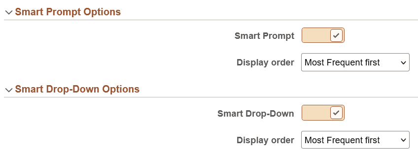
These options are enabled by default. These options display prompt values and drop-down list values in two sections, namely, Most Relevant and Others. For more information, see Using Drop-Down List Boxes and Using Smart Prompts.
Note:
The Smart Prompt Options and Smart Drop-Down Options are not available if the system administrator disables these options on the PeopleTools Options page. See System and Server Administration: PeopleTools Options, Setting Smart Prompt and Smart Drop-Down Options section, for more information.
This example illustrates the fields and controls in the Smart Prompt Options and Smart Drop-Down Options sections of the My Preferences - General Settings page. Details about these options are described following the example
| Field or Control | Description |
|---|---|
|
Smart Prompt |
The Smart Prompt option is enabled by default. The Smart Prompt option displays prompt values based on most recently used or most frequently used items as specified by you in the Display Order field. Use the Smart Prompt check box to either disable or enable the display of smart prompt values. If you disable the Smart Prompt option, the prompt values are displayed in the standard manner. For more information on smart prompt, see Using Smart Prompts |
|
Smart Drop-Down |
The Smart Drop-Down option is enabled by default. The Smart Drop-Down option displays drop-down list values based on most recently used or most frequently used items as specified by you in the Display Order field. Use the Smart Drop-Down option to either disable or enable the display of smart drop-down list. If you disable the Smart Drop-Down option, the drop-down values are listed in the standard manner. For more information, see Using Drop-Down List Boxes |
|
Display Order |
Specify the display order of the most frequently used or most recently used items. The options are:
If you select Most frequent first, then in the Most Relevant section of the drop-down list values, the most frequent items are listed first followed by the most recent items. Similarly, if you select Most recent first, then in the Most Relevant section of the prompt values, the most recent items are listed first followed by the most frequent items. |
Process Pop-up Notification
Expand this section to specify preferences for pop-up notifications.
Note:
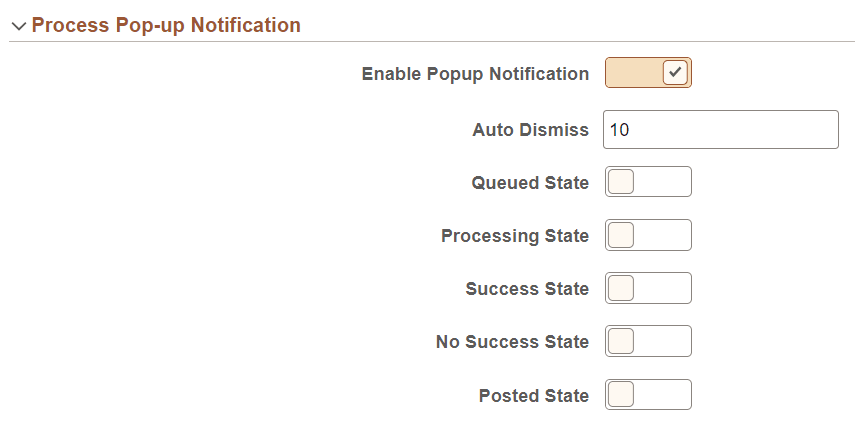
The display of the Process Pop-up Notification section is controlled by the Pop-up Notification check box in the Notification Settings page in . The configuration settings defined under this section override the settings for run/distribution status configured in the Notification Settings page. See Process Scheduler: Defining Notification Configuration.
This example illustrates the fields and controls on the My Preferences - General Settings: Process Pop-up Notification section. You can find definitions for the fields and controls later on this page.
| Field or Control | Description |
|---|---|
|
Enable Popup Notification |
Select this option to activate pop-up notifications. This option is disabled by default. Important: This option must be set to Yes for pop-up notifications to be displayed. When it is set to No, even if a specific pop-up notification type has been enabled, it will not appear. |
|
Auto Dismiss |
Enter the duration for pop-up notifications. The value you enter determines the number of seconds that a pop-up notification remains displayed. For example, if the value is set to 5, then a pop-up notification will be displayed for 5 seconds, after which it will automatically disappear. |
|
Queued State |
Enable this option to receive pop-up notifications when a process status changes to Queued. This option is disabled by default. |
|
Processing State |
Enable this option to receive pop-up notifications when a process status changes to Processing. This option is disabled by default. |
|
Success State |
Enable this option to receive pop-up notifications when a process status changes to Success. This option is disabled by default. |
|
No Success State |
Select this option to receive pop-up notifications when a process status changes to No Success. This option is disabled by default. |
|
Posted State |
Select this option to receive pop-up notifications when a process status changes to Posted. This option is disabled by default. |
Advanced Settings
Expand this section to specify preferences for grouplet updates and page cache duration.
This example illustrates the fields and controls in the Advanced Settings section of the My Preferences - General Settings page. Details about these options are described following the example.

| Field or Control | Description |
|---|---|
|
Time page held in cache |
Enter the amount of time, in seconds, that a page is held in cache memory. The default value is 900. |
|
Grouplet Live Update |
Select Yes to have grouplets update automatically. When set to No, grouplets update only when you refresh the page. |