Editing Tips and Tricks
Here are some things about the editor that will help you get started.
Hiding or Showing the Sidebar
Click ![]() to show options for managing and editing pages and page content.
to show options for managing and editing pages and page content.
Set ![]() to Edit to access the sidebar. Click
to Edit to access the sidebar. Click ![]() to hide the sidebar and increase your viewing area when you preview a page.
to hide the sidebar and increase your viewing area when you preview a page.
Getting Around
To select another page using the site tree, click ![]() in the sidebar. Use the search box at the top of the page list to search
for a page. You can also use the site navigation or links on the pages
themselves.
in the sidebar. Use the search box at the top of the page list to search
for a page. You can also use the site navigation or links on the pages
themselves.
Any changes you make on a page are stored when you switch to another page. You can also click Save to save changes in the current update.
Managing Pages
- To add a page, select the level or branch where you want to add the page, then click
Add Page, or, to add a child page, click
 , then click
  . “New Page” is added to the bottom of the site tree and you’re prompted
to name the page and specify other settings.
- To delete a page, select it, then click
 .
.
- To move a page, select it, and drag it to the new position. Alternatively, you can
cut and paste the page to a new location. To cut the page, click
 , click
  . To paste the page, select the branch where you want to paste it, click
 , then click
  .
.
- To copy a page, select it, click
 , then click
  . To paste the page, select the branch where you want to paste it, click
  , then click
  .
.
- To change page settings, such as metadata, header, footer, and other options, click
 . See Change Page Settings.
Drag and Drop Editing
To add a component from the sidebar, or to move a component on the page, click, drag, and drop the item to the location on the page. When you drag an item to the page, the boundaries of available slots and any existing items are shown. A placement bar ![]() indicates where the new content can go (above, below, left, right):
indicates where the new content can go (above, below, left, right):
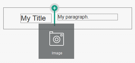
Description of the illustration component_insert.png
You can have multiple items in a slot and move items on the page just by dragging them to a new location. You can also adjust the relative width of two components in a slot by clicking and dragging the boundary between the two components. The component snaps to the next grid line indicated in the “ruler” displayed above the components.
The size of each component is displayed both in pixels and as a percent of the available space in the slot. To adjust widths to values other that those defined by the grid, press and hold the Ctrl key while you click and drag the component boundary.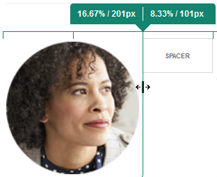
Description of the illustration component_drag.png
Components
After you place a component on the page, you can adjust the alignment, spacing, and other properties by selecting the item, clicking the item’s menu icon ![]() , and choosing Settings. If you click the component name instead of the menu icon, you can see and select the menu icon for the slot and component group (if the current component is part of a component group). If you select one of the other tabs, you can see the menu icon and set properties for that element:
, and choosing Settings. If you click the component name instead of the menu icon, you can see and select the menu icon for the slot and component group (if the current component is part of a component group). If you select one of the other tabs, you can see the menu icon and set properties for that element: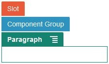
Description of the illustration settings_stack.png
Theme designers can specify which components are included with the theme, so some components available with one site may not be available with another. Theme designers can also specify which components are allowed in a given slot in a given page layout. If a component isn’t allowed in a particular slot, the placement bar changes color and symbol (minus) ![]() and a message similar to the following is displayed:
and a message similar to the following is displayed: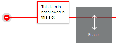
Description of the illustration slot_restriction.png
Adjusting the Size and Spacing of Components
-
px (pixels): the default. If only a numeric value is specified, pixels is assumed.
-
% (percent): sets the item to a percentage of its parent HTML element size. Example: 25%
-
em: sets the size of the component in em-spaces. Example: 20em
-
vw: sets the size as a percentage of the width of the viewing area and is responsive to the size of the viewing area. Example: 10vw
Editable Layout Content
Theme designers can add “built-in” content to page layouts, such as copyright notices, that can’t be changed in the editor. Theme designers can also designate simple text and image content as editable, including digital assets. This allows a contributor to change the text or image content, but not alter the location or other layout attributes. Editable text elements have a menu with options for specifying bold, italic, and underline text and for changing or removing a link:![]()
Description of the illustration simple_text_menu.png
Editable graphic elements have a settings icon ![]() and panel where you can specify an image, title, and alternate text.
and panel where you can specify an image, title, and alternate text.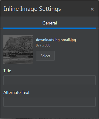
Description of the illustration simple_image_settings.png
Note:
The changes you make apply to the current page only. The original content is stored with the layout in the theme and is the default when the layout is first applied to a page.Styles and Formatting
Most components have one or more base styles defined by the theme that specify aspects of the component’s appearance. You can easily switch styles or override a style. To choose between available styles, open the component’s Settings panel, click the Style tab, click Choose Style, and choose a style from the menu. To specify your own values for the properties specified in the style definition, click Customize and specify the formatting options.
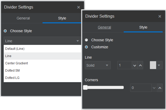
Description of the illustration style_compare.png
Undoing Your Changes
Use ![]() to reverse the last edit or change you made in the editor. You can use undo
multiple times to reverse a series of changes.
to reverse the last edit or change you made in the editor. You can use undo
multiple times to reverse a series of changes.
Use ![]() to reapply the most recent change you reversed using undo. You can use redo
multiple times if you have used undo multiple times in succession.
to reapply the most recent change you reversed using undo. You can use redo
multiple times if you have used undo multiple times in succession.
-
If you switch to a different update, the undo chain is reset and you can’t undo the changes made in the update you worked on earlier. Within an update, you can undo changes even after you save them.
-
If you change views in the editor, such as switching pages or changing the size for a given page, you must manually reverse those types of changes.
-
If you edit text components, such as titles or paragraphs, the text editor has its own undo chain. When you leave the text editor, you can no longer undo those changes.