- Using Integration Insight in Oracle Integration Generation 2
- Work with Consoles and Dashboards in Insight
- Work with the Console and Dashboards for a Business Process
- Create Custom Dashboards
Create Custom Dashboards
Custom dashboards use visualization charts, such as pie charts or bar charts, to represent indicators (dimensions and measures) for Insight models that have indicators defined.
Insight Administrators and Business Executives create custom dashboards.
For overview information, see Custom Dashboards.
To create a custom dashboard:
- On the Models page, click the model for which
you want to create a custom dashboard and ensure that the model has indicators
(dimensions and measures) defined. If not, follow the steps in Define Indicators.
Note:
You can only create and define indicators for models that are in a Draft status. If you have to create a draft of your model to add indicators, you must also reactivate the model. Metrics may be lost while the model is being reactivated.
- On the Consoles page, click the model (business process) for which you want to create a custom dashboard.
- In the model's console, click
Create.

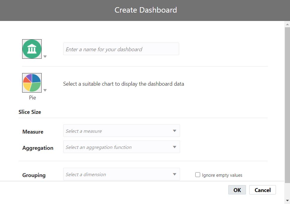
The Create Dashboard dialog is displayed.

- Enter a suitable name for the dashboard.
- Click the dashboard icon to show the icon picker. Choose an appropriate icon for your dashboard.

- Click the chart icon to show the chart picker. Select a chart appropriate for the data visualization.

- Based on the type of chart you choose, select appropriate values for each of
the fields in the Create Chart dialog,
where:
- A Measure value is an indicator defined in the model for the business process that is a quantifiable value, such as item count or price.
- An Aggregation value is a function
that operates on the selected measure. Available functions are:
- Average
- Count
- Count Distinct
- Maximum
- Median
- Minimum
- Percentage of Total
- Standard Deviation
- Sum
- Variance
- A Grouping/X-Axis value is a dimension indicator defined in the model for the business process that specifies a grouping for the aggregated measure value, such as geographic region, salesperson, order start date, or status.
The following table describes the fields and values in the Create Chart dialog for each custom chart type.
Fields and Values Pie Bar Bubble Area Line Scatter Slice Size. Select the values that the slice size represents. These values are mandatory. -
Measure. Select the measure for the slice size.
-
Aggregation. Select the aggregation function for the measure.
X X-axis. Select the value to be represented on the X-axis. This value is a dimension indicator used to group data. This value is mandatory.
X X X X-axis. Select the values to be represented on the X-axis. These values are mandatory. -
Measure. Select the appropriate measure indicator.
-
Aggregation. Select the aggregation function for the measure.
X X Y-axis. Select the values to be represented on the Y-axis. These values are mandatory. -
Measure. Select the appropriate measure indicator.
-
Aggregation. Select the aggregation function for the measure.
X X X X X Bubble Size. Select the values to determine the bubble size. These values are mandatory. -
Measure. Select the appropriate measure indicator.
-
Aggregation. Select the aggregation function for the measure.
X Grouping. Select the dimension indicator to group data. This value is mandatory. X X X Grouping. Select the dimension indicator to group data shown on the X-axis. This value cannot be the same dimension used for the X-axis. This value is optional. X Ignore empty values. Select to display data only for valid values, and ignore null values, of the selected dimension. X X X X X X